Line25 is reader supported. At no cost to you a commission from sponsors may be earned when a purchase is made via links on the site. Learn more
This post rounds up a collection of 25 cool website designs that all feature modular content block layouts. The grid based content block layout has become popular for many types of websites, especially portfolios and curation websites, such as Pinterest.
There are multiple advantages that may turn the balance towards using an organized modular content block layout for your website. For instance, these types of designs are well known for their meticulous order and structure which makes your content more visible and easy to notice.
These sites have a series of tiling blocks that fill the page, often in a kind of modular format where they rearrange themselves depending on the viewport size. With fully responsive, well-organized content and powerful features, there’s nothing bad to say about modular content block layouts. It’s all about each one’s style and requirements. See for yourself!
Mercer Tavern
This is a beautiful example of a website which has a grid layout. This one-page design includes high-quality images and subtle animations.
DesignersMX
Get inspired by this modular content block layout and see how the designer organized everything to the smallest detail.
ChadMiller
This is a full-width layout which includes large content blocks. These have neat animations and each leads to a specific page.
RED Interactive Agency
This website includes multiple modern features which, altogether create an exceptional design. For instance, parallax effect, animation effects, grid layout, full-width high-quality images, etc.
BL:ND – Brand Strategy Design Consultancy
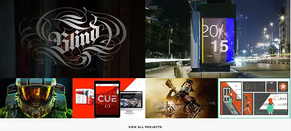
In this example, you can see a stunning image gallery with a full-width grid layout. This keeps the projects more organized and more visible.
Everlovin’ Press
Here is another amazing example of an excellent grid-based layout. This adds a little order to the whole website, making it more compact, with a well-thought design.
Bernd Kammerer Portfolio
Check out the portfolio page layout from this website. It has a neat modular content block layout which includes an eye-catching animation effect.
Neighborhood Studio
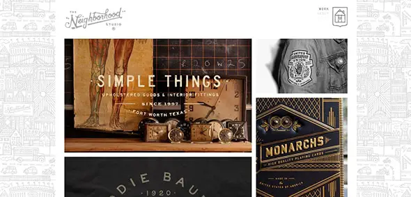
This beautiful website design includes a grid layout with amazing animations. Also, the background has a gorgeous design pattern which looks stunning.
DB Works
In this example, you’ll see how you can showcase your projects in a professional, well-organized manner – with a grid layout, of course.
Claire Coullon
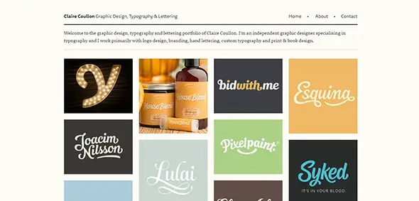
This modular content block layout includes various small images, with animated overlays and a short description. The whole design is boxed, to make it more compact.
AXT
Discover this full website and learn new features that you can apply in your future designs. It has a grid layout, on the works page, which keeps everything in check.
United Pixelworkers
Here’s an excellent example of a grid-based layout that you can use as an inspiration to create future designs. This layout has a well-organized grid design that will get your attention.
Berger & Föhr
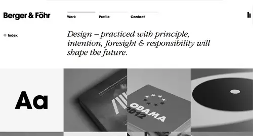
This is a black & white layout with a block layout that animates into a full-colored version when hovered over each image.
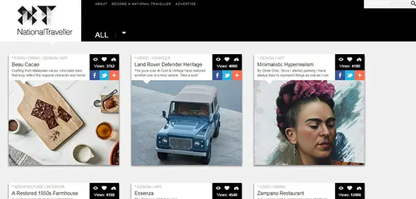
NationalTraveller
Here’s a well-designed grid layered design which has an organized content. This includes multiple blocks with shadows and other features that give them a 3D look.
Webdesigner Depot
This website has a grid layout with big headings that allow you to better visualize each subject.
You’ve probably heard or used Pinterest before. This layout is a perfect example of a grid-based layout.
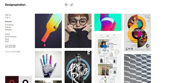
Designspiration
This is another great example of a website which has a modular content block layout. Follow this link and see it for yourself.
Hatch
Lees Ferry
Leodis Lager
MAP
The news page from this website includes a beautifully organized modular content block layout. Follow the link and see the full design.
My Poor Brain
This is an excellent grid-based layout which demonstrates a great order and organization. This design displays beautifully across any device.
Nowy Teatr
This is a creative website which uses a grid based layout but in a different manner. The space between them is different and they have a specific link that leads to a custom page.
Silk Tricky
Here you have a completely unique website which has a unique design. It uses grid blocks to create an interactive gallery with a creative design.
Spazoidipaolo
This is another beautiful website which has a grid-based layout. Follow this link, see the full design and discover new features and functionalities.
Grid-based websites give a certain edge to the websites that use them. Which one of these modular website designs is your favorite?
















Great roundup. Currently looking to try and do something similar for a new project we have, so very useful to look at these examples and see how others have implemented grid /block based solutions.
Awesome..inspirational for web designers and graphic designing companies..
Fantastic designs. Great job editor!!!!
All of them are fantastic Layout and quite inspiring.I like them al…..l
Thanks for sharing. I was searching for inspiration. Got it better one now! Will post the URL once I finish the work, to show how I transformed this idea.
We are using the mosaic blocks on our site as well, but not for the entire page. I think that without text content and certain other factors, using the blocks as your entire landing page may not be the best option for SEO. While other pages may still display text content, your home page is usually your most linked to page of your site and should contain actual text content as well as awesome design.
Great post as always, web designer depot is a great resource, I knew a lot of them from your list, but not that one. Thanks again.
Great article Chris. The block layout is becoming a lot more popular, in part due to the rise of browsing on touch screen devices such as phones and tablets, but if they can all look as good as these above it can only be a good thing!
That's great article. You know – this is exactly what I was looking for. I shall give you a big thanks for this great piece of information. Keep it up.
What outstanding variations on a very basic, traditional grid system.
Serious as a heart attack, this would be a great project for students!
Incredible websites, pinterest have change the idea of a portfolio website, and html5 help so much, good article
All are awesome layout….. i liked all!!!!!!!
One of the nicest block layouts, is Chris Coyier's <a href="https://css-tricks.com" target="_blank">CSS-Tricks</a>.
Check it out, also – give the screen a resize, it's nice!
okey
A trend I can get behind. Hope Microsoft doesn't overkill it.
I really like it used on this site: https://www.wakeupnow.org
Another great block layout from https://momentous.ca/
Here's a great block layout from Minneapolis: https://patstap.com/
Simple but effective seems to be the way ahead at the minute, working on making your website cross-platform is the biggest thing at the minute.
At the minute.
Lots of website seem to be taking this approach, Windows 8 shares the same content block layout. I really like it but I think benefits much more from a touch screen browser.