Line25 is reader supported. At no cost to you a commission from sponsors may be earned when a purchase is made via links on the site. Learn more
User dashboards are difficult interfaces to design, as there’s loads of information that needs to be neatly presented to bring the user up to speed, but you don’t want to slap them in the face with tons of data.
Today’s showcase features 25 nicely designed app dashboard designs that do a great job of presenting information neatly and clearly in a concise dashboard. See how they use color, charts, graphs, and icons to create visually stunning interfaces.
Want more great app design resources? Check out these iOS App Templates for Creating Awesome Apps.
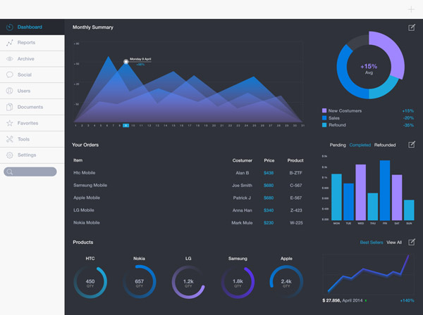
iPad Dashboard by Davide Pacilio
This is a concept for an iPad dashboard design created by designer Davide Pacilio. It has a dark theme, with neon hues of blues and purples.
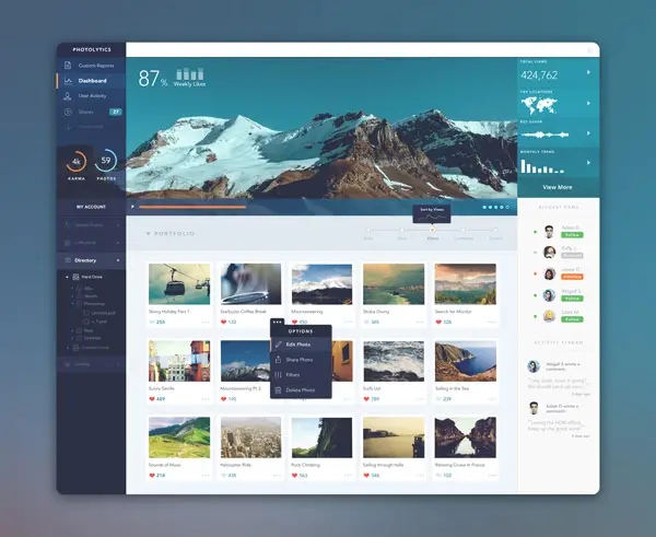
PhotoLytics Dashboard UI by Balraj Chana
For this dashboard UI the designer has been experimenting with various style. The dashboard consists of a real-time analytics platform of a user’s photo stream.
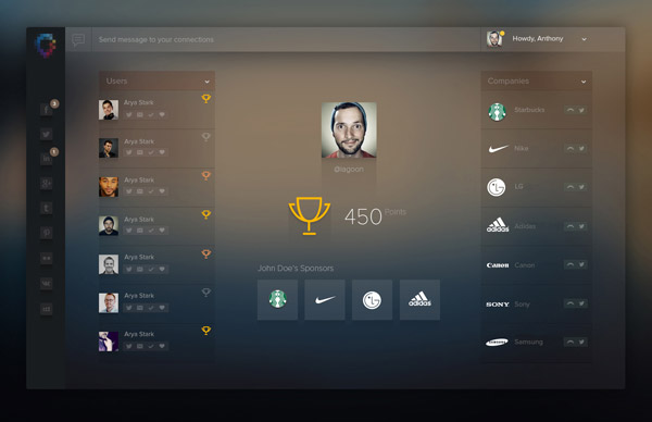
Ladderboard by Vivek
This designer has been working on this app concept which helps you better manage your social connections.
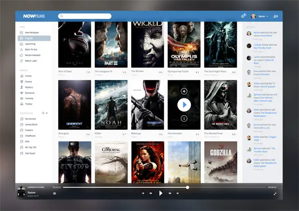
NowFilms by Aaron Sananes
Check out this movie app dashboard UI. The player at the bottom is an optional feature. You can choose to completely disable it if needed.
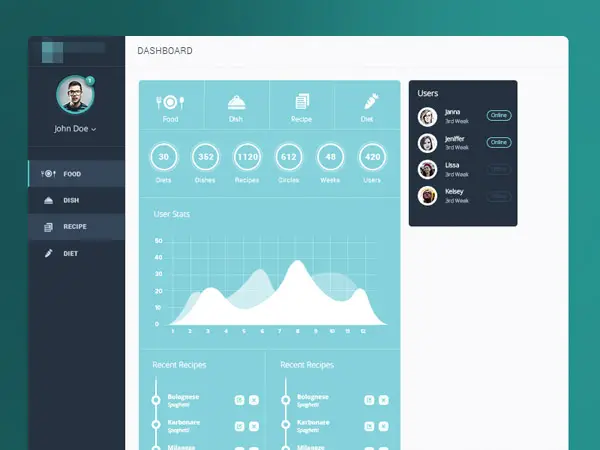
Main Trainer / Admin Dashboard by Vladimir Babić
This is a simple, pastel-colored admin dashboard for a fitness/nutrition app. It has some cool graphics worth checking out.
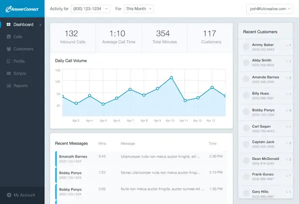
Answer Connect Dashboard by Joshua Iwata
This designer has been working on a dashboard concept for customers of an answering service. It has a blue colored palette and simple graphs that are easy to read.
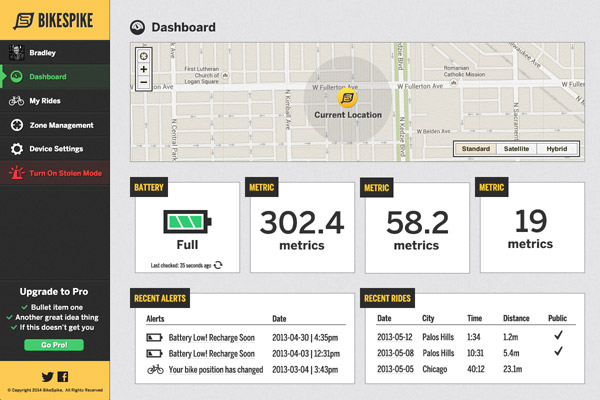
BikeSpike Dashboard Mockup by Brad Siefert
BikeSpike is GPS style low jack security system for your bicycle. This dashboard design has a different style from the rest app dashboard showcased on this list.
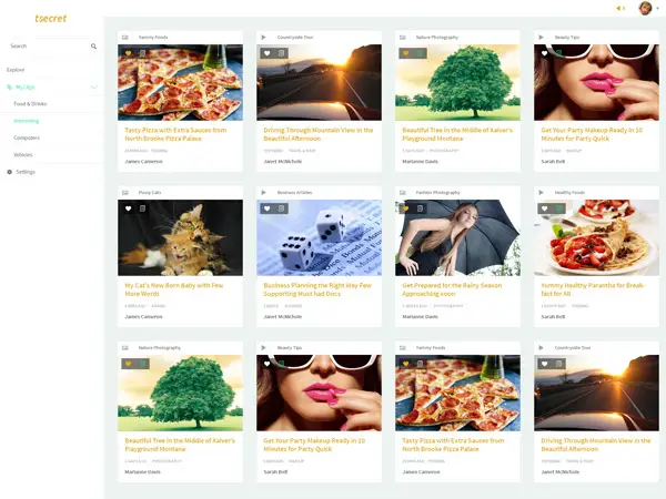
Dashboard by Nuruzzaman Sheikh
This is a content sharing application’s dashboard design. It’s a first draft testing but it already looks pretty good!
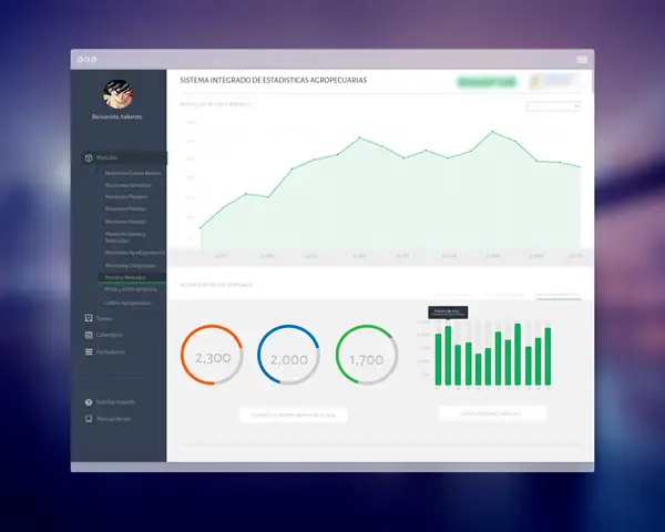
Spanish Flat Dashboard by Robin Marquez
This is a simple Spanish dashboard that I made for a national entity by designer Robin Marquez. It has different types of graphs and a modern color palette.
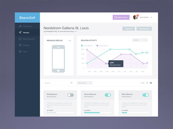
BeaconSoft Venue Page by Megan Fox
This is the venue page for BeaconSoft. The users can preview the messages attached to the venue, compare beacon activity and manage individual beacons right from this dashboard.
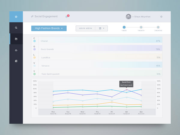
Social Engagement Dash by Rovane Durso
This is a simple, social engagement app dashboard created by designer Rovane Durso.
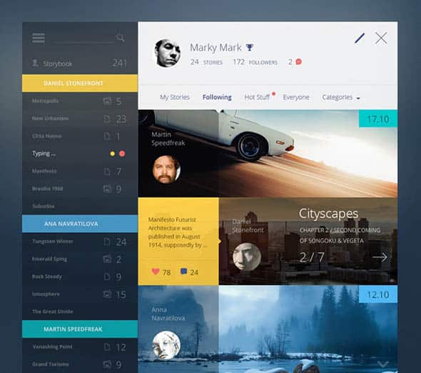
Story Book
We love this app dashboard design, not only because of the color choices but also because of how the layout was created.
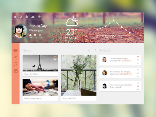
Personal Dashboard by Florent Legrand
This is a more feminine-colored app dashboard design with orange as an accent color. It was created to serve as a personal dashboard.
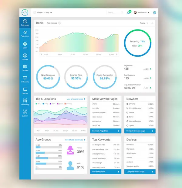
Dashboard by Avinash Tripathi
This is a complex dashboard design with lots of graphs with beautiful gradients and other useful elements.
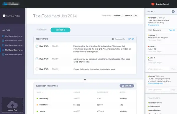
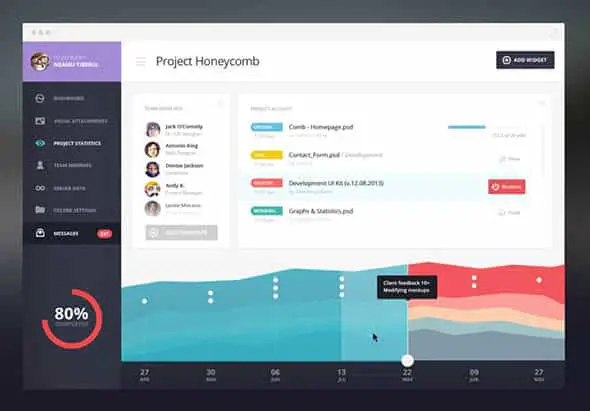
Task Management Design Direction by Brandon Termini
For this task management app dashboard design, designer Brandon Termini went with a more vibrant look and feel.
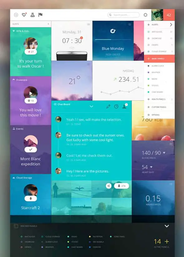
Panels Dashboard
This is a colorful dashboard design with a metro-style layout. It contains graphs, clocks, and more.
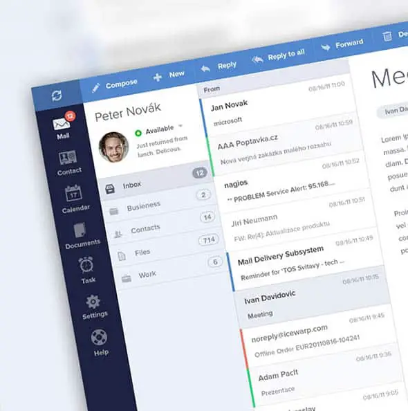
Ice Wrap E-mail client
This is a blue app dashboard design created for an e-mail / messaging app. It has Contact lists, Calendar, Documents options and more.
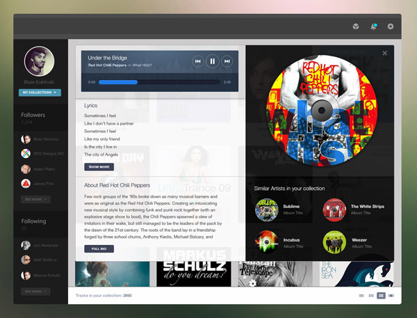
Music Collection by Blaze Kuklinski
This is a simple app dashboard design for a music app. It serves the purpose of showcasing your music collection in a modern way.
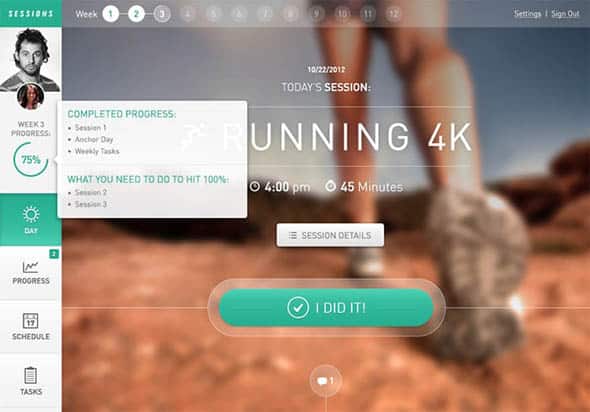
Fitness Web App: Sessions
This fitness web app dashboard is responsive and fluidly scales to mobile. Check out all of its features.
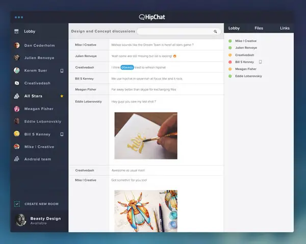
Hipchat V.2 by Beasty
This is a cool and simple chat app dashboard with a user-friendly interface and lots of interesting elements.
Super Tablet Dashboard UI
The great thing about this app dashboard design is that it can be downloaded as well! Use it as an inspiration for future projects.
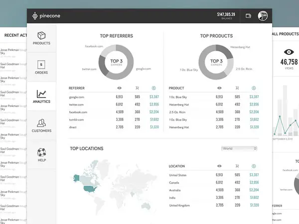
Pinecone Wireframes by Matt Bango
This represents some process work for Pinecone. The designer did some static mockups and then added them into a HTML/CSS/JS prototype to get a feel for flows and what the app will be like in production.
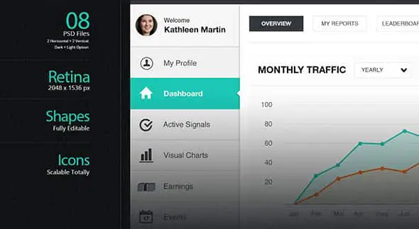
To-Do Dashboard
This is a simple, yet attractive work management platform for creatives with a lot of cool features.
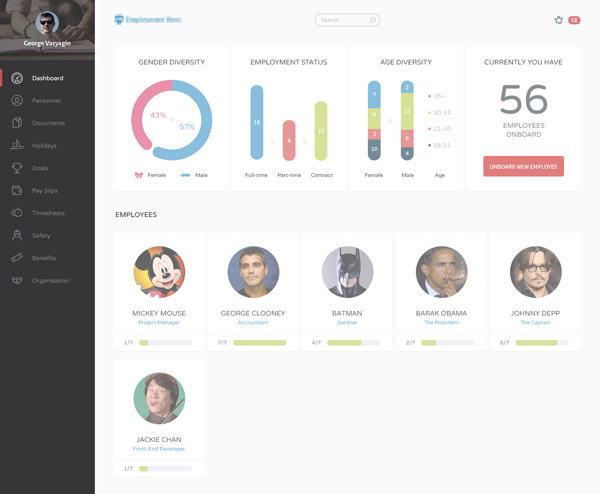
Flat Dashboard by George Vasyagin
This is a colorful flat dashboard design with simple but effective graphic elements. Check it out!
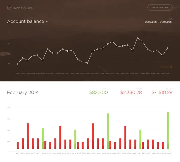
Bank Statistik by Tomas Jerabek
This app dashboard design project will be able to show exported data from internet banking. It was generated only with Angular.js on the client’s site.

Great, all of those app dashboard design concepts are awesome especially for dashboard by Avinash Tripathi
your site in Best
I love ” line25″
Nice collection!
Nice collection, Chris!
i love dashboard design by Aryo Pamungkas
I will immediately grab your rss feed as I can not find your email subscription link or enewsletter service. Do you’ve any? Please let me know in order that I could subscribe. Thanks. adgcfgdacfgc
I was looking through some of your blog posts on this internet site and I conceive this web site is rattling informative ! Keep on posting . bbedakbbccbe
its nice and interesting article thank you
i love ur work thanks for every thing
Witout doubt an amazing information you pointed out here in this article
Great collection. We can get some ideas bout the dashboard design.
today i found a css code for contact form. my contact form right now not working. can u suggest me what i do.
The Davide Pacilio one is very nice.
Nice visuals but not very useful dashboards, plus a lot of violations of visual info principles. pretty and clean, though.
Exactly what I was gonna comment … almost 80% of these dashboard are just bling bling and not very useful.
Dashboards are for data consumption , not to make data look good.
Very good, this help me a lot, thanks Chris Spooner!
very very good
thanck you