Line25 is reader supported. At no cost to you a commission from sponsors may be earned when a purchase is made via links on the site. Learn more
A website style guide is an important aspect when it comes to bringing coordination and collaboration amongst the team. A style guide acts as a directing tool which guides the developer, and with the help of the website style guide, designers choose the correct way of designing a website. Usually, when a team works on the same project considering the hierarchy and complex interaction, a style guide always keeps you consistent and coordinated at the same time. A website style guide acts as an anchor that conveys the design as intended. Maintaining consistency throughout the website without a style guide is difficult, as the website may look unprofessional. The only way to achieve an organised and systematic flow in work is to abide by the style guide.
Usually, the style guide is for the designers and developers so that the digital presence of the product is improved. Many may find it difficult in creating a style guide and for that few directions is given ahead.
To begin with the style guide, here are some quick tips that you know before you create a style guide. Always design the product first and then the style guide, as this would help you to know the kind of design you need to remain consistent. Always stay coordinated with the front-end developers as they would help you to give a preview of the result.
When you create style, the guide makes sure the company goal and customer needs are incorporated, and consistency is maintained. Stating every detail likes links, titles, buttons, exceptions, corner cases and much more are necessary. The designers and developers must not bring changes to the styles as per their personal preference. It should be made sure that the teammates must follow the style guide. Make sure that the teammates are in a loop with the style guide and always keep a check on it if it is updated. Style guides are a must for web projects.
Moreover, the style guide gives a consolidated view of all the elements in the website at a single place. This blog would help you out to create a style guide on your own.
1. Clear structure:
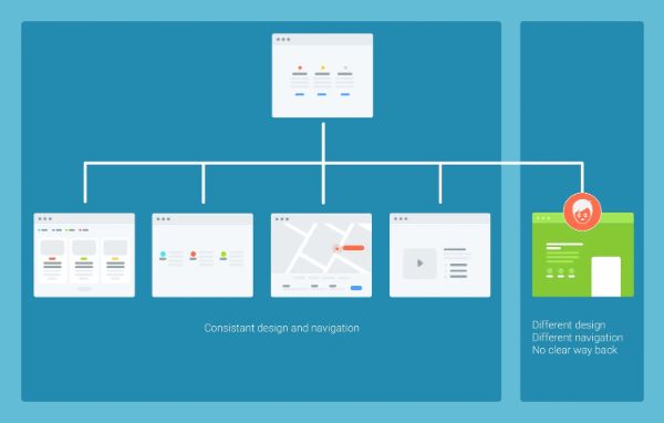
The primary purpose of creating structure is to represent the elements to be used in a way to create coordination and understanding. If anyone looks at the style guide, they could have a clear idea of what kind of design and how to maintain the structure throughout the website designing. So, while creating a website style guide, make sure to have columns which presents specific structures which conveys the details that you should consider stating it.
2. Color Palette:
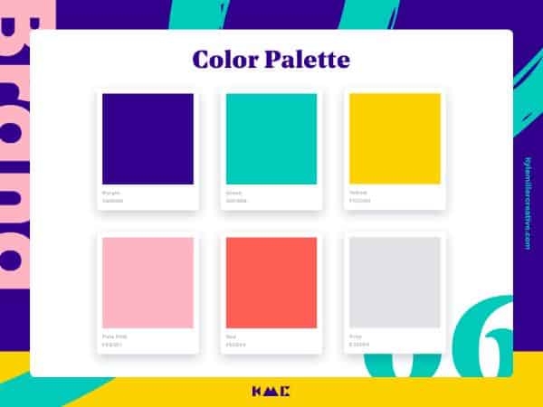
Every brand has their own choice of colors that represents them to the clients. While working on a website, you must consider the color palette for the brand that needs in future projects. The color palette helps the developer and designer when to use which color and this helps to stay consistent with the brand color. When working in a team if you get a new designer or developer, there are chances that communication, coordination and interpretation would be at a different level. So, only if the style guideline consists of the color palette, that would be helpful for the former teammates as well as the new ones. The color palette with their names would create a professional outlook.
3. Notes and Text Notes:

One of the things that make your work easier is notes. Notes and text notes help to keep everything labelled. In Photoshop document, you might have noted that if you can add some context to any area, you are working for it. You can also manually fill out notes, and they set them in a group and place them on top of the related content. Both ways of having notes can be helpful if it saves you effort and time.
4. Typography:
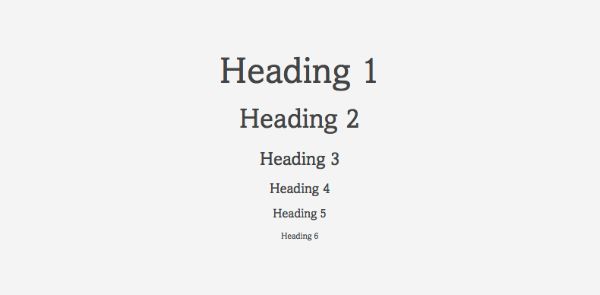
Nicely built typography offers for creating a harmonious style guide. To create clarity, legibility and consistency, we should always stick to at least two typefaces through all the pages. Using different fonts for headlines and the body of a website is essential. Using proper hierarchy, line-weight, weight, letter spacing and including examples would bring out the front details.
5. Have a proper form with form fields:
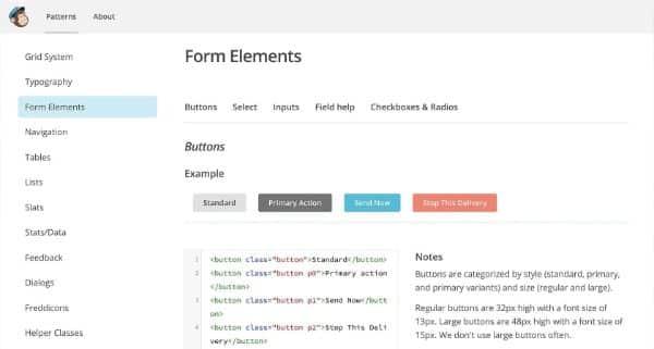
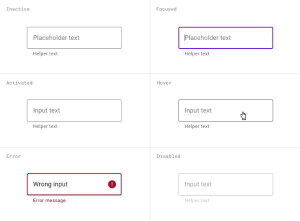
If your work has too many fields, you should always reduce the complexities and present them in a way that can help you to map it out and design correctly. If you are working with a form field, you might have to consider the position and alignment of labels, active text. Also, considering the entered text, placeholder text, focused input field state, normal input field state, error validation, submit button alignments, submission load graphics and much more would be helpful.
6. Margins and Paddings:
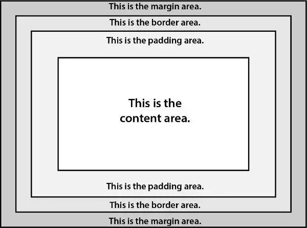
While designing your websites, the margins and padding should have estimated and listed. Ignoring the margins and padding, we are sure there are chances that the website that is going to reach the end-users would be a turnoff. To make the layout look good and sorted, it is undoubtedly necessary to fix up the margins and padding. Make sure the white space that gives your design some breathing room is as per the margins. You can also use a shape layer that would help you to ensure what kind of space your design needs.
7. Image treatments and example:
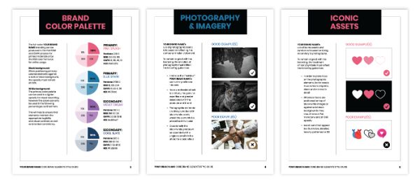
It is one of the sure things we maintain while designing a website is giving a consistent image treatment to every image. The style guides must have image treatments used consistently on all images and appropriate examples which represents the same. The subtle border or any opacity to the image mention it. This makes the developer and designer follow the rules as per the brand needs.
8. Text Wraps:
Usually, the headlines must contain only four words and anything more than that would be a clutter. Also, make sure the heading doesn’t get dragged to the second line. There is a possibility that when any handheld device is in use, the end-users may get the text that would end up in the second or third line. Always indicate line heights for the typography which would end up to the second line or third. The way the text appears should stay consistent throughout, which brings the prominence of the content along with the other elements in the website. The text wraps must consider in a way which makes sure, and the mobile device is compatible or else it would appear cluttered in those devices.
9. Typography pairing and Descriptive header hierarchy:
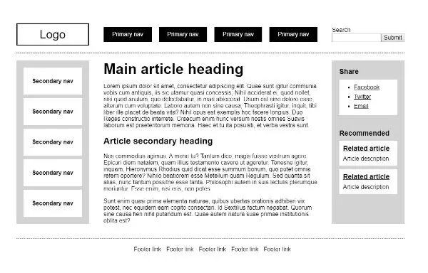
While suggesting header, make sure detailing given is for better interpretation. The person who creates the style guide may be different than the developer and designer. Hence, it should be made sure that the implementation is as per the ones directed. To avoid using more description for easy interpretation words such as primary header, secondary header and headers used for sidebar widgets must be used. Give every content a specific header to make it easy to find, and it would help others to comprehend what kind of element needs to be in the layout. The description would be long enough to go through, which would take more time and challenging.
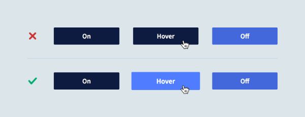
Always mention the buttons, navigational states and text links in the style guide. There are instances that each element used at a specific time needs stating in the style guide. It is necessary to add the instances as to using which elements when it helps the designer or developer to get the idea of styling the website. If you have enough time, they also make sure that you also label these instances, which would be more helpful.
Conclusion:
Make sure you have done a whole lot of research for the brand before creating the website. Incorrect research increases the chances of users not appreciating your design. Spend as many days as you want for the research about the brand. This would help you to create the best website style guide. It would take many tasks to create a style guide, but it would be worth as the efforts reflect at the later stage. When you work for a brand, you must know the mission and goals that need to be on the website. Only proper research would help you to get a clear idea of what to bring on the website be it the content, designs or the color you choose.
Creating a style guide would boost not only your productivity but also the confidence in your designs. When you are creating your own brand, it is a fun and creative process to create your style guide. It would be a lot different, creating a style guide for your clients. You would have to get briefs from them about the brand and independent research for it. Only proper research would lead to a proper understanding of the brand. Later can be represented through a style guide for future references. While creating a style guide, you eventually end up knowing much more about the brand than you could have known by any other means.
Style guide if considered are just cataloging every aspect of a website project. This includes color to be used, outlining the fonts, tone of voice and more. The projects benefit from the style guide be it building any new website or formulation any marketing strategy, creation of brand or publishing a blog post. A style guide helps document crucial decisions about the project before starting the work. Moreover, it helps ensure that the teammates and clients are on the same page from the start. The style guide also ensures consistency throughout the project, and it consists of all details, which helps to pick up easily from where someone left off. As clear instructions to follow is in the style guide, it easier to follow the guidelines. Creating a style guide would also prepare you to create a much better one in future for other projects.
When you create your website style guide, it can take many forms. A style guide can be just a page document consisting of just outlines, a font choice or could be large documents having every other detail like design philosophy to pixel width between elements on the page. Style guide entirely depends on your freedom of choice and can have your uniqueness; it is not necessary to follow a particular set of rules. With the tips as mentioned above all, you could do go through the steps. Use them wisely while creating a style guide. The chances of your vision interpreted out there would increase through the style guide. You could see the transformation of documented designs elements into an amazing visual design.
