How to Create Retina Graphics for your Web Designs

Home » Tutorials » How to Create Retina Graphics for your Web Designs

Line25 is reader supported. At no cost to you a commission from sponsors may be earned when a purchase is made via links on the site. Learn more

The more products Apple releases, the more widespread Retina displays become. So far we have Retina capable iPhones, iPods, iPads and MacBooks of various sizes, which together make up a pretty substantial audience. Let’s take a look at how you can create special retina graphics for your website so your design looks crisp, sharp and clear on those powerful screens.

Why support retina displays?

I initially didn’t expect the user base for Retina displays to be very large, after all it is a relatively new technology. But then I took a browse through my Analytics account and realised that Apple devices dominated my mobile stats, and of these devices most iPhones, iPods and iPads now all have Retina screens. Factor in the number of users with a 13″ or 15″ MacBook Pro with Retina display and the audience slots right in behind Chrome, Firefox, Safari and Internet Explorer in terms of sheer numbers. If you support the Opera browser chances are you’re catering for a smaller user base than your Retina capable audience (that’s the case with my own website stats at least).

How to create retina graphics

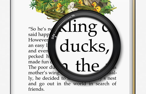
You might expect Retina graphics to be saved with a higher PPI resolution, but that’s not the case. All you need to do is save a set of Retina versions of your images at twice the size, so a 200x200px image would become 400x400px. These supersized images are then displayed in the original image size dimensions, which helps create that smooth and crisp appearance on high pixel density screens.
It sounds simple, but how do you go about acquiring double sized images?

Design logos and icons in Illustrator

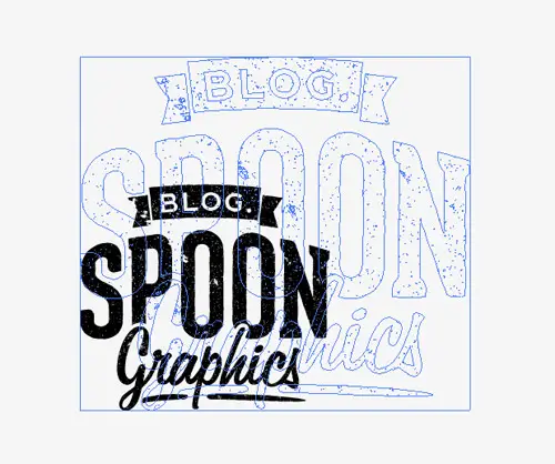
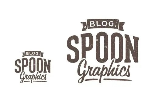
Vector graphics are the perfect solution to creating retina graphics. If you have a logo or icon in an EPS or Ai file it can be scaled to any size before being exported or copied into Photoshop. Paste the element as a Smart Object and it will retain its vector roots so it can be doubled up and saved out as a special retina image.

Use Photoshop’s vector features

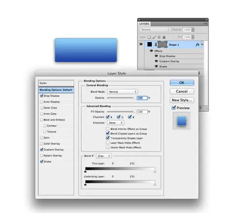
Photoshop is a pixel based application at heart, but that doesn’t mean it’s not packed full of vector features. Every shape tool has the option of creating a vector layer instead of pixels, and all your Layer Style effects remain scalable. When you come to scale up your elements x2, all the effects should scale to produce an almost exact replication at double the size.

Cheat and scale up your pixel images

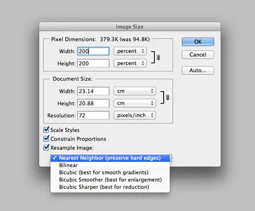
One of the rules that is always drilled into us as Designers is not to scale up an image, but if you’ve already designed your website and you want to go back and add retina support you have no option other than to rebuild every image manually. Usually scaling up an image would result in a fuzzy appearance with lots of anti-aliased lines, but there’s a little option in Photoshop’s Image Size menu named Nearest Neighbor. This setting will avoid blurring your image and retain hard edges, which makes it useful for small icons and solid colour objects. It won’t produce results as good as completely rebuilding the element, but it provides a decent alternative at a fraction of the time.

What about design at 200%, then scale down?

You might be thinking “Why don’t I just create my whole layout at double the size, then I can scale down the elements to create the standard images?”. In traditional print design theory this would work, but in web design we work at a pixel level and create perfect shapes and lines. Even scaling down an image in Photoshop will result in a fuzzy appearance, especially at the small scale of icons.

How to code your retina graphics

Once you’ve created and exported copies of all your standard images at double the size, you can begin adding them to your website using various methods. A quick note about file naming, the standard is to save your retina images directly into your usual images folder with the same filename, but with the addition of @2x on the end. So snarf.jpg would become snarf@2x.jpg.

The easy Javascript way

<script src="js/retina.js"></script>

The absolute easiest way to put your collection of retina images to use is to link up the retina.js script. Retina.js checks for @2x images in your images directory and automatically swaps them out for you.

The manual CSS way

@media only screen and (-webkit-min-device-pixel-ratio: 2), only screen and (min-device-pixel-ratio: 2) {
	header h1 a {
		background-image: url(images/blogspoon-logo@2x.png);
		background-size: 164px 148px;
	}
}

Alternatively, you could add your retina graphics manually to keep all your page styling within your CSS files. A media query containing min-device-pixel-ratio: 2 will target devices with 2x pixel density. Following this you replace each element’s background image with your @2x variant, but don’t forget to scale it back to the original image size using the background-size property.

The HTML way for inline images

<img src="images/snarf@2x.jpg" width="300px" height="150px" />

The CSS method is great for background images, but for inline images in your HTML you’ll have to modify the <img> tag. Simply add the @2x image to the source attribute, then use width and height to scale it to the original dimensions.

Author
Iggy
Iggy is a designer who loves experimenting with new web design techniques, collating creative website designs, and writing about the latest design trends, inspiration, design freebies, and more. You can follow him on Twitter

41 thoughts on “How to Create Retina Graphics for your Web Designs”

  1. Great article, thanks Chris! I had wondered what was the best practice for saving out retina images.

    When I first bought my Retina Macbook, I couldn’t deal with Photoshop rendering my designs at 1x (everything looked too small, and zooming in only made things pixelated) … I’ve worked around this by creating all my (web) designs at 144 dpi. When I save out my images, I use ‘save for web’ anyway, so it’s saving them at 72dpi.

    Any thoughts on this? What do other people do?

    Reply
  2. Our web design team have expert knowledge of search engine optimization and search engine marketing that can be integrated with all leading social media applications….

    Reply
  3. Presumably this will work on all devices with such screens and not just Apple products?

    The Nexus 10 has a 300ppi resolution. The iPad's 'Retina' is 264ppi.

    Reply
  4. I imagine this works quite well in reverse for sub-optimal phones and Android tablets as well.

    How much code is just becoming simple browser detection and adaption today!?

    Reply
  5. Hello! Do you know if they make any plugins to protect against hackers? I'm kinda paranoid about losing everything I've worked hard on. Any tips?

    Reply
  6. Nice article! Here is a tip: Instead of using exactly width and height for every image in your media queries you might use background-size: contain;

    Reply
      • We both know the answer to that, but I wouldn't use the scaled down technique as it's not good on many accounts. Especially when a real solution comes along.

        My main issue here is; the start of the article takes an EPS/vector and puts it into Photoshop for upscaling? That's just backwards.

        Chris obviously doesn't know how to use SVG on the web so cannot teach it, but this is wrong and encouraging bad hack-like habits.

        When a proper solution comes along, websites adopting this technique will be left with stupidly big images and what then? Imagine years of CMS posts which adopt this technique, and the solution – then becomes the problem.

        Reply
  7. How about generating 1 large image in JPEG at quality 0 and the just let the browser scale it down to the needed size .

    Lets say that you're gonna show an image in size 400 x 600. Your image in Photoshop is 2048 x 1536 so you scale it and crop it to 400 x 600 and save it in quality 100. But instead you can try to save it in 1200 x 1800 at quality 0 and save a lot of kilobytes.

    But how about all the artefacts in the image when using quality 0 ? Well, they're only visible when viewed at 100% (1200 x 1800). But since the browser is resizing to 400 x 600 they probably won't be visible at all.

    Try this little test: https://dl.dropbox.com/u/145581/imagetest/index.html

    Reply
  8. Downscaling images works fine if they're exactly quadruple the original image size (2x as wide, 2x as high). You run into trouble with fuzziness and weird artifacting of you use a different multiplier.

    Reply
  9. In actuality, 400×400 (160,000 sq pixles) compared to 200×200 (40,000 sq pixles) is quadruple-size, not double-size, since the 400×400 image occupies four times the area.

    Reply
  10. I hate that my image work load is doubled just because of a new screen on Apple products, it may well have made the world "more beautiful" for some people but it's made it a load of extra work for web designers.

    Reply
  11. This is great article. I've just been designing at 2x the size and scaling down using smart objects, I haven't experienced any fuzziness at the smaller size but Ill try this way and compare the results. Either way all this adds to the increased amount of work needed to get the job done these days without any increase in the delivery time.

    Reply
  12. Our developers are experimenting with using SVG's, which aren't very compatible with IE (in China, IE never dies!). What they have come up with is to copy the SVG code as js and have the whole thing drawn independently of the SVG file. I can get you more information if you are interested. What this allows is for us to do our entire workflow in Illustrator and we have infinite resolution, all the time. For retina & responsive design, this is a huge time saver with symbols, character styles, etc all in AI. Personally, I think it is much more useful for my designers to be thinking in terms of objects and type than layers and layers. I think people use photoshop because they have always used it.

    Reply
  13. I've not currently adopted retina because on mobile the images are small and fit anyway but on the ipad3 it does matter. I think it does as an x factor to the site but I may wait a year to implement this one other devices start to support it. Thanks.

    Reply
  14. Hi Chris,

    great writeup about serving Retina images with JS or jQuery, but I agree with @Jimmy on this one!

    Compressing your images is easier and you dont have the extra asynchronous downloads for your JS (especially on mobile)

    Reply
  15. Or, just make everything twice as big, and turn the jpeg compression all the way up (i.e. set the quality down). The resulting image takes up less disk space, and you really have to zoom in to see the quality difference.

    Reply
  16. I don't think the "px" suffix is proper syntax for the img tag height and width attribute. You can also stop adding "/" characters to your img tags if you're coding for HTML5. That's only necessary for valid XHTML markup.

    Reply
    • The "/" may not be necessary, but it's perfectly valid in HTML5 as well. If you were writing XHTML for years, it's kind of a hard habit to break. As long as your code style is consistent throughout your site, it shouldn't matter.

      Reply
      • @Steve, guilty, I’m so used to adding the ending /> to my img, br, etc tags. I figure it’s not going to break the code and it’s just out of habbit

        Reply
  17. Thanks for the useful information, Chris.

    A good way to also accommodate for retina displays is to maybe use instead of just images as these are also scalable. And also, it's a good idea to start using vector graphics obviously you'd need a .png/.jpg/.gif fallback for the older browsers that don't support this type of image extension.

    Reply
  18. What about WordPress images you add to posts though? These content images are the most important yet will remain at the same DPI.

    Reply

Leave a Comment

Verified by MonsterInsights