Line25 is reader supported. At no cost to you a commission from sponsors may be earned when a purchase is made via links on the site. Learn more
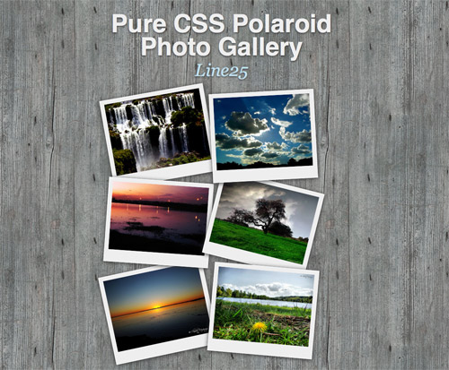
Magical things can be done by combining various CSS properties, especially when some of the new CSS3 tricks are thrown into the mix. Want to build a stack of Polaroid photos with pure CSS styling? In this tutorial, you will learn how to create a CSS Polaroid photo gallery.
Check out the demo to see what we’ll be building. Remember, because we’ll be using a couple of CSS3 properties, users with IE won’t see the complete effect, but fully supporting browsers such as Firefox and Safari will be treated to the whole experience. We’ll use basic CSS to style up the photos into a Polaroid style images, then inject some additional styling with shadows and rotation, then use the z-index property to alter the stacking order of all the objects.
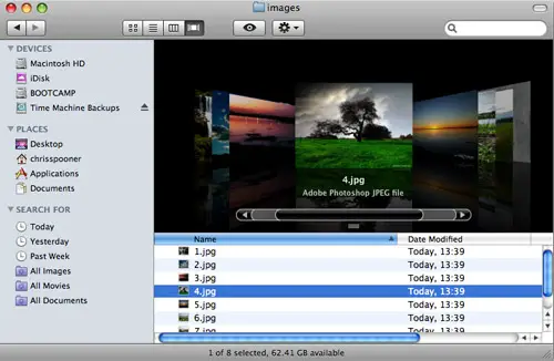
Start work by sourcing your images. For the sake of the tutorial, a bunch of beautiful shots were sourced from Flickr Creative Commons search:
- Iguassu Falls 006 by claudio_ar
- Sweet Home Under White Clouds by galego
- Sunset over the highway by claudio_ar
- Skies and fields from Argentina’s pampa 7 by claudio_ar
- Sunrise by claudio_ar
- Södermanland Lake by claudio_ar
body { background: #959796 url(images/wood-repeat.jpg); } #container { width: 600px; margin: 40px auto; }
Next, set up the basic page structure with a container centered on the page. Grab a repeating wood texture to add interest to the page background.
<ul class="gallery"> <li><a href="#"><img src="images/1.jpg" alt="Photograph of a waterfall" /></li> <li><a href="#"><img src="images/2.jpg" alt="Photograph of clouds and sunlight" /></li> <li><a href="#"><img src="images/3.jpg" alt="Photograph of a lake scene at dusk" /></li> <li><a href="#"><img src="images/4.jpg" alt="Photograph of a tree and green grass" /></li> <li><a href="#"><img src="images/5.jpg" alt="Photograph of a beach sunset" /></li> <li><a href="#"><img src="images/6.jpg" alt="Photograph of a flower and lake" /></li> </ul>
Semantically lay out the collection of images in an Unordered List element, and wrap each image with an anchor to create a clickable link. Don’t forget to add a suitable description to each image.
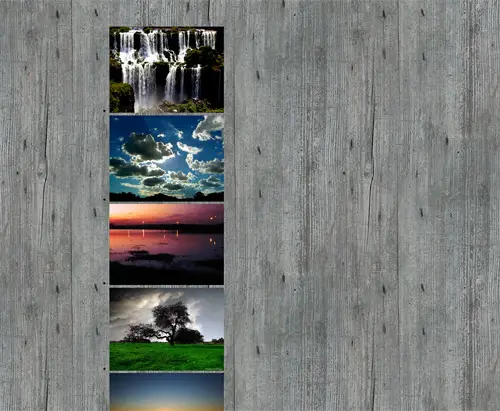
Now we get to start work on the CSS to style up the gallery. Firstly, we’ll want to remove the default bullet point graphics that appear on the list elements. Simply use list-style: none to clear these out.
ul.gallery li a { float: left; padding: 10px 10px 25px 10px; background: #eee; border: 1px solid #fff; }
Give the images the Polaroid effect by adding a few styles to the anchors. Firstly float them to the left to stack them up side by side, then add some padding. Setting a background of a light gray will then give the traditional Polaroid shape. Finish this off with a very subtle highlight in the form of a 1px white border.
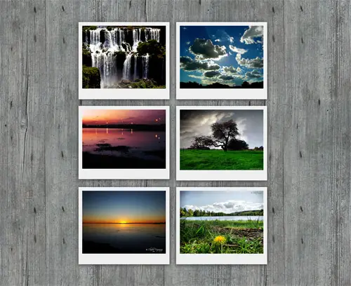
ul.gallery li a { float: left; padding: 10px 10px 25px 10px; background: #eee; border: 1px solid #fff; -moz-box-shadow: 0px 2px 15px #333; position: relative; }
To really add realism to the design, use the CSS3 box-shadow property to add some shading to the photos. To ensure the stacking order works later, we’ll also need to add position: relative to the CSS.
<ul class="gallery"> <li><a href="https://www.flickr.com/photos/claudio_ar/2214532638/" class="pic-1"><img src="images/1.jpg" alt="Photograph of a waterfall" /></li> <li><a href="https://www.flickr.com/photos/galego/3131005845/" class="pic-2"><img src="images/2.jpg" alt="Photograph of clouds and sunlight" /></li> <li><a href="https://www.flickr.com/photos/claudio_ar/1810490865/" class="pic-3"><img src="images/3.jpg" alt="Photograph of a lake scene at dusk" /></li> <li><a href="https://www.flickr.com/photos/claudio_ar/2952099761/" class="pic-4"><img src="images/4.jpg" alt="Photograph of a tree and green grass" /></li> <li><a href="https://www.flickr.com/photos/claudio_ar/2811295698/" class="pic-5"><img src="images/5.jpg" alt="Photograph of a beach sunset" /></li> <li><a href="https://www.flickr.com/photos/claudio_ar/2601700491/" class="pic-6"><img src="images/6.jpg" alt="Photograph of a flower and lake" /></li> </ul>
Now we need to target each image individually, so go back and give each anchor a unique class name.
ul.gallery li a.pic-1 { z-index: 1; -webkit-transform: rotate(-10deg); -moz-transform: rotate(-10deg); } ul.gallery li a.pic-2 { z-index: 5; -webkit-transform: rotate(-3deg); -moz-transform: rotate(-3deg); } ul.gallery li a.pic-3 { z-index: 3; -webkit-transform: rotate(4deg); -moz-transform: rotate(4deg); }
With unique class names in place, we can then add unique styling to each photo. Write out some lines of CSS specifying a different z-index order and a touch of CSS3 rotation to add variety to the images.
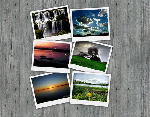
The stack of Polaroid photos should now be overlapping each other and have the appearance of being randomly placed on the wooden surface.
ul.gallery li a:hover { z-index: 10; -moz-box-shadow: 3px 5px 15px #333; }
Style up the :hover state of the anchors to adjust the z-index to a higher figure, this will ensure each image will jump to the top of the stack when it has mouse focus. Also, adjust the box-shadow to give the impression that the photo has lifted off the screen.
That’s all there is to it! Check the complete CSS and HTML in the example demo. You could take things further and combine the images with a great looking javascript lightbox effect for use on your own website.
Hi there!
Nice job really! Im working on something simmilar but I want to give a title to the pictures on the bottom white bar. I tried to use the CSS content:after and to display the pics title but its not really working. Can anyone help?
CSS
ul.f_galeria a:after {
content:attr(title);
}
Very nice gallery. worth trying out.
I am reteaching myself web design because I want to finally make money doing something I love. This was a fun little project to do with the photos I have taken. My only question, since I am still kind of rusty, is what would I use to make the images become thumbnails of larger images instead of redirecting to another page since these are my own photos?
Wowm this is so cool, bookmarked it for future use, thanks . .
Superbe!!!
Thx… i was looking for something like that :) i will try it
Simply delicious; as always IE doesn’t show it properly; if somebody got the same problem this is the time to change to firefox or chrome…
those aren’t standard css.
those marked with -moz- and -webkit- are browser-specific extensions to css.
so it won’t work on opera either
as of now, css3 is still in drafting stages.
This is great yet so simple though there’s plenty of workarounds that need to be done for IE.
it`s not work in internet explorer 6
i hope to find solution for it
This is awesome! :-)
CSS3 is ten years late and behind explorer 4.01 capabilities (published in december 1997).
Everything that IE antagonists are exited about CSS3 is way to old and out of fashion.
W3C reinventing the wheel as always but too godamn late, as always…
Very Nice… Is there anything that can be done to make it work on IE? Not that I like IE, but most people use it…
rotation / shadow does not work for me in demo. I’m using firefox 3.0.14 on a Windows XP machine.
In Firebug -> Styles, the -moz-transform and -moz-box-shadow-properties don’t even show up!
Tried de-activating WebDeveloperToolbar AND FireBug – no success!
These two are not real CSS3 properties anyways, are they?
regards, pw
You can rotate with IE too: https://msdn.microsoft.com/en-us/library/ms533014(VS.85).aspx
Great CSS3 tutorial. Thanks Chris.
css3 FTW!
Nice howto – css3 is going to make the web even more beautiful =)
I loved the rotation effect. I didn’t know that was possible. Thanks for that tip.
I also liked how you did the overlapping effect.
Dosent work in firefox or explorer – demo.
It’s working for me in Firefox
Great demo, cool to see new stuff with CSS3
Thanks for the tutorial. I am definetely going to use it.
Simple and excellent. Fantastic result.
Hadn’t ever imagined such a nice design. Thank you for sharing! :D
that was a quick one, great tutorial
Really good job Chris.
That will really help me to understand more CSS and learn further more about it.
great tut ^^
Hi Chris. Could you proper credit me???
Five of the six photos are mines …
I assumed the link to the photos on Flickr would credit them enough, but I’ve also added your username to the link.
Merci beaucoup :)
Thanks for the comments everyone.
Great thinking on the nth child selector, gutted I didn’t consider that!
Great tutorial! Very nice and well prepared for the future of CSS.
I’m confident that other browsers will implement all CSS3 features soon – exept our little friend IE :)
This was a fabulous tutorial…I was able to pull it off and add the lightbox effect, which I’ve never done before, and they work together really nicely :)
Nice, why not use nth-child psuedo class rather than classes to target the anchors. e.g. ul.gallery li:nth-child(1) a
Safari, Chrome and Firefox 3.5 will display this content properly (which also gets several of the Linux specific browsers as well). IE7 and below and Opera are not CSS3 and IE8 is only partially.
As for the unique class names, I agree, they should be ID’s. The purpose of an ID is to give an element a unique name. Classes are there to cover multiple items on the page that need the same behavior.
Still this is an excellent tutorial!
Yeah, it doesn’t work in FireFox 3.0 either. It’s a nice novelty, but of really limited use if 99% of web users won’t be able to see it.
Works perfectly with Firefox 3.5, though.
great post, and awesome idea…way to really showcase the power of non IE browsers…as a web dev, i’m sick of my friends asking why i get mad when they use IE, they always ask “but isn’t it all just the same?”
Nice, reallly nice, but only worked on Firefox, it didn’t work on IE8 nor Opera 10
Thanks anyway
Creative and amazing one!!
Hi,
Please add https://www.whiteshoop.com to your list.
Thanks,
PJ Pergas
You’re site sucks. It looks horrible in Firefox… I can’t imagine what it looks like in IE. And… It has nothing to do with this tutorial. Stop spamming your worthless crap.
s, its only working in only mozilla……
One small quibble. Instead of assigning “unique class names” to the anchors, why not make them IDs? Accessing elements by ID is the fastest operation, and this is actually the intended use of IDs.
This is a good article. Thanks for the tips on css. Keep em coming.
Wow. This is awesome! Good stuff for sure! Can’t wait for IE to catch up to the rest of the browsers so it looks equally as dynamic! Great job!
Impressive yet so simple! I like the approach and will be looking into implementing this with my clients. Thank you!
This is great, except the rotation doesn’t work in IE, and in Chrome I’m not showing any shadows behind the polaroids? Should they be there?
Amazing tutorial. Love the rotation!
It is guys like you who inspire to really go and do my own corporate website. These ideas make me stand out from the median. Now only trying to find time to really do it. With my (lack of) skills it will probably take me another 4 months to do it by the time you will have another great concept that I want to take on.
Nice! But as long as you’re using CSS3 for the shadows and rotation, why not use ‘nth-child’ selectors for the random scattering, instead of adding all those classes in the HTML?
That’s what my example does (but instead with CSS, it’s injected by JavaScript – see the first comment ) .
Excellent tutorial. I never knew it was so easy to make a background like that, I thought it was going to include loads of images etc!
It’s your little tutorials like this that are really helping me understand CSS – keep up the great work!
Awesome tutorial, Chris! I can’t believe, that it works also *ok* in IE6! Why do we still need jQuery or other big javascript frameworks when it do the same thing with some nice CSS? Thanks a lot!
You can add the Matrix and Shadow filters for IE to rotate the image and add a shadow for them. Then it’ll be truly cross-browser, with the lack of supporting Opera (but hopefully that’ll change soon).
It doesn’t work in MSIE 7
Really? Unbelievable!! :-D
It is kind of useless unless there is a solution for IE users.
http://www.dowebsitesneedtolookexactlythesameineverybrowser.com
That is awesome, thanks for that link…and completely correct.
IE is kind of useless unless it implements CSS3.
When will people learn IE is obviously not the best browser.
This is a really nice idea, there is elegance in its simplicity.
Might be worth adding the webkit box shadow too [
-webkit-box-shadow: rgb(51, 51, 51) 0px 2px 15px;
].Thanks for taking the time Chris
I second this. Everything else you do has both -moz and -webkit, the shadow should be setup as well.
excelente tuto !
really good tutorial one thing which browsers is will work.
Great tutorial Chris. Good to see more and more CSS3 properties in action. IE will probably catch up in around 2025 :)
Great tutorial.
It’s good to see what can actually be achieved with CSS 3 once in a while. I saw already hundreds of post with lists of CSS 3 properties and but never this!
Keep up the great work, it’s always a pleasure to check your blogs out.
really nice gallery for my web projects thumbnails. thanks
Wow – that looks a lot like my “polaroid photo viewer”. Only mine has the addition of “captions” and can also be dragged around with jQuery:
https://www.marcofolio.net/webdesign/creating_a_polaroid_photo_viewer_with_css3_and_jquery.html
A couple of weeks ago, I also created a “non-full screen” version for those who wanted the polaroids trapped in a container:
https://www.marcofolio.net/webdesign/the_polaroid_photo_viewer_non-full_screen.html
Anyway, good to see that you’ve picked up this technique too and interested to see how you would handle it!
So is your post because you like what is done or you just want people to know you created something with jQuery?