Line25 is reader supported. At no cost to you a commission from sponsors may be earned when a purchase is made via links on the site. Learn more
Anaglyphs are those amazing 3D images that are created by offsetting two of the red, green and blue channels, and are viewed with those nerdy looking 3D glasses with different coloured lenses. I don’t know if this effect works for real, as I’ve unfortunately misplaced my 3D specs, but it’s a pretty cool text effect nevertheless! Let’s take a look at how a similar style can be created for sprucing up your web designs while taking into consideration semantics and avoiding the repetition of any markup.

What we’re creating is basically a cool transparency overlay effect that closely resembles anaglyph stereoscopic 3D images. To use the effect in our web designs we’ll, of course, build it with CSS, but the main consideration is to keep everything neat and true in our markup, without any repeated markup. Therefore, we don’t want to use anything like this:
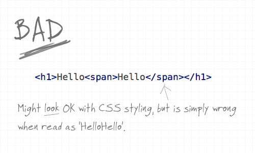
Using a span would be handy to provide us with something to target our CSS to and style up the two words to overlay on top of each other, but when reading aloud in the markup, and when viewed without CSS styling it’s simply wrong. With the effect being more presentational or aesthetic than it is part of the content, we need to ensure it’s semantically correct.
The :after class and content property
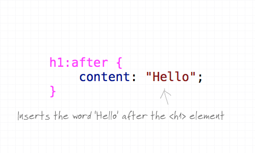
Here’s where the content property and the :after pseudo element comes into play. The :after pseudo element allows us to insert a snippet of content after the targeted header and adding our extra text in the CSS content property keeps our markup free of any wordage that shouldn’t be there, ensuring that it can’t be seen or read by screenreaders, RSS readers or search bots.
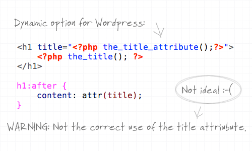
What’s more, we can also use the content property to not only manually write in some text, but also ask it to take the content from a specific attribute such as the title. This provides a dynamic solution that could be implemented in WordPress, but it’s not 100% ideal as it doesn’t stay true to the natural use of the title attribute. The title attribute should provide more information about the element, rather than regurgitate the same text.
Styling it up
So far we’ve just got two of the same word placed side by side. Let’s add some extra CSS styling to overlay the two and bring in some colour.
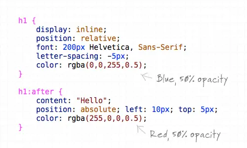
First up, the H1 element is converted to inline and positioned relatively to allow the absolute positioning of the generated text to work. Next up, the font styling is specified as 200px Helvetica with some letter-spacing tweaks to tighten up the example. The text is then coloured using RGBa, which allows the aplha transparency to be set so that when overlayed the underlying colour will show through. The generated text from the content property is also given some styling, specifically the text is positioned absolutely to sit slightly offset from the original at 10px and 5px on each axis, and is switched to red to contrast against the blue.
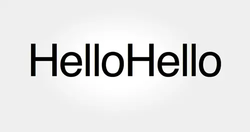
The final anaglyphic effect
<h1>Hello</h1>
h1 {
	display: inline;
	position: relative;
	font: 200px Helvetica, Sans-Serif;
	letter-spacing: -5px;
	color: rgba(0,0,255,0.5);
}

h1:after {
	content: "Hello";
	position: absolute; left: 10px; top: 5px;
	color: rgba(255,0,0,0.5);
}
Comments are closed.