Line25 is reader supported. At no cost to you a commission from sponsors may be earned when a purchase is made via links on the site. Learn more
Layouts are the foundation of a website. They separate the website’s sections and guide the visitors to the most important elements of a page. Layouts don’t have to be boring, though. A creative designer can combine both an unusual layout with user-friendliness so that the website will be fully functional and still attractive to the users. If you want to design a website with vertical layout, then you must browse through these awesome design examples first!
Original layouts play a great role in improving your website’s user experience and make them more appealing to the visitors. By browsing through these hand-picked examples, you’ll get your dose of web design inspiration, get new ideas and be even more creative. These 24 beautiful websites with vertical layouts belong to very different niches, from presentation sites and landing pages to corporate and even portfolio sites.
Also, in this list, you will see some popular website designs belonging to some famous companies everybody has heard of, such as Reebok, Canon, Nike, Philips, Nokia, Citroen and more!
Here they are! What do you think about these websites with vertical layouts?
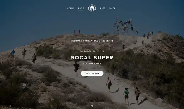
Race Microsite Progress
This first example has a modern and functional design layout which is perfect for a sports-related website such as this one. It’s straightforward and delivers the right information from the beginning. The overall style is friendly and has a pleasant fluidity.
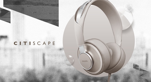
Web | OBH Landing Page Concept
If you were working on a landing page project and you were looking for a great source of inspiration then you might want to analyze this example. It uses large thumbnail images and combines them elegantly with minimalist design.
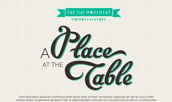
Landing page design
If you want more landing pages examples check out this one. It is beautifully designed and has a unique, customized layout. It looks authentic and the web forms designs have some interesting details.
Upskydown / Henry Daubrez Castaño
Upskydown is a creative director and graphic designer’s website and it uses a vertical layout. It uses a full-screen picture with a grey color overlay on which the menu bar and large thumbnail photos are placed.
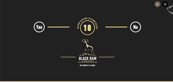
Black Ram Whisky
The best thing about this website’s layout is the awesome navigation and the way the website sections run wide across the page. The whole website has an open, friendly atmosphere and some bold details. This website has a vertical layout and it stands out from other websites through its unique design layout that makes elements float.
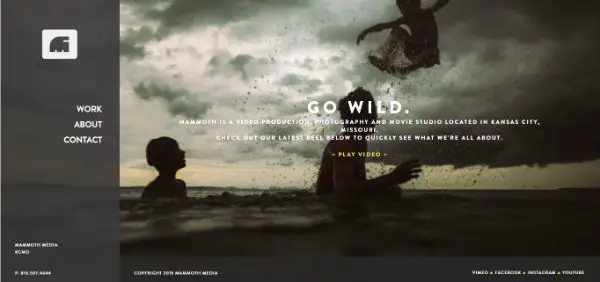
Mammoth Media
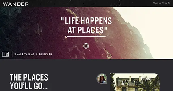
Wander Product Summary Page
This example uses a vertical layout and typography in a creative way. It combines colors, images and different graphic elements to make an elegant website.
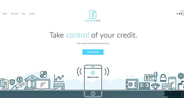
Dispute Doc website
Pioneer Square Labs
Canon EOS-M / Campaign Microsite
This is a microsite campaign example that could come in really handy for similar projects. It is a great advertising and web design example.
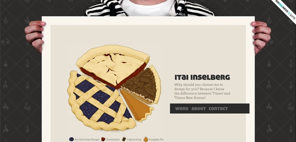
Itai inselberg
This is yet another cool example of a website with a creative vertical layout. The background and graphic elements are mixed well together and the information is presenting in a functional and effective way.
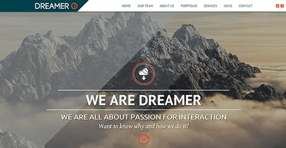
Dreamer – Responsive One Page Parallax Template
This is a responsive one-page parallax website with a vertical layout. It is perfect if you are trying to make something different and responsive.
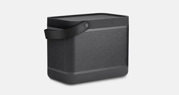
Beolit 12
Beolit also has a vertical layout and presents its products in an effective eye-catching manner. This is definitely an example worth following.
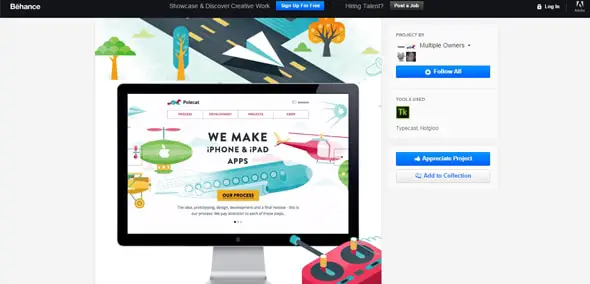
Polecat 2.0
Polecat uses illustrations in its header and has a similar vertical design layout. The creative design and the way content is presented merge well together. This web layout screams creativity and personality! It is so lively and gives the user a pleasant feeling when navigating through its content.
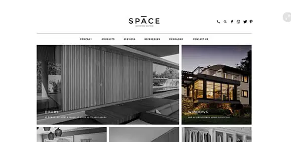
S p a c e website design
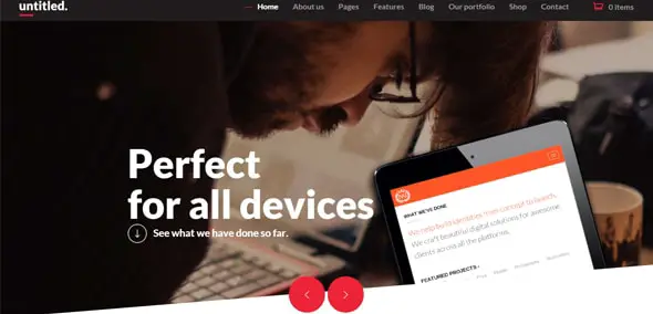
Untitled – Creative Multipurpose WordPress Theme
This is a multipurpose WordPress template that uses a vertical layout and some angled graphics. It comes with a series of great features which will definitely come in handy. This website is a great website that offers big visuals and a clear flow of information. It has a more neutral design, with some color accents.
Web Design UX/UI | Kortx – The Big Data Marketplace
Squarespace
On Squarespace, you can create your own website and present your ideas. One of the ways you can do that is through a vertical design layout such as the one in this example.
DS3 Cabrio
This example is great and uses a vertical layout to present content and cars to its visitors. It uses a vertical colored menu bar that blends in perfectly with the dark design layout.
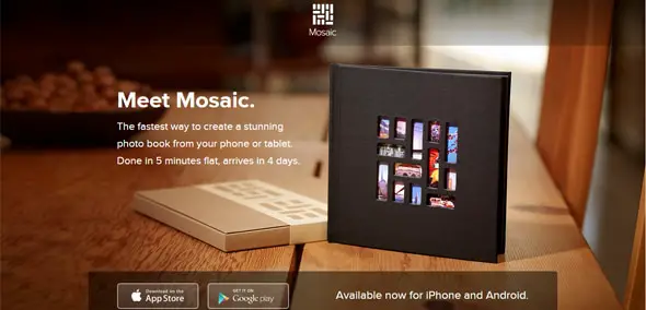
Heymosaic
This website presents an app called Mosaic. With this app, you can create stunning photo books in a few simple steps. Its website has a vertical layout that presents the app’s feature in an elegant way.
Manufacturedessai
This website comes along with a friendly vibe thanks to the way it mixes typography, colors, and images. It also uses a vertical layout. This is definitely an example worth following!
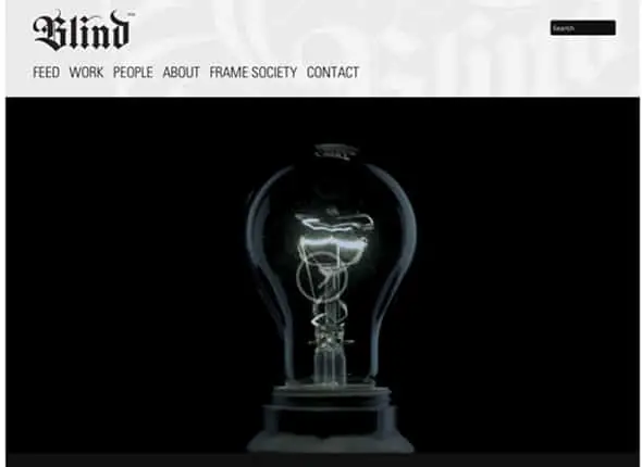
Blind website
The Blind website template uses all the creative means to make an awesome vertical design layout. It has a light grey background and uses many black and white photos, icons and badges.
RED
Parasponsive HTML5 / CSS3
Last but not least, Parasponsive is a really nice example of a website that uses a vertical layout. It also uses many graphic elements to present content in a creative and unique way.










Good stuffs! Thanks for sharing!
Hey…Thanks for sharing wonderful layouts :)
Keep going