Line25 is reader supported. At no cost to you a commission from sponsors may be earned when a purchase is made via links on the site. Learn more
The use of paper and card textures in website design gives a low-fi appearance with a rough cut-and-paste and unpolished style. This hand crafted look works wonders with web design, adding a personal and informal feeling to the design.
Check out this collection of 15 websites that use paper textures in their designs. Want some similar website designs for inspiration? Check out these retro style designs.
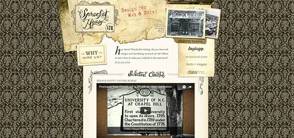
Sprocket House
This website has a very cluttered header with lots of realistic graphics and textures, for paper, photos, and more. It has a vintage design and a decorative, dark background.
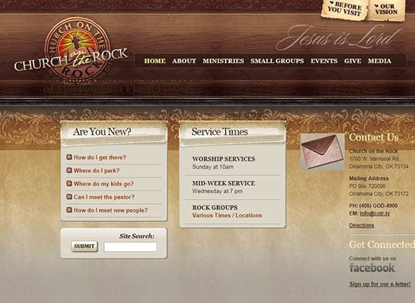
Church on the rock
This is the presentation website of a church. It uses a vintage, sepia color palette and an overall aged-paper design style.
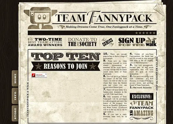
Team Fannypack
This is a really cool website design that perfectly uses realistic aged paper textures to create the look of an online newspaper.
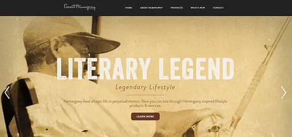
Ernest Hemingway Collection
This website uses a more modern approach, by only overlaying an old, aged paper texture onto the slider image.
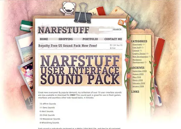
Narfstuff
This is a fun website design with lots of cool, vector illustrations and paper textures of different types.
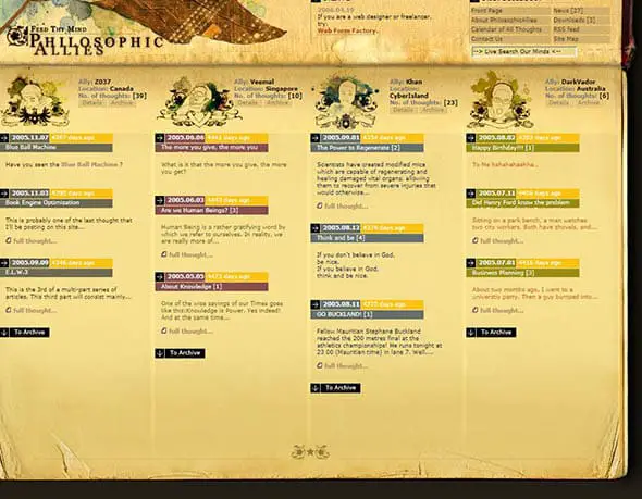
Philosophic Allies
This website uses a sepia-toned paper texture alongside some cool and creative illustrations. It has an overall handmade atmosphere.
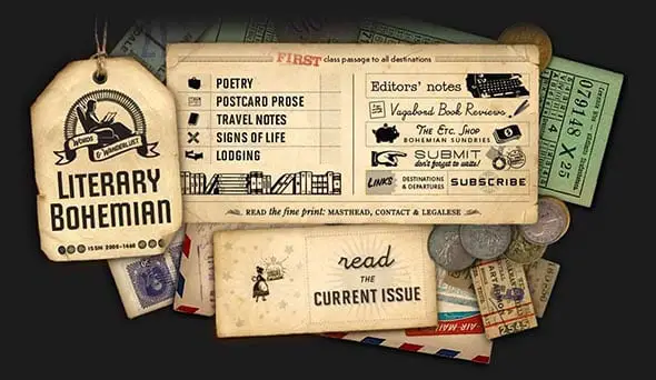
Literary Bohemian
This is a great example of how to use paper textures in web design to create realistic websites. This website combines paper textures with other realistic illustrations for different objects.
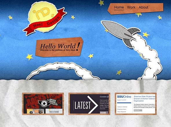
Noel Design
This website design is very fun and unique. It uses paper textures differently and looks more like a kids online color book.
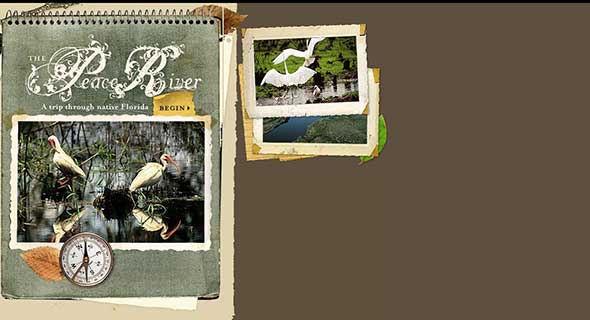
Peace River Excursion
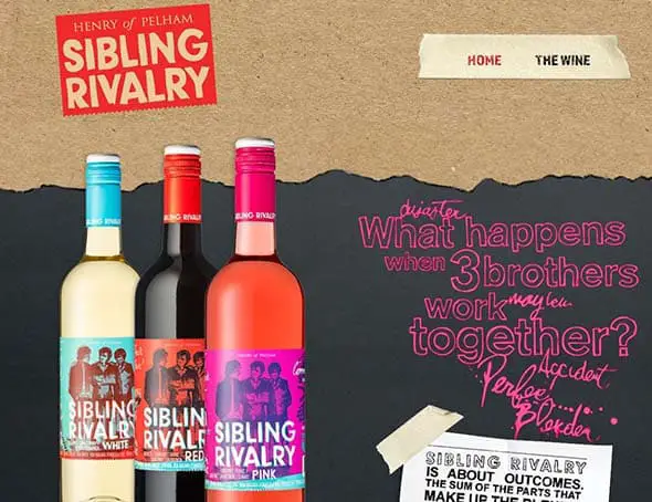
Sibling Rivalry Wine
This is another modern example of how to use paper textures successfully in web design. Looks great!
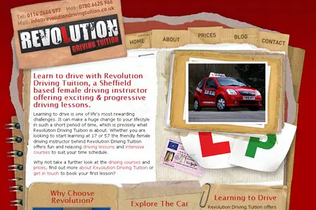
RevolutionDrivingTuition.co.uk
This website seems a little bit too cluttered but it surely has a design you’ll remember!
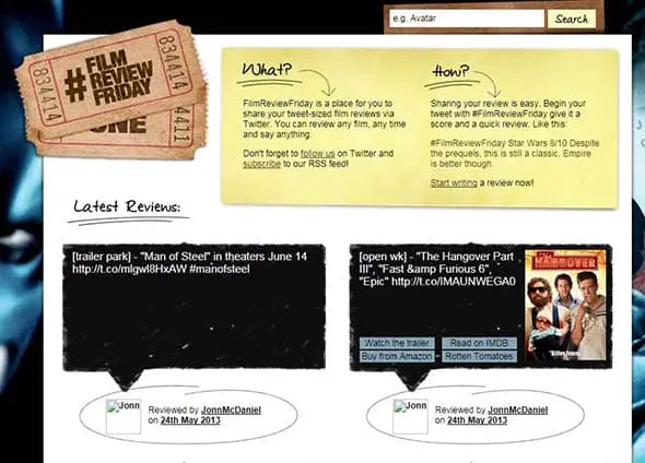
Film review Friday
This is a simple website design with lots of paper-textured elements, from realistic vector illustrations, such as the movie tickets, to content blocks backgrounds.
Hlvticons
Check out this example of a modern website that uses paper as a background for the content section of the site. It has shadows and textures, so it’s very realistic.
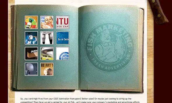
Fish marketing
This website design uses lots of different textures and realistic objects, such as this open book which serves as a small grid gallery.

Good collection. Thanks
very nice layouts
There are other similar information? I have a great need.Ed Men Long Sleeve
looks like collegeprowler took a step backwards…
Some nice websites.. Thanks for sharing!
Nice collection of craft based websites if that makes sense. Next time I get a brief where I can implement this style I will come back to get some inspiration. Top Stuff!!!
amazing work
wonderfol desing, thank
tebrikler, çok güzel bir blog
Great, thank you
Makes me want to upgrade my skills. Those designs are beautiful!
Gorgeous paper orientated designs that will be great for inspiration. bookmarked. thank you!
Some inspiring designs here. Thanks for posting!
What about spoon graphics?
All those paper designs are really great artwork! But many of them have been showcased over and over. Seems to be a fair sign that grunge is already becoming mainstream. Whereas the colorful, clean, geometrical designs like Veerle Pieters’ Duoh! still seem to be too avantgardistic to be recognized. I am wondering as to when they will hit the design blogs …
The Art of Paper :)
No doubt there are some brilliant designers at work out there. Thanks for introducing us to some really cool sites!
As a side note, don’t you think it’s a little funny that as designers we often fall back on “paper media” to help us with our digital designs!
There are some damn good designers out there!
Wonderful creative presence :)
@claire – I’m in the same boat. In my mind I have the best intentions for what I want to do, but then the client always steers me away from what I was thinking by wanting something more corporate-tized.
Thanks Chris, for the cool list, very inspirational. These sites will definitely add to my mind’s eye for the one day when I get a client that says “Go nuts, do whatever you want!” Or maybe I can redesign my own site…
Really nice list, i always think i want to go for a ‘srunched paper design’ then i lope off and get a corporate one. One day..
x
Fantastic designs. Great roundup Chris once again.
good one!
cool roundup!
Digging the list Chris. Nice work.