Line25 is reader supported. At no cost to you a commission from sponsors may be earned when a purchase is made via links on the site. Learn more
Learn how to use the CSS text-shadow to create cool text effects, by following this easy, step by step tutorial. Check it out and start learning!
The CSS3 text-shadow property has been around for some time now and is commonly used to recreate Photoshop’s Drop Shadow type shading to add subtle shadows which help add depth, dimension and to lift an element from the page. This isn’t all the text-shadow property is capable of though, by getting creative and playing around with the colours, offset and blurring we can create some clever and pretty cool text effects!
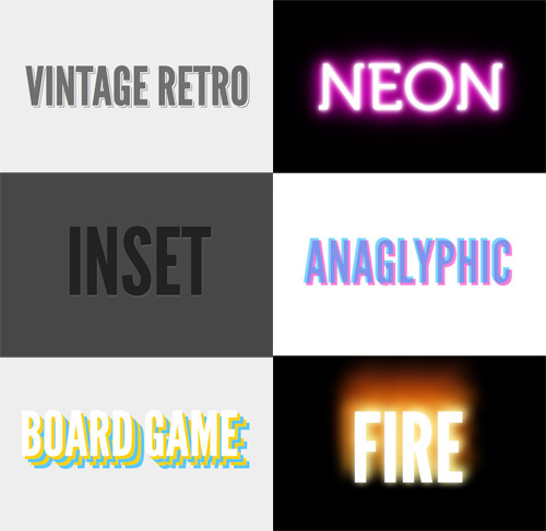
Check out the six text effects of vintage/retro, inset, anaglyphic, fire and board game in the demo, then copy the code snippets below to use the effects in your own designs. Needless to say you’ll need a text-shadow supporting browser (Safari, Chrome, Firefox) to see them in all their glory.
How text-shadow works
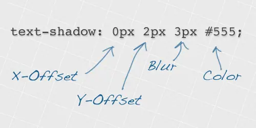
The text shadow CSS property is used to add shading to any text related HTML element. The syntax includes figures for the X-offset, the Y-offset, the blur amount and finally the colour of the actual shadow. What’s more, you don’t have to settle with one shadow, you can build up multiple text-shadow values to create some really cool effects!
Vintage / Retro text effect
text-shadow: 5px 5px 0px #eee, 7px 7px 0px #707070;
How it works:
The vintage style text effect is made up of two text shadows, but the first is set to the same colour as the background in order to give the impression that the second shadow (the thin dark grey one) is offset to the bottom right. Remember to make sure your first shadow colour is set to the same colour as your page background, and the text and second shadow also both use the same colour.
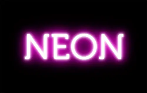
Neon text effect
text-shadow: 0 0 10px #fff, 0 0 20px #fff, 0 0 30px #fff, 0 0 40px #ff00de, 0 0 70px #ff00de, 0 0 80px #ff00de, 0 0 100px #ff00de, 0 0 150px #ff00de;
How it works:
The neon text effect is made up of 8 levels of shading. The base text is given a white fill, then each of the 8 text-shadow values are given larger and larger blur amounts while also getting darker. This blends between a vivid white inner glow and the large purple outer aura.
Inset text effect
text-shadow: 0px 2px 3px #666;
How it works:
The inset or letterpress style text effect is one of the more common uses of text-shadow. The shadow is offset on the Y-axis by a tiny amount to give the impression of a subtle highlight. On dark backgrounds offset the shadow underneath the text with a light colour, whereas on light backgrounds offset to the top of the text with a darker shadow colour.
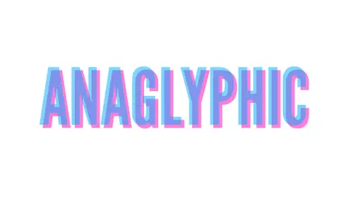
Anaglyphic text effect
text-shadow: 8px 8px 0 rgba(255,0,180,0.5);
How it works:
The anaglyphic text effect recreates the cool effect used on old 3D images. The effect is recreated with CSS using a mix of text-shadow and RGBa colouring. Using RGBa on the text and the shadow allows the alpha channel to be set to 50% transparency so the underlying text is visible through the shadow.
Fire text effect
text-shadow: 0 0 20px #fefcc9, 10px -10px 30px #feec85, -20px -20px 40px #ffae34, 20px -40px 50px #ec760c, -20px -60px 60px #cd4606, 0 -80px 70px #973716, 10px -90px 80px #451b0e;
How it works:
The fire text effect is another style that uses multiple levels of shading. Each shadow is offset in different directions, uses various blur settings and blends a range of warm colours to create the impression of a flame. These colours span from bright whites through to yellows, oranges and darker amber tones.
Board Game text effect
text-shadow: 10px 10px 0 #ffd217, 20px 20px 0 #5ac7ff, 30px 30px 0 #ffd217, 40px 40px 0 #5ac7ff;
How it works:
The board game text effect simply uses multiple shadows each with an increasing amount of offset from the original text to create an alternating series of colours. No blurring is used to keep the shadows crisp and sharp as exact reproductions of the original text.
This is SOOOOOOoooooooo COOOL! Totally amazing how you can create those incredible graphic text images using CSS alone. I was thinking the text was created with photoshop when I first saw the text. This is totally awesome. Thank you so much for sharing.
Very beautiful effects
Thank you
Very nice effects, pretty and clean, delicious :]
Great post. Thx :)
Great article! I just got the idea to make a 3D-page with the anaglyph-effect…
shame on IE for not following this.
WoW !!!
I just like the neon……. great….
great post, I love the INSET, looks so nice when its done well, also the anaglyphic one is really nice
awesome stuff, i'm sure to steal a few of those :) thanks again
Really neat effects, but I have to kill the cat…they are all pretty difficult to read…
text-shadow property is amazing! shame on IE for not following this.
It just goes to show the power of what css is actually able to achieve coupled with some imagination and time.
Great post
It's definitely awesome work
Thankyou…
Love it. Now i need to create a web design for a client that i can use this with… can't wait
neat effects, chris. thanks for the pointers. appreciate all the tips on website design, especially css. kudos to all the contributors!
I'm definitely going to try out the vintage retro text effect, thanks!
Great examples!
Best regards!
WordPress with CSS text shadow will be nice, i would try out. Thank you to share.
nice effects.. but.. only ie9…! :(
would be nice if this effect we use the trick a:hover…hihihihi
nice nice nice
Merci pour ce post !!
Exellement
Je voulais dire Excellent !! ;-)
These techniques are freaking ridiculous. Thanks so much for sharing!
Thanks for sharing. Inset and and vintage are cool.
wow..great..very nice..thanks for sharing..
I already knew how to do multiple text-shadow effects, but these actually look good. Nice job!
What a great tutorial, Chris! So concise. Great examples. I'm excited to try some of these out. The Anaglyphic in particular…
Nice! Great little tutorial/demo. I also used the Neon sample to hack a little something together. Could use some tweaking, but it's got potential: https://fascinationstreet.co.za/untitled/neon.html
Very Cool!
Thanks for share!
Hey Chris! Thanks for the enlightenment the text-shadows can be put on top of each other.. I agree with @sanji ! Awesome post as usual!
great stuff! I didn't know that you can apply multiple shadows like in "fire" – very impressive effect :)
This is simply great!! Chris! u'v been my css icon… thnx for every blog u'v written!! :)
wow! didn't know shadow can be stack like that, really like the vintage and inset. cool post! keep it up man!
very nice. thanks for sharing.
NICE!!
I thought I wasn't going to like these, but Vintage, Neon and Inset are great effects and the tuts are really handy… thanks!!
Love these! Thanks Chris
Nice FX!
I start playing with this effects and some jquery and this is the experiment i did
https://test.gabiton.com.ar/glow/
Check it in chrome or safari, ff doesnt seem to handle it right… (hover in the text)
Love this, really like Anaglyphic.
Excellent tutorial!
Great article and great example of why I love reading your sit! Can't wait to try these out.
ahem…why I love reading your "site" : )
I love the INSET and VINTAGE… the other not so much, but all are Awesome, if you know how much time I spent first time "some months ago" learning how to make a nice text shadow, or an inset effect you'll see how happy I'm to see yous post.
Hey man, thanks very much.
Wow…thanks for the info…
Had no idea you could stack the shadows like that. Love the effects!
Sweet, didn't know you could stack multiple shadows.
Yeh CSS3 Supports Multiple Styling.
Ex: You can provide multiple background for an element.
The Anaglyphic and Board Game effects are my favorites and now you've got me wondering where I should implement them.
Very Nice.
This is awesome. Its a shame its real world application is restricted by IE.
Thanks for this tutorial, Chris!
Great tutorial Chris.
Viva to CSS3!!! That IE cold be soo cool looking! They just don't get it!!
It's possible to make the 'inset' to work on IE?
Really nice tut thank you !!!
Thank you!
Vintage / Retro & Inset are especially cool!
Ooooooh! Nice!!!! Thanks for the how to's too! :)
So simple, yet creative, css bits, and its nice to have a bunch of them in one post.
Chris, you rock man! :)
Thanks
Wow, this a new text-shadow effects Chris!
I like the Anaglyphic text effect, thats good effect.
Awesome!
really like the way you use the property to make these cool effects.
Nice effects Chris!
I especially like the #FIRE one. Thanks for sharing this!