Line25 is reader supported. At no cost to you a commission from sponsors may be earned when a purchase is made via links on the site. Learn more
We’ve all seen videos on websites restricted to a specific frame size, but why not make use of the user’s whole monitor? Once upon a time, only Flash was capable of such wizardry, but these days Javascript and HTML5 make it perfectly feasible to stretch your video footage to fill the browser window. This post showcases 15 websites that all make use of full-screen video techniques.
The Build Film
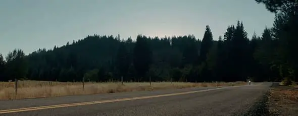
The first example is The Build Film’s website. This company’s website focuses on presenting the world of custom motorcycle making in an interactive way. This website presents a series of short films that manage to introduce the person watching them into the motorcycles. Check out this example that makes use of a user’s whole monitor!
iuqo
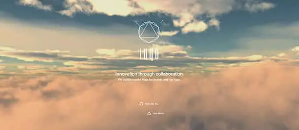
Full-Screen videos can be used in an elegant way such as this example. This website uses an above-the-clouds video on which the company’s logo, name, and motto are overlayed. Have a look at this inspiring example.
El Monstruo
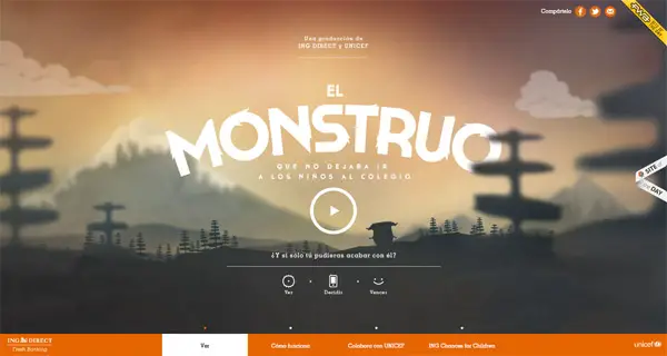
This website’s aim is to raise awareness on children education. This website, along with the videos is an ING DIRECT and UNICEF project in which you can also be a part of.
The Y.CO
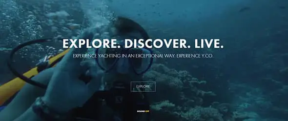
This website presents a company’s passion, yachting, through a series of short films as the first thing a visitor sees when entering this website. This is a great way to promote your business. It is definitely an example worth having a closer look at as it might be a great source of inspiration.
Aaron Ohlmann
This website belongs to a movie maker called Aaron Ohlmann and he produces really powerful and meaningful video. This website showcases his work through full-screen videos. Check it out!
Barrel 2012 Recap
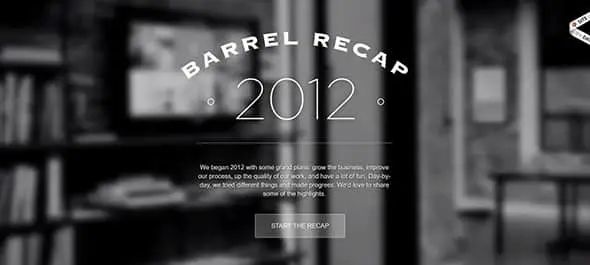
If black and white films are more your thing then you might want to have a look at this example. Barrel Recap uses short back and white videos to present their company’s work starting from 2012 to the present.
Various Ways
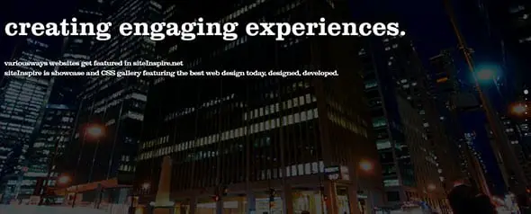
Various Ways is net another good example of a website that uses a full-screen video to grab their visitors’ attention. They also overlayed typography in different sizes in the header. Keep scrolling to find out more about this company and what they have to offer and check out their cool website and see if you find your inspiration. This is yet another good worth having a closer look at thanks to its unique way of presenting content to their visitors.
Oh Land Music
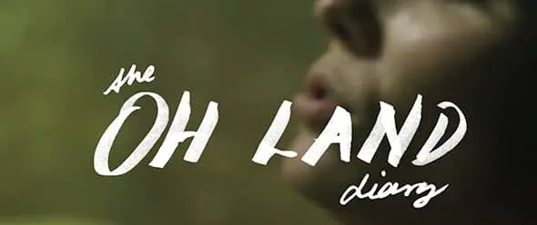
This website focuses on presenting a music diary through a showcase of music and music videos. The first thing a visitor sees when entering this website are some sequences from one of the works presented on their page. Keep on scrolling to find out more!
Black Negative
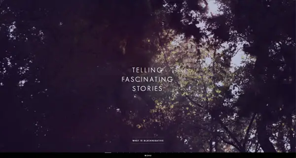
This is a portfolio website that opens up with a full-screen video on which some white keywords that form a motto are overlayed. It is an elegant way to grab your website’s visitor’s attention. Check out this website and see if you find your inspiration.
Piero Milano
Piero Milano’s website is yet another good example of a website that uses black and white short films to promote their business in an elegant way. Have a look!
Gin Lane
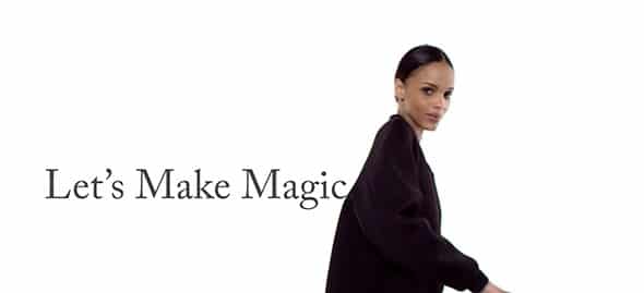
The Gin Lane website starts with a white background on which the phrase “let’s make magic” appears as a lady walks from left to right. All in all, this website has a neat and minimalist design in which the walking lady blends in perfectly and is a great addition to the website’s design.
Films by Brett Johnson
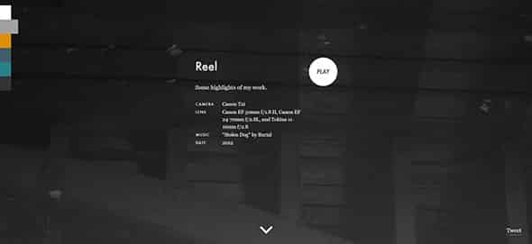
This is yet another good website worth following, as it might be your next source of inspiration for future projects that use full-screen movies and short films. Brett Johnson has some amazing work and through his website, he showcases it in an elegant way. This is definitely an example worth following in the future!
Working Element
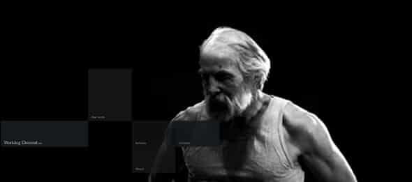
Working Element is yet another good example of a website that uses black and white full-screen movies as the first thing a person sees when entering this website. The background is black and has a person working out. Overlayed, you’ll see a unique menu bar. Check out this amazing website and find out if this is the source of inspiration you were looking for!
Brightly Preflight Nerves
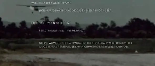
If you are into vintage films or if you are working on a similar project such as this example, you may have just found an amazing source from which you can get your inspiration. Have a look!
Epopee
Epopee is a website that showcases plenty short films in full-screen mode. It also mixes the right choice of typography and color palette to make a really good-looking website.
The Twelve
This is yet another website that uses full-screen movies as the first thing a website’s visitor sees, and thanks to it, this website has an elegant way to present the company or business.
Novembro
Last but not least, Novembro is yet another good example that might be your next source of inspiration. If you are working on a similar project then you might want to have a closer look at this example.




Truly amazing design and all having a different from any other design…
We implemented a video background on https://calio.co to add some spice to the site.
If you scroll down you’ll see we dropped in a a background video of rain. I get comments on it all the time which is pretty cool.
Love look of Zürich one, SF Dok. But, I’ve checked few of them, they aren’t working ( include SF dok ) perfectly or have some problem with finding right navigation etc… so, some of them maybe special, but not for me.
I actually love full screen pictures. Videos look awesome too, but here the question with internet speed arises: if its too slow, the site would be loading a while. And what I totally dislike is the sound when you open the site
These websites, their videos, specially captain dash, are really captivating! Maybe there should also be a video presentation where the topic revolves about the introductory paragraph of this showcase! “Darkness of space; In the age, where flash was the only blah, blah, blah…” :) Why don’t you create a page like that here!
Another amazing site with full screen video :] https://kindform.com/
Really liked the look of the iuqo one, but when I actually went to it found it really confusing and I’m not totally convinced everything resized correctly…
the peugeot one is amazing, i wonder how they do those kind of interactive videos
It was a great interactive experience, they must create all of the movies (such as the scenes with the car driving away from the police) with every style of car that’s available for the end user to make.
It was really cool though!