Line25 is reader supported. At no cost to you a commission from sponsors may be earned when a purchase is made via links on the site. Learn more
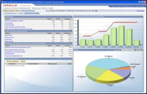
A dashboard is a display of important, actionable information. People with access to the dashboard make decisions and carry out essential tasks based on information presented to them on the dashboard. Hence, it becomes crucial for a dashboard to display accurate data in the most appropriate manner possible for supporting the user to take the right action at the right time. The space on the dashboard falls short of fitting in the complex form of data it needs to display. There are many do’s and guides to help you understand how to design dashboards correctly. However, it is just as crucial to understanding the don’ts. These are 16 things not to do while designing dashboards. Read them carefully to avoid these mistakes:
1. Skip storyboards during the design process:

The most important aspect of designing dashboards is the storyboarding process. It helps create a strong foundation for a user dashboard. However, it can also get very difficult, and it can be very tempting to avoid this step altogether. Here you need to get all parties on the same page, at least regarding the strategic decisions. You need to decide what you’re trying to achieve with this dashboard, who are you designing it for, their goals and responsibilities, and what tasks this dashboard will be used for?
If you skip this vital step, your dashboard would have a weak foundation. With ambiguity around the purpose, scope, and strategy, your system would turn out to be an expensive affair with no direction or use whatsoever.
2. Try and make all users happy:

As bad as you want to, you cannot please everybody. This is an age-old saying that implies human life and also transcends into dashboard design. Generally, brands or businesses start designing dashboards with overly ambitious and unattainable goals – to make everyone in the organization happy with the dashboard.
Different users are going to have different goals. You’d be better off by defining and limiting your dashboard to meet the specific requirements for the end users you have in mind. Doing so would help you design an intuitive, quick, and comfortable experience for your users. When you try to please everyone, the chances of your dashboard failing increases significantly, and everyone would be less satisfied.
3. Ask the end-users what they want:

This might sound odd, but yes, it is not advisable to rely on your end-users to understand what they want. In the case of dashboards, they don’t know what they want. It is your job to understand and deliver what they want. Even if the end users have certain ideas about what they want, it is not what they need. And it would not solve their problems either. Their preferences are guided by brief encounters with other products that might not give the most optimal solution to their product/problem.
4. Present Data with no context:
Numbers without context are just characters that take space. They have no value beyond that. Numbers can mean different things to different users. For instance, saying last week sales would have relevance in operational context since operational analysts meet weekly. However, sales data or numeric value has no importance for the marketing team. It doesn’t indicate the impact of their marketing campaign on sales figures.
Similarly, it won’t be useful to tactical managers. It doesn’t indicate if there’s growth or if they are still behind their competitors. The right context for the right audience is very important. So presenting data without context is a big no for dashboard designing.
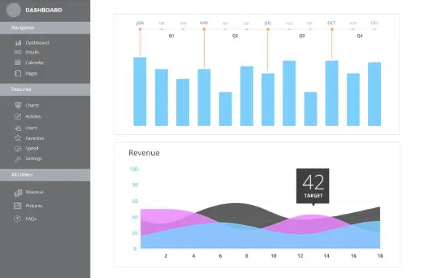
5. Design with more than three colors on the dashboard:
No matter how many elements you have, don’t go beyond three colors (hues) while designing your dashboard. It is very easy to get tempted to want more colors. However, it would cause a lot of visual conflicts and make the dashboard complicated. All the UI elements such as callouts, boxes, and checkboxes should never focus away from alerts, data visualization, and other important insights. Each color needs to have a purpose.
6. Show all information to the user all at once:

The dashboard user should find it easy to glance at and understand the data as quickly and efficiently as possible. If you show too much information to them, it can hinder their ability to focus on crucial. This limits their abstract thinking ability. The end-user can be a pro-level executive or an analyst. You should do your part by only providing them with the most crucial information needed to make their decisions. The information should be provided in easily customizable and first glance amount. For instance, if a decision-maker needs to know top-performing products, they don’t need a list of all the products they deal in. They need the top 5 or 10 as per the requirement. All the details you show on the dashboard should have direct relevance to the end-user.
7. Overlook user acceptance evaluations:
Most designers ignore this part of designing a dashboard as they don’t feel obligated to do so. However, even if you can or cannot afford to have this process within your business cycle, user acceptance can prove crucial for giving important feedback to designers. It would help determine the project’s success and ensure if your communication and vision matched that of the end-users requirement.
8. Ask users for the visualization style to choose:
The visualization aspect of dashboards is crucial. It would determine how well the information is presented and easy to grasp for the end-user. However, most people treat this as an information piece that has to be gathered from the end-users. In reality, it is supposed to be a solution provided by you to the end-users. Understand that your end users might not be the best judge of choosing the most helpful visualization tool and might demand some flashy chart they saw somewhere and found to look cool. It is your duty to know the merits and demerits of each visualization option. Based on that information, you need to make the call that fits the users’ requirements the best.
9. Using colors and other formatting details on the wireframe:
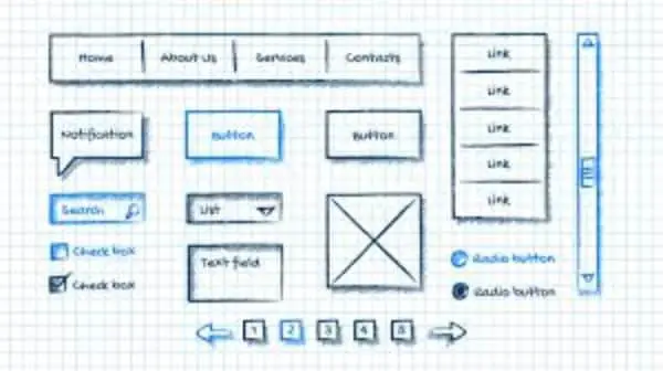
Designers are always under pressure to show colorful prototypes to impress business users. However, when it comes to a wireframe, it is not meant to be colorful. The priority objective of a wireframe is to represent the strategic requirements and scope of the project visually. Colors should only be used to make the layout more comprehensive or to distinguish elements from one another. If you include different colors in the wireframe for design purposes, users’ personal preference leads to unnecessary debates.
10. Analog gauges:
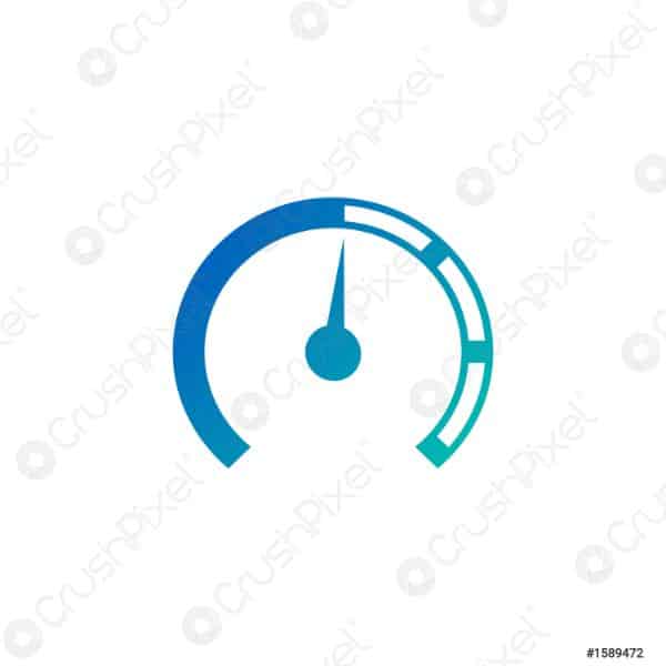
Analog gauges had a very authentic and retro vibe that people used to love in dashboards. However, it is better to bid it farewell now as design trends move towards flat and material gauges and away from analog ones.
11.Putting static content on the dashboard:

There is no point in putting static content on the dashboard. It is the place for dynamic content. Static content won’t have any purpose on the dashboard. The data would need to be updated frequently and regularly. If it is not, there is no benefit to the user to come back to the application. If users can predict the contents of the app, there is no scope or need for re-engagement.
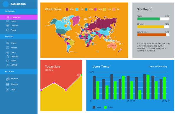
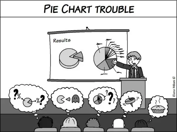
12. Prioritizing variety over usability:
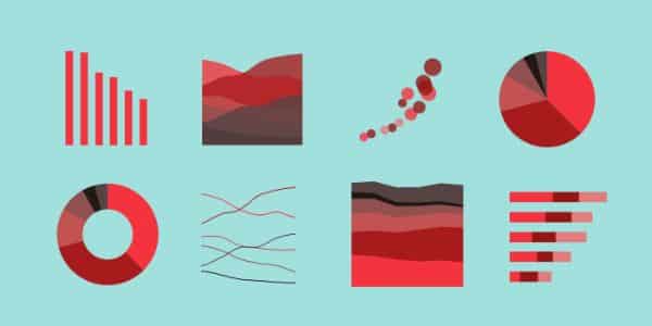
A dashboard is a compact space that has to hold a lot of important information. As a designer, you would try and make this screen look as visually pleasing and exciting as possible. However, at times designers tend to overlook usability to stick to aesthetics. They often hesitate to stick to one medium of visual communication, i.e., using a graph, pie chart, or any other format. This is because they assume the user would get bored, and the design would get monotonous if all the data were presented in bar graphs or pie charts.
As a designer, it is your responsibility to choose usability over aesthetics and not compromise on representing the data in the most accurate manner possible. If you can provide the user with the data they desperately need to solve a problem and solve it quickly, they would not get bored looking at all the bar graphs or pie charts.
13. Arranging the data inefficiently:
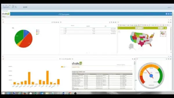
A dashboard is an essential tool for multiple users to get the most out of their data in the shortest span possible. When you design a dashboard, you cannot fit the data bits randomly in a haphazard manner. A dashboard needs to be organized properly with the appropriate placement of data based on various factors. You need to think about the desired and importance based viewing sequence, visual design that differentiates the data into meaningful groups without causing unnecessary confusion. If this is not done correctly, the result is often cluttered chaos.
Your goal is not to make a dashboard that only looks good but also to arrange the data in a manner that complements its use. The most prominent data has to be prioritized. Data that calls for urgent attention needs to stand out, and data that should or needs to be compared should visually indicate comparable data sets.
14. Poorly highlighting data that is important:
A dashboard is a place where all important data needs to be displayed. However, there has to be a hierarchy of essential data that has been shortlisted and presented on the screen. Everything on the dashboard can look visually important, and when everything demands attention, nothing grabs your attention. If that is the case with your dashboard design, then it has failed. When a user looks at the dashboard, they should tell which information is more critical immediately. Generally, dashboard designs have the logo and navigation controls on the top left corner of a dashboard. They catch immediate attention because of their visual positioning. However, their visual presence can be subdued by placing them elsewhere as they don’t serve much of a purpose to be put upon such a visual reference point.
15. Displaying overly-excessive detail or precision:

Dashboards need to present relevant data in their most useful format possible. Most designers misunderstand this as showcasing the data to their last decimal point for accuracy and precision. You are just giving users unnecessary information to read and deal with, which solves no purpose and wastes their time. A data entry with a value of $2345.67890 can be represented as $2346 or 2.3M.
16. Using lagging measures on the dashboard:
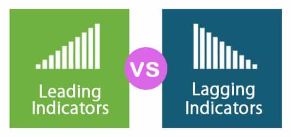
Many designers often make this mistake. They fill the data on the dashboards with measures and information too late for changing or correcting. These past-based reports won’t help you influence the future and should not hold up space on the dashboard. You should focus on displaying data that can tell the user what changes need to be done to change tomorrow’s course. You should focus on providing effective measures and not lagging measures. A useful dashboard that indicates issues in indicators or data points that can be urgently rectified can give a company a fighting chance against its doom.
These were the 16 things not to do while designing dashboards. A dashboard is an essential and visual tool that needs to be designed with aesthetics and usability both in mind. However, you should never compromise on relevance for aesthetic appeal. There are many considerations to keep in mind to ensure that the dashboard solves its purpose exactly how it is intended to do. Go through these points time and again when designing your dashboard, so you know what NOT to do. When designing dashboards, avoiding mistakes can be crucial in understanding and defining what needs to be done. It also saves time on trial and error that can also be an expensive affair.