Line25 is reader supported. At no cost to you a commission from sponsors may be earned when a purchase is made via links on the site. Learn more
Hand Lettering is the process of drawing letters. For each letter, there is much thought that goes in. Generally, when we create a hand-lettering piece, the way each letter and word are created is highly customized. This design has a particular, custom-made nature. It is essential to think about how each word puts forth the message you want to deliver and how different words fit together in a composition.
The reason people put in efforts for Hand Lettering over fonts:
It is a question that many people who aren’t aware of the process of hand lettering often ask. There is a wide array of fonts to choose from. It also takes way fewer effort. The answer to still choose hand lettering is that with this method, you can create something truly unique. The chances of anyone copying your hand lettering piece is almost negligible as no can download your hand lettering font style and use it for their brand. Apart from this, it gives a sense of a personal touch as it is handmade. In this technology-driven world, having something hand-drawn is often appreciated by consumers.
The possibilities of creativity are endless with hand lettering, and it can feel to be a bit overwhelming if you’re new to the process. However, if you know all the right steps and tricks, all you’d need is practice before you start making your hand lettering pieces.
Here is our Hand Lettering Tutorial & Guide for Beginners:
1. Understanding the Materials:

Generally, all you need is a pencil and a paper to get started. However, if you want to learn the art of hand lettering in greater depth, you’d need a few more tools.
Since there are a different set of pens and pencils available, they all leave a different sort of impression on the different quality of the paper. There’s no one kind of right or wrong paper to choose. However, it comes in handy to know what paper works best for what purpose. You can use a simple computer A4 sheet white paper or even cardstock. However, using a Rhodia dot pad is the best way to get started. The presence of multiple dots and division of the grid makes it ten folds easier to maintain proportions, angles and also the letter size when you start. You could also use Canson Watercolor paper that has a particular texture that enhances the presentation of your work. One interesting approach could also be using a black paper and using a white or any other light colour to create an eye-catching contrast.
Pencil:
It might feel like an essential tool, and you might feel this shouldn’t be much pondered upon. However, that is not true. It is safe to say that pencils can be one of the essential tools in the hand lettering toolbox. There are different types of pencil that you need to be aware of before choosing your pencil. There are certain parameters for the same:
Their softness or hardness differentiate the pencils in the lead. Softer lead leaves a darker trace and requires frequent sharpening. A harder lead, on the other hand, leaves a lighter trace and doesn’t need as much sharpening.
For hand lettering, you want to stick to pencils with harder lead because such pencil marks are easier to erase. The chances of smudging the graphite reduce and also you won’t need to keep sharpening it continually.
This isn’t a hard rule; however, harder lead often is more comfortable to use for hand lettering. If you wish you could give a softer lead a try too.
To understand what pencil has a softer lead or a harder lead, you need to familiarize yourself with a few terminologies. Like ‘H’ stands for hardness, ‘B’- blackness and F is for an excellent point. It is pretty self-explanatory. Using an H, HB and F pencils are generally recommended for hand lettering. Apart from these pencils, you could also try mechanical pencils. They provide an excellent grip.
Ruler:
With hand lettering, you don’t just start drawing in thin air, without any guidelines. It is a must for hand lettering practitioners to first lay down the basic guideline for which they need a ruler. Apart from drawing guidelines, ruler can also be used for outlining longer straight lines. You can work your way with a basic ruler too. However, a rolling ruler is often recommended.
Eraser:
Not only as a beginner but even as a skilled hand lettering practitioner, you’d still need an eraser. You might create some extra guidelines or strokes before you fine-tune your hand lettering, which you’d later need to erase. However, choosing the right eraser is very important for art practice like this. You wouldn’t want to leave dark marks from overusing the wrong kind of erasers.
Tombow mono is a pen-shaped eraser tip that is useful for removing fine details and lines without erasing surrounding lines. A kneaded eraser is an excellent choice as it doesn’t leave any flakes on the paper once you’re done erasing. Such erasers usually work best for lighter pencil marks.
Pen:
After you’re done creating your hand lettering piece, with pencil and all other elements we have used so far, you’d want to ink your letters. This is a delicate process. It requires an eye for detail. It should be done with time and focus. All your efforts so far can go to waste if you rush here and make a mistake. There’s a wide variety of pens you can use for hand lettering. Sakura Pigma Microns are generally the right choice as they have one of the best fine tip markers. Other than this, the Uni Pin Fineliner pens, Uni Posca pens and also Molotow One4All are also good options.
2. Learning about letter construction and relation:
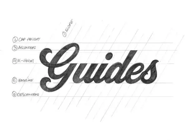
Basic understanding of guidelines is essential for drawing letters. It helps you keep your letters in the right proportions, which creates a harmonious relationship between them. Few terminologies you should be aware of are:
The Ascender line shows how long the ascender of a lowercase letter should be. This is for letters that have an ascending line present in their construction like h,l and b.
Cap Height: Talks about the height of an uppercase letter.
X-height: Is the height of the lowercase letter.
Baseline: this is the line where all the letters rest.
Descender line: shows how long the descender of a lowercase letter should be. This is for letters that have a descending line present in their construction such as p, j and g.
These are guidelines that can help you design a much neater composition; however, you can ignore a few of these rules at times, for visual adjustments. Knowing about them is a must before you choose to ignore or use them.
There are specific shapes that work well with almost any lettering style. These are called mother forms. Few letters can be categorized into different shapes such as the letter A and V are triangle shapes, H and E have rectangular shapes. Moreover, O and C have a circular shape. If you put these shapes into the perspective of your guidelines, in the same proportion, you’d notice the circle and the triangle would look comparatively smaller than the rectangle. This is because the rectangle touches both the cap height and the baseline with its entire border. While the circle and triangle only touch parts of their shape on these lines. Hence, even if they are the same size logically, optically they are not.
3. Learning the anatomy of the letters:
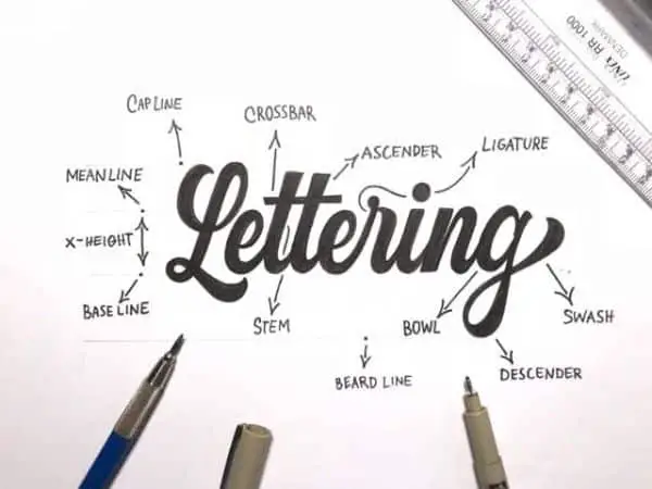
There are a few commonly used terms in the field of hand lettering that deconstructs different parts of the letters into terminologies that define them. A basic understanding of a few of them can help you better put your lettering to use. We are only discussing the most basic ones to get started:
Leg: It is the proportion of any letter that extends downwards and is attached to one end of the letter and free at the other. For instance, the letter K has a leg.
Arm: This is a straight or curved portion of a letter which extends upwards or outwards. It is attached to one end of a letter and frees at the other, for instance, Letter V.
Ear: The small additional stroke that extends outwards in some typeface styles for lowercase g.
Shoulder: This is the stroke that curves downwards and to the right of the lowercase letters of n, h and m.
Tail: Tail differs from the leg as it is a decorative curved descender specifically for the uppercase letter Q, R and K. For lowercase letters, that have tails are j,p,g, q and also y.
Spine: Spine is the primary curved stroke that in inside the upper and lowercase of the letter S.
There are other terminologies as well; that you should continuously learn about once you get done with using these essential parts with ease and perfection.
4. Chose a lettering style:
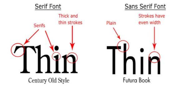
There are various lettering styles one can explore when getting into hand lettering practice. While there are many other styles of fonts that you can use for your hand lettering piece, serif and sans serif works best for beginners. Hence, we are only going to discuss these two in greater detail for now.
Sans Serif is one of the best starting points for beginners. This is because they have basic shapes that allow you to focus on their form and their relation with the other letters. The term comes from the French language where sans stands for without. This accurately describes this lettering style. Generally, all computer fonts and website fonts use san serif as it provides ease of reading. It is also an excellent addition for your lettering pieces, especially if you combine it with a few of the other styles. You need to pay attention to having equal thickness with all your strokes, and also the height and spacing should be linear.
For learning Sans Serif hand lettering, the wooden board technique is one of the most efficient methods. This needs you to divide the letter into most basic shapes, then to put them together and finally inking the letter.
Serif fonts are described best by the small extra stroke they have at the end of the main horizontal and vertical strokes of some letters. Although serif fonts share three forms of letters with san-serif letters, they are different from sans serif fonts because the serif fonts add small decorative strokes at the end of the letterforms. Serif fonts have a different thickness in the strokes, which means you don’t need to be consistent with the stroke thickness.
It is essential to understand where to add the serif (decorative part). A great way of learning this is thorough with your letterforms.
5. Add dimensions, details and decorative elements:
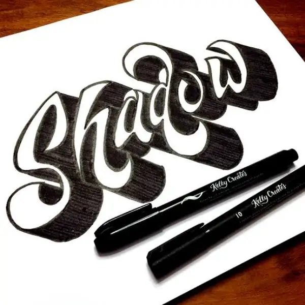
Now we have a clear understanding of basic style categories of hand lettering. If you follow all the steps until the fourth one, you’ll still have a finished product in your hands. However, after putting in so many efforts, you’d want to make sure that your piece looks more refined. For this, we can look at ways of making our pieces look more decorative and interesting.
This can be done by adding dimension and shadows. For adding dimensions, you can use three types of shading: the drop line, drop shade and drop shadow. This is a technique of drawing the same shape you want to beautify behind that main shape. Constant practice makes you better with experimenting with this creative method. This results in more expressive letterforms.
Another way of adding dimension can be using the concept of light and shadow. Imagine a light source for your lettering piece and accordingly play with contrast and highlight on the surface of the letters that would be more exposed to the light and darkening the ones that would be less. You can always add more life forms and shapes to enhance your overall design.
There are two methods of achieving hand lettering, that is through the traditional pen to a paper method we discussed or also on tablets, digitally. However, many designers and lettering practitioners feel that using the traditional method of a pen to paper produces more authentic and impactful hand lettering pieces. You could always refine your hand-drawn hand lettering piece digitally using Illustrator or any such software later. These were the 5 steps for Hand Lettering Tutorial & Guide for beginners.