Line25 is reader supported. At no cost to you a commission from sponsors may be earned when a purchase is made via links on the site. Learn more
While it might be tricky to know what a specific graphic designer’s job is, it does not always end with using specialized software, and design principles to simply make an artwork, logo or digital content. There is much more to it than that. Though there is a constant spotlight on the digital work of a graphic designer, print media is equally important to do correctly. Given the liberty of digital media, one might believe that print design is growing irrelevant- but that isn’t the case. Print design is still an important part of the communication design field. As such, new graphic designers must have a good handle on print skills as well to be marketable in the field.
Print Design: A basic overview
The print design appears on hard copy media such as billboards, brochures, posters, and business collaterals – in place of digital websites and platforms. Much like the goal of digital communication design, the role of print media is to convey the message using graphics to the viewers.
Given the role of technology in today’s world, print might sound like a rare choice. If you look closely, you realise that print media surrounds you. It is an excellent tool for brand advertising and marketing, given that almost everybody comes across multiple print articles daily.
The most skillful hand of communication is graphic design. Think of print as another extended arm that helps you reach the audience and share your message. Professional designers, too, agree to the fact that no matter how efficiently you project digital designs, print media is still a requirement. And as a graphic designer, one must understand what an intense and captivating print can be.
Print design, too, is evolving – much like digital technology. Coastal Creative – a print agency’s founder Mark Krenn marketing clubbed with experiential design helps to “bridge a gap between offline and online world” through print design. Newer technologies that fuse digital spaces with print design only prove the fact that print shall not become obsolete anytime soon. Advertisers prefer campaigns that spreads out to customers at every point in time – which means a fusion of digital and print media.
Let us take a look at some useful pointers that one must keep in mind while designing print media.
1. Variations of Print Design:
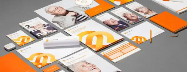
Print design is around us in every way possible, yet, we often take it for granted. Business marketing still relies on traditional ways of promotion, such as print media to create brand awareness. Every industry depends on print – be it the fashion world, where a well-designed magazine cover can make all the difference, or even the sports world – where billboards serve to be the best advertisement spots for promotion.
To name a few, here are the various kinds of print design that a graphic designer must be aware of –
- Business collaterals: Business cards, brochures, posters, letterheads, etc.
- Merchandise: Branded labels, shopping bags, stationery
- Billboards and banners.
- Publication designs and book covers.
- Signages
- Invitations and greeting cards.
- Menu cards and calendars.
2. RGB and CMYK:
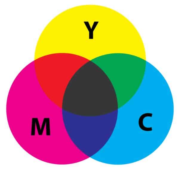
The system used by the computer to generate colors is not the same that a printer’s software uses. RGB – short for red, green and blue – is the system that a computer software uses, white printers work on CMYK scale – which is the cyan, magenta, yellow and black color set.
An RGB scale has much larger iterations of colors that most of the printers can produce. If you intend to design for digital purposes only, then ideally, you must set your color mode to RGB in the softer. However, in the case of print media, CMYK is the most suitable one.
However, even though one might use a CMYK scale on the software while designing, the color on-screen and print might turn out to be extremely different. To avoid this issue, you can look more into the various monitor calibrators, which help sync the colors on screen and in print.
3. Resolution:

Working on the web, resolution might not turn out to be an issue. However, when it comes to print media, high-resolution files are always recommended to achieve the perfect print effect after production. If you fail to use a high-res file, your print might turn out to be pixelated, blurred incoherent and/or muddy.
The most important unit that a designer must ensure is the DPI, or dots per inch. As the name hints, this unit determines the number of dots the printer is bound to create within the area of one square inch of the printing surface. Ideally, one must always set the DPI to a maximum value of 300 dots. You can altogether avoid going any higher than that as it unnecessarily increases file size and makes it more unwieldy.
Please note that you should not confuse DPI with PPI (pixels per inch) as PPI is more concerned with the concentration of dots in a square inch of screen space. Hence, it is more useful for digital media than print design.
4. Scaling:
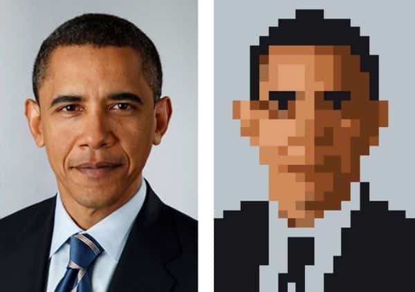
Your design might look perfect on the screen, but what if it had to fit into a billboard? Or maybe a little business card? Necessarily, the same size from your screen won’t work in either of the scenarios.
Another important aspect of this struggle is also typography. To ensure that the text on a business card is readable, the fonts used must be strong or heavy – you can avoid thin and light fonts altogether. At all given points, readability should be in mind alongside the scale.
A different issue can potentially arise when it concerns images. For example, raster images, when stretched to larger sizes, can turn out to be blurry and/or pixelated if they are not of a high resolution. Similarly, vector images do not cause this problem as they are infinitely scalable.
5. Bleed:
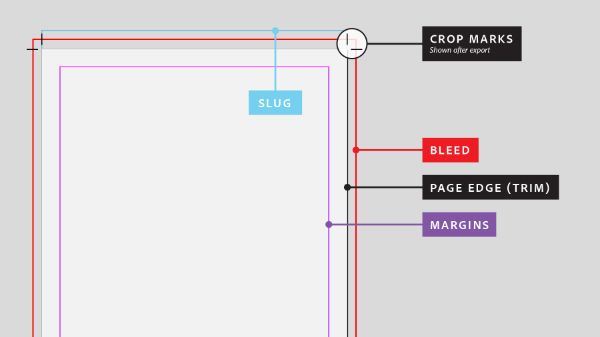
When it comes to print design, it becomes crucial to understand that the way a printer might cut the paper might not be in anybody’s hand. Hence, it only makes sense perfect sense to leave spaces around the edges of your design. This ensures there is space for error. This particular extra space is known as a ‘bleed’, and every good, renowned software provides guidelines to show you the start and finish of a bleed.
It is always advisable to check in with your printing company about the amount of bleed a printer might need. Various printers have various bleed requirements.
6. Proofreading:

This point cannot be stressed enough. One of the biggest downfalls of printing out the designs in a tangible form is the scope for silly mistakes. Unlike the vast array of custom changes available on the web, you cannot go back and make changes in case of spelling mistakes, and clearly, you end up wasting the excessive amount of money.
The only way to forfeit this problem is to check your spellings. However, it comes with a drawback. Spell check won’t ensure grammatical mistakes or misspelled proper nouns such as names. It also won’t ensure if you’ve used the right homophone – such as ‘you’re’ – when you actually should’ve settled on yours.
Typos might not be your only enemy. You also need to check the kerning, punctuation – the correct form of the dash, and more. In brief, anything that can go wrong, you need to make sure you’re one step ahead of figuring it out. The best way is to get all these tiny silly mistakes out of the way – preferably print a sample – before finally settling on a mass print.
7. Have a word with your printer:
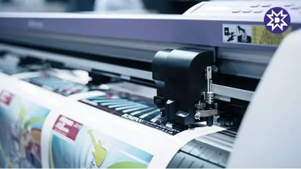
In case you are attempting to re-print a piece of design that you have already done through a commercial printer previously, or you wish to match the colors to an existing collateral piece, it is essential to have a word with your printer. You must provide them with some samples of the previous work to ensure the least amount of last moment jump scares!
Having a word, you can rest assured that the printer can take care of it. Usually, the print technicians have their mix of base colors – so to ensure accuracy, it’s always helpful to provide with some material to refer.
It is always an essential step in case you are going for a bulk print or complex jobs, and reputed printers would never have an issue providing you with a sample to match the colors – mostly, as long as you’re paying for more than two or three business cards.
8. Digital Design vs Print Design:
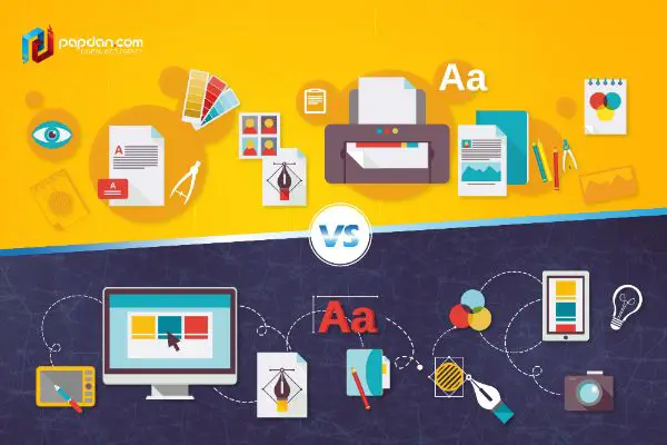
In various ways, digital and print media are similar. Most importantly, they both have the same goal – communicating with an audience. Just like digital mediums, the basic principle of design is very same for print media as well. But to think about it, print design different from digital in a some important ways. Print designers need to work within set boundaries and make sure that the result is absolutely perfect to the pixels.
This also highlights another point – is Print media more costly than digital design? Definitely. A digital design job might not incur any error charges. However, there are many dollars spent on rectifying print design jobs. But there is only so much you can do – proofread and get samples of your designs printed before giving the final print job of a bulk order.
Print designers also need to ensure they work between distinct boundaries – which might be a boon as well as a bane. For example, there’s a limit to a banner’s size or that of a business card, or maybe the number of words that could sit on a magazine page. It is a print designers job to be aware of these parameters at all times, and work consciously towards not messing up the design with silly mistakes.
9. Importance of Print Design:

By now, you can only imagine that the graphic designers have a predefined set of challenges that comes with print design. Hence, they require a unique skill set to tackle the issues. A successful print designer is aware of all these challenges, the vast array of design software as well as has a proper understanding of the basics print design principles.
For instance, a print designer must ensure high-resolution of all the designs to print it in the highest quality possible. Not everything revolves around the vast world of Photoshop when it comes to print design. For text-heavy publication design – such as books, magazines and brochures – Adobe InDesign has proved to be the best software. When it comes to large format files or vector graphics, Adobe Illustrator is a great option.
Mostly, these skills might be specific to print design – but they apply to all the graphic design-related careers. Professional designers have agreed that working offline helps the graphic artists to think creatively and then, that thought can be transitioned into the digital design as well. It not only helps artists and graphic designers to improve their set of skills but also makes sure of a diverse portfolio.
But in case you haven’t gotten out of the ‘digital space’ all your life, it can be challenging to adjust and give a design to print in for the first time. So hopefully, these 7 steps – along with the other important information about the print design – shall positively help you get better. Last but not least, it is surely imperative to keep practising and understanding the various terms related to print design. It is the only final step to ace it!
