Line25 is reader supported. At no cost to you a commission from sponsors may be earned when a purchase is made via links on the site. Learn more
More and more web designers have started using transparent photo overlays in their website designs. If you want to start using this technique as well, check out the websites below for inspiration and admire the subtle effects of transparent photo overlays.
Using photo overlays is an excellent and quick technique that adds depth to your designs. You can apply it in various situations, for instance, to emphasize a specific content that’s important to your website. These will look amazing with a semi-transparent layer above the background image that still allows you to perfectly read the text. You can also use them in drop-down menus, banners, quote windows, buttons, etc.
Certain transparent photo overlays can be easily achieved by using PNGs or editing the CSS file. You can make any element transparent by customizing its opacity. By setting the value from 1% to 100% you can play with its design, creating semi-transparent items. Experiment until you get the desired effect.
Accio
This website design contains a beautiful color overlay of the menu buttons over the background photo, along with simple but effective animations. This is a gorgeous fullscreen template which has a parallax scrolling effects well.
Ronneby
Ronneby is a beautiful website and a great example of how you can use a semi-transparent color overlay for the home page. This helps better visualize the CTA, but still being able to view the image from underneath.
Marketify
This is another lovely website design which uses a transparent black color overlay technique to the homepage. Learn from it and use it in your own digital projects. You can use Marketify to promote and to create a stunning business online to sell various products.
Politician Drupal Template with Gallery and Blog
The designer used a gray semi-transparent color overlay on top of the government building, creating a contrast between it and the clear image of the man. This is a subtle effect that has an amazing result.
Tennis Club WordPress Theme with Gallery and Blog
In this website design, the large background image is subtly hidden beneath a color overlay that emphasizes the large title.
Stable High
This site a transparent color overlay that tones down a little the intensity of the image. It has a modern and flexible design that your users will love.
Motorcycle Sport Responsive PrestaShop Theme
There are lots of neat overlay effects in this website’s design. For example, the header, with all its elements, is placed above the background image and over a semi-transparent overlay.
Law Responsive WordPress Theme
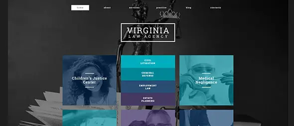
See this wonderful example of how you can improve your overall design by using transparent overlays. Here, this technique is used for the image and the banner images.
Nostalgia
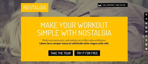
This is a stunning example of how to successfully apply this technique. The designer used transparent overlays for the background image and the result is amazing.
SquareCode
This website’s design has a transparent color overlay on top of the main image. See how the designer used this technique and learn from this example.
Rock Band Responsive Joomla Template
Here is another eye-catching web design which uses a golden color overlay. Also, this site has a responsive layout and this effect will look amazing on any screen size.
Checkout
This is a creative way of using transparent color overlay by creating depth and separation between the UI elements.
Water Polo Responsive Website Template
This central image has a neat overlay effect that has emphasizes the white font messages on top of it.
Church Suite
The designer used various shades of blue to build this creative theme. It also features semi-transparent overlays that are applied on images for a more subtle effect.
Wish – Responsive Multipurpose WordPress Theme
This website template has an amazing semi-transparent color overlay on top of the main image. This allows the menu and other UI elements to be highlighted for a more interesting look.
Hopes
This is another example of how you can use transparent overlays to significantly improve your website’s design.
Jevelin
Here you have an excellent web design website inspiration that uses transparent color overlays in its design. The effect is beautiful.
CheerUp
The designer used an amazing semi-transparent color overlay on the background image in order to make the text readable on top of this busy image.
H-Code
In this website’s design, you can discover another wonderful way of using transparent overlay technique.
Business Responsive Joomla Template
This is a beautiful semi-transparent color overlay with a red tint that adds an exceptional feel to the overall design.















Love the Accio one and also the H-Code one, pretty incredible use of overlays and imagery.