Line25 is reader supported. At no cost to you a commission from sponsors may be earned when a purchase is made via links on the site. Learn more
Designers see it as crucial. Site owners want to fill it up with anything they can find. You might wonder what I am talking about. It’s whitespace!
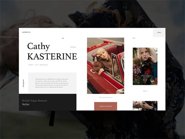
Whitespace is one of the most crucial elements of design. Without it, you will battle to create a great website layout. However, many see it as simply empty space, and therefore as something which should be filled.
As a designer, working with whitespace is one of the most important elements of design. How do you work effectively with whitespace, and why is it so important?
Why does whitespace matter?
As a designer, you’ll understand that whitespace is absolutely crucial. Without taking whitespace into account, you will lose a basic building block which will shape your design.
When designers speak of white space, they are speaking of the negative area within a design. Imagery, text, headers and logos make up the foreground of a design.
However, it is whitespace which determines how a design will be perceived. Whitespace provides the breathing space which allows your design to shine.
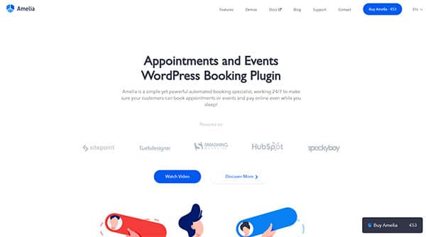
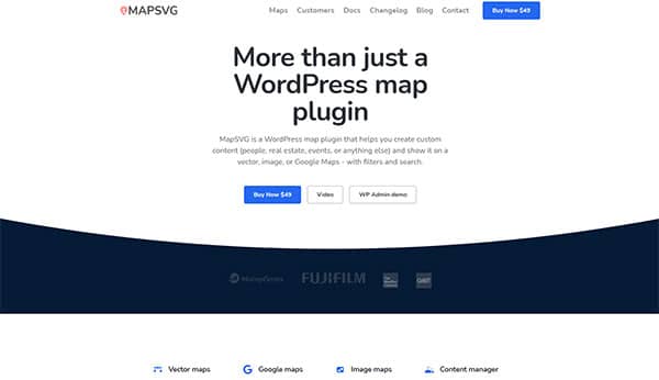
When you use whitespace well, your foreground will stand out without overwhelming your viewer. All viewers enjoy sites which are uncluttered and easy to absorb.
When a site is clean and simple in appearance, it will keep your viewer engaged. All designers wish to create sites which have a high conversion rate, and whitespace plays a big part in creating a website that viewers will appreciate.
Why is it beneficial to use whitespace?
Whitespace increases legibility
When your text is well-spaced and easy to read, your legibility will increase. Your viewers will understand what they are reading and where to proceed. The page will come across as well organized and easy to understand.
Whitespace around chunks of text helps people to understand how the information fits together. This creates a positive user experience.
Whitespace increases user interaction
When you present your visitors with chunks of text, they will sometimes battle to interact. Large chunks of information without whitespace can feel intimidating.
However, when you include whitespace, your viewer is far more likely to interact with your site.
Simple and easy-to-digest information will keep your viewer engaged without slowing him down.
You can also use whitespace to attract attention to specific areas of your site such as headings or subheadings. This will focus your viewer’s attention.
Viewers are 20% more likely to find a site with large amounts of whitespace easier to understand.
Call to action buttons are essential elements on any site. Your goal as a designer is to assist them to stand out.
You can do this by using vivid imagery or increasing the size of your buttons. However, surrounding your buttons with large amounts of white space can often be equally effective.
Whitespace keeps your site uncluttered
When you use whitespace well, your site will appear well organized, simple and clean.
This will add a sophisticated element to your site.
Viewers enjoy websites that feel simple and easy to understand. When you make use of whitespace, your site will appear clean, uncluttered and well organized. This will appeal to viewers.
Whitespace creates balance
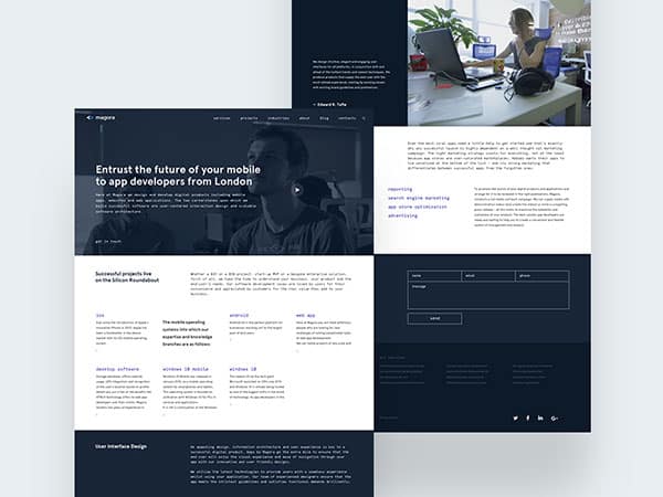
When you don’t use whitespace on your site, your site will appear busy and chaotic to viewers.
This will feel overwhelming and confusing.
A confusing site often encourages viewers to disengage.
However, too much whitespace will leave your site looking empty and incomplete.
By creating a balance, you’ll end up with a simple, clean-looking, and modern site with visual appeal.
Whitespace provides separation
Carefully used, white space will separate the various elements of your content, allowing your viewer to skim each one.
Internet viewers scan content rather than reading each different element. They then choose to engage with aspects that interest them most.
By using whitespace to create separation, you are giving your readers the freedom to choose which aspects of your site interest them most. Ideas and topics are more clearly communicated.
Designing around the fold
Web designers have heard that it is important to design with ‘the fold’ in mind. This concept shares that when a user clicks onto a website, they will not necessarily scroll down further. Therefore, designers often place important information on the top of the page, or ‘above the fold’.
This concept has become controversial recently and many designers are unsure whether users scroll down or not. However, we do know that making the site cluttered with too much information is both distracting and uncomfortable for viewers.
How do we create balance?
If you believe that your viewers will not scroll down, and it is, therefore, important to have information at the top of your site, you could add only vital elements to this area.
These would include crucial content and your call to action button. You can then use whitespace to highlight these areas.
You can place less important content below the fold.
Your viewers will be able to access important information as well as take action.
Your white space will give your viewer breathing space to absorb this information quickly and enable him to take action.
It is therefore beneficial to create a clear, uncluttered site using whitespace.
Simplicity
When it comes to simplicity, web designers have a lot to debate.
There are many designers who state that a minimalist website with muted colors will improve the user experience. However, there are people who seek information from the internet and do not mind whether the site is cluttered.
While some people prefer to read information divided into short paragraphs and bullet points, others prefer descriptive chunks of information.
Clean and easy-to-read blogs appeal to some, while others enjoy busy sites.
Some web browsers prefer the clean-looking Google search engine while others prefer busy Yahoo.
White space is therefore debatable, with designers believing it has the power to create an enjoyable site with a great user experience, while others argue that white space is unhelpful.
A designer’s perspective
As a designer, you work towards creating a great user experience for your viewers. You’re also aiming to build a great site for your clients, whether they are startups or larger companies.
By using white space effectively, your readers will have a great experience. This will keep them visiting your site in order to learn more.
If your site sells products or services, regular subscribers will soon become loyal customers.
If you are promoting a news site or blog, your user will be able to enjoy your articles when they are well spaced and easy to read. This will encourage your reader to delve further into your site. You want your site to be simple, intuitive, and to have ‘flow’.
As a designer, the goal is to keep the site clean, simple, and easy to understand. This prevents viewers from becoming easily overwhelmed.
A viewer who finds a site legible and easy to digest will carry on reading or exploring. It can often be far more complex to create a simple site, but it is simplicity which appeals to viewers.
Whitespace is not merely a space to fill. When used creatively it will improve a design. It helps your text stay legible and creates space between headings so that viewers can easily absorb information.
When white space is used well, you can even work towards creating columns that offer structured content to readers.
Summary
Using white space assists you with improving your user experience. When working with whitespace, take into account what you would like to see on your page.
Would you prefer a squashed and chaotic site or one which is well spaced and easy to read? Would you like information on a site to be orderly and given separate headings, or would you like to see a disorganized site?
As a designer, it is your job to improve the user experience. Focusing on composition, balance and legibility is an important element to the user experience.
When your clients appreciate a site, they are far more likely to read for longer and return at a later stage. Careful use of whitespace will, therefore, improve your site’s conversion rates.
