Line25 is reader supported. At no cost to you a commission from sponsors may be earned when a purchase is made via links on the site. Learn more
Creating a perfect website design is an exhausting task. There are many factors to be considered before starting to create a website design and one of them is choosing the right font. You have to take due care when writing the website content and during the selection of images for the home page.
Also, you have to ensure the connection of social media channels with the website along with the placement of elements. But people miss out on one of the important aspects of creating an appealing web design. You have to select the appropriate fonts to craft bespoke website design.
Selecting the best typography to evoke your website’s experience is highly important. You can elevate your website to the next level by choosing the right font. It gets difficult to understand the typeface of a brand to finalize the font for the website. Well, you may feel that choosing the right fit for the website fonts is not that simple but we have some solutions for you. We have come up with a proper guide to help you with the selection of fonts to craft a bespoke website design.
1. Select Fonts that Match Your Brand (Hint – Develop Brand Guidelines):

The first thing when it comes to selection procedure of the fonts is to match them with the brand. You should understand the fact that it is not always about following the current trends of website designing. Rather, the font selection should be in the context of the brand’s voice. For instance, a website for the beverages should not have the fonts that are compatible with furniture products.
If you have guidelines for the branding, then you must follow them to select the fonts. The brand guidelines help you to streamline the branding strategy and also help you to understand the brand in a much better manner. You’ll find all the things in the guidelines that you are looking for. The rules in the guidelines have the information about the use of colors, logo and most importantly, typography. Thus, if you have brand guidelines, then stick to them for selection of the fonts.
2. Be Consistent with the Selection of Fonts:
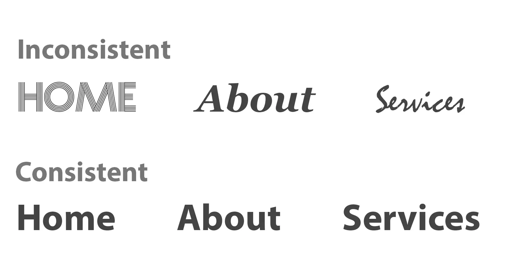
As a creative web designer, you might feel that experimentation is a good idea but that might not be a good thing to do always. When someone receives your visiting cards or checks out your brochure, they get a feel of your brand identity. So it is important that you follow a similar font style on the website. It also helps to increase your brand recognition.
If you fail to match the font style then your brand will look jumbled and messy. It is necessary to use same fonts on your website that are used on other branding materials. However, if you still choose to have a different font then make sure that they are similar to the fonts on other branding collaterals.
3. Choose the Perfect Ranks for the Fonts:

There is a sacred rule of designing that suggests you should not use more than 3 fonts on your website. Each font signifies the importance of the content. It is quite similar to the selection of color palettes. Usually, you choose a primary color, secondary color, and accent color. The same thing goes with fonts. You can prioritize which fonts to be used where.
Generally, the headers are framed with the primary fonts, so that it enhances visibility. Generally, the primary font has the highest visibility on the website. It is recommended that you should use the font that blends with the logo while choosing the primary fonts.
The secondary fonts are used for the textual content of the website. It includes blogs, articles, description, and paragraphs, etc. Your secondary fonts should be readable. Unlike primary fonts, your secondary fonts should not be eye-catching. Rather, they should be legible for reading a long description of your products or services.
Lastly, the accent fonts are used to highlight the call to action on your website. The accent fonts help you to stand out from the other website content to gain attraction. You should select a typeface that has the ability to distinguish itself from other website pages.
4. Classification of Fonts:
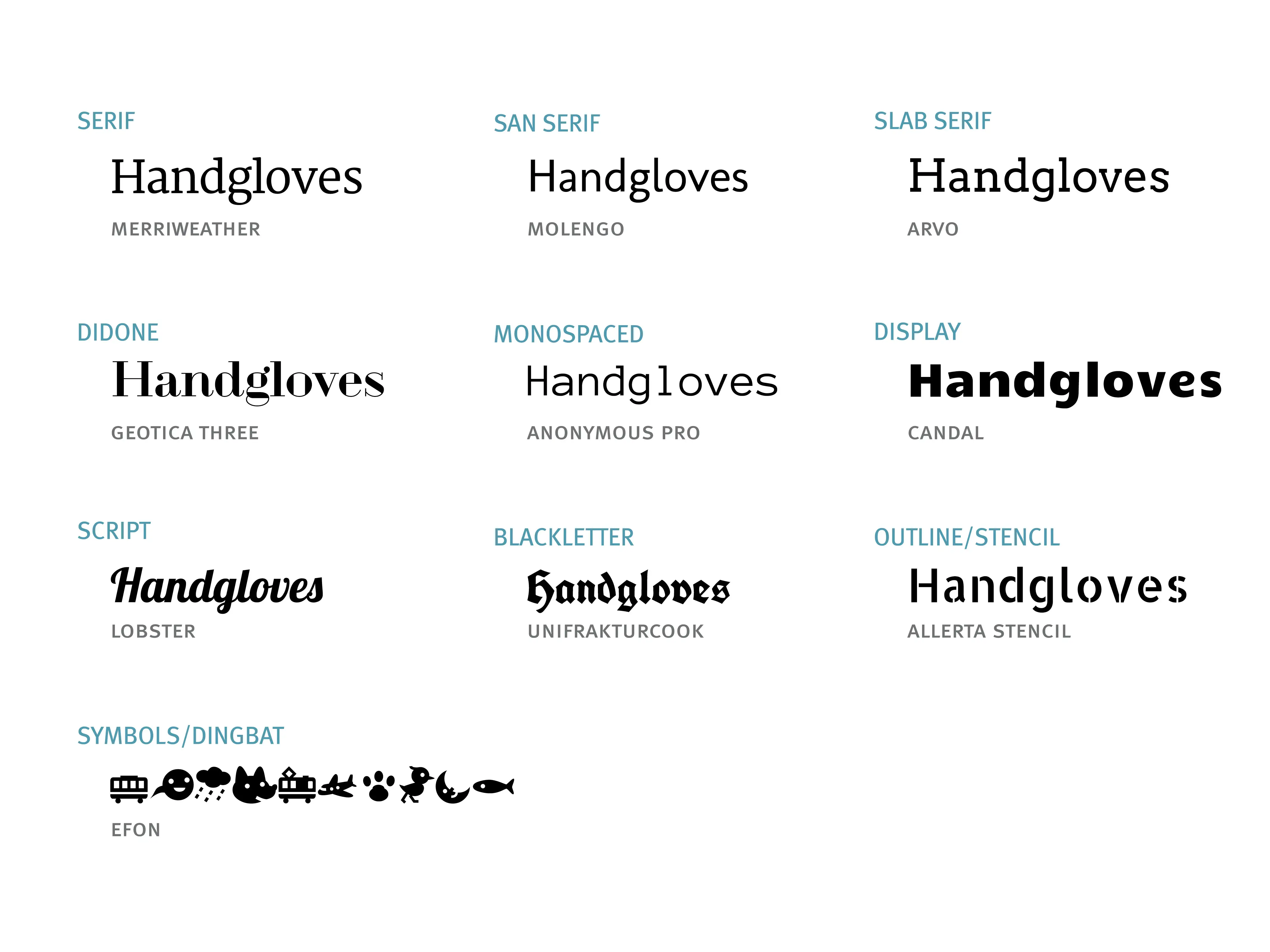
You should understand the difference between the usages of Serif, Sans Serif, and Script Fonts. Stay focused on the classification process of fonts.
- Serif Fonts are print compatible. It gives a classic and elegant look to the website content. This font is suitable for an older audience.
- Sans Serif fonts are without serif line similar to the Serif Fonts. These fonts are the best fit for the screens of computers and smartphones. It is one of the most utilized website fonts that connect with the youth.
- Script Fonts reflect the handwriting style. These fonts help you to acquire the attraction of the audience. Mostly, it is used for titles rather than for paragraphs because otherwise it will hamper the readability of the website content.
5. Figure out the Ideal Size and Weight for Fonts:
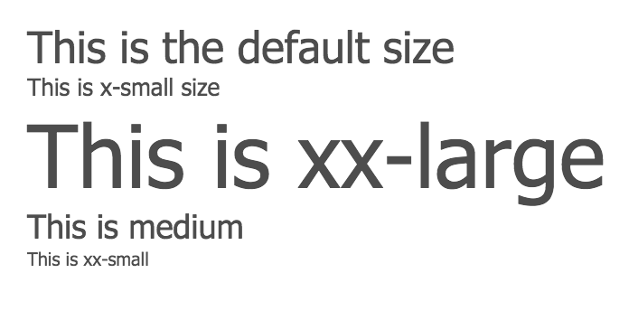
In the case of selecting the fonts, size is highly important. After selecting the type scheme, the next step is to fix the size for headings, sub-headings, and paragraphs. Apart from the size, the weight is another vital factor of font selection. You should know where to use bold, italic and underline tool for the fonts. Make sure that you avoid overuse of these different font styles because it may affect your style track negatively.
6. Follow the Latest Trends:
There will be a lot of rule-breaking involved while you’ll follow the newest style of fonts for your website content. It is recommended that you should try the trendy fonts for the headers and sub-headings. People are using serif and sans serif together while breaking the bars of designing do’s and don’ts.
But at the same time don’t get carried away with the creative approach. You should know that readability is the most important priority and thus, avoid complicating your website content with funky fonts.
Selecting the perfect website fonts depends on the requirements of the brand. The debate about the selection of font style and design can be concluded by deciding how you want to portray your brand. The fonts reflect your brand identity, thus, choose it wisely.
Nice article as it covers all the main points to choose perfect fonts. And we have to remember that typography and font-choice should not be an afterthought while designing and developing a website as they have a far-reaching impact on many important elements, including user experience, user perception, readability, and even mood.