Line25 is reader supported. At no cost to you a commission from sponsors may be earned when a purchase is made via links on the site. Learn more
If you want to be a good designer, it is very important that you’re on top of the trend before it even is a trend.
Having a good sense of what is going to take off is actually key in making a great product, and you’ll be recognized for being one of the first. You will also be praised for the innovative and new approach to common problems.
Originally, animations were treated as an aesthetic, but they’re now a very powerful tool for smoothing user interactions.
And yet, the fundamentals are unchanged, we just have a better implementation thanks to the better technology available.
Creating animations has always been considered as one of the most complex aspects of web design. Many designers (read that as designers-only) are creating the animations in After Effects and then sending them to the dev companies they work with. Not at all surprisingly, many don’t make the cut. We’ll see later why.
What exactly is an animation?
Animations aren’t just for cartoons. You’ll find touches of animation everywhere, from small hover effects to full-screen moving images. It’s trendy, it’s fun, and it’s user-friendly.
The word actually comes from the Latin word “Anima”, which means “soul”. It is basically an attempt of breathing in life into a static artificial object, something that appeared thousands of years ago when Pygmalion tried to wake up his statue of Galatea.
The animation is actually what happens when you have something that was originally made in 2D or still form, and it’s brought to life and moves in ways that follow the laws of physics.
It’s the way an app icon bounces like a ball while it’s loading or the way a cartoon character walks across your screen. The most important fact? Animation is nowadays ingrained in web design and is actually a great addition to a lot of website elements.
The animation trend
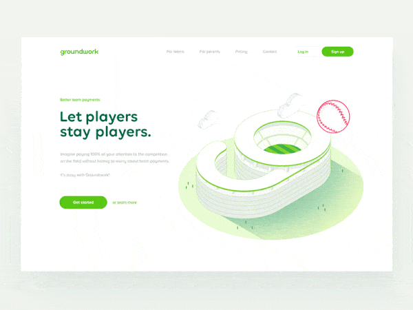
In the field of web design, the animation is something you’ll see more and more every day. The key to it is moderation, because a small, simple website animation may be engaging and interesting, and the user won’t even think about it at all.
A large animation, on the other hand, can be used as an interesting visual that pulls you into the design. However, if you mix up too many moving effects, it causes complete chaos.
One effect of the rise of animation is actually the availability of more tools that will vastly improve the UI production workflow, as well as the performance on devices and in browsers.
Animations are actually made using JS and CSS code that won’t overload the site when they’re adding moving elements to it.
And, even more important, these animations aren’t there just for fun, but they actually improve the user experience. It’s a great tool for web designers that helps them make the website better, and much easier to use.
What makes them trendy is realism. Today’s design landscape has a lot of minimal and flat designs, and users need more cues to tell them what to do.
A few animations can guide them without changing the aesthetic too much. Animations actually help add order and instructions to schemes that may be a bit too simple or may not provide enough direction for users.
In a situation like this, an animation will create a happy medium between usability and stripped-down simplicity. Look at fintech apps, for example. They need to have maximum usability and minimum animations so that they’ll work well for all target audiences. And they’re doing it great.
Why use animations in web design?
Are animations just another thing for designers to play with, just like those banner ads? Or are they a truly essential tool that designers can use, just like they use color, grids, and flow?
The primary use of animations is to increase usability. A simple animation can actually be a great guiding tool to help someone understand which button they should click, or where they should go next in a website’s map. Many designers will pair a simple animation with the user tool to click or scroll.
When used correctly, animation can provide valuable feedback to the user. How many times have you filled in a form in an incorrect way, and it shows a message box that highlights your mistakes and tells you how to fix them?
Well-thought-out motion can guide users and give them context, and you even have the opportunity to surprise the users, making things much more enjoyable and engaging.
In web design, animation is a motion that is actually very useful if you don’t use it in a purely decorative way. A good UX and UI designer will often use animation in order to improve their whole workflow.
The second use of animations is, obviously, aesthetics. Animations can be used as a great decoration. Oftentimes the goal of animation is purely visual, and that is acceptable to a certain extent.
A decorative animation can help create an emotional connection between the user and the interface. An animation can also spark visual interest, and make sure your users stay engaged with your website for a longer period of time.
When you’re creating an animation that is purely visual, consider what it should do. Think about what kind of connection you want your user to have.
Should it be fun, or surprising? Do you want to put a bit of unique content that should be shared? Even something that is purely visual should have some kind of goal.
Another reason to use animation is to communicate some kind of function. An animation can be a great tool to show your users how a specific something works in an intuitive way. Don’t do the same mistake that some people have made with the parallax scrolling effect by using it excessively and for no reason.
Animations also help guide the user. Animation isn’t just for animation’s sake, in the end, it’s all about conversion. Except when people use it in their favicons like it is shown here.
They can help your users understand the page, and steer them towards a specific place where they should click.
You can use them for revealing information. As an addition to hint at functions, you can also make them a great tool to reveal secondary information.
For example, you can have a user hover with their mouse over content, and reveal additional options.
And, due to the hover content’s “hidden” default state, this is something that you only want to use for secondary information, and nothing that is actually vital for users that want to navigate your site. Also, keep in mind that hover doesn’t work on a mobile device.
Large vs small animations
When it comes to animations, there are two categories, and they’re fairly easy to understand, you have large and small animations.
Large animations can be recognized by the scale they have to them. They’re often in video form, with run time, and they fill a pretty significant portion of the screen, reminding of a short movie.
You can use them as a focal point in the complete design, and the user doesn’t really have to perform an action to see the animation in motion.
They tend to be pretty common nowadays, and a good example is a video background. If you have substantial movement, that can also be considered a large animation, such as a drop-down menu that’s a full page.
These animations are the first thing you’ll see when you get to a page, and as such, pretty hard to miss.
Small animations, on the contrary, are something you’ll discover only when you begin interacting with the website. They might be hover states, or usability guides or tools.
They’re more of an accent that contributes to the overall aesthetic, instead of being the design’s focus. They aren’t as obvious as large ones, and they offer a more supportive role to the design.
Examples include simple fades or slight changes in sizing. You can think of them as things that you won’t notice as being animated, and they fell pretty natural while adding up to the overall experience.
Designing great animations
There are a few aspects that you should consider when you’re putting together an animation.
- What are you trying to convey, but you can’t do it only with the UI?
- What does the user need to understand?
- What is the absolutely most subtle effect?
- What are the feelings you want to evoke?
- Are the UI pieces accessible to screen readers?
Start small
When you’re considering animation more as a design tool instead of a stylistic choice, it’s best if you start small.
Small, unobtrusive animations will perform better, and a big, flashy animation must absolutely have a purpose, and not only look good.
Another thing you will come to realize is that everything is a character. Sure, this may seem unintuitive at first, but consider a few things. The key to a seamlessly designed website is the website’s ability to empathize with the user.
- What makes you feel at ease?
- What is the fastest way to get to the information?
- What element is the most compelling, and you can place it to direct attention?
Animations should be or should happen, fast
How do we interact with real objects? Sometimes we move slower, sometimes faster. The speed may depend on the size, the task, or whether we’re dealing with an object full of liquid you don’t want to spill.
Generally, we pick and move things around pretty fast, and individual movements may even happen in milliseconds.
This is the same measure we want to use for a user interface animation. If it’s longer people will either lose patience with your product, or their machine, or both.
This is especially true if the product should be used repeatedly because even if the animation is fun and entertaining, it loses the appeal if someone has to see it one too many times.
Occasionally, make things bounce
A physical object will bounce. Some will not be good at it, but anything will bounce if dropped far enough on a hard surface, provided there is not too much air resistance.
And interacting with UI elements is just like interacting with a small, hard object. When you toss it to one side, it bounces a bit. If you drop it, it bounces a bit.
Therefore, making the animation bounce, especially if it’s been moving vertically, can be helpful when appropriate. Maintaining the illusion is all that matters.
You need to teach the animation to live on its own, as a big part of the process of development, and this can be accomplished in a couple of ways:
- The animation should move towards being actually informative, guiding the user’s attention, and appealing to rational actions.
- The animation should be designed in the same way the rest of the page is – color palettes, storyboards, and composition, everything should match.
- The animation needs to follow the branding guidelines, appeal to the users’ emotions, and be a part of a living style guide.
Things in motion need a bit of time to stop. And, if you set a stationary object into motion, it’ll take a bit of time to speed up. Yay, physics!
So, when you’re making things move, make sure they get a bit of time (of course, in milliseconds), for them to either slow down or speed up. This is known as “easing”, and you will actually find functionality for it built into CSS.
Summary
Animations are important, and a good one will undoubtedly make the user’s experience much better. This can either be in the form of an emotional connection, for example, of just by making the site easier to use.
It’s a design technique that won’t go anywhere anytime soon, as it engages the users even in the most mundane of tasks, adds life to the design, and makes you really stand out above the crowd.
Animations are a core component if you want to make that emotional leap from a usable site to a desirable one.