Line25 is reader supported. At no cost to you a commission from sponsors may be earned when a purchase is made via links on the site. Learn more
When it comes to service companies handling various business functions, SaaS companies are the best. They are a market that has started growing immensely in the past few years. These types of organizations handle Customer relationship management, enterprise risk management, and so much more.
What makes them so memorable is their functionality and accessibility. They make products available to be bought online and even to be accessed in the same way.
When it comes to optimizing the user experience on your website, having a visually appealing design only won’t do the trick. Instead, the key to a fantastic website is having an amalgamation of both content and format. You want your website to convert visitors into new leads. But that is not an easy job to do. It is a time-consuming job.
When you’re starting a website for your company or improving your old one, it is essential to implement up-to-date strategies. You want to use tools that will help you drive conversions and have new leads. You want people to subscribe and connect to your brand.
The design on your website should concentrate on your buyer persona. This is a post that is dedicated to helping you increase your SaaS conversions. To make your website looking fresh and modern, use these tips.
Your landing page should be simple and compelling.
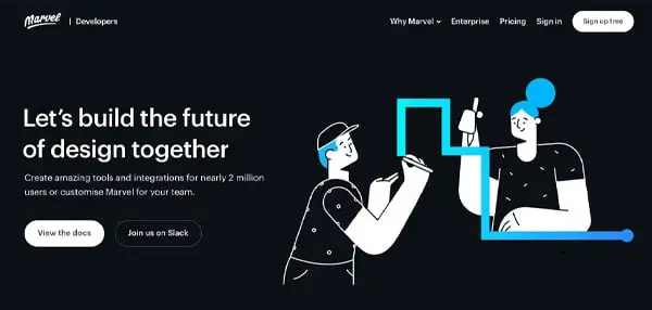
The first thing a customer sees when he opens your website is your homepage. The front page is an essential element when making a great first impression. Design it that way, so it is captivating and appealing to the eye. Yet, don’t make it too creative.
Carefully use color schemes, pictures, and other graphic elements to make the site stand out and capture the user’s attention. But don’t overdo it. Make sure it is simple yet convincing. You might also want to serve your products and services as simple as possible.
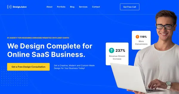
Keep Your Value Proposition Clear
![]()
When creating a SaaS homepage, you have several options available for positioning products. When a person lands on your page, they should be immediately greeted with the value of your company. Show them exactly what you offer. To do this, highlight the product’s importance.
You can also add a real-life background image. That is to prove the context for the products and their uses in life.
Lead Magnet CTAs
You can’t have a startup website without a CTA button. This serves so that people will get into action immediately after they’ve finished exploring your content or before they do so. A sign-up pop-up is the most common type of a call-to-action button. Many business owners make a mistake and forget to add a proper CTA.
The CTA should be clear and concise. If they are done right, they will generate a good conversion rate. It also needs to be easy to spot. So try to use a contrasting color. It also depends on your website’s color scheme. If you have a red color scheme, for example, you can’t use a red CTA. It won’t stand out.
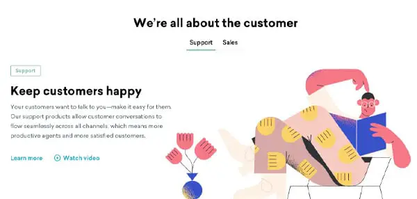
Your site should be embedded with stories.
Even if your site is, for example, an EPOS system, your main goal when creating a website is to tell a story. You don’t want to overwhelm customers with dull facts and statistics. To avoid this, tell exciting stories. You can say to a piece of information about the goods and services you offer. And then add testimonials from clients.
That way, you’ll ensure people that your brand is legitimate. You can have a particular theme on your story or add different microstories all over your site. It is proven that people enjoy content that is filled with information.
Work Both Ends of the Funnel

It is never to also add a short video on your page. You can tell your story, experience, or even the products, the services you offer in the video. You can address problems your users have and suggest solutions based on them. A video always makes people closer to a buying decision.
Pillar Blog Posts
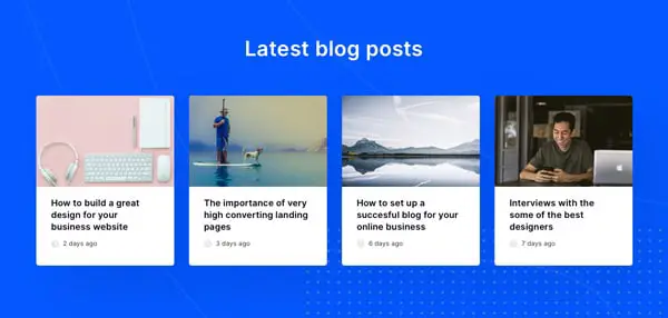
Many inexperienced SaaS companies overwhelm visitors with recent blog posts on the homepage. They cram articles and articles, making no space for exploration from the side of the users. This often causes people to leave the page in a matter of seconds. To prevent this from happening, try using analytics.
Find what blogs are best at grabbing attention and engaging the visitors. You want everything to be magnetic. You can never go wrong with three blog posts. Place your best seats on the homepage.
Your tutorials and FAQs should be available in video form.

A lot of people hate reading FAQ. They can be long and often don’t help at all. Instead, try using video tutorials that demonstrate how a product or your website, in general, is used. But, the video should be short. Make them no longer than three minutes. With visual content being on the rise, a video is a fast-rising star.
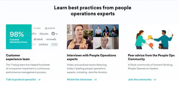
Add Testimonials

Many people buy a product that their friend or family recommends. That is why a website must have testimonials and reviews from customers. They believe more to the people that are just like them. They want to be familiar with the product.
If you dedicate a page specifically for reviews, they will believe your brand is trustworthy. And, that is what it should be. You want to present yourself as a genuine company that appreciates people and their opinions.
Don’t Overwhelm Your Visitors.
Another common mistake many people make is stuffing the homepage with information that can be put elsewhere. The front page should be simple yet eye-catching. A good website guides users towards other pages. If you put everything out there, it will result in you having fewer conversions and leads.
That is due to people spending less time there. Please don’t push it too far. Use content little by little and watch how a whole plot is woven.
Add a pricing page
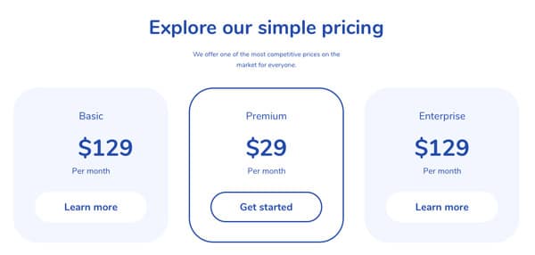
Dedicate a page for pricing only. On that page, you can use a pricing table to compare prices. For example, how your prices differ from your competitor’s prices. For many SaaS products, you can’t often show the pricing. That is because of the complexity of custom integrations.
Easy to Find Contact Information
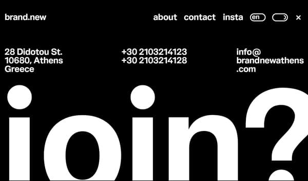
Another thing you should add to improve leads continuously, and that is to add a contact page. You don’t want people to spend hours searching for contact information. If you make it hard for them to find it, they are guaranteed to leave.
To avoid this, highlight location, email, and phone number on the page itself. This will make customers appreciate you for making your information easy to find.
Chatbots should provide your tech and account support.

Many websites are starting to use chatbots instead of actual human operators. Chatbots are one of the lead generation software you can use too for your site.
They are automatic, and they perform tasks much more comfortably. They also are great at saving time, energy, and money.
They are the frontline of your business as they can be a fun experience for users. You can use chatbots to solve inquiries. They can never get tired of working as well.
Demos, Trials, and Freemiums for SAAS
Many people are starting to love the fact that they can experience a product or a service before purchasing it. Having a demo for your goods is a beautiful tool that makes many people happy.
They can see how the product works. This can be experienced through a video or a product tour. You want them to see which features it has and whether those features match their need.
You can also ask people to sign up for a free trial before they can use it. This type of strategy is suitable to use at the final stage of the funnel. Many podcasts, courses, and other online learning tools are based on this strategy.
All browser support
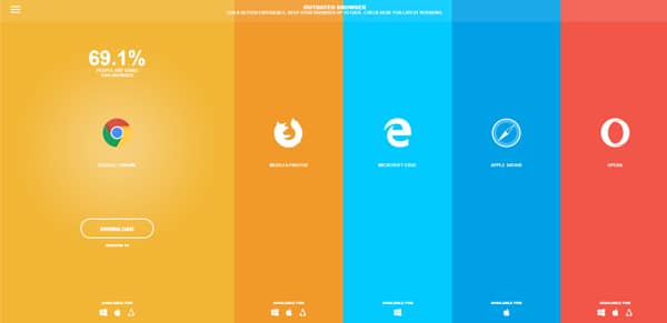
You want your site to be available in as many versions and browsers as possible. With the increasing use of smartphones, many people use them to access websites and web content with a mobile version. And, a large portion of those same pages isn’t available in that way.
This drives many people away. That is why an excellent website must be fitting for all types of devices.
When displaying a SaaS product on a site, having a list of its features is excellent. But do keep in mind that you should present only a small amount of components. If you compile all the things it has or offers, you may bore the reader. Not only that, but many people cannot keep track of everything they’ve read.
Make a list short and straight to the most critical characteristics only. Also, do make sure to make navigation easier for them. It would be best if users can go from one feature to another with ease.
One of the oldest tricks in the Conversion Rate Optimization book is to minimize navigation options for visitors while they’re on transaction pages. Various success stories give evidence for the success of this strategy.