Line25 is reader supported. At no cost to you a commission from sponsors may be earned when a purchase is made via links on the site. Learn more
With the pace of change in trends and design world, it at times gets very exhausting for both designers as well as their audience to adapt and accept the ever-changing trends and to keep up with them. This is where Vintage design gains its popularity. By inculcating vintage design practices, you allow the audience to have a sense of comfort and ease. Earlier trends had a longer shelf life, and such design practices were carried out for several years, which made it easier to remember and more comfortable to relate to a product. Designers have begun to realize the power of this, and are actively using vintage design practices to stand out from the rest of the competition.
It is essential to understand the two terminologies, retro and vintage. Earlier, the two words used to mean different things, while vintage was drawing inspiration from something that existed as a product, retro was referred to the intentional implementation of old design styles and language, to give the product a retro feel. The terms, however, can be used these days interchangeably, as many designers use a blend of both to create and recreate the brand image in today’s time.
Some eras and styles date back enough to be called vintage. Each era, each style has something unique to offer. Here, we will learn about some of these popular Vintage Design practices and how can they be used to make your product stand out.
1. Art Deco:
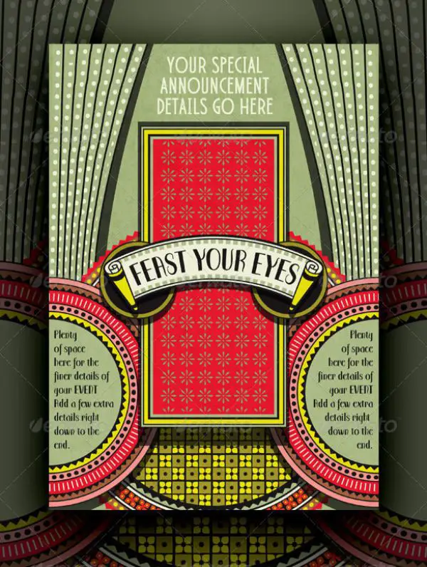
Art Deco was a movement in the decorative arts and architecture which initiated during the 1920s and further developed and gained acceptance as a dominant style in western Europe and the United States by the years of 1930. The name for this movement comes from Exposition Internationale des Arts Décoratifs et Industriels Modernes, held in Paris during 1925. Art deco explained design by turning modernism into fashion. It was known for its use of geometric shapes and symmetrical patterns, also ideal human figures. It was a modern style that focused on the rise of the machine culture and how it affected society. There was the use of yellow and gold to symbolize wealth.
Over the years, Art Deco has been used by several different industries and walks, such as monumental and public sculptures, studio sculptures, paintings, and even in architecture, mainly skyscrapers. It is also many times used for decorations and motifs, furniture, textiles and fashion, jewelry, glass art, and also graphics and designing.
By drawing inspiration from this Vintage style, you can design your brand in a product by using proper symmetry, layered shapes, rectilinear geometry, intricate line art, aerodynamic curves, and metallic colors like gold and chrome.
2. Art nouveau:
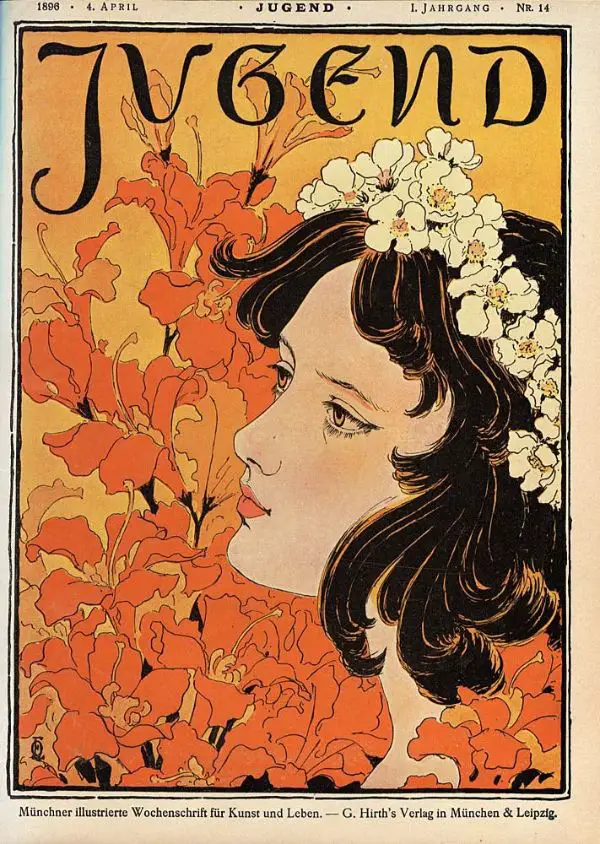
Art Nouveau is a form of art that emerged from the angst of the 19th century’s modern art. William Moriss’s floral designs and the Art and Crafts design movement founded by his pupil were instrumental in the emergence of this art form. This art form gained prominence during the late 1980s and has had multiple natural forms as its inspiration. The design practice of Art Nouveau tries building a relationship between different elements and natural forms in the most harmonious way possible. The design style is recognized by its use of curved lines and the intricate detailing often inspired by plants and flowers. The center attraction of this art form is using natural beauty instead of intentional beautification. The art form uses very contrasting colors, ornate patterns, and a significant focus on young women, plants, and trees.
Over the years, this art form gained acceptance in many fields, and practitioners of each draw inspiration from this to date. It is widely accepted and used in Glass Art, Paintings, Jewelry, Interior Designing as well as Graphic Designing.
By using certain design principles that this art form followed like using artistic designs on everyday objects, breaking away and challenging the rigid structures and restrictions of classical arts, heavy use of pastel colors, and using flowing lines can help your brand stand out with a design that breaks from the rules and restrictions and emphasizes on the natural aspects of design.
3. Bauhaus:

Bauhaus is a design form that originated in Germany. It was a German art school that was operational from 1919 to 1933, which combined the fine arts and the craft. Walter Gropius founded Bauhaus, in Weimar. The term Bauhaus translates to building a house. It was created with the ideology of creating a total work of art in all aspects of art.
It gained popularity in modern design practices like modernist architecture, design, and architectural education. It left its impact on many other developments in interior design, graphic design, industrial design, and also typography. This movement has had a considerable impact on architectural trends in Western Europe, the United States, Canada also Israel. Tev Aviv got the recognition of world heritage site in 2004, because of its abundant use of Bauhaus in its architecture.
Its core principle is to eliminate/avoid using anything that can be even slightly distracting. It believes in emphasizing the core aspect of the design, removing any excessive element. It believes in the simplistic approach to design. You can make use of this prominent design form by inculcating its specific characteristics, such as using a lot of primary colors, thick lines, geometric shapes, simple texts, and more.
Now that we have discussed three prominent art movements of the past to draw inspiration from, we can look upon certain distinctive features that can help add a retro and vintage look to your design.
4. Use of colors:
It is crucial to understand how the color scheme used to be like in the early days to recreate the same feel in your modern design. Generally, it is advised not to use very bright colors, as it goes against most of the vintage design premises. Another aspect of colors you need to keep in mind when designing a vintage look is the saturation aspect. Reducing the saturation to an extent helps the image look old, and this is a common trick that many sound designers use to date. Another element you could experiment with is texture. It changes the color and also gives a rugged, worn look to your product. You could put forth more effort and make use of only two colors for the entire design. Earlier, this used to be done to ensure the design is print-friendly.
5. Use of Simple Shapes:
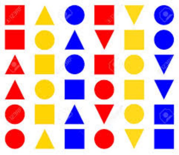
The retro design had heavy use of different geometric shapes such as circles, rectangles, starbursts, and more. Including shapes in your design that are not too complex as vintage designs were primarily known for their simplicity. It is okay and encouraged to break from the symmetry aspect at times and use asymmetrical shapes to break from mundane, common shapes. Generally, rounding off the turns and edges reemphasizes a vintage design instead of using pointed or squared shapes. Squared shapes often feel modern and hence can take away from the vintage feel of your design.
6. Use of Typography:
Typography is one of the crucial elements of design to get right while trying to inculcate a vintage feel in your design. A wrong font can throw the entire design off, even if you get the colors right, use simple shapes, and follow every other guideline. Hence you need to ensure to thoroughly check through multiple fonts to choose one that makes your design look a bit old. Many vintage ads used to put emphasize on typography strictly, whether it be banners, flyers, or any advertising. It used to complement the brand’s identity. Hence it is essential to look for a font that doesn’t only feel vintage but also complements your brand. Some of the ideal fonts to experiment with are Bobber, Canter, Sesame, Zorus Serif. You can take inspiration from signage and advertising. Neon signs, pinstripes on the car, and many more can be a good starting point for retro typography inspiration.
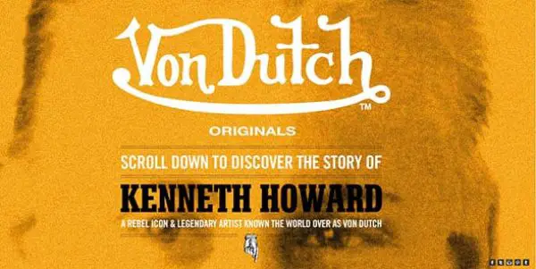
7. Use of Logos:
![]()
Logos were an essential part of the design to make a product stand out from its competitor in old times. Using the same concept and creating logos or emblems ensures a better presentation of products and services of sites and better promote products. Applying sober colors to retro logos and emblem creates a classic ambiance for the audience. The shapes and format of logos also need to adhere to the guidelines of old logos. The vintage logos have to appeal to masses, and they’re often known for their timeless nature that is not affected by time, trends, and era. It is essential to include a sense of value in the logo to make it stand out and have a lasting impact. Many times designers use handwritten scripts to make it as authentic as possible. You could also incorporate hand-drawn logos to create a unique and vintage logo.
8. Use of Borders:
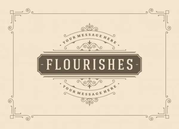
Using borders is a straightforward yet useful tool to give a vintage feel to a product. Successful designers use borders strategically to lie emphasize on the essential areas of the website, product, or any material they are working on. If you are dealing with images, you can have vintage frames to help give that authentic feel to your product. Generally, vintage frames or borders have a contrast between thick and thin strokes and experimenting with more than one texture. Often ornamental borders are used in vintage design frequently, and you can incorporate them as well if it fits your design language.
9. Use of Line Art:
Line art is a method of drawing, where the entire composition consists of straight or curved lines that are put against a relatively plain background, without using gradations in the shade, or hue for representing two-dimensional or three-dimensional objects. There is scope for using different colors, but traditionally line art uses the only monochromatic color scheme. It empathizes on form and outline, shading, texture, and over coloring. Vintage logos have been taking inspiration from this art form, and this is a movement towards gaining popularity of flat designs. Such line art uses thin lines and easy illustrations. It can be sophisticated or sketchy, elegant, or wild.
10. Nostalgia:

Though not a tangible design element, Nostalgia plays a crucial role when trying to get a vintage design correct. The primary purpose of a vintage design is to drive Nostalgia. Nostalgia among the audience, give them a relaxed and comfortable memory that they distinctively remember, and for them to be able to relate your product/design with that memory. Currently, the 80s trend is prevalent to pick on since the adults of now who have disposable income and purchasing power were kids back then. Tapping into their childhood memories and evoking emotion from there would guarantee better engagement. By adding a style statement that is distinctively exclusive to the target audience’s nostalgic period, you could increase your sales exponentially.
11. Visual Style:
Each era has its visual style. This helps vintage designs being easily identifiable. By drawing influences and following guidelines used by that particular era you want to target, you can easily create your design per it. Utilizing different era’s significant practices is one way to achieve a vintage design that is authentic and aesthetic. You could base your design entirely upon the guidelines and style of the particular era you want to follow, and inculcate in your design, or you could use a blend of your authentic design and use a bit of the retro reference to complement your design. The possibilities are endless.
12. Perception of Aging:

An exciting way to make your product look vintage is to ensure it looks old and rugged. Generally, shiny and sleek products tend to look brand new. Gloss, for instance, always looks fresh and new. It gives a perception that the product is being made recently. However, if a fine print had pixelation, used duller colors, had a crumpled paper texture, and other such excellent techniques, it would create a perception of a vintage era. That it belonged to old-time, and it has aged and traveled through the test of time.
With this, we are at the end of 12 Types of Vintage Design practices to make your product stand out. You could have a product that you launched in a time that now falls under retro, and re-introduce the original packaging you did for that product as to drive Nostalgia, or you could be an entirely new business and yet derive inspirations from vintage design practices and make your product.
Comments are closed.