Line25 is reader supported. At no cost to you a commission from sponsors may be earned when a purchase is made via links on the site. Learn more
Each day, we all are faced with thousands of options we need to make decisions on. From the moment you wake up until the moment you go back to sleep, you have endless decision points throughout your day that impact how your day goes. We get so used to making these decisions that most of them don’t even seem like one, and we make them subconsciously. Understanding how people interact with products and the reasons behind the interaction helps to apply persuasive design principles based on such data to ease decision-making anxiety. This in turn contributes to improving the user experience.
1. How persuasion works in design:

The reason persuasive design works is, there is an impact on suggestion. Compelling design is based on a fundamental understanding of human behavior for influencing their decision-making process. It is most often used for eCommerce and travel-related websites. The science behind persuasion is often also used for improving user experience across any sites on the web on different devices and screen sizes.
Persuasive design, at times, is tested on its moral grounds. Many people ask if the persuasive design is ethically correct since it uses deception. However, there is a fine line between descriptive design and the art of persuasion that helps create compelling user experiences. Tricks like dark patterns would come under deceptive practices that intentionally trick a user into taking a favorable action without letting them be fully aware of what their action would lead to. Fine examples of this can be disguised ads, trick questions when signing up, and hidden costs.
A basic rule behind the persuasive design is that a person should not use persuasive technology to persuade someone about something they wouldn’t want to be lured for. Persuasive design is supposed to be a skill that designers use for good.
2. Persuasive Design Principles:
Persuasive design works on seven common design principles that are frequently used by UX designers. These principles are:
1. Framing:

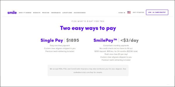
As a general rule, people like making comparisons before buying any products or signing up for any service. This need for having options for making a comparison comes out from a place where they want to make sure they decide that brings in the most value. Hence the framing design principle of persuasive design compares different options to the viewer in an appealing manner.
Some tips for implementing framing in your design:
- Use the Goldilocks pricing technique: Always offer a premium, mid-end, and budget option to the users. Stack up all options side by side and show an exact comparison between the three plans.
2. Scarcity:

The scarcity principle believes that the lesser you have of something, the higher its value rises. People generally break from their decision-making loop and take action when prompted to take immediate action based on limited quantity or availability.
Some tips for implementing scarcity in your design:
- Use time-sensitive deals: Make your products available for a limited time. This can include sales deadlines, limited duration discounts on abandoned cart products, or same-day delivery promises.
- Offer them exclusive benefits: If you have certain visitors who took the time to opt-in for your mailer list or special discounts, provide them with exclusive offers that other users don’t get access to.
- Display short on supply: If you have a hot selling product that is an absolute steal, make sure your customers know it is. Showing the count of stock remaining for that product would persuade a sense of urgency in your potential customers.
3. Reciprocity:

Reciprocity is something we follow or expect in our daily lives. The principle of reciprocity believes in returning the favor. Your visitors feel a sense of entitlement to get some value for their time or investment in your business. Hence, leaving thank you notes on them subscribing to your contact form sheets or giving them some benefits helps them feel valued.
Some tips for implementing reciprocity in your design:
- Give away useful information for free: Newsletters, whitepapers, checklists, podcasts, webinars, videos, or more.
- Provide a useful service for free: Free shipping, free goodies, or reward points on the purchase.
4. Authority:

The authority principle states that people look up to experts and genuine sources of information to validate to get influenced by when making their decisions. If they are to see an expert’s recommendation, their chances of taking action increases significantly.
Some tips for implementing authority in your design:
- Have an authority person try your services: If your product is that good and you have the marketing reach for it, reach out to famous influencers of your niche to validate your product or services.
- Use your experienced personnel: If you are a small scale business who cannot afford or reach authority celebrities, sell your experienced individuals to attest the services by validating their expertise first.
5. Social Proof:

The Social Proof principle is very apt in today’s time. It is based on the fact that people tend to follow what others do. They would want to see others walking down a decision path before deciding on a decision themselves. It helps to relieve anxiety for them because they get reassurance that they’re not alone in this decision. Or comfort from the fact that others who took this decision seem to be happy with it.
Some tips for implementing social proof in your design:
- Validation Logos: Mention your well-established affiliations and highlight them by showing their logos on your website.
- Social Shares: Make the share count visible for others to see how many times people have shared your content.
- Reviews: If you are a big seller platform, having high ratings for any products would show users that many people enjoyed using it.
- Testimonials: Testimonials can work wonders to gain customers or visitors’ trust, as it shows that your organization has delivered expected results to others.
6. Salience:

The salience principle is straightforward and important to understand. It states that people tend to pay attention to what is most important to them at the given moment. Google’s home page is a fine example of using the Salience persuasive design principle. The website has a simple interface and design with a prominent search bar in the center. This works as people generally use Google for searching the web, and it is right there in the dead center.
Some tips for implementing salience in your design:
- Up-sell your customers during checkout: When your customers are ready to checkout, suggest them complimentary products or accessories of the product they just bought.
7. Contrast:

There was a memory experiment conducted by Hedwig von Restorff during 1933 to find out what things stands out in people’s minds. The test participants were shown ten unique items. They were then asked to remember all the items on the list. Nine of those items were written in black ink, and one was in blue ink. When the participants had to recall all the things from the list, most of them successfully recalled the one item in blue ink. This persuasive design principle indicates that people are more likely to remember what stands out from the crowd.
Some tips for implementing contrast in your design:
- Make use of eye-catching CTA buttons: CTA buttons are the most important aspect of your website that you want your visitors to interact with. If your website has primary colors as blue and white, using a green CTA button would help it stand out and attract your visitor’s attention.
3. Persuasive Design Strategies:
Whenever you browse the web, you are subconsciously being persuaded, when you are on your favorite eCommerce website or even on your social media feed. There are brands and designers continually trying to get your attention. Now being a designer and knowing these persuasive design strategies can be very helpful. Let us discuss some of them:
1. Element Reduction:

Earlier, when the internet was relatively new, websites didn’t bother much with user experience. They would try to fit in as much content on a webpage as possible, to get a space on this newly explored medium of communication and information. However, with time as we evolved and realized the potential benefits of providing a good user experience, this habit became obsolete. You should always aim to reduce the unwanted or extra elements on your page, as it helps your audience focus on what you intend to highlight.
2. Tunneling:

If you have an eCommerce website, you might want to consider hiding the interior left navigation when your customers reach the checkout page. It takes immense work to persuade customers to reach the end of the purchase funnel. However, suppose your navigation is visible while deciding to check out the product and purchase it. In that case, it might distract them from making their purchase. Hence creating a tunnel vision for your customers helps increase sales and converts.
3. Suggestions:

Suggestions are one of the softer strategies that aren’t too direct on the visitor’s face. And this is what makes it super effective also. The right information has to be presented to the interested visitors at the right time for being efficient. This can help change their behavior. Now when you set up an eCommerce website, this can be complicated as you might have to rely on recommendation engines that require complex algorithms. Alternatively, a simpler approach can guarantee similar results. Suggestions have to strategically place in the trigger areas of motivated users to persuade their behavior and keep them engaged. For instance, when a user is searching for a new course to learn on your website, you could provide them with recommendations based on the profile they filled out, or else also based on their previously completed courses.
4. High Autonomy:

We, being humans, prefer being in control. Or at least believing that we are in control of our actions and environment at all times. Hence if you can manage your audience to feel greater autonomy, it would increase their certainty and trust in you and reduce anxiety and doubt. To make your audience feel the perception of freedom always includes an exit for them through whatever they are doing. Other than this, speed up interactions, split up the tasks, and reduce each step’s complexity. Your focus should also be on competence, clarity, and ability to influence and emotional engagement.
5. Conditioning:

Conditioning is not as subtle as suggestions. It is a direct and powerful strategy that encourages and reinforces the desired behaviors you want the customers to get used to. There are many approaches to conditioning. You can use rewards in different ways to avoid mundane tips. Then you can have consistent design choices as well that help reinforces targeted behaviors. There is also an added advantage to learners who follow instructions to complete the profile to access the entire site. And users who don’t can be given limited access.
6. Surveillance:

When you collect data about learner behavior and performance results, that is known as Surveillance. Information is power, and handing that power to the learners can be one of the most persuasive strategies. At times, people are very competitive, and exploring their competitiveness can act as a great motivator.
This was all you need to know about persuasive design. Persuasive design is a convenient and efficient method of catering to your audience to gain their attention, interest and inspire them to take desired actions that you want them to take. However, it is not fooling your customers or exploiting them by using clickbait or disguised ads. The intention behind persuasive design is always to improve the overall user experience and journey for the users, allowing them to experience that makes them come back to you. Persuasive design is used in web design, app design, and even branding strategies and communication plans by various brands in their daily marketing. It has more to do with understanding important concepts like customer psychology and the rule of designs to create a seamless experience for users.
