Line25 is reader supported. At no cost to you a commission from sponsors may be earned when a purchase is made via links on the site. Learn more
At the present age, having a detailed website is very valuable for the advancement of the business. Out of various fields in the market, beauty salons are observed to have a high traffic of competitors without exceptions for spas as well.
A website is considered one of the best places to promote a business as it is reachable to more number of people. A salon website is a place to sell your salon to the world.
Hence, building an attractive website to promote beauty salon and spa is a must to increase your chance of obtaining more bookings and clients.
Most people are clueless when it comes to designing a website for salons. You must be sure your salon web site is full of useful information and attractive to receive more customers.
You are in a competitive niche and this is a good reason for salons to need a beautiful website. One of the best ways to demolish your competitors is to achieve high rankings on search engines such as Bing and Google.
We’ve added several tips to make your salon and spa website informative and attractive:
Salon homepage
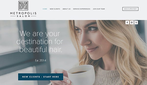
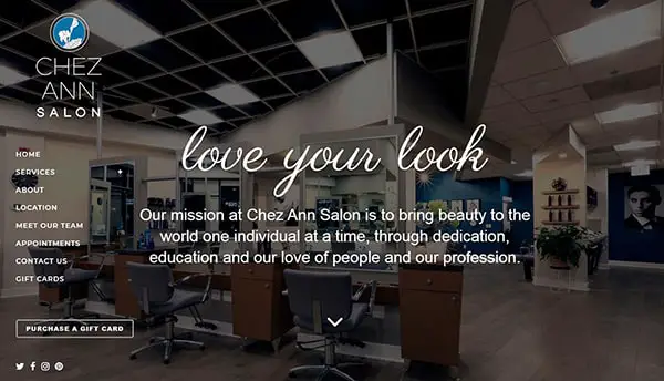
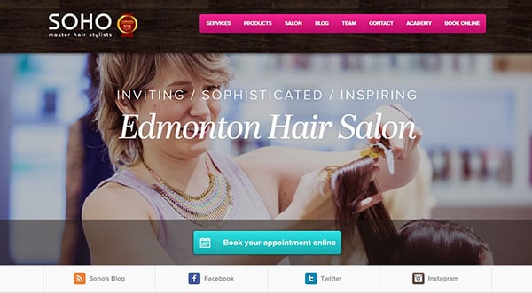
The best way to create a nice first impression is to have a well-designed homepage as it would be the foremost part of your website a customer views.
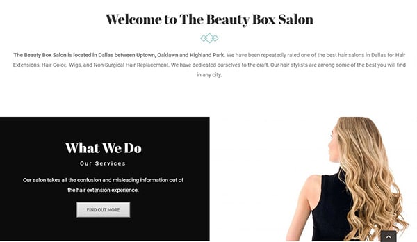
Thus, you have to include the information such as the details of your salon, the purpose or uses of your salon and another vital part to include is how you would distinguish your salon from all the other competitors in your area.
To make the home page more attractive you can try highlighting the headings, using attractive images and even bullet points. Also, ensure that the customers find it convenient to follow through your website without any turbulence.
Colors
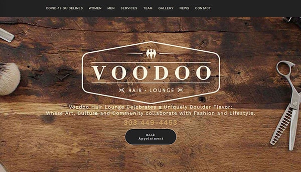
The colors chosen for your website have to look good, but not be over the top and should not deviate the customer. Hence, it is wise to pick a color scheme that is consistent with your salon’s style and also doesn’t hide the important information present on your site.
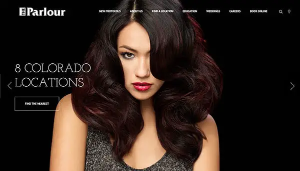
Go for a predominant black website if you want a stylish but safe look. Still, if you want some energy to be transmitted by your brand, try red shades combined with black and white, or some color schemes involving yellow or orange. If this is too much, go for neutral colors, but your salon website might look like everyone else’s.
Content
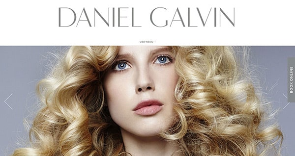
One of the key aspects that beauty salons deal with is beauty. Hence, it is essential to include animations, interactive images, some gifs even, banners or high-quality images on your website to demonstrate ‘beauty’. Visualize your website like a virtual salon guide and ensure it represents your style and the service quality.
The copy
In order to increase your website’s traffic use relevant keywords. Replacing some of the words on the website can obtain a huge impact on the website content and this can be easily identified by Google as it deals with context and its relevance.
Structure
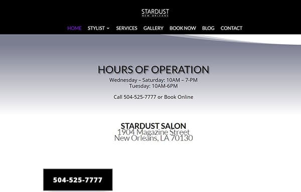
Ensure that the relevant information for the visitor is clearly specified in the top section of the website so that people don’t have to waste their time to learn details regarding the website. The information that the hero section of the site must contain is mentioned as follows:
- Salon timings
- Contact details
- Reservation button
Responsive design is a must
Ensuring that your website is mobile-friendly has to be considered as important as developing a perfect web design.
According to this year’s design trends, websites are required to scale themselves on any device so that it becomes easier for the client and prospects to locate you irrespective of the device they are surfing through.
Website information
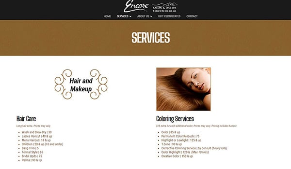
You have to ensure that the details of the service offers are available on your site and also that your website is packed with relevant information.
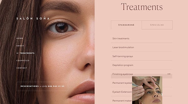
You can also create a different page where all the info regarding your services is mentioned in detail such as mentioning the process of certain service.
Show You Like What’s Popular
Trendsetting is considered as one of the secret foundations of a beauty salon. A question might pop up in the client’s mind that when your website alone is not up to date, how better could the services offered by your salon would meet their requirements?
Typography is important
One of the most important aspects of web designing is choosing a perfect font so that the website appears interactive and modern.
Also, the website design has to be unique and meet the standards of their target audience. Combined together, these efforts would improve the UX of your visitors, who are then growing your business by generating sales.
Online booking
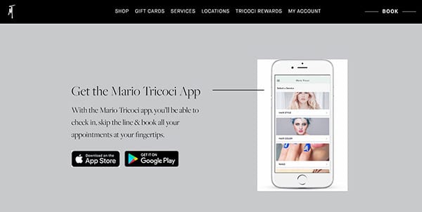
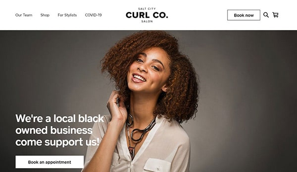
Nowadays, online booking has made it easier for visitors to book an appointment without much hassle. So, while creating a website for a spa/salon, make sure you include some kind of CTA so that a mere visitor to your site could also become your potential customer. For that, you can use a WordPress booking plugin instead of creating something custom.
Collect emails
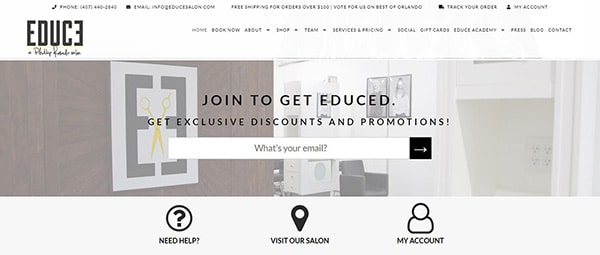
Adding a popup to your website would be a way to make the clients stay longer on your website and you can impress the client by inviting them to join your newsletter. You can do that with a one-time discount.
Also, this approach could be the first step to initiate communication with the customers through email, and slowly, you can convert these clients into your potential customers.
The Competition
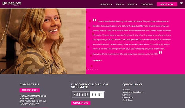
Ensure that the website includes a few customer testimonials, as this approach can build a sense of trust in the customers’ minds and sway them away from your competitors and make them your potential client. As long as your website is fresh and clean it has the ability to attract potential customers right into your saloon.
Your contact info should be easy to find
Make sure that you specify the mode of communication clear on the website homepage. So, that no customer or a client finds it confusing as to how to contact you in case they want to make an appointment. You can make it time-efficient for a client to contact you in the following ways:
- Your phone number should be visible and clickable from a smartphone
- Your address and the directions to your salon should be clearly visible
- A booking CTA the most visible button on your site
Salon offers on your website
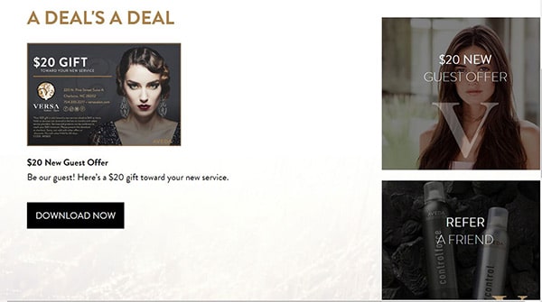
One of the best ways to stand out from your competitors is along with regular services, include and highlight a few services that only you are offering. Promoting this information on social media platforms is also advisable as it can reach more people this way.
Have clear CTAs
It is rather important to include a CTA button like a link or even an image on every page of your website so that the client does not have to search for the option when they get interested while looking at some particular service in one of your web pages.
Feature Products
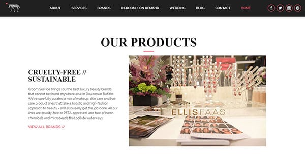
Although every stylist out there knows the research work they have done on a product to bring it into the service, the trick lies in conveying the customer about the major advantages of those products so that the customers learn how enhanced your products are and how well it can profit them.
Include client reviews
One of the best strategic moves to attract more clients to gather information about your clients’ reviews on Yelp, Facebook, and Google. Using this information you can include a page on a website called “Reviews”. Such a number of enormous social proof examples attract more customers to your saloon easily.
Best practices
Make sure that the website design you have chosen is something that you really like. There are a lot of salon templates or spa WordPress themes that you can find on Google with a simple search so browse through them and find one and buy one.
All the above-mentioned tips and tricks would help you turn mere visitors into potential customers to your website. A key point to always remember is: improve and promote your website often to keep up with the website design trends.
