Line25 is reader supported. At no cost to you a commission from sponsors may be earned when a purchase is made via links on the site. Learn more
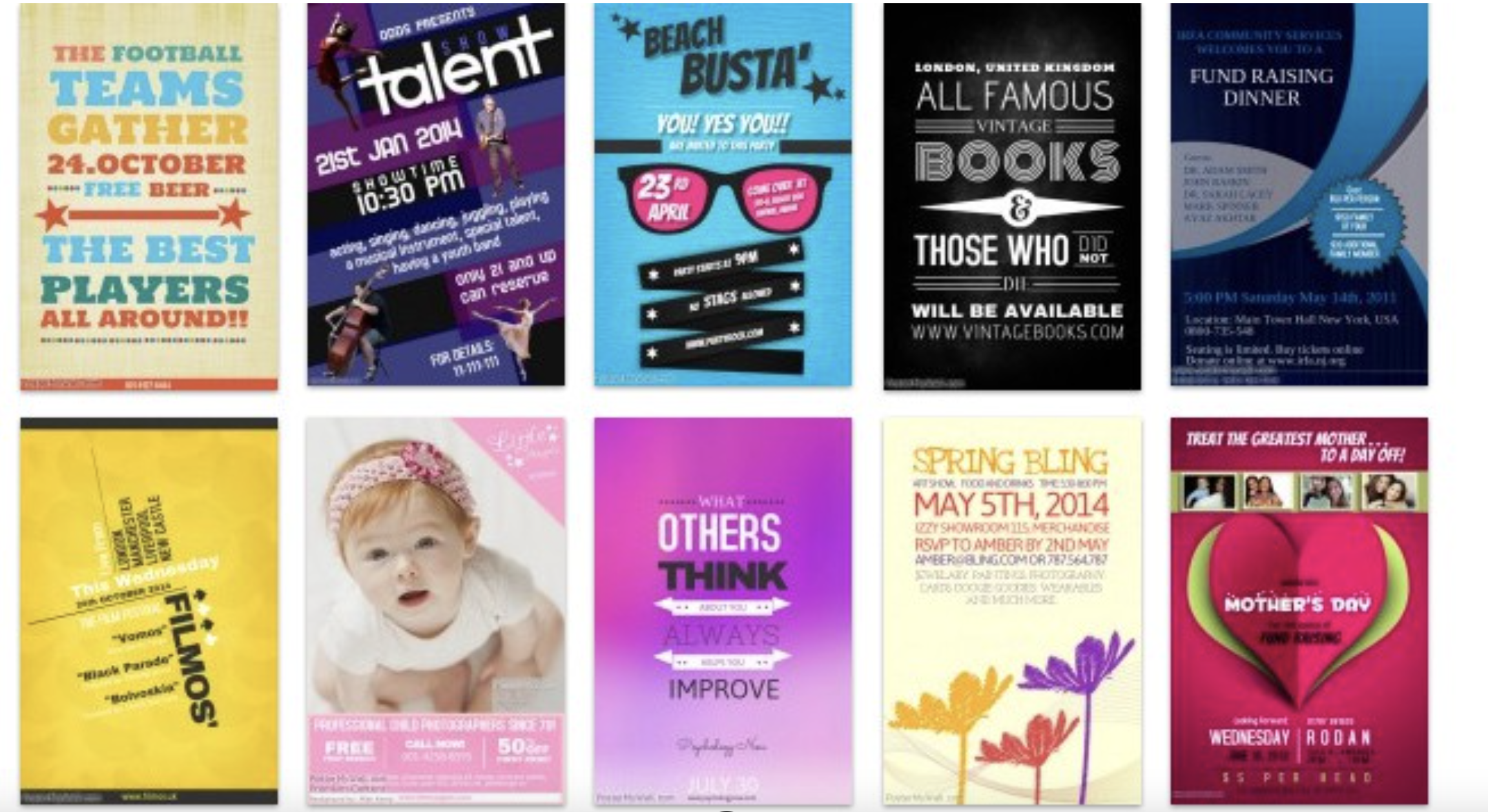
Flyers are a great and easy way to promote your business. A well-designed flyer can grab the users attention and hold it long enough for them to act on it. It is an important part of marketing strategy and when done well can bring in immediate sales and brand recognition.
For a flyer to stand out in a crowded marketplace, it has to be well designed— this would mean that the designer has to be skilled enough to choose the right font, artwork, and color to create a compelling visual. If you are a business owner, you would want your customers to pay attention to the content on the flyer and take action.
Style of a flyer is usually determined by the designer. It would largely depend on the needs and goals of the client. It could be big, bold and vibrant or simple, with minimal use of color. We have accumulated a collection of flyers and 10 creative ways to make it stand out. Hopefully, this gives you the inspiration you need to make a flyer that would stand out for your next project.
1. Collage/ Mix
By mixing various design elements, you are able to create a flyer that stands out. Combining typography styles and playing with size combinations can help push your poster design to the surface. Take a look at the flyer above, you’ll see that the designer has played with mixing different textures and superimposing colors to make the design pop. This poster is designed by Austin Peralta.
2. Vibrant colors scheme
Sometimes all it takes is a bright, punchy pop of color to make the design stand out. This design by ONF showcases a great color palette and shows how using bold colors can make a big difference in your design. By sticking to just two brights, the designer is able to draw attention to the primary elements in the flyer.
3. Simplicity
Minimal designs create an impact of their own. Besides bringing clarity and legibility to the text and the content, they help draw the user to the primary elements of the content. This poster was designed for a bar in Montreal, Canada. Designed by the agency BZOING is a perfect example of a minimalist design.The use of simple foliage and beautiful type makes the design stand out.
4. Vintage/Antique effect

This vintage looking poster was designed by We print pancakes.This hand crafted poster features vintage typography and plays with form and content.
5. Pattern Study
The human eye is naturally drawn to patterns. As a designer, you may choose to use them throughout your design or use them just as an accent to enhance the look and feel of the design. However you may choose to use them, they are capable of making people looking at your flyer. Here is a beautiful poster designed by Matteo Vandelli ,Guilia Faini and Luca Sarti is a perfect example of an eye grabbing patterned flyer. The trio came up with 6 different patterns that could be mixed and matched to promote a street fair.
6. Seasonal inspiration

If you are designing for a particular season, make sure to use design elements that represent your theme. This will make your customers instantly relate to the idea behind it because of the familiarity of the elements within your design. Here is an example of a poster that illustrates this idea.
7. Photography
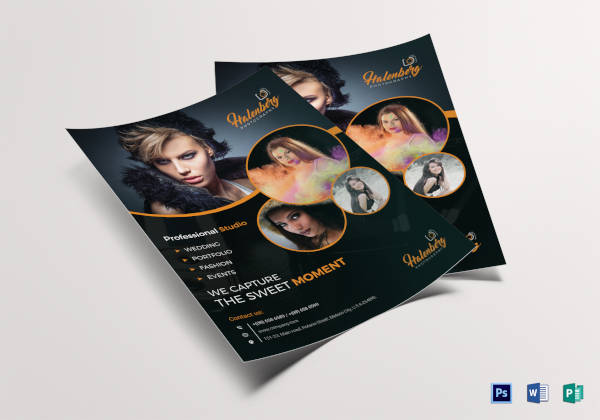
If photographs take center stage in your designs, then it is important to choose high-quality imagery that sets the tone of your work. Combining it with the right font should help convey the overall idea or the message behind the project. Here is a great example of a poster where photography takes center stage. Combining it with unique typography and colors, the designer is able to make this poster visually engaging.
8. Layers
 This poster shows how to layer different design elements effectively to create an eye-catching style. This design is able to mix/match and layer typography, colors, and photography without compromising the integrity and readability of the content. This design Steve Wolf showcases this idea. By layering typography, photography and other design elements, he is able to create an eye-catching layout.
9. Think outside the box
One of the best things about designing a poster is that you have the creative freedom to take it any direction you chose. This is where your creativity can shine. So make sure to think outside the box, and make something unique and eye-catching. Here is an example of an amazing poster that was designed for the Wing Sydney opening. Carmen Zeng is the designer behind this flyer. She was inspired by origami and wanted to translate the idea into her design. By using ripple effect as a decorative element, contrasting typography and color, she was able to create flair and movement to her design.
10. Layout and composition
Choosing to display your content in a creative way helps your poster get noticed. It is easy to create a unique visual experience by filling up space in a creative way. This poster was designed by Oguzan Pelit. He experiments with layout, and places his text inside the shape of a shoe to create a compelling image.
Lets take a quick look at some of the elements that make or break your flyer design.
Typography
Make sure you choose a font the represents the style or theme you are going for. Typefaces usually have the power to convey an emotion or an idea just by their presence. So if you are looking to portray a musical nuance, make sure to go with a typeface that has rounded edges /cursive style to represent this feel.
Color and Layout
Choosing a color palette for your flyer is tricky. It take some time, patience and research to come up with a color scheme that would represent the feel you are going for. Starting from the color wheel and studying different color schemes should help you pick out a color that can set the tone for your project. Layout is another important aspect to look out for when designing a flyer. You can add polish to your designs by paying close attention to alignment, spacing and balance.
Comments are closed.