Line25 is reader supported. At no cost to you a commission from sponsors may be earned when a purchase is made via links on the site. Learn more
You probably set high standards for yourself and for your work. This requires knowing the latest web design trends, and determining how you can put these new, and often innovative, trends to work.
It’s the same for Be Theme’s creators. They make a constant effort to stay current with the latest design trends in order to provide web designers with up to date pre-built websites.
Be Theme’s authors and designers have launched over 200 pre-built websites to date. We want to share the latest releases with you.
They embody some of the design practices described in recent and current web design trends, including:
- The use of hero images to captivate users.
- Application of visual hierarchy techniques to help influence user decisions.
- Inserting parallax, hover, and other subtle effects for a more satisfying UX
- Using patterns and full-width layouts to help point users in the right direction.
How Trends Found Their Way into the Latest Pre-Built Website Designs
Partly due to the use of the same or similar templates, and partly due to constraints the use of mobile devices has placed on website design, many websites have the appearance of being nearly carbon copies of other sites.
. Recently recommended design practices, involving everything from the use of long scrolling to minimalist design, and the use of hero images, confirm the fact that a newly-minted website can be modern, unique, and much more appealing that most others.
Nevertheless, these latest pre-built websites have several things in common. They are easy to customize, they require no coding to do so, and they can be installed with a single click.
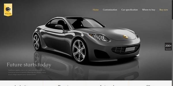
This pre-built website could tempt you to go into the automobile business, or at least, purchase the product.
- The ultra-impressive hero image fits right in with the website’s unique value proposition, as well as the overall theme.
- The way colors are used is particularly modern looking, and go nicely with the way in which white space is used.
This is an example of one thing the right blend of modern design practices can produce – a feeling of elegance.
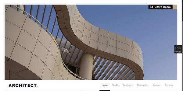
- This is an excellent example of putting minimalist design practices to work. The images are captivating, and visual hierarchy principles are put to good use. The design elements relate to one another in a way that encourages user interaction.
- This website also features an imaginative play on perspective, resulting in an impression of depth that helps to engage the user and highlight the brand’s innovative qualities.
- One of the several design differentiators emphasized in this pre-built website is its friendly portrayal of the corporate brand, instead of a formal, somewhat stiff, introduction.
- The way colors are used, and the way in which the icons relate to the color choices, give a feeling of warmth.
- White space is effective in focusing attention to key information can calls to action, while the card-like design is a nice feature for any website visitors who tend to scan.
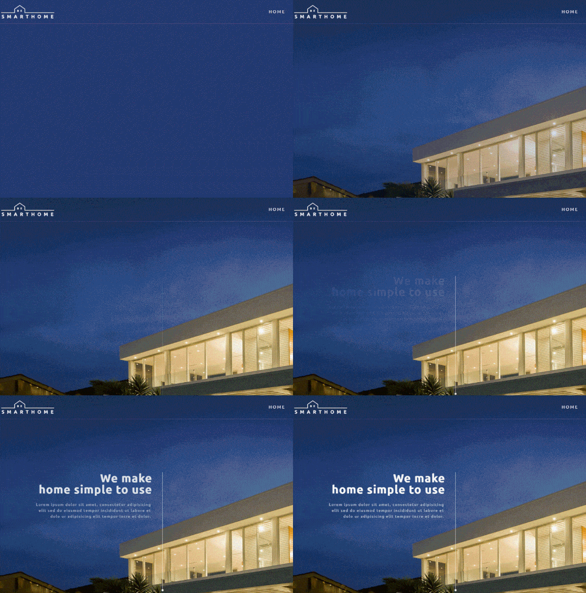
- Yet another example of an engaging hero image.
- Note the subtle use of header elements – they are easy to see, yet by no means intrusive.
- There is a nice fit between the modern lines and patterns in the images and the minimalist icon designs. Also, the design is consistent in the way graphics elements and website theme relate to one another.
- Excellent use is made of perspective, which you can see by viewing the pricing page.
Another example of the awesome effects the right combination of modern design techniques can produce.
- The header effect is almost perfect. It is noticeable, but barely. It does not interfere with the way the image delivers its message.
- Minimalist icons contribute to a tasteful, modern look.
- Want to add some spice to a gallery? Consider hover effects; as used here.
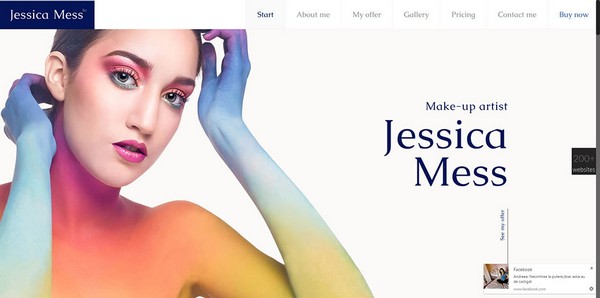
- The hero shot says just about everything that needs to be said, except for a few important details.
How You Benefit by Using Be Theme’s Pre-Built Websites
Be Theme’s pre-built websites are much more than a collection of attractively designed images. They come embedded with a wealth of useful features, they are ridiculously easy to install, and they are totally customizable.
The five shown above are ideal matches for five widely different business themes, but with more than 200 to choose from, you’ll have no problem in finding one for any website enterprise you intend to offer your services to.
One nice thing about these pre-built websites, is that you don’t have to be typing on your keyboard with one hand and holding a user manual in the other to put them to use.
Installation is quick and simple
. So is the editing process, thanks to the powerful Muffin Builder, Muffin Options Panel, Shortcode Generator combo. These, together with the 200+ pre-built websites, are but 4 of the 40 core features Be Theme brings to the table.
If the situation should arise where you want to build a page starting with a blank canvas, there’s no problem. A fifth core-feature, the Layout Generator, makes it easy, and helps you deliver awesome results.
BeTheme is the biggest WordPress theme by far, in terms of its pre-built website offerings, its core features, and a huge user base.
Another contributor is the Be support team, they are big on providing excellent service.



The pre-built features will save us web designers a lot of time. I like Be Theme the most.
They’re the best I’ve seen so far.
Loving the brand of the company and its associated pages, we are also on the verge of designing our own companies under our umbrella. Do check us out for our latest styles in design too xx