Line25 is reader supported. At no cost to you a commission from sponsors may be earned when a purchase is made via links on the site. Learn more
When you deal with a lot of data and statistics, numbers can be dull and boring to look at. Since there are many entries for any given project, it becomes difficult to present the findings in an appealing and understandable manner. The raw data cannot be interpreted easily.
When you add Data Visualization to the process, the same data becomes easy and appealing to look at. It enables the user to make sense of the given data faster. Moreover, it helps the observer to notice interesting patterns that aren’t visible when you just look at raw stats.

What is Data Visualization?
There are three main branches of Data Visualization – Scientific visualization, Visual Analytics, and Information Visualization. Data Visualization is a combination of these three branches.
The simplest explanation is that data visualization is the display of data by using graphics, such as:
- Infographics
- Charts
- Plots
- Animated GIFs
- Illustrations
Making charts and diagrams can be a tedious task. However, to ease this process, there are many amazing Data Visualization Tools for creating charts and diagrams. This list includes easy-to-use Data Visualization tools, some of which require coding knowledge, whereas others can be used by any individual easily.
Data Visualization Tools for Creating Charts & Diagrams
Visme
Visme has many icons, templates, fonts, photos, and other prebuilt media formats. Impressive presentations, charts, graphics, and reports can be created using this software. You can also create social media graphics with three easy steps. You can view and present your content from any time anywhere in real-time. It works smoothly on any device and browser.
FusionCharts
FusionCharts has some of the best Data Visualization tools available in the market. It has an extensive collection of maps and charts. There are over 90 chart types to choose from. Moreover, this tool has 965 maps. Hence you can rest assured, to find a chart or a map as per your requirement and liking. This tool supports all modern browsers but also traditional browsers like Internet Explorer 6. Hence compatibility won’t be an issue with this tool either.
FusionCharts also supports XML and JSON data formats. The charts can be exported in JPEG, PNG, PDF, and SVG formats as well. It also has a great collection of dashboards and live demos that can be used for inspiration. The charts are customizable as well as beautiful interactions.
Google Charts
Google Charts is a great Data Visualization tool available on the net. It renders the charts in HTML5/SVG format. This helps provide cross-browser compatibility as well as cross-platform compatibility for Android and iOS. Google chart also has VML to support older browsers like Internet Explorer 6 or previous versions.
There is a wide ray of charts available to choose from. The chart formats you can expect to find easily are – bar, graph, pie, area, and gauges. The interface is user-friendly.
Leaflet
Leaflet is one of the open-source Data Visualization Tools for creating charts and diagrams. You can make mobile-friendly maps using Leaflet. The software is extremely light – 33 kb. It is packed with several features that can help you make any kind of map. The software uses CSS3 and HTML5 for map rendering. It works across all major mobile and desktop platforms.
You can enhance the usability of this software by making use of the various plugins available for Leaflet. Some of them are animated markers, heatmaps, and more. For designing any map that needs a map, a Leaflet is the go-to software.
Dygraphs
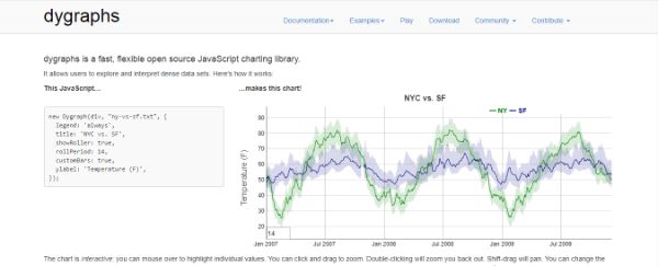
Dygrpahs is yet another open-source Data Visualization Tool for charting libraries. This software is particularly useful for handling huge data sets. The software is flexible, fast, and highly customizable. It works on all major browsers and has a great active community.
Dygraph is clear about its niche target audience and is clear about whom it wants to deliver to. It focuses on handling large data sets efficiently as compared to providing extra features.
Chart.js
Chart.js is one of the smaller open-source libraries for Data Visualization Tools. It supports six basic chart types – bar, line, radar, doughnut, pie, and polar. Even if it doesn’t provide more chart options, most of the projects can be managed with these fundamental chart types. It is an ideal solution for smaller projects.
Chart.js makes use of HTML5 canvas elements for the rendering of the charts. All charts use an aesthetic flat design and are responsive. Even if this is smaller open-source software, it is one of the most popular ones.
D3.js
D3.js also known as DataDriven.js is one of the most popular Data Visualization Tools available in the market. This software makes use of CSS, SVG as well as HTML to render the charts and diagrams. The software is strong enough to bring any of your imagination to reality with data visualization. There are tons of features; it is highly interactive and appealing. Moreover, it is free and open-source software.
There are no pre-built charts out of the box; however it has an aesthetic gallery that shows the possibilities of D3. This software is more focused on modern browsers and might have difficulties with traditional browsers.
HighCharts
HighCharts is one of the big players when it comes to Data Visualization Tools. There is an elaborative list of maps and charts that the user has access to. It makes use of the normal charts as well as different packages for stock charts that are called Highstock. Both of them are filled with features.
The chart can be exported in SVG, PDF, and PNG formats as well. This software is free for non-commercial use but requires licensing for commercial use.
Tableau
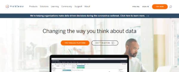
Tableau Public is one of the most popular Visualization Tools for non-coders. It includes many charts, graphs, map,s and other graphical options. The tool is entirely free and the charts can be embedded on any web page. The gallery when you visit their website has a nice collection of visualizations created using Tableau.
The charts and graphics of this software are much better than most of its competitors. The only drawback of the free version is that it has a big footer that comes with it. If you want to get rid of that, you need to opt for the premium version.
Timeline JS
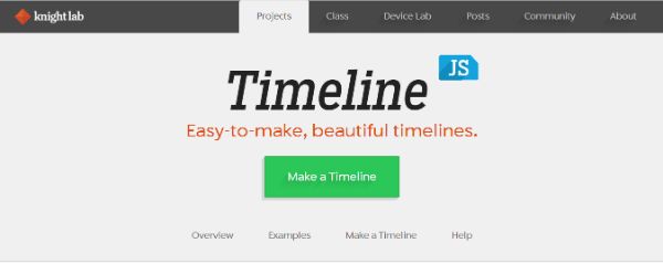
Timeline JS can help you create beautiful timelines without having to write any codes. It is a free open-source tool. Some of the popular websites also make use of this software like – Radiolab and Time.
The process of creating a timeline is a simple four-step process. The software can make use of media from various sources. It also has in-built support for Flickr, Google Maps, Vimeo, Dailymotion, YouTube, Wikipedia, Sound Cloud, and other similar sites.
Infogram
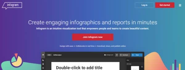
Infogram is a great Data Visualization Tool that helps the user create infographics and charts online. It comes with a restricted free version and two paid options. There are features such as 200+ maps, an icons library, and private sharing as well. The software has a very easy-to-use UI- user interface. The charts are also well-designed. There are many design templates, and company guidelines to help creators create impactful designs and projects.
There are also many animation options like bounce zoom, fade, flip, and slide. The paid version allows designers to collaborate on a project in real-time. There is support for measuring the metrics to see how your charts perform. It is optimized for mobile and different web platforms as well.
ChartBlocks
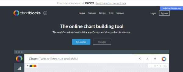
ChartBlocks is a great online platform for Data Visualization needs. It is well-designed and allows users to create basic charts effortlessly and quickly. There are limited chart types, however, all the essential ones are covered.
You can feed it data from many external sources like databases and spreadsheets. The charts can be exported in SVG or PNG format. You can embed it in your site or share it on social media as well.
Plotly

Plotly is yet another effective Data Visualization Tool that can be used for any graphing and Data analysis purposes. The graph and chart types have a great professional look and feel. The user just needs to input the data and customize the layout, notes, and legend.
Datawrapper
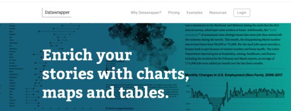
Datawrapper is one of the online Data Visualization Tools that works best for creating interactive charts. The data can be imported from any CSV file or pasted directly into the field. The software would generate a bar, line, or any other visualization. News reporters and news organizations make frequent use of Datawrapper to embed live charts in their blogs and articles. The software is easy to use and produces relevant graphics.
RAW
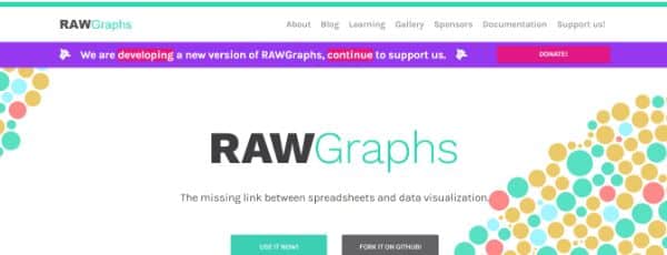
RAW can be defined as the missing link between vector graphics and spreadsheets. This Data Visualization Tool is created on D3.js. It has an excellent design. The intuitive interface makes any new user feel a sense of familiarity. This puts them at the ease in using this software from the start. The platform is open-source that doesn’t require any registration process.
The library has 16 types of charts to select from. All the processing is done on the browsers. This ensures data safety. It is highly customizable and extensible software that can accept new custom layouts as well.
Power BI

Power BI is a great business analytics tool that is developed by Microsoft. Thereby, it works well with Microsoft Office. The users are allowed to import any data such as folders, files, databases, and more. The user can also view data anywhere making use of the software. It is free to use for individual users however you need to pay a premium for the team version.
Qlik Sense

Qlik Sense is a great business analytics tool that focuses on users of any organization. The purpose is to provide these users with ease of analyzing their data and making use of analytics. They can also make use of the reporting capabilities of the software to make better decisions. There are many powerful features to be explored with Qlik Sense. Type in the keyword that you want to search in the dataset and it would show you unexpected information and data relations.
FineReport
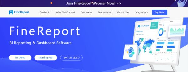
FineReport is reporting and dashboard software. It has amazing Data Visualization effects. There are self-developed HTML5 charts that can be displayed on any site or webpages. The user can also add cool 3D animations and dynamic effects. It can adapt to any screen size and has an easy drag-and-drop operation system to achieve any effect.
Grow
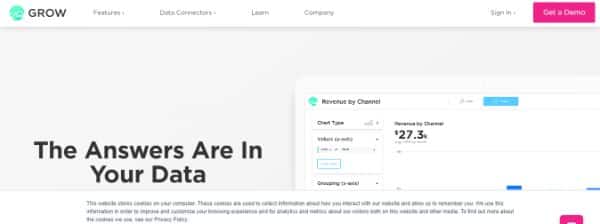
Grow allows the users in a company to track relevant and insightful data to create their specific dashboards. This helps them make informed decisions. There are over 150 integration supports with Grow. The company claims to be 8 times faster than any of its competitors. There are 300 pre-built reports and real-time updates.
Visual.ly
Visual.ly lets the user create impressive infographics, reports, videos, and eBooks for their marketing campaigns. There are many amazing templates uploaded on the platform by the users themselves. It is capable of creating automatically generated infographics for social media networks. This comes in very handy for some beginners.
Data Visualization Tools for Creating Charts & Diagrams Summary
These are 20 Amazing Data Visualization Tools for creating charts and diagrams. Make use of this software to create impressive and useful data presentations for businesses and clients.