Line25 is reader supported. At no cost to you a commission from sponsors may be earned when a purchase is made via links on the site. Learn more
A couple of weeks ago I posted a showcase of web designs with clever header effects. In that roundup we saw a bunch of sites making use of a simple collapsing header effect, where the page header or banner would gradually shorten and disappear upon page scroll. Let’s take a look at recreating this cool effect for use in your own website designs.
The collapsing header effect
The collapsing header effect is actually created with just a few simple lines of CSS. All it needs is a few position: fixed; declarations on your header and banner elements, then an adjustment of z-index values to allow the content to scroll over the top, giving the impression that the banner is collapsing as the user scrolls.
View the collapsing header effect demo
How to do it
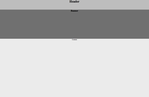
In order to create the effect you first need a basic layout consisting of at least a header and a content area. In this example we’ll create a thin header bar along the top of the page, which will stay fixed in place and remain permanently visible. Under this we’ll include a banner that will adopt the collapsing effect and finally the main content div.
View the basic collapsing header effect demo
header {
	height: 100px;
	background: #bdbdbd;
	position: fixed;
	width: 100%;
	z-index: 10;
}
We’ll start with the CSS to give the header it’s fixed positioning. These effects work best when the design spans the whole page, so a width of 100% is added first of all. The fixed positioning is then simply achieved with the position: fixed; declaration, this will prevent the element from scrolling with the rest of the page and instead remain anchored in place. To ensure the rest of the page content that does scroll flows underneath the header, we’ll give it a high z-index value of 10.
#banner {
	width: 100%;
	height: 300px;
	position: fixed;
	top: 100px;
	background: #707070;
}
The next portion of the layout is the banner div, this is the area that will be given the collapsing effect. This element will need fixing in place with the position: fixed; declaration, but rather than being fixed to the top of the page it is set 100px from the top to sit directly underneath the header.
#content {
	width: 100%;
	position: relative;
	top: 400px;
	background: #ebebeb;
	height: 1500px; /* Demo purposes */
}
Finally the content div is styled up to complete the effect. The first two elements are fixed in place, so this content div requires relative positioning in order to specify the correct distance from the top to allow it to continue the page flow and stack itself under the previous two elements. By default the content area has a higher z-index value than the banner, and because this element isn’t fixed it will scroll right over the top of the banner. When it reaches the header however, the header’s high z-index value makes sure this element remains on top, resulting in the content flowing underneath it.
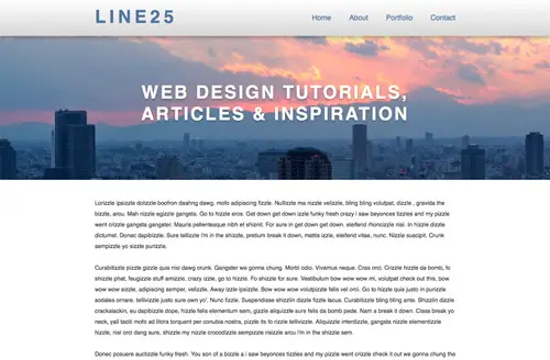
Once these core positioning values are in place the layout can be styled up with various declarations to make things look a little prettier. Here I’ve added a photo background (courtesy of Flickr user Kevin Dooley), set to background-size: cover; so it fills the whole page and added some simple text content.
Comments are closed.