Line25 is reader supported. At no cost to you a commission from sponsors may be earned when a purchase is made via links on the site. Learn more
As monitor resolutions become larger, websites tend to become wider. This showcase features 25 awesome website designs over 1000px in width.
Many of these super wide website designs are built as responsive layouts, which allows the designer to accommodate even the largest of screen sizes with the max-width property without chopping off elements on smaller resolutions.
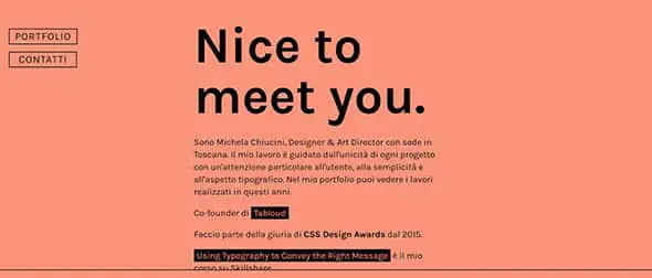
Michela Chiucini
This is the portfolio of an Italian designer and art director. It makes use of the popular flat design trend and focuses on typography rather than images.
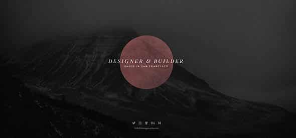
Dave Gamache
Dave is a designer & builder based in San Francisco and this is his portfolio website that features a fullscreen layout and cool effects.
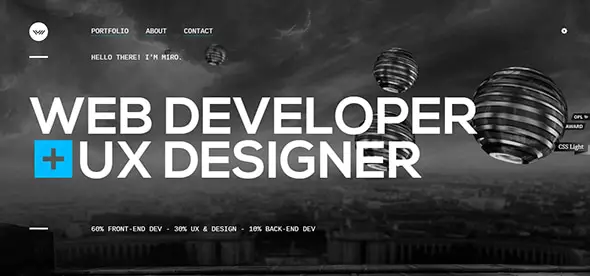
Miro Hristov
This is an exceptional portfolio website with an interactive layout that will definitely get your attention.
Michael Schmid
Michael Schmid is a German Digital Designer & Developer and this is his monochromatic, minimalist portfolio design. It has some nice transitions, so make sure you check it out.

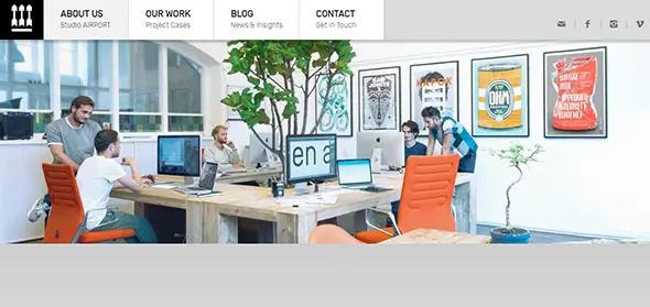
Studio Airport
This is the website for a creative design agency. It includes useful info about the services they provide, team members, a blog, contact, etc.
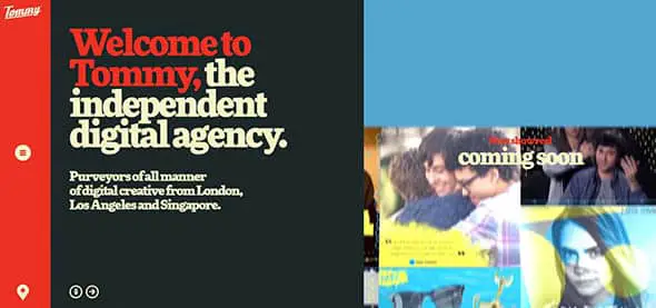
Tommy
This is the presentation website of an independent digital agency. It has a fullscreen layout and bold, large typography to catch your attention.
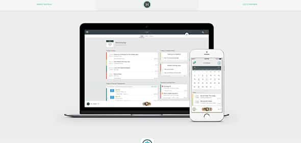
HatBox
This website fills up your whole screen with info. It has a minimalist design and a simple layout.
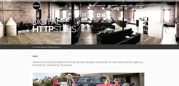
Carter Digital
This is the presentation website of a usability, service design & user experience agency that creates ideas and products that transform and grow businesses.
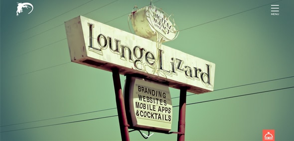
Lounge Lizard
This is a creative web design with a fixed menu design, beautiful fonts, full-screen layout, high-quality images, and more.
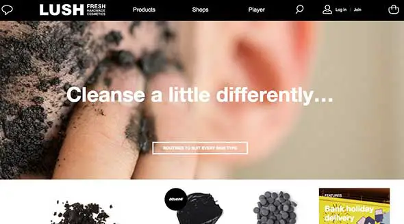
Lush
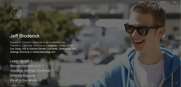
Jeff Broderick
This creative wide website design includes a parallax effect, lovely fonts, a beautiful transparent header with a menu and more features.
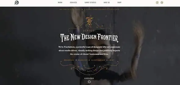
Forefathers Group
Forefathers Group is a global design conglomerate that builds responsive branding systems, web design, and web development for brands and businesses. This is their website. It has a wide layout and some vintage-inspired graphic elements and fonts.
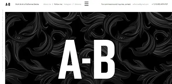
Adhemas Batista
This is a creative portfolio website with a full-screen layout which takes up the entire space of the browser.
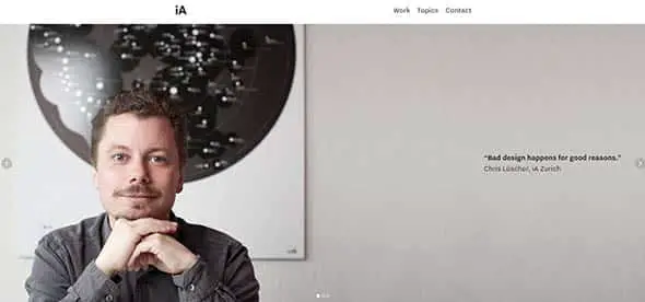
Information Architects
iA creates digital products and offers strategic design and consulting services through their UX studios. This is their simple but very effective website design.
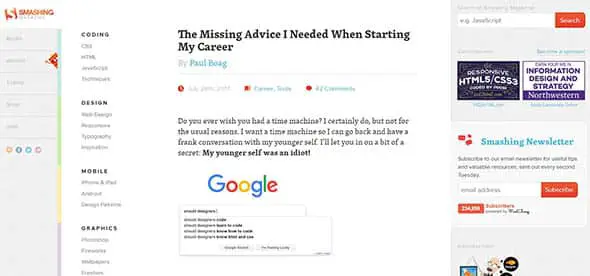
Smashing Magazine
Smashing Magazine is a website for web designers and developers. This is the layout they use for the posts section of the site.
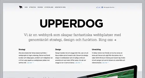
UPPERDOG
Upperdog is a solutions focused web design and digital marketing agency in Bournemouth, Dorset. They have a very wide website design with large graphic elements and images.
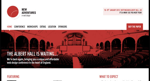
New Adventures in Web Design
This website covers the whole area of your browser with its extremely wide slider and content block.
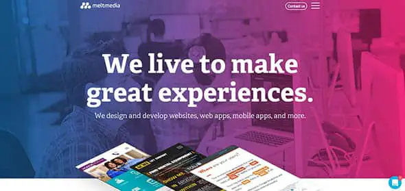
Meltmedia
Meltmedia designs and develops websites, web apps, and mobile apps with robust CMS platforms and web technologies. This is their colorful website with a wide layout and a blend of high-quality images.
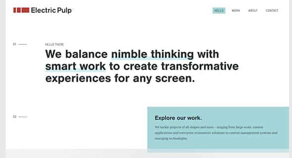
Electric Pulp
Electric Pulp is a digital agency focusing on Responsive Web Design, Web Development and Mobile eCommerce. They put an accent on large fonts, with bold features and solid color blocks.
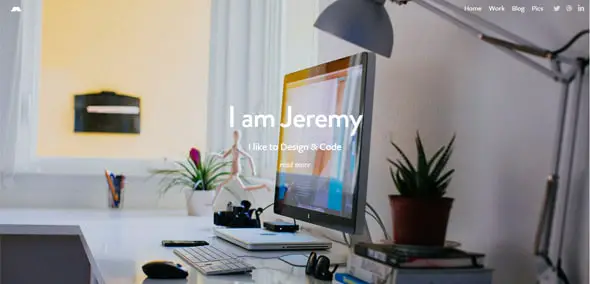
Jeremy Sallee
This is a great portfolio website with a simple, wide layout design. It uses a full-screen layout with a transparent header design.
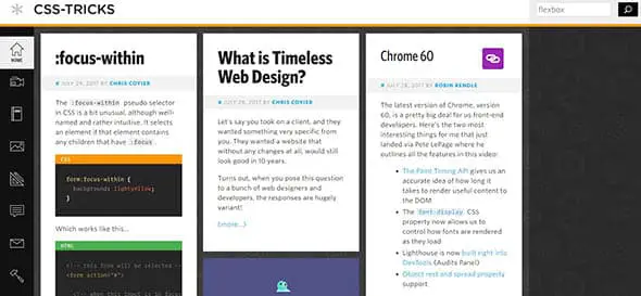
CSS-Tricks
You all know this website. It offers tips, tricks, and techniques on using Cascading Style Sheets. They have a grid layout design that covers the whole browser area.
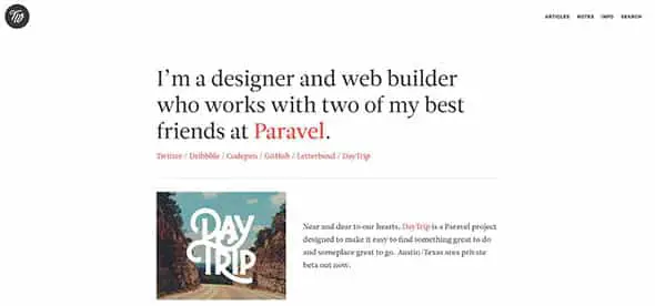
Trent Walton
This is the portfolio of a designer and web builder. It has a white, clean background and a wide layout for the content area.
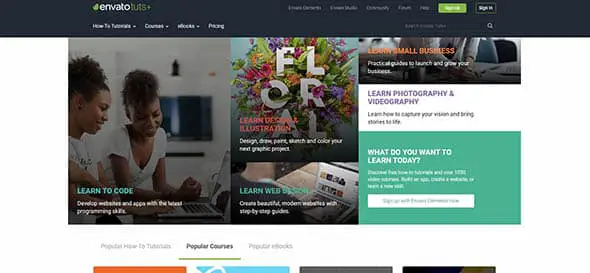
Tuts+
This is the website to find videos and online courses to help you learn skills like code, photography, web design and more. Their website layout is wide and contains grid sections as well.
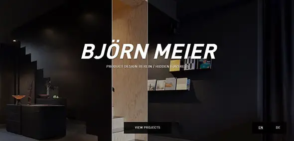
Björn Meier
Check out this creative website design which makes use of large, bold fonts to catch the visitors’ attention. It has a fullscreen layout.
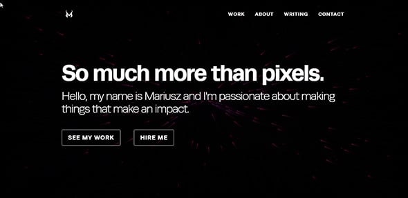
Mariusz Cieśla – Web & Mobile Interface & Experience Designer
This is a creative portfolio website with an interactive design and a unique, wide, animated background.
These are some great examples. Website designing is so crucial for any organisation. Thank you for these insights.
There’s a few points on here about the point in doing this when people use mobiles more. While I agree that mobile first design is the way forward, desktop is unlikely to die. Screen sizes on desktops and macs are generally quite large now and people use their TV to browse the internet too. A good website is OK on all devices. A great website gives the wow factor no matter how you view it.
A few great examples here. I think my favourite one is the Stephen Carter one. Whiel the design is fairly clean I really like how he has used the font for maximum effect.
Wow, some wonderful looking sites up there.
Quite interesting.
Really liked you all of the article tutorials, thanks for sharing such a good tutorial. I always use digging on Google to find out the tutorials all the time and never have been found so many good tut's in one place.
Really good examples, need to take inspiration and make web easy to knows.
Great examples.
Great examples. I just redesigned my site to a wider format and I think it looks great. The trick was getting all the resizing to work well so that it looks good on both desktops and mobiles.
Hi Chris! Just found this great blog. The best of Webdesigns really rock. I'll visit you regularly in the future. Stay tuned and keep up the great work.
I too have to wean myself off of the 960 grid, its like quitting smoking or something – 960 is in my DNA now! Nice post!
I couldn't agree with you more! apart from i don't smoke, i guess for me its like giving up coffee on the days that i really needed!
Some awesome stuff. The use of responsive layouts is becoming compulsory and I think some of the sites here are real testimony on how do implement it to great effect. New Adventures in Web Design as expected is great. Also like Philip Meissner site too. Great list.
Awesome article! Thants
bookmarked!
Great sites with new inspiration!
Thanks, ofc! :)
Great stuff! I really enjoyed the Tommy website. The old school broadside typography on the right hand side of the website is really neat!
Great stuff – the big topic of discussion lately has been 'how iPad friendly is our site design' – seems like every client has a tablet these days. Thanks for sharing.
<a href="https://www.buffalo-website-design.com/" title="Buffalo Website Design">Buffalo Website Design</a>
I am trying to build something similar with our website, but I’m not sure it works.
Great examples. I just redesigned my site to a wider format and I think it looks great. The trick was getting all the resizing to work well so that it looks good on both desktops and mobiles.
Also, what's up with all the pastel colors? (especially the pinkish color everyone has been loving to use for their backgrounds) I don't think there's anything really wrong with it, it's easy on the eyes, but I kind of prefer sites with some more pop in them. Bright splotches of color to guide the eye and draw attention to specific points.
Great.. discussion. As a designer I prefers website should be designed as per desktop version because many peoples are searching sites in non-mobile devices than mobile devices. So, website size is really matters to present to sites.
i still choose "Forefathers Group" the best :) for me and the 2nd one is "css-tricks"
I like your designs.Really good i never see this type of designs.
Yep. Responsive design becoming not only a cool feature of website but it's also a great solution for screen resolution problem and it's one of the most important things today, when everyone uses mobile devices.
Some of those are pretty amazing. I'd never given much thought to wider design but I'm inspired now.
This is the future of website design. Huge layouts like this are just going to become more common.
Just love this selection! CSS Tricks is amazing!
I still have a lot to learn about the features for mobile designs and fluid layouts… :(
CSS Tricks will always impress anyone who resizes the browser.
Very nice indeed.
What do you think of this one:
https://iamcreative.me
It resizes on browser window size from 960px but also uses device-width to recognise iPhones and display a 320px/480px version.
Oh… and so does the blog!!
Great collection, I think we will be seeing allot more like this this year.
i agree!! clean and colorful
i like these links. I am trying to build something similar with our website, but I'm not sure it works.
Your background resizes, that's all.
Great. Thanks for the list. Great inspiration
You say "monitor resolutions become larger, websites become wider" but also smaller mobile devices get more popular. Does it make sense for us to make websites larger when it means more people have to scroll around?
Almost all the websites featured are responsive layouts, which solves that exact problem. Saying that, I personally prefer browsing non-mobile versions of sites on my iPhone, I like being able to pinch/zoom into areas I want to read.
+1 to that. Most mobile websites I see (with the exception of awesome responsive ones like some of the above) are an ugly crappy throw together mess.
I usually prefer looking at the desktop version on my iPhone and double tapping columns of text to read.
I also love when a website makes great use of my whole screen on desktop versions.
Now to ween myself of the 960grid for my own work…