Line25 is reader supported. At no cost to you a commission from sponsors may be earned when a purchase is made via links on the site. Learn more
Successful digital marketing is when all the aspects of your website and your online presence are correctly aligned. Your PPC ads, if you choose to use them, are effective, and your SEO is on point. But, if you don’t have a well-crafted landing page, then you are in for failure. And eventually, your business can suffer. You are required to have a flawless landing page in all the possible perspectives and aspects. A useful landing page is enough to keep your users and visitors engaged and convert them. Here, we have made a list of things that you should not do while designing landing page. Let us take a look at each of them.
1. Not creating a mobile version:

Mobile is a large portion of running marketing strategies and campaigns successfully. No one should overlook the significance of creating a mobile version of their landing page or website. Yet, sometimes, the landing pages are either wholly missed or are not designed perfectly enough to catch the user’s attention and keep them engaged. The designers find the perfect parallax scrolling or the right theme for the landing page. This landing page looks good on the desktop, but what about the landing page’s mobile version?
You realize that when you check the mobile version of the same page, the parallax scrolling doesn’t function well or is not an available tool to use because of the small screen. It may or may not take a lot of time to load, which also hurts your website’s reputation. There is a misnomer that desktop is where the customers place an online order. People these days, especially independent youngsters, place on order through a mobile phone. They want the world at their fingertips on their mobile phone. Hence, it is crucial to understand that if it doesn’t work on mobiles, then having an immaculate desktop version is useless. Designing landing page requires you to take mobile versions into serious consideration.
2. More load time:
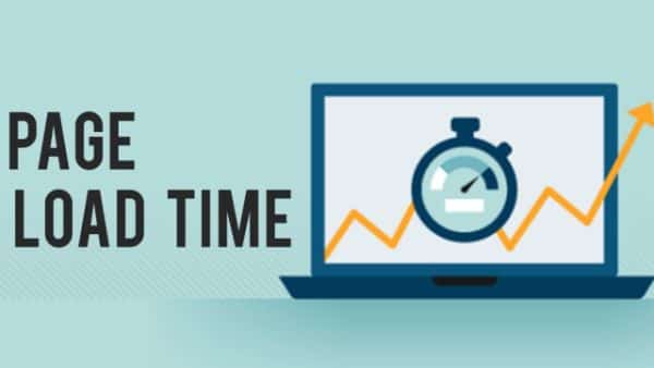
We all know how irritating it can get when dealing with a landing page that doesn’t open up on time. The load time of any web page can impact the business’s performance on digital platforms. Around 70% of the people leave the page because it took a lot of time to load. The time taken by a webpage to open up entirely so that the user can interact with its UI elements is called Load time. And when the users find that the page takes up a lot of time to open up, they leave the page instantly. This is called the bounce rate.
Ideally, your landing page should open in not more than 4 seconds. You lose a lot of potential traffic when your landing page is slow to load than your rival websites. Yes, the layout and the content of the page can take up some time to show up. But you should always make sure that the load time of your web page is the least. Therefore, it is of no use that you expect a lot of traffic when your landing page takes a lot of time to load on all the devices.
3. Absence of a clean design:
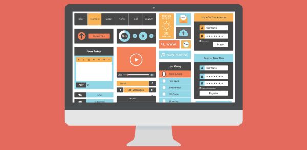
Nobody likes a landing page where there is a lot of clutter, and you don’t know how to go about the page and find a specific thing you are looking for. An ideal landing page is enough to provide information about your business. Moreover, it is sufficient to keep its visitors engaged and encourage other visitors. This is the only purpose of a landing page. Hence, there should not be anything more on the landing page that serves something that does not align with its mission. If you don’t want to overwhelm your web page visitors, keep the information less. In addition to that, you should also keep the UI elements clutter-free.
The navigation of the website should also be precise and immaculate and easy to understand and work with. You are not supposed to put long-form content on the landing page. Instead, the pointers should serve the purpose effectively in guiding the visitors through the funnel. The information that you put in the user’s first line of vision can either make or break your business. Moreover, a lot of content can be placed at the bottom of the landing page, where a user can scroll and read. You can keep the content to a minimum by using pointers, images, or videos to guide a user. A word of caution here should be that video should not make the page slow, and the video should be clickable. Don’t make it mandatory for the visitor to watch the video else the user is bound to bounce off your landing page.
4. Poorly defined headlines:
Ideally, a useful landing page should have an energetic and engaging header or a headline that would interest a user in reading and browsing further. It should be able to explain why the website provides value to the user and in what possible ways. The user should be able to understand why he should invest his time and money on the site. These all factors decide the success of the landing page, and eventually your business. So many landing pages use a strong headline and then explain that with a subheader. This gives your visitor a chance to understand whatever message is, that you want to convey. According to a study, you get eight or fewer seconds to convey or convince the user why they should invest their time and money in your business.
Moreover, if your headline is not up to the mark, the user won’t make an effort to read further or browse it. And you should consider the headline on the webpage, similar to the headlines in the newspaper. It should be catchy and should encourage a user to dig further. Moreover, the headline should be sharp and attention-striking to engage the user with your landing page and eventually, your website. From an SEO point of view, the headline should have practical terms that the crawlers can index. Hence it is better to write “we deal in IT services” rather than “welcome to our landing page.” Therefore, craft catchy yet meaningful headlines that would not hurt SEO rating as well as your landing page traffic.
5. Using pointless content on the page:
The biggest mistake you can make while designing landing page is to have content that does not align with your landing page’s purpose. We all have been to the landing pages with some images or sponsored content that does not serve any purpose, not even the basic one on the landing page. Moreover, the user gets distracted with such content and may also feel useless to browse the landing page if the content is meaningless.
The landing page should be such that it should the user should feel a connection with the page. And the irrelevant content fails to do this for your user. Hence, instead of using meaningless content, you should use images, videos, or text that explains your business. This can engage your user and is bound to create more of the user traffic for your website.
6. Not paying attention to the layout:
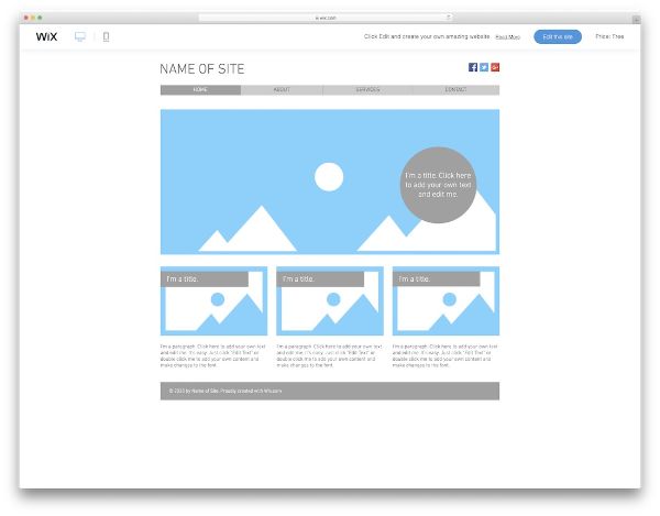
A great layout is one of the key factors behind the success of a website. We all understand that an excellent looking website always gains the attention of a user. But a landing page with a bad layout, turns off a user, no matter how fast it loads or how good your site is. The layout of a web page includes its UI components and the content’s arrangement on the page. As we previously saw that a cluttered design is of no use, when you are working for designing landing page, this holds the same here too.
You can have meaningful content along with a lousy layout. But what’s the point of it? Hence, you should always make sure that the page layout is well designed to arrange your content. The content could be anything, including images, videos, or inbound links. But the way you present the content on the landing page, in the form of its layout, decides how the landing page appears to the users. Based on that, the user may choose to delve further or bounce off the page.
7. Target Specificity:

When you are working with designing a landing page, you should only have one point in mind – to convert your users and visitors into loyal customers. This can happen only when you have the information on the landing page that is to the point. Moreover, a compelling call to action should be your target for the landing page. You should know which CTAs you should include on the landing page that can turn your visitors to customers.
If you put up a lot of CTAs on the landing page, the users and the visitors tend to get confused and turn your user off. This can lead to a high bounce rate with the passage of time and can hurt your SEO ratings on the Search Engine Results Page. Hence, you should have your users focus only on one CTA that drives your users to turn them into customers. This can increase your landing page’s conversion rate. Don’t put information on the landing page that is for general purpose. Instead, be specific when it comes to handling your landing page. The specificity increases page engagement with your users and visitors.
8. Not being attentive to the forms:
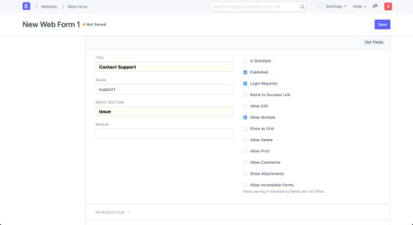
Web forms are the point of interaction of a customer with your business and your brand. Your website should contain web forms where you can collect the customer’s information or let them interact with you through the web forms. Hence, it is an essential part of your landing page. To make your customers fill up the forms, you should have a stunningly designed web form. Initially, the web forms were plainly in black and white themes, and the users did not bother with that kind of design. But with time, users have started looking for visually appealing web forms.
Therefore, you should have a web form that has an appealing design. In addition to this, you should only collect the information that is required. You should not have too many fields for the customer to fill-up the form. The other thing that you should always remember is, stay away from creating complicated web forms. An intricate web form is one where the user doesn’t understand a particular part of the form. Hence, he ends up filling the wrong information in the form. So, the bottom line is, you should have a web form that has a good design, along with the simplicity of it.
9. No readability with the content:
There have been so many websites that purely focus on the content and the layout of the website. But the designers often forget to pay attention to the readability of the content on the landing page. The designers pay so much attention to having a clean design of the page that the readability of the textual content is ignored. When designing landing page, the text has to be legible. When a user lands on your landing page, he tends to read the textual content you put up on the page. But, the text is readable if the font color and the background color work in tandem. Anyone can read black fonts on the white background, and hence the readability here is more. But if you put an orange background and the fonts in red, I don’t need to tell you that the readability factor is eradicated. And when such an issue is encountered, the user doesn’t even bother reading the content. He simply goes to another website and bounces off your landing page.
The same thing happens when you have an image as a background that has more opacity, and then the text becomes difficult to read. This can cause a lot of readability issues. Using images in the background is in the trend right now, but it is pointless if it doesn’t enhance readability in any way. Hence, readability always comes first when you are putting the textual content on the landing page.
Conclusion:
A landing page is the most critical part of any website, and it decides whether the people visiting it, convert successfully. So, a poorly designed landing page can hurt your business reputation online as well as in real. Hence, if you follow the above-given points when designing landing page, you should be able to create a successful landing page. A successful landing page is one that converts the visitor to a customer without any hassles.