Line25 is reader supported. At no cost to you a commission from sponsors may be earned when a purchase is made via links on the site. Learn more
Just as much as the website design is a crucial part of your business, designing a web form is important too. What people don’t know is that the process, much crucial information about the users is gatherable with the help of well-designed website forms. It makes the process of understanding your clientele easier and more efficient.
Essentially, the whole process is a win-win situation for both sides. But sadly, not many people have the basic knowledge of designing a web form. An effective web form is aesthetically pleasing and yet serves the purpose of creation. While designing a website, web forms are often the last bit to work on. But that shouldn’t be the case since web forms are a great strategy to pull out information of the client and study the analytics of the situation as well. It is the most frequent interaction of the user with the website.
While most of the people are unaware of what a web form is, we would like to share the basics, as well as the, don’t do’s of web form design. But before jumping into what should be kept in mind while designing the forms, let us try to understand their importance. Web forms can be in various forms – check out forms, registration forms, pop-ups, etc., here is what website forms are.
What are Website Forms?
To put it in simple words, a website form is a type of online supplement that requires the input from the user’s end. Just like a necessary document that we fill out for all official purposes, a web form requires for the users to put in particular details that might be crucial to access the website. Many businesses willingly chose to input website forms on their websites to make sure they receive data about the customers and build a database that could profit them in the longer run.
In simple words, a web form is an extension for web development. To make things easier, PHP web development also offers a framework for the development purposes that can be a foundation to build web forms, pages as well as full websites. So to say, it is always an option to hire PHP web developers to help you design forms in case you wish to more professional and technically sound with the development.
Based on the elementary concept of designing easy and efficient web forms, it is essential to keep track of what are the don’ts in the process. While designing a web form might be a simple task, to make it technically sound, some points have to be kept in mind. In this article, we’ll go through these don’ts and sum up for what makes a good web form.
1. Information overload:

It is a simple thing to keep in mind that everybody’s time is super valuable. To be wasting it by answering irrelevant and unnecessary questions. If a minimum of two fields (say, for example, name and email address) is required for a particular set, do not overburden the form with telephone number, address and fields which might not be necessary. Instead, use something called progressive profiling. This ensures that you add multiple questions after the customer or user has been through the website form more than a couple of times.
Make sure the way of asking for information isn’t misleading either. A user shouldn’t feel like he or she is only interrogated for marketing purposes. They should feel like being a part of the system, and this is done using intriguing catchphrases. In case you are filing a request for a budget or a quote, you can start by asking questions that relate to the challenges, timelines as well as expectations before asking last name or address.
2. Label Placement:

It is a given that you must ensure the form field labels are correctly placed. This way the customers aren’t misled or confused as what information is needed. Left-aligned labels are a hassle to keep up for users after they begin finishing up with a form.
Most phone devices can zoom in on the field once the user starts to type, which in return hides out all the labels that align on the left. This method makes sure that the user zooms out every time they need to move to the next input.
A more reliable solution is to use responsive queries that align the labels to the top on mobile and yet right-aligned on the view for desktop. This also is a try in the direction of making the labels bold to ensure more prominence over the input fields.
3. Placeholders are the new Labels!
“Placeholder” attribute is a new addition to the input fields given by HTML5. This ensures a small hint as to the expected value or amount of field. The placeholder text is pre-coded in the field before a user tries to enter authentic information. It disappears when a user starts to type in the value.
This technique is now widely used by many web designers. It helps eliminate labels and make placeholders as the new labels in the input fields. This method ensures clean designs, but it does leave a considerate amount of sacrifice on the user experience.
Placeholders are a liability in situations where a user becomes unsure of the value, method or format that had to be entered. For reviewing the placeholder text, the user can only do so by refreshing the page. This results in losing all the entered data. It becomes a tedious and recurring process that guarantees the loss of attention from the user and eventually, drives users away.
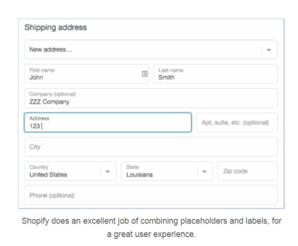
One compromise to overcome the issue is to hide the labels (using CSS). Also only show them after the user makes one of the input fields active. For example, Shopify is one such platform that provides a solution to this issue. It hides labels and then allows the users to see them once a particular input field is live.
4. Layout and Spacing:

An excellent visual flow is necessary to provide ample space around fields and sections. This makes the design cleaner and more understandable. Grouping also matters a lot when designing website forms. It helps to make sure you have sections in the form that ensure easy readability. They make the forms more responsive.
For example, first and last name can be grouped with a phone number, email address as well as address under a standard heading “Contact Information”. This gives a proper context to the fields that have is requested and highlight the urgency of the label. To organize the form in a better manner, make use of dotted lines or solid lines. This would help separate the various headings and groups from labels.
A two-column layout for a form is always a good option. This works in a tricky way; in a sense, you can add all the labels and input fields on the left and the clickable submit buttons on the right side. This shall ensure that people don’t miss out on information that had to be filled out and submitted by looking at the second column. Furthermore, the buttons can be colour-coded to make it easier to spot the fields that are left to fill.
5. Error Messages and Misleading Validation:
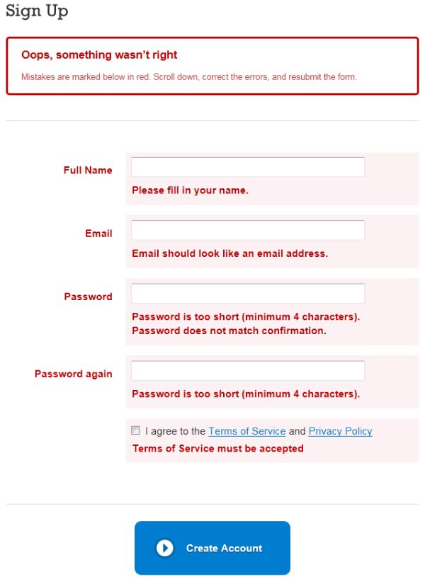
Coming across frequent errors might hurt or frustrate the users. An error might occur when the user might forget to fill a particular field. Moreover, they might fill the wrong format of information into the input fields. For example, an email address instead of a phone number.
To make sure this issue is fought rightly, display error message around the input field so that the user is aware of the fact that there has been some mistake on their part of the submission. Use star marks, or colours, lines and borders to highlight the error fields to avoid any kind of unhappy users. Make sure to have a suggestion in the field area describing why the input is incorrect and what a correct entry might look like.
6. Captchas:
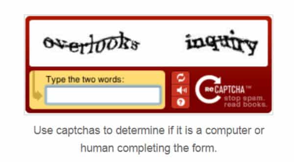
Form spam is a frustrating affairfor website forms. They can also result in reporting of lead generation. A smooth, convenient way to combat this is using captcha or a device that determines if a human or computer is filling the form.
Sometimes, captchas are confusing for the users to solve, or might be ignored. So make sure only to put them to use if you know your website is going to receive a considerable amount of form spam. Also, to ensure smooth and more accessibility, make sure to provide the options of refreshing or playing the audio file of words.
“Honeypot” is another way to combat form spam. This method makes sure that there is a hidden field that can only be filled in by spambots. What makes it more thrilling is that it makes sure the spambot does not get through the completion of the field!
7. Success Messages and confirmations:

To make sure the person doesn’t feel disengaged it is inevitable to give in an instant reply or feedback. This helps acknowledge their effort to fill out the website forms. You can make things more reassuring by addressing an email to the user with the information submitted to tally the info as well as keep a copy of the submission.
It is a useful practice to provide a time limit within which a person can get in contact with the user. This ensures that the user isn’t left hanging without any assurance of form receiving.
8. The form can’t be annoying!

The style that makes a web form says a lot about the people who design it. While a floral style could make it more feminine, a dark layout could also make things dull. Since a web form should be inviting enough to catch a person’s attention. It should make them want to sign up for it. The design needs to be in a way that does not put off the users. It cannot be impersonal or distant from the message that the web page is supposed to convey.
A web form should be a more indulging process for both the user as well as the designer.
Errors that need to be Avoided
To sum up the article, here are a few pointers that should be avoided while designing website forms:
- If you are using an auto-fill option, try not to use the auto-advance option. The auto-advance option ensures that the cursor automatically advanced to the next field upon pressing the enter key. Most of the users aren’t used to this feature. They would want to fight it to fill the field according to their pace.
- Make sure you do not design a form that has low readability or is confusing to get through. Try to organize the form in a way that sorts things out for the users.
- Never upload a web form without making sure you test it.
- A form needs to be optimized for phones as well. When approaching this step, make sure to optimize your form for every device.
A webform is a crucial element of a website, a magnet that helps in lead generation. It helps apps and websites to reach a target conversation rate that helps them to stay in business.
Designing web forms has never been an easy job, as there are tons of factors to be sure about. As a web designer, it is your responsibility to make be cautious about every minute detail. Make sure to consider the things that you shouldn’t do to create a form that attracts attention.
Comments are closed.