Line25 is reader supported. At no cost to you a commission from sponsors may be earned when a purchase is made via links on the site. Learn more
In case you didn’t know, Squarespace is a SaaS-based content management system (CMS) which is composed of a website builder, blogging platform and hosting service.
Using it, you can create blogs, galleries, commerce and more. Pages, galleries, blogs, e-commerce, domains, hosting, analytics, 24/7 support, you have all of it in one place.
Most Squarespace designs are minimalist and that’s one reason they are so popular. They are stripped naked of eye candy and fancy colors or effects, leaving the underlying structure exposed. Simplicity makes them beautiful. The key to a beautiful minimalist site is also a solid and structured layout, as well as focus on stylish and well-designed typography and these examples have these characteristics.
So, we decided to gather here in this post, 22 inspiring Squarespace website designs, so you can see what this platform is capable of, in case you want to use it yourself. These beautiful and clean website designs were created using Squarespace. Here they are!
PaperMakeStack
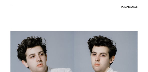
Justin Gorman is the creative director of Instrument and editor of Familiar and this is his portfolio website. You can listen to some of his music or scroll through his journal. The site has a minimalist and elegant design which can be a great starting point for future web projects.
The Welsh House
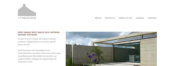
On The Welsh House website, you’ll find an amazing gallery of refurbished Carmarthenshire cottages. You can even rent some of them.
Finnish Cultural Institute in New York
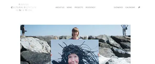
The Finnish Cultural Institute in New York aims at creating a dialogue between creative arts such as design, architecture and contemporary art in both Finnish and American culture. The website looks nice, it has a white background and a minimalist design.
The DO Lectures
Exactly how many awesome things are you able to do? surely there’s plenty you didn’t know you could! The Do Lectures is basically an encouragement network and on this website, you’ll find inspirational talks from passionate and creative people. You can definitely find your inspiration in both web design and their videos.
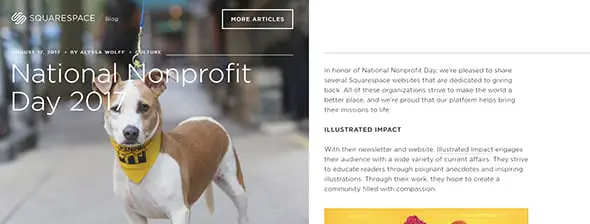
Squarespace — Blog
This is the Squarespace Blog on which you’ll find various articles about what you can do on Squarespace. This blog has a sensitive way of presenting its information to its readers through web design.
Squarespace — Mobile Apps
If you are looking forward to using Squarespace to promote your product here’s a great example. Squarespace has introduced a new suite of iOS apps designed to capture and showcase all your ideas.
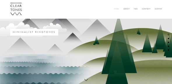
Clear Tones
The Clean Tones is a Squarespace website which presents different minimalist ringtones. The website looks really nice. It uses several horizontal bands with illustrations. The ringtones are divided into categories: classic, organic and much more.
Tudor Watch
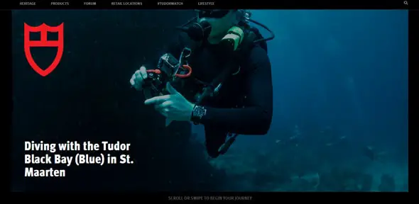
Check out Hodinkee’s Tudor dive watches in action on this Squarespace website. This website can be a great source of inspiration if you’re working on a magazine website, for example, or if you’re looking for an effective way to present your product’s features.
Olly Moss
Olly Moss website uses a modular grid layout. Olly Moss is an English graphic designer who is famous for his posters, especially the Harry Potter ones. On this website, you’ll find all the posters he’s ever created.
The Car Crush
If you have a crush for cars then you might have just found the perfect website. The Car Crush website greets you with a large and representative image. If you’ll keep scrolling you will notice the minimalist design and a blog layout.
Universal Art
Universal Art is an amazing app which will guide you in museums and galleries. It’ll help you experience and discover each piece of art you’ll be visiting. The website keeps it simple and minimal, it has a large image in its header followed by a white background and plenty screenshots of the app.
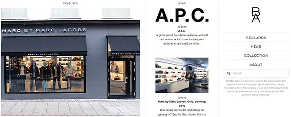
Blender Agency
Have a look at this amazing Squarespace website. This website is a good example of an innovative minimalist design! Blender Agency is one of the most popular high-end and contemporary high-street fashion brand and this website presents their collections, news, and features.
New Yorke
Neue Yorke is the journal and portfolio website of Davy Rudolph. Neue Yorke is also a really nice Squarespace website. a has an unique and minimalist design, with a vertical gradient menu bar and a modular grid layout.
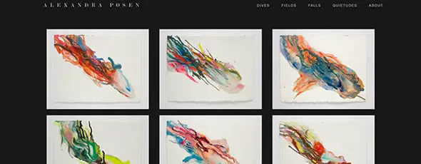
Alexandra Posen
Negative space helps you better organize graphics, keeping a clear space between each element. This way, your website has an increased readability, allowing your users to quickly navigate through it. Your visitors will be automatically guided throughout your design, to all the main focus areas, thanks to the clutter-free layout. Alexandra Posen’s website is a great example on how to use negative space masterfully. She is a very talented painter with some impressive artwork. You can see her works on her Squarespace portfolio website.
Mario Hugo
And if you want to get to know more talented artists have a look at Mario Hugo’s website and get inspired from it.
Derek Boateng
It’s not a bad thing to have a large amount of negative space. Some may think that a lot of content, lots of images, text, more features will improve the overall design but, in fact, it does the exact opposite. See how clean this design looks! This website has a really nice flat design, which is quite trendy nowadays. It presents Derek Boateng’s work. He is an interactive designer and art director with more than 10 years of experience.
Big Human
We love this visually balanced website. It has a balance between the elements on the website which makes the content very clear. This company is obsessed with digital products and this is their portfolio website. It uses a modular grid layout with large thumbnail images. The website looks modern and eye-catching at it can be a great source of inspiration for future projects.
Mike McQuade
Having the perfect amount of negative space into your designs is a technique that you master over time. It’s important not to overdo it with large empty areas, as well as not to keep your web elements too crowded. See this perfect example! Mike McQuade is yet another talented illustrator working for the New York Times Magazine. On his website, you’ll find a showcase of all his works.
Active Schools
Active Schools is a Squarespace website which aims at increasing movement and physical education activities in schools. The website greets you with a really nice photo of kids playing, large typography and two buttons in case you want to join their movement or participate in a challenge.
Darrin Higgins
Darrin Higgins’ work focuses on product design, web design, UI and UX, branding, illustration and much more. On his website, you’ll see more of all the things he likes creating.
Salty
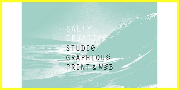
Salty is a creative studio with a really nice website. The first thing a visitor sees in probably the yellow frame that continues all the way down to the footer and gives the website a friendly vibe. Keep scrolling to check out this studio’s works and get inspired.
Daniel Benneworth-Gray
Last but not least, Daniel Benneworth-Gray’s website is yet another great example of a Squarespace website with a clean and minimalist design. His work focuses on book design and you’ll find some of his projects on this website.










Designs of all these websites are very beautiful and amazing. Thanks for sharing!
Fabulous designs. Thanks for sharing