Line25 is reader supported. At no cost to you a commission from sponsors may be earned when a purchase is made via links on the site. Learn more
Website viewers don’t pay a great deal of attention to the structure of a design or what goes into the planning. They aren’t aware of the many ingredients, the complexity of the mix or the thought that goes into it.
Instead, they explore the end result. They are aware of how they feel when they use a site and this is about it.
Good design is always invisible and it is reflected in your User Experience. When your user enjoys a site, it will become a destination of choice.
On the other hand, users often abandon their shopping carts because they feel uncomfortable or frustrated.
If your user experience is not enjoyable, you also won’t encourage viewers to return.
User experience is often subliminal. If a user can navigate a site easily, it loads quickly, and information is broken up into manageable chunks, your user is likely to have a positive experience.
However, there are many situations which will frustrate your user and cause him to abandon the site.
As a result, it is helpful for designers to explore User Experience. User Experience is different to the User Interface, where your viewer will engage with your platform.
User Experience relates to the impression your user forms of your site, and how it works for him. This impression often determines how long users stay onsite, and whether they will return.
Although your user will get an overall feel of your site, an awesome user experience (UX) depends on some great ingredients. These helpful hints will assist you to great a great UX.
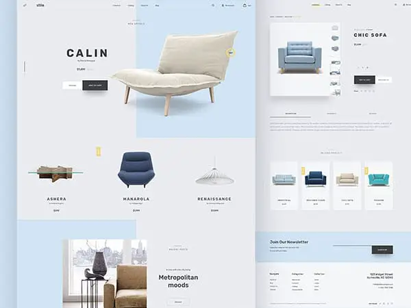
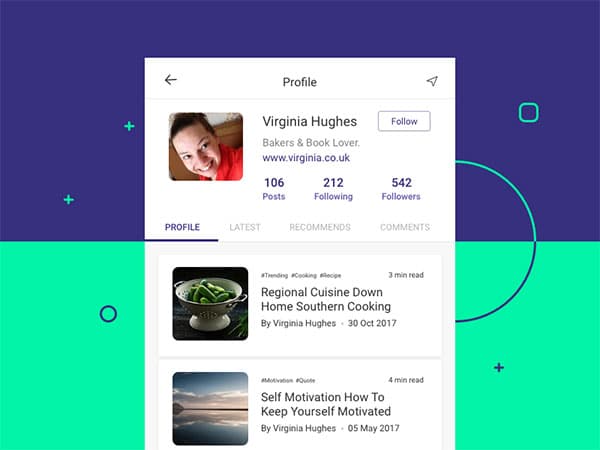
Although very simple, your navigation tabs play a crucial role in assisting your viewer to search your site effectively. Without knowing where to go, your viewer will abandon your site.
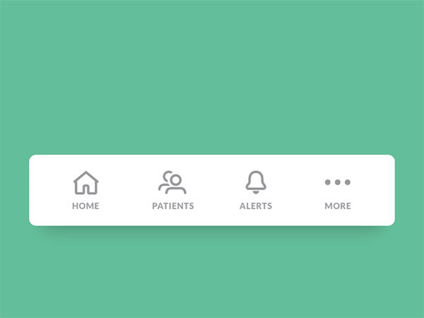
Arrange your navigation tabs around any subcategories which work best for you and your viewer. Once your viewer is able to find the way around your site, he will be able to acquire what he needs.
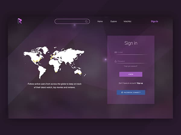
Registration
When your viewers access your site, they may not always wish to register at first. Lazy registration allows your viewer to browse your site first. Not all viewers will register with your site, but those who do will often become more engaged.
Once your viewer has engaged, he will be more likely to make a purchase, which is what you ultimately want.
Breadcrumbs
Your breadcrumbs leave a trail for your viewer Home>Women’s Wear>Shoes>Sandals assist your viewer with where he is on the site.
They will also show him where to return or backtrack without beginning again from the home page.
Creating breadcrumbs will therefore prevent your viewer from getting lost on your site.
Dividing up your results
If your viewer is looking for a category of products to choose from, you don’t want to overwhelm him. You will also want your page to download quickly. One way to do this is to divide your results up into various pages.
If your viewer searches for sneakers, for example, you could show your results over 10 pages, giving your viewer your full selection in small chunks. Your viewer can then add favorites to a wish list. This effective technique is known as pagination.
Ask your customers to vote on your site
Customers are generally happy to share what they like with you, so if you add a ‘vote to promote’ box to your site, you will be sure to increase customer engagement.
Your customer will be able to share any thoughts with you simply by clicking on your screen. This takes a lot less effort than filling out a comments form.
Vote to promote boxes are often present on news sites or community based websites, but you could easily include them on an e-commerce site too.
Readers use their mobile devices
Mobile devices are intensely personal. Users are therefore using their devices to browse the internet. Instead of the old internet model, where placing items on the top of the screen was crucial, users now look for responsive designs.
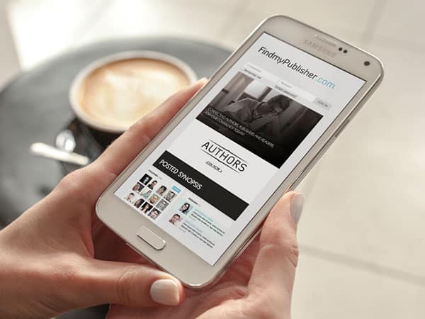
If you’d like to know whether your users are coming to your site through a mobile device, check your Google analytics stats.
If you have a high number of mobile device users, ensure that your site is responsive (or that you have a useful app) and a good mobile navigation so that your users can find what they want and make purchases easily.
Users don’t read all your content
When people access your site, they will be looking for content which is relevant to them. You can show your users information available on your site by using headings and subheadings.
This gives your user the opportunity to scan through your content without having to read through huge amounts of information. By scanning subheadings, your user will be able to read only those parts which interest him/her.
Along with headings and subheadings, you can make your site more attractive by dividing your information into bullet points. Short paragraphs will assist you to keep your information attractive to viewers.
Your viewers are impatient
Internet viewers will bounce of your site if they don’t find what they are looking for rationally quickly. As a result you will need to present your information in tiny chunks.
Write a great introduction which gets straight to the point and keep all important information in the earliest part of your content.
Viewers who remain interested can always scroll down for more.
Keep your site clear and simple
Your users enjoy a clean, clear website which won’t overwhelm them. As a designer, you therefore need to work with white space.
When your content is presented in small chunks, with a clear order, your viewers will see your site as easy to understand. Use white space between your paragraphs.
This will help you to create a hierarchy, where you’re most important information is presented first.
Your use of white space will prevent your viewers from feeling overloaded. It will also make your content easy to read.
Work towards creating flows
As a designer, it is so easy to look at elements of a design without taking the larger user experience into account. Page design often captures the designer’s attention before the greater experience or flow.
However, our users follow specific patterns or ways of accessing information. These flows need to be supported by our overall web designs. Keeping our end user in mind is the biggest priority or goal when it comes to site design.
When designing a site, we need to consider how to get users to convert into clients. This means creating a positive user experience.
We therefore need to optimize our designs towards a great UX. This is beneficial to both business owners and site viewers.
Keep your site well organized
As explained earlier, most clients battle with chaos, information overload and a cluttered site. In order to reduce this, keep your copy organized into clear sections.
When your site copy is organized into a clear package, it will make it easier for users to enjoy browsing your site.
Keep your thoughts well organized: If you are speaking of summer fashion and offering your user some helpful tips, don’t allow yourself to drift into winter designs. Stick to summer. Make your points clearly and concisely. Your user will then be able to follow.
Visual organization: When your text is clearly formatted with headings and bullet points your user will grasp immediately what you are saying.
Keep your text blocks clear, concise and legible.
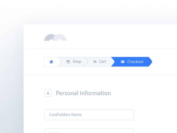
Progress Bar
When your user has elected to make a purchase, this purchase should be easy to make. Users abandon their purchases when they have to take part in a complex payment process.
However, if your payment plan takes time, it is often helpful to show your user how far they are progressing in the process.
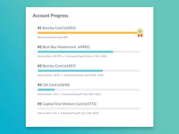
A progress bar guides your user through the payment plan. This helps your user to see that they are actually making way, and that the end result is close.
Allow your viewer to scroll
Even though dividing up information is helpful for viewers, enables your site to download quickly and prevents overwhelm, it is often helpful to introduce infinite scrolling to your site.
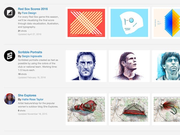
Infinite scrolling means that your page will load one set of data. When this data comes to an end, the next set will load. This is often useful for product pages. It can also be used to show new elements of a portfolio.
This way your viewer is able to select how much information they wish to browse on your site.
Ending thoughts
When you design your site with your visitor in mind, you will keep your viewer engaged. This will lower the bounce rate on your site. It will also increase your conversion rate.
When you know your audience and how they behave you can design your site around this. This will increase the effectiveness of your site.