Line25 is reader supported. At no cost to you a commission from sponsors may be earned when a purchase is made via links on the site. Learn more
Color is the silent language of design. The right palette can evoke emotions, create harmony, and transform a good design into an unforgettable experience. Color palettes are essential in defining the mood and impact of any design, whether graphic art, interior design, or branding. A right combination of colors can evoke emotions, tell a story, and create an impression.
Vibrant tropical hues, soothing pastels, and so much more—the list goes on when it comes to the perfect palette. In this guide, we’ll explore 10 popular color palettes that are currently trending, each with its own unique vibe and aesthetic.Whether you’re aiming for a bold and energetic look or a calm and minimalist feel, these palettes offer something for every design style and project.
Here are 10 popular and trendy color palettes that are widely used in design and art:
1. Pastel Paradise
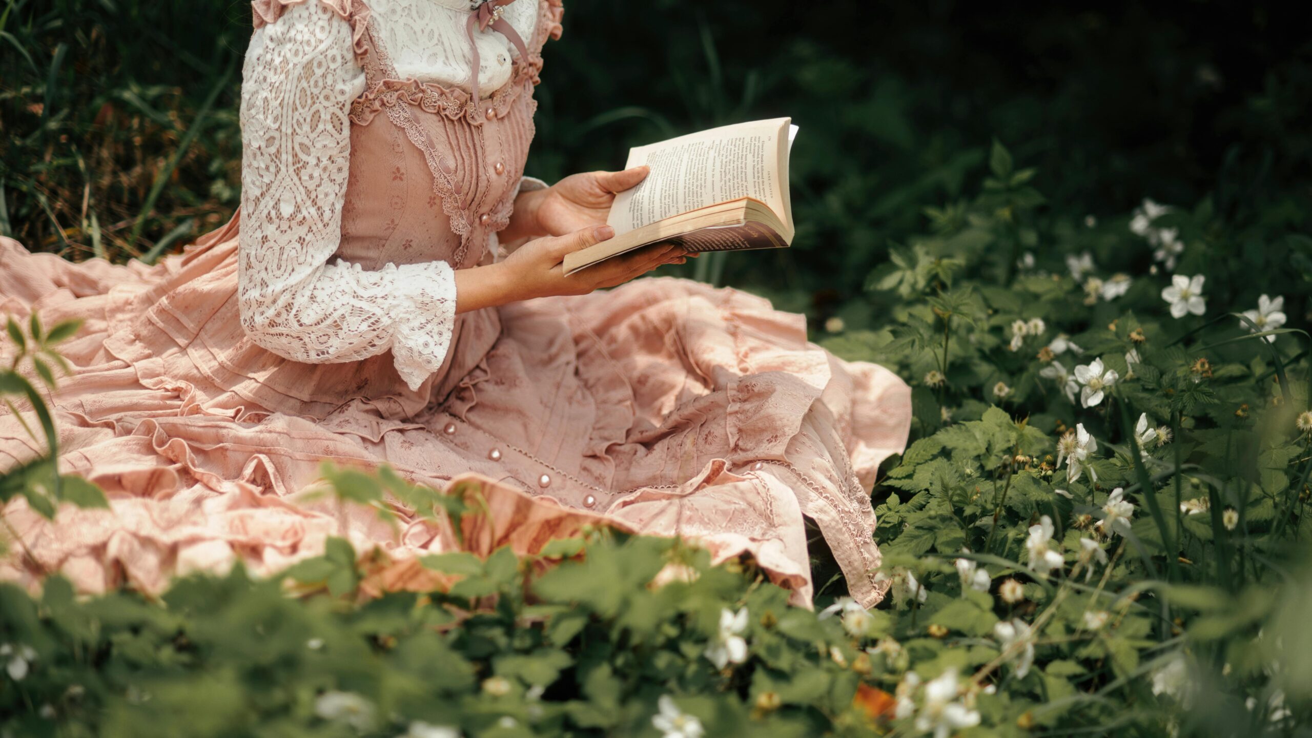
Pastel Paradise is a dreamy color palette that blends soft mint green, blush pink, lavender, pale yellow, and sky blue to create a soothing, gentle aesthetic that whispers of spring mornings and delicate emotions. A soothing palette that brings a sense of calm and gentle sophistication.
Colors: Soft mint green, blush pink, lavender, pale yellow, sky blue
Best For: Wellness brands, spring collections, minimalist designs
Impressive Presentation Folder Designs to Inspire You Complete Guide HERE!
2. Modern Monochrome
Modern Monochrome is a sleek color palette of charcoal, silver, white, light gray, and deep black that embodies sophistication through nuanced grayscale tones and minimalist elegance. Timeless and professional, with nuanced depth and elegance
Colors: Charcoal gray, silver, white, light gray, deep black
Best For: Tech interfaces, corporate branding, luxury packaging
3. Earthy Naturals
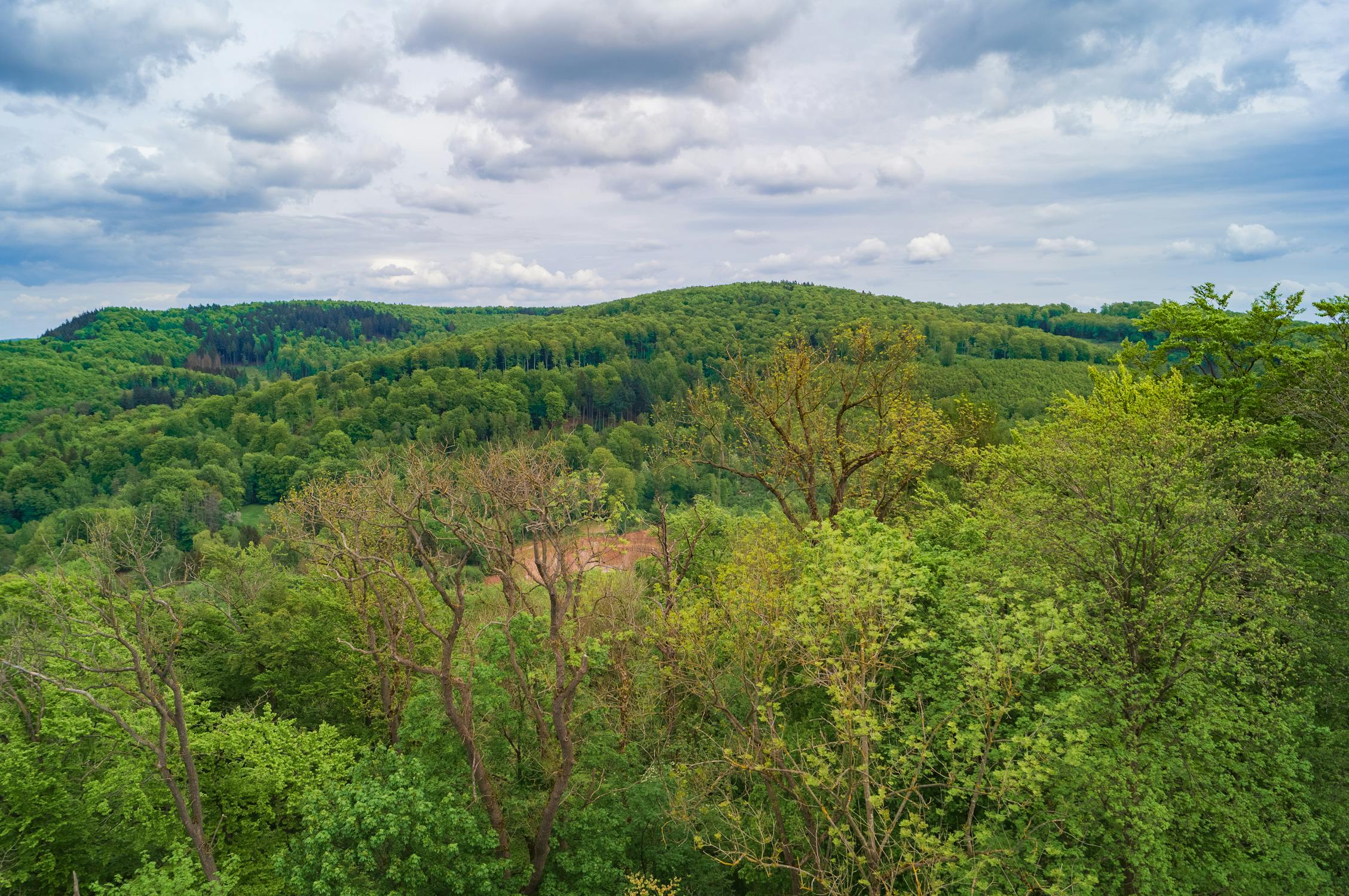
Earthy Naturals is a grounding color palette of terracotta, sage green, warm beige, deep brown, and muted olive that celebrates the raw, organic beauty of natural landscapes. Connects design with the grounding elements of the natural world.
Colors: Terracotta, sage green, warm beige, deep brown, muted olive
Best For: Sustainable brands, interior design, eco-friendly packaging
4. Retro Sunset
Retro Sunset is a vibrant color palette of burnt orange, mustard yellow, deep burgundy, coral, and dusty rose that channels the warm, nostalgic spirit of 1970s design.
Colors: Burnt orange, mustard yellow, deep burgundy, coral, dusty rose
Best For: Vintage-inspired graphics, nostalgic branding, creative portfolios
5. Ocean Depths
Ocean Depths is a maritime-inspired color palette of navy blue, teal, seafoam green, deep turquoise, and white that captures the serene and powerful essence of marine environments. Evokes the serene and powerful essence of marine environments.
Colors: Navy blue, teal, seafoam green, deep turquoise, white
Best For: Maritime brands, travel websites, environmental campaigns.
6. Vibrant Tropics
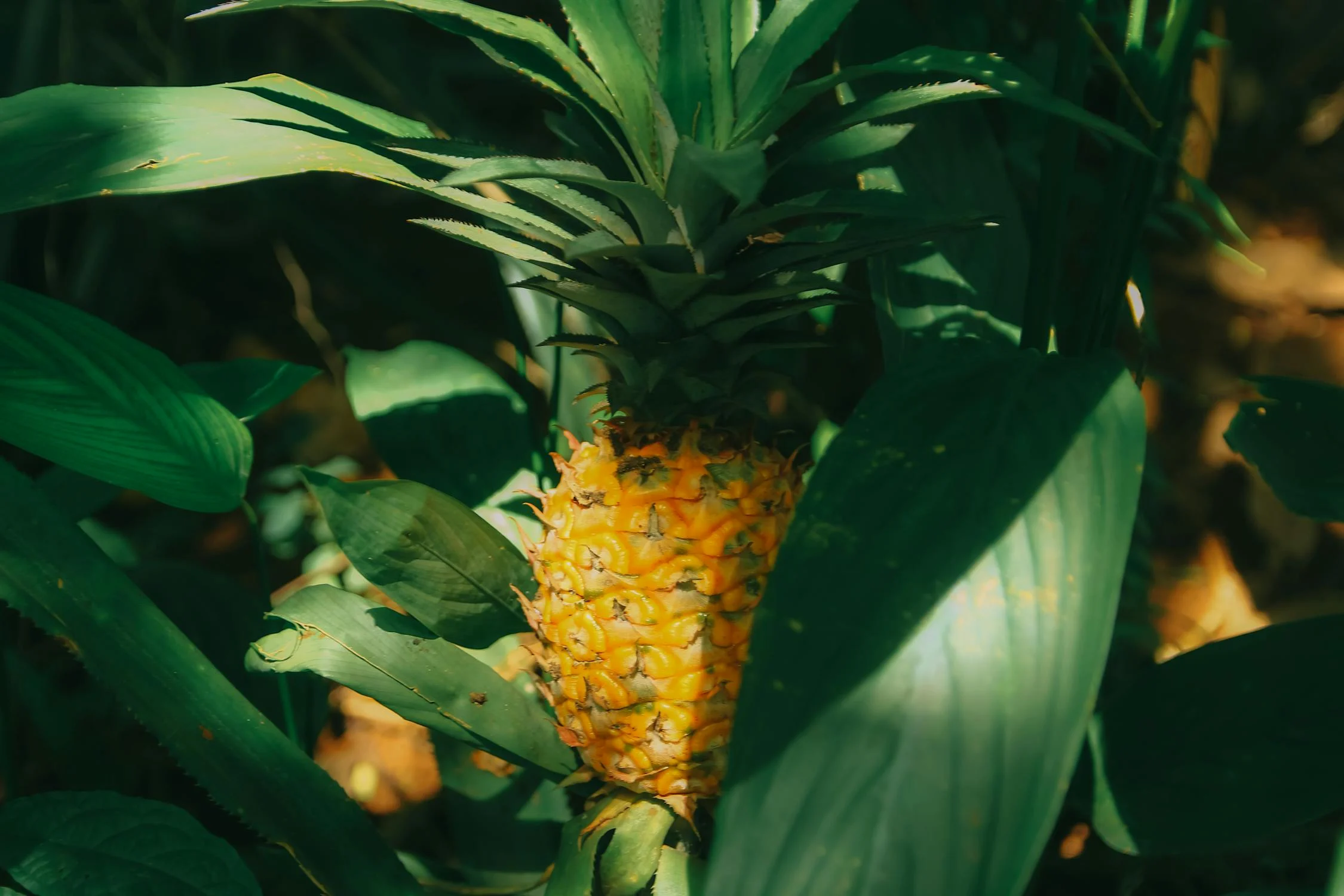
Vibrant Tropics is an electrifying color palette of bright yellow, electric blue, vivid green, hot pink, and tangerine that bursts with energy and celebrates unbridled creativity. Energetic and playful, radiating pure joy and excitement.
Colors: Bright yellow, electric blue, vivid green, hot pink, tangerine
Best For: Festival branding, youth-oriented designs, summer campaigns
7. Minimalist Neutrals
Minimalist Neutrals is a sophisticated color palette of cream, taupe, light gray, soft white, and warm beige that embodies understated elegance and refined simplicity. Sophisticated and understated, allowing design elements to breathe.
Colors: Cream, taupe, light gray, soft white, warm beige
Best For: Luxury fashion, wellness apps, contemporary architecture
8. Electric Neon
Electric Neon is a high-voltage color palette of neon green, hot pink, electric blue, acid yellow, and bright purple that electrifies design with its intense, rebellious spirit. Bold and unapologetic, demands immediate attention.
Colors: Neon green, hot pink, electric blue, acid yellow, bright purple
Best For: Gaming branding, tech startups, music festival posters
9. Soft Scandinavian
Soft Scandinavian is a delicate color palette of pale blue, light gray, white, dusty pink, and muted mint that captures the essence of Nordic design’s minimalist and serene approach. Embodies simplicity, cleanliness, and understated elegance.
Colors: Pale blue, light gray, white, dusty pink, muted mint
Best For: Lifestyle blogs, minimalist websites, Nordic-inspired design
10. Desert Sunset
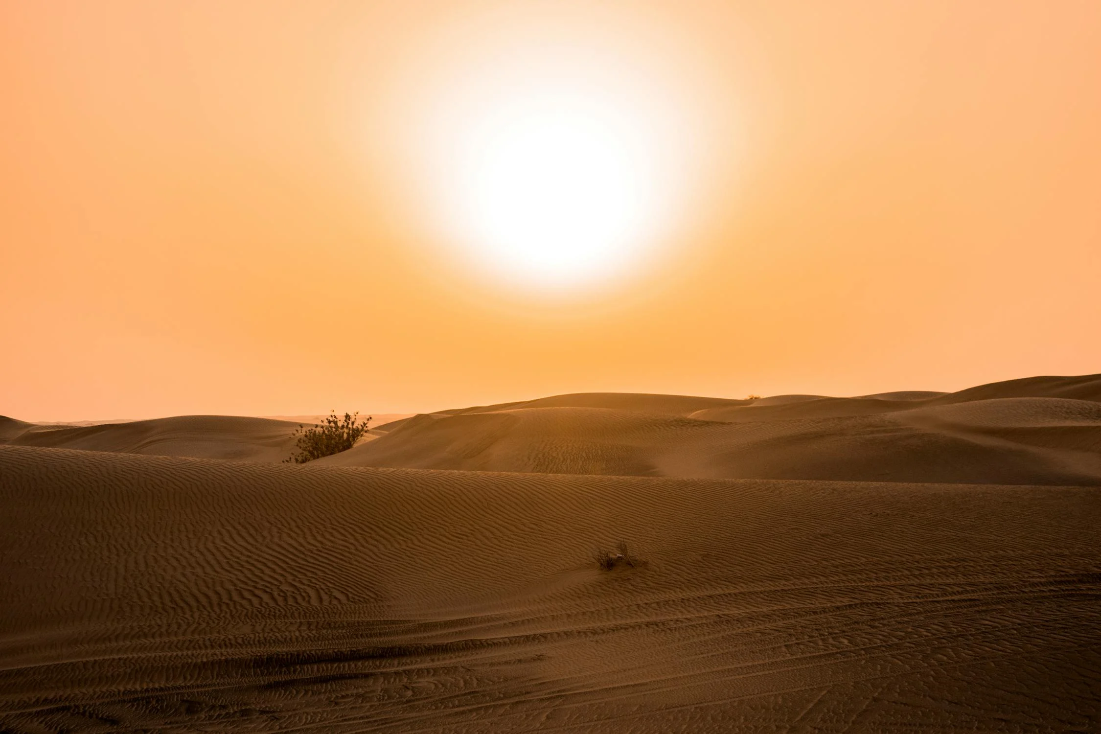
Desert Sunset is a warm color palette of sand beige, rust red, dusty orange, warm brown, and pale yellow that reflects the magical, transformative light of dusk in arid landscapes. Captures the magical transition of desert landscapes at dusk.
Colors: Sand beige, rust red, dusty orange, warm brown, pale yellow
Best For: Bohemian branding, travel photography, artisan products
Tips for Using Color Palettes
Context is Key: A palette that works for a tech startup might feel completely wrong for a children’s book.
Accessibility Matters: Always check color contrast for readability.
Psychological Impact: Different colors trigger different emotional responses.
These palettes can be adapted to suit various creative projects, whether you’re designing a website, creating artwork, or decorating a space.
Conclusion
Selecting the right color palette is essential in creating designs that resonate with your audience and convey the intended message. Whether you opt for the warmth of earth tones, the vibrancy of neon shades, or the timeless elegance of monochrome schemes, the possibilities are endless. By understanding the emotional and visual impact of different colors, you can craft a look that is not only visually appealing but also aligns with the mood or theme of your project. Experiment with these popular palettes to find the perfect match for your next creative endeavor!
Common Questions about top 10 Popular Color Palettes
- Black and white. A top “color” combination. …
- Leaf green and Yellow. This eye-catching color palette is a classic choice for health brands as these shades suggest freshness.
- Purple and yellow. …
- Orange and white. …
- Baby pink and blue. …
- Pink and grey. …
- Pink and black. …
- Cool greys and blues.
Gen-Z yellow (a bright and sunny color) was seen as being labeled as the next trend that will rival millennial pink. Similar to how Millennial Pink gained popularity, Gen Z today has its own set of preferred colors, with Cyber Lime and Digital Lavender taking the spotlight.
- Monochromatic Color Palette. A monochromatic color palette uses only one hue for its color scheme. …
- Analogous Color Palette. …
- Complementary Color Palette. …
- Triadic Color Palette. …
- Split-Complementary Color Palette. …
- Tetradic Color Palette. …
- Square Color Palette.
The Pantone Color Institute has picked Peach Fuzz as their color of the year for 2024. It’s a fantastic standout color on its own, and it also works well with different shades of pink for a soft color palette. Nostalgia is making a comeback with vintage pastel colors and softer tones.
During a recent study at the University of Maryland, sociologist Philip Cohen asked nearly 2,000 men and women a simple question: “What’s your favorite color?” Blue turned out to be most popular across the board, followed by green for men and purple for women.
