Line25 is reader supported. At no cost to you a commission from sponsors may be earned when a purchase is made via links on the site. Learn more
As most of you know, Wix is a website builder that has helped millions of people create beautiful websites without writing or knowing a single line of code. In fact, Wix has been used to create websites by more than 80 million people in 180 countries (yes, this is not a typo). That should speak volumes about the quality of Wix’s platform.
But to make things even better, Wix has constantly been improving their platform, adding features like parallax scrolling, video backgrounds, and much more. Wix’s newly revamped website editor is quite hard to beat. In this article, we are going to summarize the features that the New Wix Editor has. So let us go ahead and take a look at what Wix is capable of:
► Editors Note
There have been some significant changes and updates to Wix since this article was published in 2016, and worth looking at how advanced their Editor and site-building capabilities are now in 2021. Wix is most definitely a leader in web design and site-building platforms. I don’t think you’ll be disappointed when heading over to see the New Wix Editor features, benefits, and amazing design features they provide.
Strips
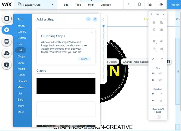
What’s that, some of you may ask? When you’re creating a website, you want to control everything as much as possible, down to the smallest detail. You also want to be able to quickly add and re-arrange elements on your page. Strips is Wix’s way of giving users control over horizontal sections on their website, making website building and editing a breeze. It’s like having your own section splitter built-in, that lets you slice up the web page’s real estate section by section, in any way you like. Each strip can contain anything you want – HTML, video, photos, text, and more. They can even be parallax strips if you want. You can also re-arrange your strips at any time with ease. Take a look below to see just how easy it is to add a strip using Wix:
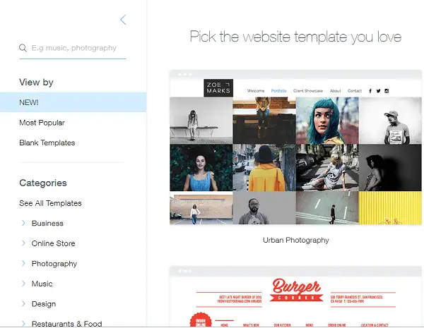
First, I am going to create an account by entering email and password – as easy as that. Next, I am asked to choose my website template, so I am going to choose a Portfolio template as an example. It should be noted that there are a total of 33 beautiful portfolios & CV templates to choose from at the time of writing this article.
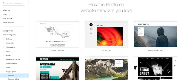
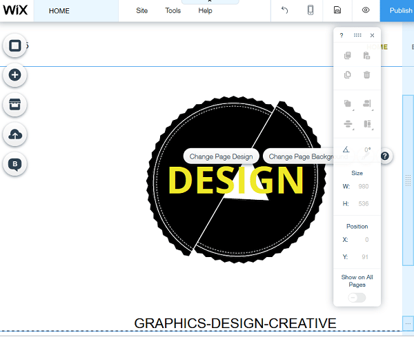
Once I chose the template, I am taken inside the new editor where all the magic happens. My initial thoughts about the editor are that everything is laid out and organized neatly, allowing me to access any section I want without spending too much time trying to find things.
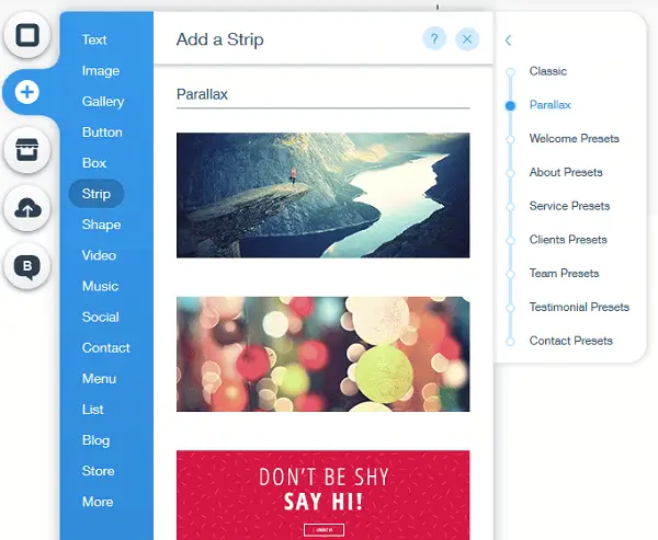
To add a strip, simply click on the + button, and choose “Strip” from the elements option.
Adding Videos
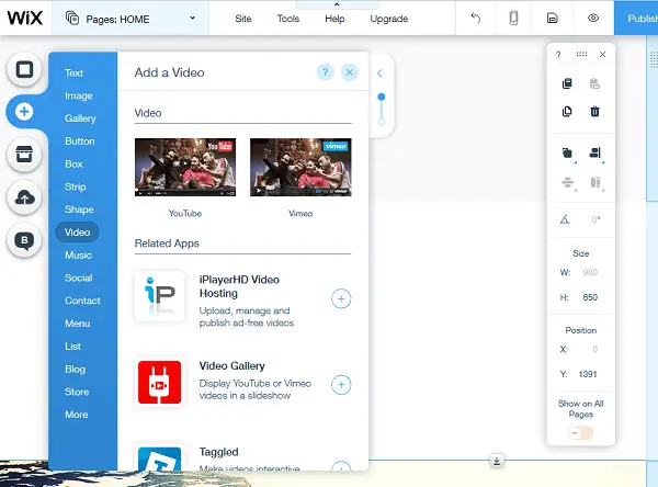
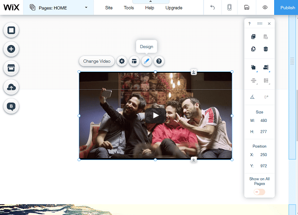
Adding videos has never been easier than with the new Wix Editor. You can add videos quickly, and even as a website background in parallax mode. To add a video simply click on Add > Video part and then choose the video you want to add. You can also change various video settings such as styling, size, placement and more.
Parallax Scrolling
We love parallax scrolling. Parallax scrolling means the background image is moving at a slower speed than the foreground, creating a 3D effect in the eyes of the visitor. Adding parallax scrolling to your site using the new Wix Editor takes under 1 minute. Simply add a strip to your site and specify that it should be in parallax style.
Countless Templates
What good would a website builder be if it didn’t have a nearly unlimited number of built-in, responsive templates? Wix has all of that and more. You can choose from many beautiful templates from a number of categories such as business, online store, photography, music, design, restaurants & food, accommodation, events, portfolio & CV, blog, health & wellness, fashion & beauty, community & education, creative arts, landing pages or simply view newest or most popular templates. If you like to create things from scratch, you have that option too by starting with a blank template and customizing it fully from the start.
Plus much more
But this isn’t all. Wix also has a number of other awesome features such as:
- pinning elements to the screen. This is an often overlooked but extremely useful feature that everyone should take advantage of. When you have a website with an important element, let’s say for example you want people to contact you for a quote, then it’s in your best interest to pin the Contact Us button to the page, making it as easy as possible for the visitor to find the button and click it. The more obstacles you give to the visitor, the lower your conversion rates will be. Wix allows you to pin any element, helping you make your website’s goals easily achievable.
- anchors menu. Anchors menu is Wix’s way of allowing you to put HTML links to take users from one section of the page to another section on the same page. So for example, if you’re creating a parallax website with all content one 1 page, you can create menu anchors for “Portfolio”, “Contact Us”, “Testimonials” etc. Even if you aren’t creating a 1 page website, you can still take advantage of the anchor’s feature by creating anchors for specific things on the page, such as “read more” and anything else.
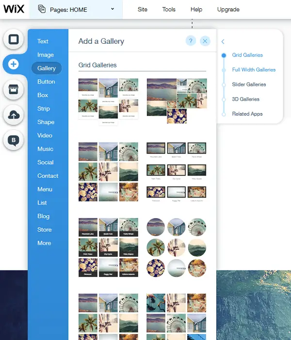
- dozen of gallery styles. You can choose gallery styles such as masonry, collage, portrait grid, framed grid, rounded grid, chic grid, floating grid, honeycomb and many other beautiful gallery styles. You can even add full-width galleries with sliders.
- buttons. The buttons section contains a number of beautiful call-to-action buttons, as well as icons, a custom PayPal “buy it now” button, and many more.
- boxes. Here you have the option to add a number of differently styled boxes and ribbons, to be used as you wish on your website.
- various shapes. The shapes section contains a lot of different icons, shapes, ornaments, lines, and more.
- lists. Here you can choose lists such as top stories, testimonials, product lists (if you’re creating an eCommerce site), team members, music-related lists, and others.
- and much, much more
Conclusion
If you’re looking to create a beautiful, mobile-friendly, and optimized website with an easy-to-use editor, Wix will be pretty hard to beat. With so many options available, it can be hard to determine sometimes where you would get the most value in a website-building platform. Wix has been around for a very long term and serves millions around the globe. Reputation and credibility are always good to look at before choosing and Wix definitely has both. There is a great benefit to seeing what they can offer you in your quest for design perfection.

I’m trying to redesign an old website of mine to make it responsive. No matter what I do, I can’t get the new Editor – I keep just being taken back to the old one. It’s driving me mad. I go through the process of updating all my sites (I only have three) to the new Editor – and nothing happens. It looks as though I will have to delete/unpublish my old site and start all over again.
Wix is easy to use especially to end users who doesn’t know how to code using HTML. this app or plugin help them a lot in creating their dream website for their store.
There are some great tools for businesses who need to create a DIY site. However, businesses that want to create a valuable, lasting brand should always engage a reputable firm to help them become the digital leader in their industry.
Amazing set of sites, however with Wix there is no fully control over what you do, web designers are still in demand for sure!
Wix is required to create a profile in an introductory course for Mass Media at my university. The instructors believe it is easy to use and is great for students who need a simple portfolio or a way to display their photography. Some students purchase actual plans, others simply only use it for the class and forget about it. Overall, I don’t see anything extremely terrible with it. Although, I do suggest if you are wanting to promote yourself as a web designer, you should definitely create your own site from scratch.