Line25 is reader supported. At no cost to you a commission from sponsors may be earned when a purchase is made via links on the site. Learn more
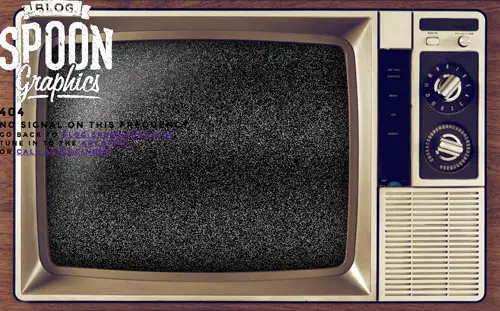
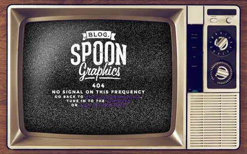
I’m currently working through a redesign of my SpoonGraphics blog and wanted to create something fancy for its 404 page. I decided to have a go at coding up a full screen retro TV screen filled with animated static noise, upon which I could display the usual 404 text and relevant links. Follow the step by step design process of the final 404 page and learn how a bunch of clever little CSS tricks helped transform the idea into reality.
The 404 page idea I had in mind was a retro TV screen that filled the user’s viewport. I also wanted some animated static noise as a background for the screen upon which I could lay up the usual “file not found” text. Being a fluid design that filled the screen meant there were some responsive issues that needed addressing to make sure the content scaled in relation to the background TV image.
View the TV screen 404 page demo
Prepare the images in Photoshop
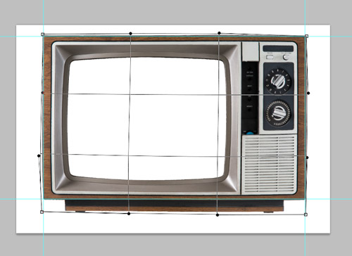
The first step in creating the TV screen 404 page is to source an image of a TV to use as a large background image. I found this photo of a retro TV set on ThinkStock. Open it up in Photoshop, clip it out then began Warping the edges so the outline is perfectly straight.
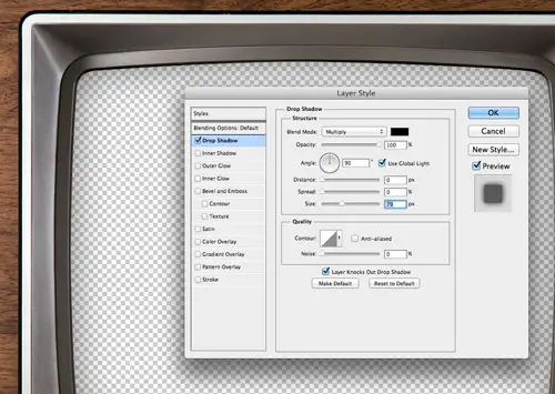
Once the image is cropped to size and the screen removed a Drop Shadow adds nice touch of depth and realism to retain that curved screen appearance.
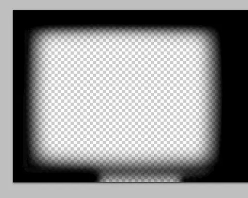
Right click on the Drop Shadow effect in the Layers palette and select Create Layer. Use a brush to fill the outer edges with black, leaving just the main screen area transparent.
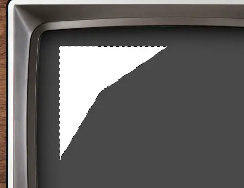
Roughly draw a triangular reflection on a new layer with the Polygonal Lasso tool and fill it with white.
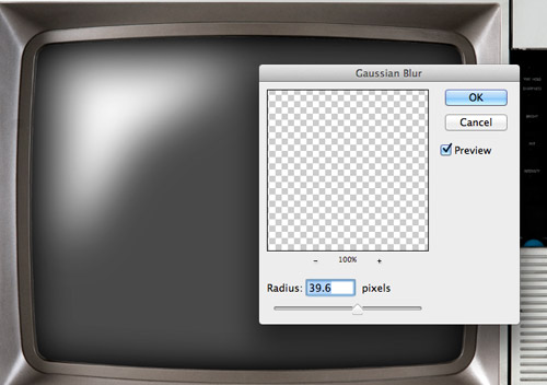
Add a Gaussian Blur to remove the hard edges and create a more realistic highlight.
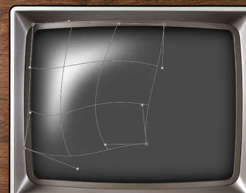
Press CMD+T to Transform, right click and select Warp then morph the shape to match the contours of the screen.
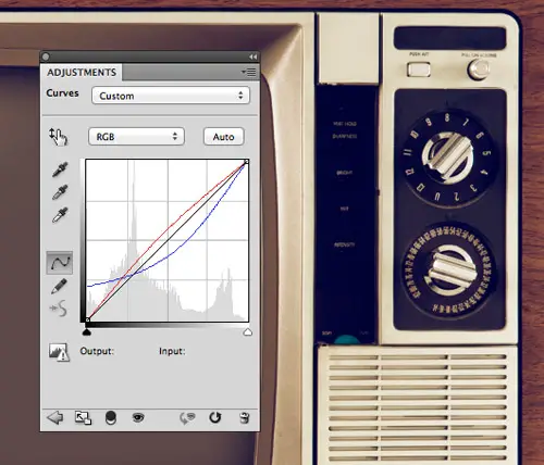
Add a new Curves Adjustment Layer and adjust the Red and Blue channel curve profiles. Add a slight bend to the Red channel, then increase the shadows in the Blue channel and bend the line in the opposite direction. This adds a cool retro photo effect to the image.
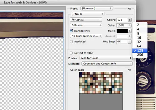
It’s going to be tough balancing between quality and file size in order to achieve a nice looking full screen background image. I chose a 1400px width for the image, which is large enough not to look too fuzzy when scaled up to fill higher resolutions, but at this size the file size is still going to be pretty hefty. The image requires some kind of transparency to allow the screen to remain see-through. The highlight and shadows require alpha transparency to work but a PNG-24 is waaaaaay too large. Toggle off those layers to export just the TV set as a PNG-8. A PNG-8 is still pretty big but you can get away with reducing the colours to achieve a small-ish file size and decent image quality. Don’t forget to also change the Matte colour to black.
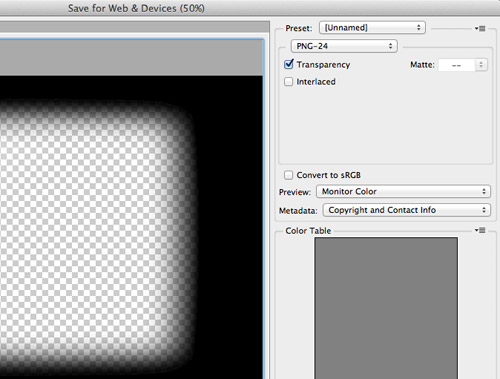
Toggle off the TV layers leaving just the shadow and highlight. This layer of the design can actually be scaled down to save a few hundred KB’s. Resize the image to around 600px then export it as a PNG-24 with alpha transparency. When it’s scaled up to the full screen size with CSS there won’t be a noticeable loss of quality.
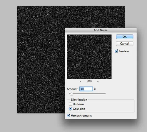
Next we need to create an animated gif (remember those?!) for the static noise. Create a 500x500px Photoshop document and fill a new layer with black. Add a Noise filter to create a static effect.
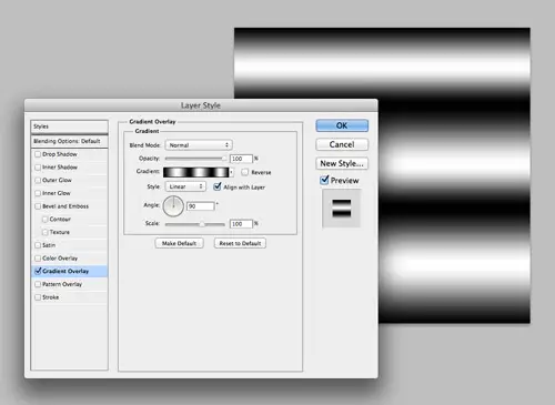
Create another new layer and add a Gradient Overlay with multiple black/white stripes. Change both the gradient and the layer to Soft Light to produce a scan lines effect.
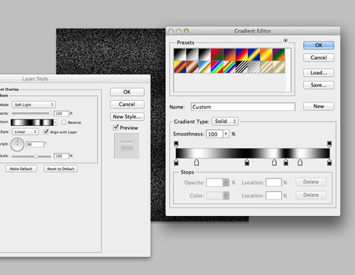
Repeat the process of creating a noise layer followed by a gradient layer, until you have around 5 individual groups. Each Noise filter will be random, but make sure the gradient stops are in slightly different positions on each individual layer.
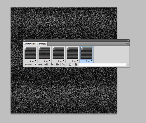
Turn off the visibility on all layers then open up the Animation palette. Create a new frame then turn on a group of layers. Add a new frame then turn off the previous layers and turn on two new layers to create the next stage of the animation. Repeat the process for all the groups of layers.
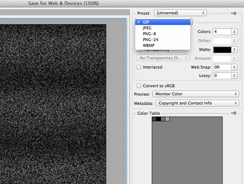
Export the file as a Gif to retain the animation. A few KB’s can be squeezed out of this one by cropping the image down to half its width and reducing the number of colours to 4. It will still tile perfectly and less colours will just mean more contrast with less midtones between the black and white speckles.
Create the HTML structure
<!DOCTYPE html>
<html>
<head>
<meta charset="utf-8" />
<title>404</title>

<link href="style.css" rel="stylesheet" />

<link href='https://fonts.googleapis.com/css?family=Montserrat:700' rel='stylesheet' type='text/css'>

</head>
<body>

<div id="tv">
 	<div id="content">
		<a href="https://blog.spoongraphics.co.uk" id="logo"><img src="images/spoon-logo.png" alt="Blog.SpoonGraphics" /></a>
 		<h1>404</h1>
 		<h2><span>No signal</span> on this frequency</h2>
 		<p>Go back to <a href="https://blog.spoongraphics.co.uk">Blog.SpoonGraphics</a>,<br/> tune in to the <a href="https://blog.spoongraphics.co.uk/archives">Archives</a><br/> or <a href="https://blog.spoongraphics.co.uk/contact">call an Engineer</a></p>
 	</div>
</div>

</body>
</html>
Create a HTML file and begin constructing the basic layout of the page with various HTML elements. All that’s required is a div named “tv” to provide a hook for the TV set background images, then a separate div to keep the textual content together.
Style it up with CSS
body {
	background-color: #000;
	background-image: url(images/static.gif);
	font-family: 'Montserrat', sans-serif; text-transform: uppercase; letter-spacing: 0.3em;
	font-size: 62.5%;
}

body, html, div {
	height: 100%;
}

#tv {
	background-image: url(images/tv.png), url(images/shading.png);
	background-size: 100% 100%;
}
The first step in the CSS file is to layer up those three background images. The static noise needs to go in first, so that is added to the body. Multiple background images can be used to add the TV and shading images to the TV div. For some reason the second background is placed underneath the first one in the multiple backgrounds syntax, so that’s the order they need adding to the CSS! There’s two important declarations here: background-size: 100% 100%; makes sure the images fill the screen, but more importantly stretch to each edge so no background static can be seen. The cover value does a similar job, but retains the image ratio. Next, to make sure the images stretch to fill the page vertically as well as horizontally the div, body and html all need reminding to fill the page with height: 100%;, otherwise the divs will collapse to the amount of content within them.
#content {
	width: 60%; height: 65%; position: relative; top: 20%; left: 10%;
	text-align: center; color: #fff;
}
The main content panel can then be moved into place. The background images will scale and squash with the browser window so percentage figures are required so the content area moves in relation to the screen on the TV image.
#logo {
	display: block;
	width: 20%; 	margin: 0 auto 2em auto;
}
	#logo img {
		max-width: 100%;
	}
A little responsive web design trick for getting images to scale to the size of their parent is to add max-width: 100%;. When the parent container gets smaller than the image dimensions, the image will scale down to fit.
h1 {
	font-family: Serif; font-size: 10em;
	margin: 0 0 0.1em 0;
}

h2 {
	font-size: 3em; text-transform: uppercase; line-height: 1.5em;  margin: 0 0 1.3em 0;
}
	h2 span {
		font-size: 2.05em; display: block;
	}

p {
	font-size: 2em;
}

a {
 color: #ded7bd; text-decoration: none;
}
	a:hover {
		color: #af9a77;
	}
The remaining font styling is added to style up the headers. Ems are used to keep the content scalable. Any fixed dimensions wouldn’t work when the TV set appears at a smaller scale on a smaller resolution. The old trick of adding a 62.5% font-size on the body helps keep the Em mathematics simple.
Make it scalable
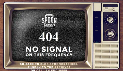
The 404 page works well at a decent monitor resolution, but on in a smaller viewport the TV background image is too small to fit the content within the screen. We need to scale the text content just like the image, rather than it retaining its size and simply wrapping.
<script src="https://ajax.googleapis.com/ajax/libs/jquery/1/jquery.min.js"></script>
<script src="js/jquery.fittext.js"></script>
<script src="js/scripts.js"></script>

</head>
<body>
<div id="tv">
 	<div id="content">
		<a href="https://blog.spoongraphics.co.uk" id="logo"><img src="images/spoon-logo.png" alt="Blog.SpoonGraphics" /></a>
 		<h1 class="scale1">404</h1>
 		<h2 class="scale2"><span>No signal</span> on this frequency</h2>
 		<p class="scale3">Go back to <a href="https://blog.spoongraphics.co.uk">Blog.SpoonGraphics</a>,<br/> tune in to the <a href="https://blog.spoongraphics.co.uk/archives">Archives</a><br/> or <a href="https://blog.spoongraphics.co.uk/contact">call an Engineer</a></p>
 	</div>
</div>
Thankfully a clever jQuery plugin called FitText does just the job. The jQuery library, the FitText plugin and an empty scripts.js file are added to the HTML, followed by a series of unique classes (or ID’s!) to each of the headers to make individual tweaks.
$(document).ready(function() {
	$(".scale1").fitText();
	$(".scale2").fitText(3, { maxFontSize: '100px' });
	$(".scale3").fitText(3, { maxFontSize: '25px' });
});
Add the fitText function to the three classes in your scripts.js file. Applying a generic FitText function to all three elements does work, but to make the scaling transitions perfect some tweaks are required. Adjust the “compressor” value and the maxFontSize options to make sure the text doesn’t get out of control. The plugin ignores the font sizes from the CSS file, so the max font sizes are needed to prevent the text from scaling up too much. This is all really just trial and error when testing the page and zipping the window up and down in size.
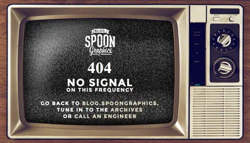
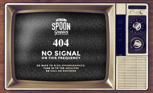
The final 404 page
This leaves the cool TV screen 404 page complete. The clever little CSS tricks make sure the background images completely fill the screen no matter what size the user’s monitor is, while the FitText plugin and the fluid structure scales the content to match.
Comments are closed.