Create a Letterpress Effect with CSS Text-Shadow

Home » Tutorials » Create a Letterpress Effect with CSS Text-Shadow

Line25 is reader supported. At no cost to you a commission from sponsors may be earned when a purchase is made via links on the site. Learn more

The letterpress effect is becoming hugely popular in web design, and with a couple of modern browsers now showing support for the text-shadow CSS3 property, it’s now simple and easy to create the effect with pure CSS. No Photoshop trickery here!

Letterpress – Isn’t that a type of industrial print method? That’s right! But the effect has also made its way into web design. Check out the previous feature showcasing examples of how designers are using this cool ‘de-bossed’ look on designs across the web.

With the recent support of text-transform in Safari and Firefox (3.1+) the effect can easily be created without needing to use any image replacement techniques. This means your text is much easier to edit and has the benefit of being rendered directly in the browser.

View demo

Create a simple background

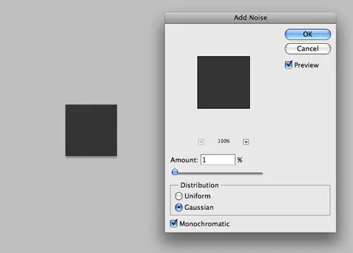
Start out by creating a simple background. In Photoshop create a 100x100px and fill with a dark grey. Add some texture using the Noise filter.

f

<!DOCTYPE html PUBLIC "-//W3C//DTD XHTML 1.0 Strict//EN" "https://www.w3.org/TR/xhtml1/DTD/xhtml1-strict.dtd">
<html xmlns="https://www.w3.org/1999/xhtml">
<head>
<meta http-equiv="Content-Type" content="text/html; charset=UTF-8" />
<title>Pure CSS Letterpress Effect</title>

<h1>Line25</h1>
<h2>Pure CSS Letterpress Effect</h2>


</head></html>

Set up a plain HTML document, then add a few lines of text to test the effect on.

body {
	background: #474747 url(bg.png);
}

h2 {
	font: 70px Tahoma, Helvetica, Arial, Sans-Serif;
	text-align: center;
}

Style up the text using the usual CSS properties to edit the size and basic appearance.

Text-Shadow CSS3 Property letterpress effect with CSS

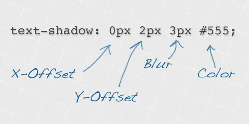
Now we’re ready to apply the text-shadow property. This works by specifying an x-offset, a y-offset, the shadow blurriness and the actual colour of the shadow.

color: #222;
text-shadow: 0px 2px 3px #555;

To create the letterpress effect, we need to add a shadow that’s lighter than the colour of the text to ensure the effect works correctly. Here we’re using #555555 against the darker #222222 text colour. A 2px vertical offset and very subtle blurriness help give the exact appearance we’re after.

View the CSS letterpress effect demo

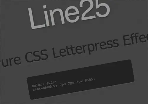
Simple! Check out the example to see it for yourself. Don’t forget, users with rubbish unsupporting browsers will only see the plain text, without the cool shadow awesomeness, so use it wisely.

View demo

Author
Iggy
Iggy is a designer who loves experimenting with new web design techniques, collating creative website designs, and writing about the latest design trends, inspiration, design freebies, and more. You can follow him on Twitter

75 thoughts on “Create a Letterpress Effect with CSS Text-Shadow”

  1. I was looking for something just like this the other day. Thanks so much for the detailed explanation/tutorial. I’ve been seeing this technique around and definitely see it as a growing trend!

    Reply
  2. Thanks Chris, nice and simple and easy to follow. I know i’ll be using this in my designs from now on.

    Give us more like this.

    Thanks again.

    Reply
  3. Oh my god. I never knew of this can happen only using simple CSS codes! Maybe now is the time to focus more on CSS codes rather than using plain images and combined it with CSS. Page load might reduce a lot!

    Reply
  4. You can add this to the CSS but if it’s overdone, or added to smallish type it tends to lose it’s effect. Headlines are best use.

    Reply
  5. Thats a nice.
    Can I use the background of the example on my own page for free or under a creativecommons licenses?
    Greetings
    Marius

    Reply
  6. just a note: the effect illustrated is known as relief or emboss printing. Letterpress (which I worked with for a few years in the 70’s is indistinguishable from any other printing unless magnified at least 5X. All magazines prior to the lithography boom around the early 70’s were printed letterpress. Get a magazine like Life or Time from the 60’s or before and compare the type under magnification to anything from the mid 70’s onward.

    Reply
  7. I was looking at this on a site the other day wondering how they achieved it, awesome as it works with the CMS.

    Amazing how these little touches make such a huge difference.

    Reply
  8. a, a * {
    color: #1456a5;
    text-decoration: none;
    }
    a:hover, a:hover * {
    color: #39f;
    text-shadow: 0 0 3px #1456a5;

    Another cool shadow at https://raphaeljs.com/
    just a few number changed.

    Reply
  9. Hi,

    I would like to achieve the same effect but with a ghostwhite (#F8F8FF) background. Could you help me with the code, I tried hours with no luck?

    Thank you.

    Reply
  10. Hi,
    The press effect successfully shown in IE & FF, but not in chrome. (Chrome shows a text with a drop shadow) However recently I updated the FF and now it’s also showing a text with drop shadow ?

    Reply
  11. Hmm, cant seem to make this work, whats the browser support? you mention Firefox, but ive tested it in this? even firebugged your demo.. but tried on a white bg?

    Reply
  12. Very nice, gonna try it out right away ;)
    BTW.!! I belive that all of us are gonna love when IE6 is left outta here.. :D I to, leave ppl with a message, telling them to upgrade from IE6.

    Anyways, keep em comming :)

    Reply
  13. That is a lovely effect. I was wondering what the reason for creating the grey background was, I can see many other uses for this. Cheers!

    Reply
  14. I clicked b/c I’m awesome. ;) It was worth it. :)
    I think a few people have called it Letterpress and it pretty much spread without anyone blinking an eye. . .

    Reply
  15. No idea why we’re calling this the letterpress effect. Good letterpress doesn’t smash the hell out of the paper. What’s wrong with calling it what we’ve always called it: Debossed.

    Reply
  16. Something I played with is using an rgba color so that you don’t have to customize the text-shadow for every style you want to use it on. Also helps if you have varying background colors.

    Reply
  17. Hey nice easy effect here. I just wanted to share what it could look like in Internet Explorer (and firefox) using 2 absolute position spans – https://dealfreezer.com/demo34_pure_css_letterpress_ie.html – thanks!

    Reply
  18. Hmmm, I’m using the latest version of Firefox. Is it one of the rubbish unsupported browsers? It seems that I can’t really view the example page, at least I can’t see the effect.

    Reply
  19. I can’t wait for all browsers to implement CSS 3. It will make so many things so much easier for us.

    I personally refuse already IE 6-Support for my portfolio web site, the users get redirected to a page with alternatives to IE 6.

    Reply

Leave a Comment

Verified by MonsterInsights