Line25 is reader supported. At no cost to you a commission from sponsors may be earned when a purchase is made via links on the site. Learn more
Navigation is an extremely important part of a website. It has to be clear, perfectly-linked and user-friendly. Even though we see mostly basic navigation menus on websites today, some interesting designs have started to appear.
Navigation bars help visitors browse through the website with ease, thus having a well-designed web menu can make your website more accessible and user-friendly. Each site is unique and so are the various types of web navigation designs that you use.
Today, we selected 25 website designs with unusual navigation menus. Navigation is something that fascinates us, and we’ve previously written roundup articles on websites with pop-out navigation as well as others. The navigation menu concepts gathered in this article are unique, original and will surely catch the visitors attention. Despite looking unusual, these navigation menus are perfectly functional and user-friendly.
These are some well-designed navigation menus that you can use as inspiration to improve your website and make it more user-friendly. Some of these websites feature fixed navigation, universal navigation, vertical sliding navigation, sub-navigation menus, single page dot navigation, carousels, hidden menus, and more. Each one has its uses and is perfect for a specific type of website. You just need to decide which of these designs will fit your website’s style and use it accordingly.
Browse through this article and check out the unusual navigation types we showcased here. Experiment and see which one is perfect for your current project and keep in mind other types of menus that you can use in your future designs.
However, make sure that your navigation menu is displayed properly and is fully functional from a mobile device. These navigations have responsive designs that automatically adapt to any screen size, but some may be more difficult to use on a smaller screen. So keep that in mind when choosing your nav menu type.
So, let’s analyze some types of menus and see how you can improve your website design by using them as inspiration. What do you think about these? Which ones are your favorite? Let us know in the comment section below.
Vincent Tavano
Vincent Tavano’s website has an unusual navigation menu. It uses a series of background pictures or animations to present each project this company has worked on. As you hover your mouse on that portfolio menu the background will change accordingly.
Rafael Derolez
Rafael Derolez, in his projects, focuses on creating interactions such as the ones you will see on his personal website. He has an unusual navigation which he uses to present his portfolio in a creative way. The website keeps it simple, uses a black background and huge typography as the first thing visitors see. Once you start scrolling you’ll notice horizontal bands, each defining a different project. Whether you hover or click, a large image/icon will appear.
ECC Architectural
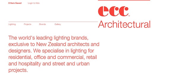
ECC is the world’s leading brand in regards to residential, office, commercial and retail lighting. This company has a nice and clean website which uses a simple white background and red typography. Through this website, you can navigate both horizontally and vertically.
Print Gallery
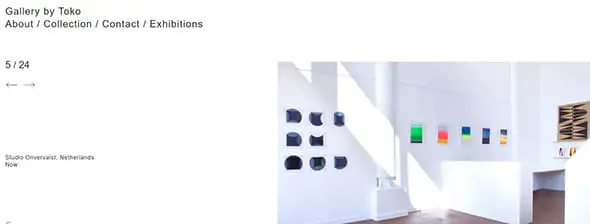
The Toko Gallery is a place where many things happen. On this website, you’ll find art, design exhibitions, book launches, industry talks and much more!
Young & Norgate
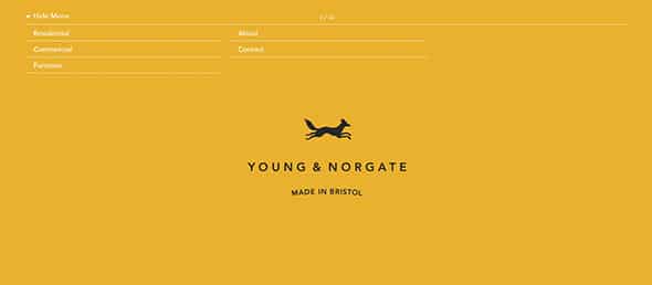
Young & Norgate focuses on making things easier for their clients. This team has a vast experience in interior and this is their amazing website. It has an unusual navigation with a simple drop-down menu which is merged with a full-screen slideshow. If you’ll click on a category the slideshow will take exactly where you want to go. You can use a menu that is hidden at all times and access it only when necessary. This is similar to the menu icon from mobile responsive layouts. Although it may seem difficult to access, hiding your menu can be a great solution if you need the full screen to display your content.
Heat Architecture
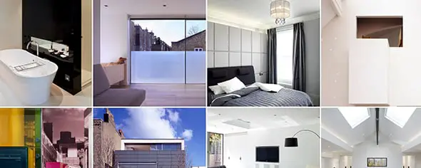
Heat Architecture’s website uses a modular grid layout. You can hover on each photo to find out more or you can directly use the vertical menu. The vertical menu is more than a tool to rapidly search and go through projects, it also shares information about each project.
The Mark Hotel
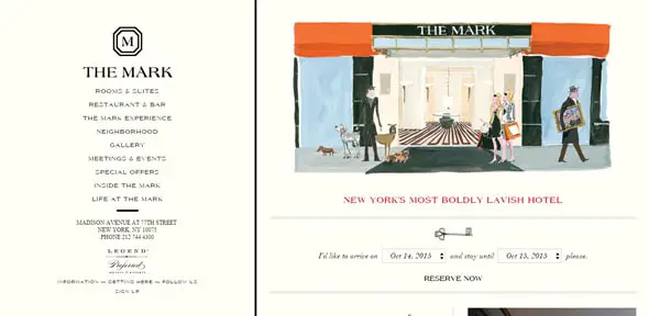
Another beautiful navigation solution is the vertical menu. There are not many websites that use this type of menu but, if you use it properly, this technique will help generate an impressive website that stands out. This type of menu navigation functions perfectly for full-width websites. This website has an elegant design layout. It has a nice preloader and a large vertical menu that changes its appearance once you click on a category. Each category has its own form of presentation.
Gloria Cortina
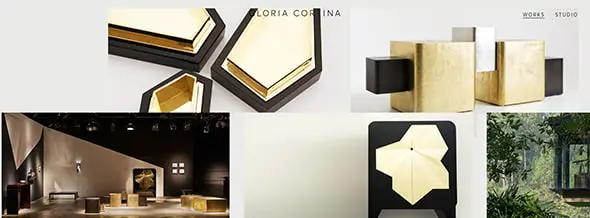
Gloria Cortina uses horizontal scrolling to present their company’s works, which is unusual for a portfolio website. The work focuses on interior design, furniture, fabrics and individual objects and this website presents them elegantly.
Vanity Claire
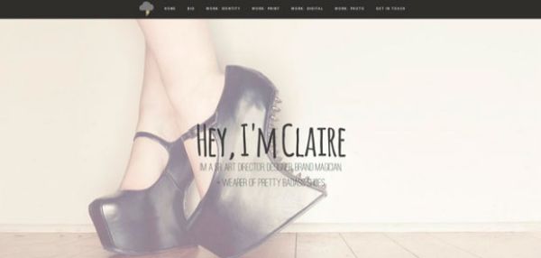
Vanity Claire’s website is a good example for one page website. By just clicking on the navigation bar, the other part of site opens and it has really good features.
Coulee Creative

Coulee Creative focuses on creating awesome websites and if you don’t believe them, check out this company’s website and get impressed by its creativity and unusual navigation. They made the content float on light gray background, they used interactive animations, combined flat design with images, videos and much more.
Beth Ellery
Beth Ellery’s website keeps it simple. This site has an unusual navigation based on a slideshow that changes it’s image and links as you scroll.
Olson Kundig

Olson Kundig is a Seattle-based design practice driven by the idea that buildings can be considered a bridge between nature, culture, and people. The website has a unique navigation which might seem normal at first sight. Projects are divided into categories and presented on horizontal bands that you navigate horizontally.
Chris Wang
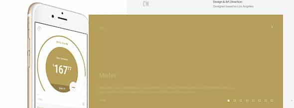
Chris Wang is a designer based in Los Angeles and this is his portfolio website. This website has a unique design and an unusual navigation that uses 2 simultaneous slideshows, one with pictures, one with content. You can click view to find out more.
BCDO
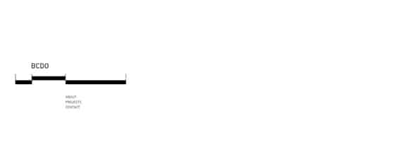
A very useful navigation is the drop-down menu with a completely responsive layout. This will look beautiful on both desktop and mobile devices. With this great menu, your users can rapidly navigate through your website. BCDO website uses minimalist design in a creative an unusual way. If you’ll carefully browse through this website, you’ll notice an interactive menu bar and a well-structured website.
A Violent Act
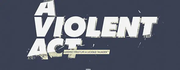
Also, if you are building a single-page design, you might want to consider a dot navigation or a sections navigation type. This is a simple but very effective and useful navigation tool that has a professional look. This is a dotted menu/sections menu has a sticky layout on the left or right side of the screen and helps you easily navigate through single page websites. The dots represent a different section of your website and to use them you just need to click on the dots and the page will automatically scroll up or down to that specific section. If you’re a fan of crime novels then you might like this website. A Violent Act presents perspectives on a double murder in a creative way. All you have to do is scroll down to read the first story. At all times you can drag the screen to the left to read the second perspective.
3sixteen — Soak Guide
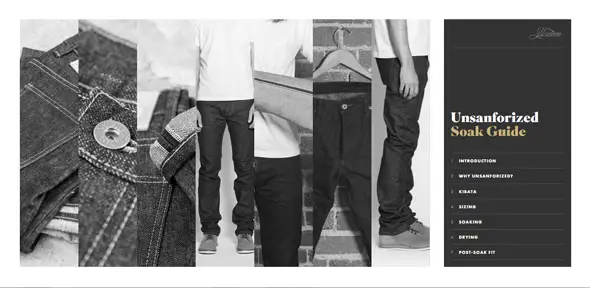
On this website, you’ll find a unique guide to unsanforized jeans. This website has a simple vertical menu bar on which each sub-category represent an image. Click on the images or the sub-category to find out more. This technique is perfect also if you have a blog. Having a carousel with previous articles that appears on the homepage and can lead visitors to navigate to the exact article, from within the carousel. The articles are permanently updated and have a nice design that will catch the visitors’ attention, making them spend more time on your website. This trend is becoming more and more popular for blogs or high-volume websites and it helps improve the user experience.
Studio Veldwerk
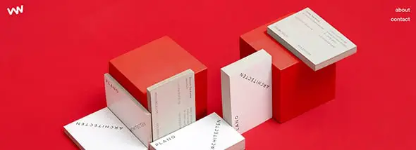
Studio Veldwerk focuses on creating simple and beautiful work. This is the studio’s business card website which looks great and has an unusual navigation. If you will want to find out more about them check out the about section and get surprised!
Television Centre
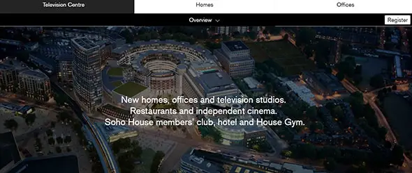
A fixed navigation is a great way of always having your menu in reach at all times. This can be the best solution for websites that have a lot of pages. Having your menu visible at all times, no matter how much you scroll down, can increase your website’s accessibility. If you are considering to use this type of menu, keep your menu light and make sure it doesn’t block big parts of your website’s content. This website focuses on presenting a new residential project in London in a creative way. The homepage uses a creative modular grid layout to showcase the project’s features.
Miami Ad School — I Want You
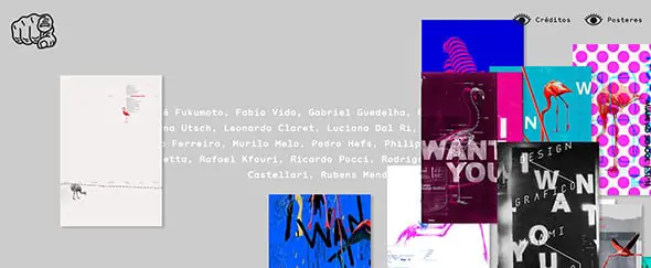
The Miami Ad School has a really nice and unusual navigation. It will definitely grab your attention. As you scroll you’ll always see their works and if you want to find out the names of those who created the posters, you can simply grab and drag the images.
Aaron Meyers

Aarom Meiers’ website is entirely made of interactive animations and that’s the base of the website’s navigation. He definitely presents himself and his work in a creative and unique way.
Boegli Gravures
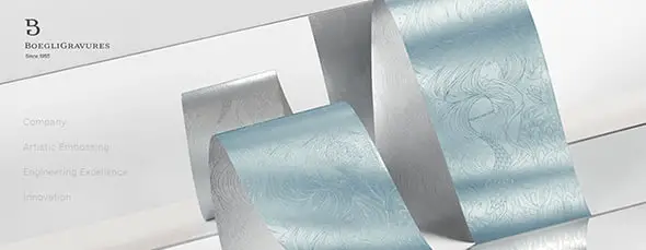
This website greets you with a full-screen photo and an elegant menu bar. Each sub-category, for example, “Company” will guide you and tell you everything there is to know about the company, from the moment it was found up until today, through a full-screen slideshow.
Laetitia Negre
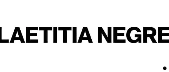
Laetitia Negre’s website has a unique design based on full-screen and medium images. You can either click on the dot or on the images to go to the next ones.
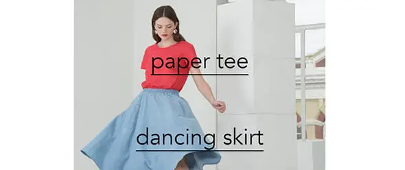
Cienne NY
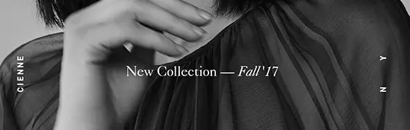
This website has an elegant navigation, especially on the website’s shop. Cienne NY has a dark design layout. The shop uses a modular grid layout with medium thumbnail images. As you hover your mouse on the product images you can directly chose the size you are looking for.
Verner
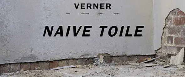
Click anywhere on the full-screen image that greets you and get directed to the products. Verner is a really nice website and company that sells clothes.
Comments are closed.