Line25 is reader supported. At no cost to you a commission from sponsors may be earned when a purchase is made via links on the site. Learn more
Looking for some inspiration for your future web design projects? Check out these awesome interactive website designs for events. This roundup gets your daily inspiration juices flowing with a total of 22 hand-picked websites.
These great website designs for events were created for music, festivals, sports, car, food, travel, marketing, business, corporate and many other types of events. Their website designs are all different and follow various web design trends.
These event websites also have dynamic designs which make them interactive and easy to remember by their visitors. They use different color palettes and interesting interfaces and layouts.
Which one of these 22 interactive website designs for events do you like most and why? Let us know in the comment section below and also if you have any other suggestions, feel free to drop us a comment!
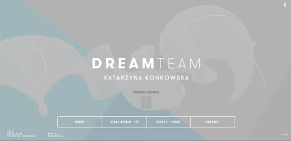
Dream Team Katarzyna Konkowska
Katarzyna Konkowska is a stage and exhibition designer with a vast experience in the television events industry. This is her website with a highly interactive website design.
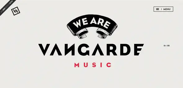
Vangarde Music
This website simply dares you to interact with its elements including fonts, icons and even menu pieces.
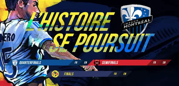
Let’s make history
This is a cool football website with great design and colors that’s available in both English and French. It includes interactive animations and more!
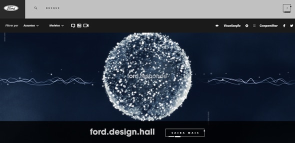
Ford Answers
This is a web platform created by Ford to answer the public’s questions about the brand, its products and technology.
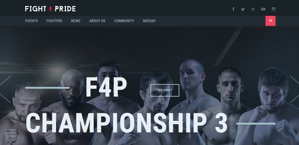
Fight 4 Pride
Here we have another example of a highly dynamic website and stunning design that makes it easy to remember.
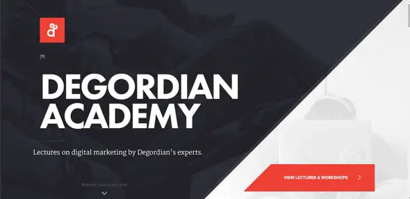
Degordian Academy
Degorian Academy website reunites lectures on digital marketing by Degordian’s experts. They have a very modern and geometric website design that stands out from the crowd.
Baku 2015 – Follow the flame
This is the website of the European Games in Baku, from 2015. You can check it out to remember which were the final results and schedule and to see lots of photos and videos from the event.
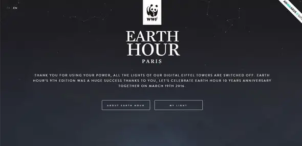
WWF – Earth Hour Paris
Earth Hour is a website created by WWTF as a countdown. This is a call-for-action on Earth Hour and it shows viewers how much time is left until the Eiffel Tower lights will be switched off as a celebration.
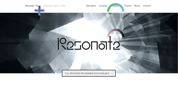
Resonate.io 2015
Resonate is a platform for networking, information, knowledge sharing and education for a festival that takes place each year in Belgrade, Serbia.
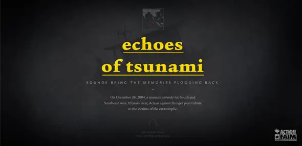
Echoes of tsunami
Echoes of tsunami is a platform that brings back the memories of the Indonesian tsunami. 10 years after the catastrophe, this website was created.
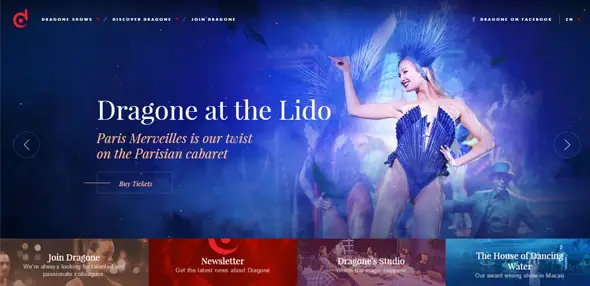
Dragone
Dragone is a highly interactive website that reunites the Dragone shows and events. Users can find out more about the Dragone performers, producers, creative designers and more!
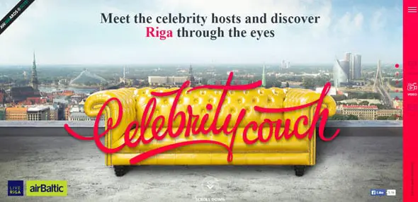
Celebrity couch
The Celebrity Couch website was created by Guilty. It has a very fun and pleasant to use interface that is sure to make the users want more.
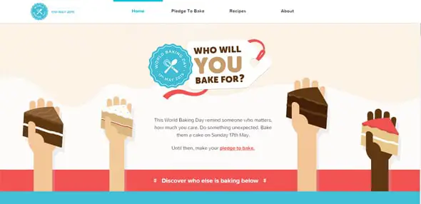
World Baking Day
World Baking Day is an awesome website full of nice flat illustrations with the sole purpose of celebrating World Baking Day. Users can have fun with interactive illustrated recipes.
The Legendary Posters
The Legendary Posters is a Tumblr theme created to display and celebrate Wieden+Kennedy Amsertdam’s Heineken Legendary Posters Campaign. It also featured some smooth transitions.
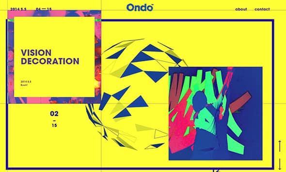
Ondo
Ondo is a great example of an interactive website that’s fun to use because it has an infinite scroll that makes its elements move around. The design is based on geometrical principles which makes everything even better.
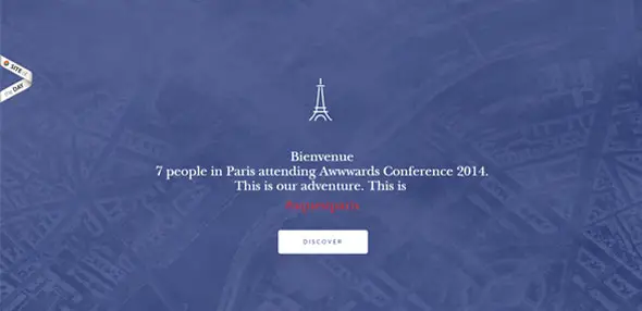
Four days in Paris
Four days in Paris is a minimalist website with smooth transition. It also plays music so it creates a magical experience for the users.
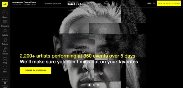
Amsterdam Dance Event
This is the website for ADE, the most extensive day and night festival in the world that contains the whole spectrum of electronic music. Its website is another great example of cool, modern design.
KIKK Festival
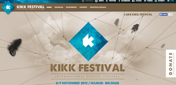
This is the website for KIKK Festival, a festival in Namur. It has a stunning design that includes a bold core color and geometrical shapes.
Design Week Portland
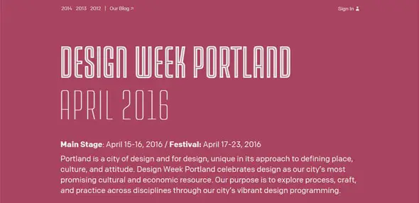
Design Week Portland is a design festival conceived and hosted by the creative community of an entire city. It has a very clean and minimal design with bold, chaging colors on the background.
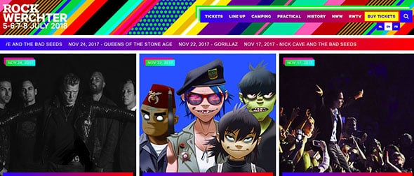
Rock Werchter
Rock Werchter is an annual rock music festival held in the village of Werchter, near Leuven, since 1976. The website they created for the festival is one of the most colorful websites we have ever seen.
Jess & Russ
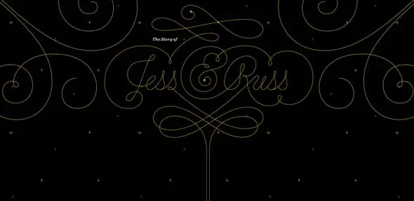
Jess & Russ is another great example of a highly interactive website based on the parallax system. The only way to find the story of Jess and Russ is to scroll through the entire website.
Sir John A Day
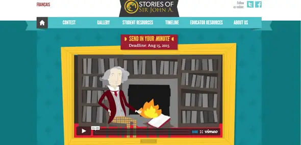
Historica Canada is the country’s largest organization dedicated to enhancing awareness of Canada’s history and citizenship. This website was built to celebrate one of their programs, Stories of Sir John A.

Speechless, all the designs above are just mind blowing and one of the best can imagine today. Web experience is getting magical these days.
Thank you for sharing! I will try this Ford Answer in my website since it looks like very elegant.
The Baku 2015 website looks amazing, however this seems very laggy on my machine is anyone else having the same problem?
Having similar issues. Viewing in Chrome. Maybe a browser thing.