Line25 is reader supported. At no cost to you a commission from sponsors may be earned when a purchase is made via links on the site. Learn more
The average person spends 60 seconds searching a website before giving up if they don’t find the information they need. If you think about it, that’s really not much time for web traffic to find and comprehend potentially complicated and detailed information on a site before choosing to look elsewhere.
Every year, web traffic grows more fickle and impatient, so make sure your design has what it takes to keep users engaged. If visitors are leaving a website, the cause is very likely poor web design and an understanding that similar content can be found a few clicks away. So good web design is the solution right? Right.
While content is obviously crucial to any site, the aesthetic presentation of that content is equally important.
Web design has a big influence on internet presence, affecting things like how traffic interacts with a website (bounce- and conversion-rates) to how effective the site is in the context of SEO and branding.
Here are some impressive web designs which showcase some of the trends used back in 2015.
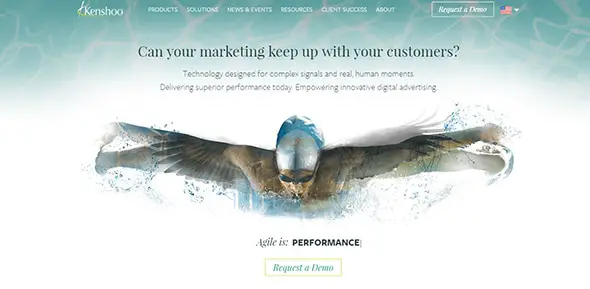
Kenshoo
Kenshoo offers an eye-catching image right from the start. This will surely get your interest, wanting to know more. Also, the overall design is well-thought, with easy navigation and other user-friendly features.
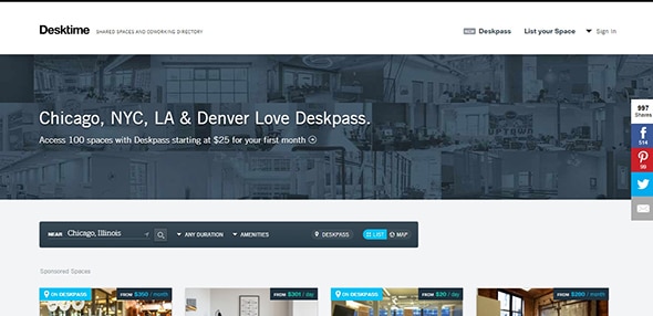
Desktime
Desktime manages to offer a well-designed website with eye-catching graphics. The layout is organized in a grid design, with all the necessary information at reach.
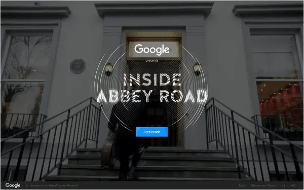
Inside Abbey Road
This website has a stunning interactive design which will surely get your attention. You can move around inside Abbey Road and explore each piece of history inside it.
Impossible Bureau
Get inspired by this stunning website design which uses gradients and a very creative carousel to showcase previous works.
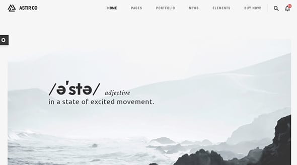
Astir
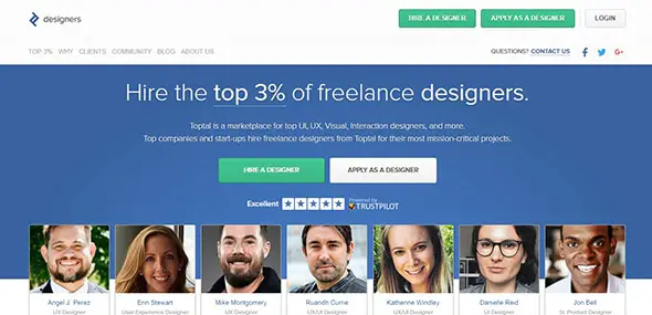
Toptal Designers
This website connects freelancers to clients, offering a large set of tools to successfully work together. This design has a fullscreen layout, with lots of subtle animations. Also, it offers neat resources for freelancers to showcase their works, resumes, skills, etc.
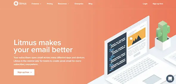
Litmus
Litmus offers exceptional services, for instance, you can easily build, test, and keep track of your emails. The website has a beautiful design with soft colors, a fixed menu, scrolling effects, and more.
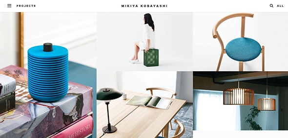
Mikiya Kobayashi
This is an amazing website which showcases various furniture designs. This website stands out through its simplicity, with a full-screen design and a grid layout.
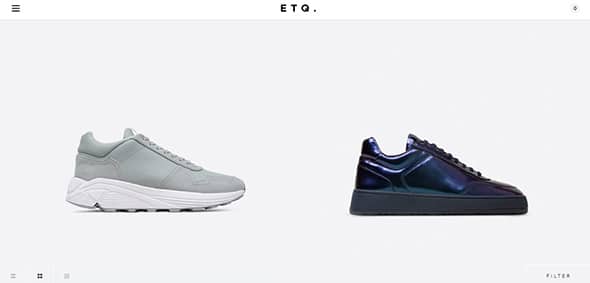
ETQ
Here you have an excellent example of a stunning website which uses a fixed footer design. The designer used a minimalistic white background to make each shoe design stand out.
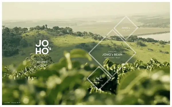
JOHO
This is an extraordinary website design which has a high-quality video background with stunning music. The images, the overlay graphics, and the sounds are amazing. See for yourself!
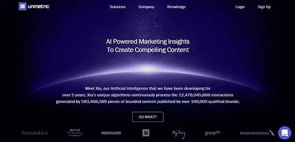
Unmetric
Unmetric includes various information about what makes a compelling content and the importance of social medias. The website has a stunning design with neat features that will keep you engaged.
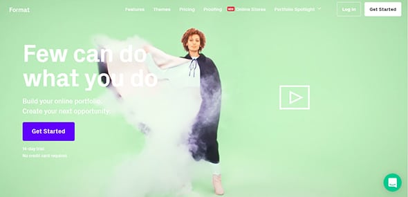
Format
This is a creative portfolio website which you can use to impress your clients. This website includes multiple tools that will ease your work and help you create outstanding designs.
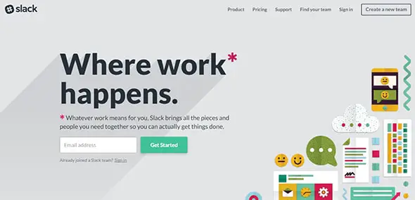
Slack
Slack offers neat solutions to easily communicate and showcase your work. This design is stunning, with a colored background and a professional appearance overall.
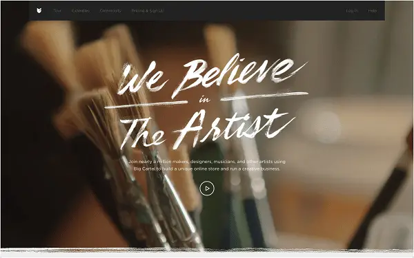
Big Cartel
With an eye-catching video background that is permanently shifting, a fixed menu design which remains always in reach and other great features, this website will definitely get your attention.
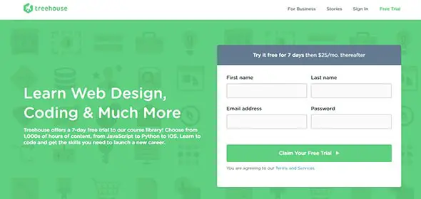
Treehouse
Chances are you’ve probably heard of this online educational platform. Here you’ll discover lots of interesting courses that you can enroll to enrich your knowledge in a certain area.
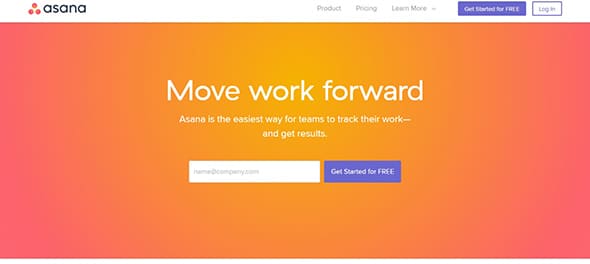
Asana
Here you have an excellent example how a colorful gradient can be used for a gorgeous design. This website has a fixed header, with animated elements, geometric shapes, and more.
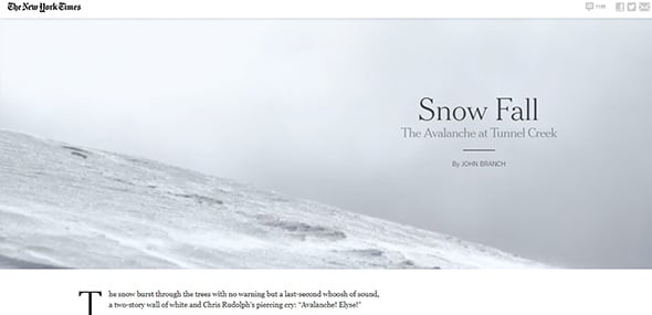
NY Times
This website is a clear example of a trend that was very popular in 2015, which is storytelling. With an eye-catching design and a compelling story, there can only be a successful website.
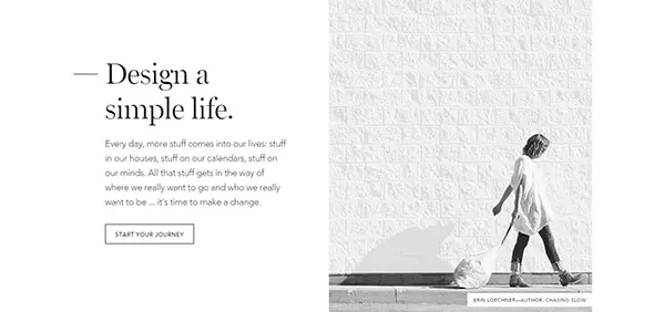
No Sidebar
This is a gorgeous website with a minimalistic design that includes many powerful features.
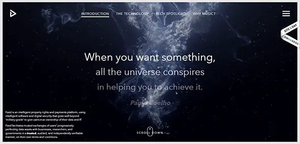
Feed
This is an outstanding website which not only has an eye-catching design but also a fully-functional one. This includes parallax scrolling, lots of animations, video backgrounds, stunning graphics, high-quality images, and more.
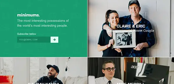
Minimums
Minimums offer a well-organized content where everything is at its specific place. The layout is based on a grid which makes it easier to see the full content at once.
I agree about Kenshoo, but I thought your selection of sites was great and have been sharing them with designer friends who agree. We’re so tired of the same templates with the same stock icons…
Thanks for sharing great list of beautiful websites
I’m Looking for some best website design to study. These are really good websites so thanks for sharing.
i like Inside Abbey Road and Mikiya Kobayashi website, minimalist designs
Excellent article, Iggy. Found some great examples to draw inspiration from. Thanks, Niraj (Founder at hiverhq.com)
Great list – but you missed Atreo.co
Check out the desktop version and mobile
Nothing like it
Are you serious with the first website on the list? Kenshoo website is a crap with a poorly information structure and navigation. About visual design, is completely amateur and this typography sounds so wrong for this website.
I still love the minimalist designs coming out on the web today. Maybe it is just because I love good typography.
The cool thing I am liking right now is the non-monochromatic gradients being used, such as #7.
Go back 12 months and the hipster designers would string you up for praising gradients (if it wasn’t so *scoff* 1920’s).
#7 is very nice. I am a big fan of the interactive backgrounds. All they need to do now is find a way it increase the performance and I am happy.
Yawn. Maybe I’m tired of all this minimalist design trend or maybe beauty is subjective (I know it is) but I only agree with one entry here.