Line25 is reader supported. At no cost to you a commission from sponsors may be earned when a purchase is made via links on the site. Learn more
Websites are designed using various colors, but not all colors are equal. Web-safe colors are more “web-safe” or “web-friendly” than others, meaning they’re less likely to cause issues when viewed on a web page irrespective of the browser or the device.
Colors form an essential part of the visual feel of the website. The right colors can ensure that your website has a good recall and also see a higher amount of engagement. At the same time, using the wrong combination of colors can leave a bad impression on the user.
On top of this, designers need to understand the technical aspect of colors. Not all browsers and devices will show the color in the same way. This is why designers need to be careful with the colors they use for websites.
What are web safe colors?
Web-safe colors are the set of colors displayed uniformly without glitches on web browsers. The most web-safe colors are part of the “Web Safe Palette.” This palette consists of 216 colors that all major browsers can display without issue. However, of these 216 colors, only 20 are true “web-safe” because they’re guaranteed to look the same on all devices and browsers.
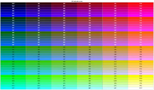
The remaining 196 colors in the Web Safe Palette are not 100% guaranteed to be displayable, but they’re still pretty close. Therefore, you can expect these colors to look good on most devices and browsers. If you’re designing a website, it’s always a good idea to use web-safe colors whenever possible. This will help ensure that your site looks its best no matter where it’s viewed.
Why are web safe colors important?
- Websites that use web-safe colors are more likely to display correctly on various devices.
- Web-safe colors are less likely to experience color banding or other artifacts.
- Websites that use web-safe colors are more compatible with older browsers and devices.
- Websites with web-safe colors load faster because there is no need to download custom color profiles.
- Websites that use web-safe colors are easier to maintain and update.
- Web-safe colors are often more aesthetically pleasing than custom colors, which can be jarring or clash with the overall design.
What is a web-safe color chart?
A web-safe color chart is a tool that helps designers choose colors that will be visible on all types of devices and screens. The chart lists a range of colors considered web-safe, meaning they are not likely to cause any issues when viewed on a website.
Designers can use the web-safe color chart to find colors that work well for their projects. This is especially important for designers who want to create websites that look consistent across all devices. Using web-safe colors can help ensure that your website looks its best no matter where it is viewed.
2022 Web Safe Color Chart Provided by HTMLColorCodes.com:
So, if you’re looking for colors that will be sure to show up on all types of screens and devices, a web-safe color chart as shown above is a great place to start. Also, there’s a really table/chart over at RapidTables.com.
Most people view the color on websites by using web-safe colors. These are colors intended to be used on all types of monitors, and they look consistent across different devices. To create web-safe colors, designers use a particular set of codes called hex codes.
What is a color hex code?
Hex codes are six-digit codes representing the red, green, and blue (RGB) values of a color. For example, the hex code for the color red is “FF0000”. The first two digits (“FF”) represent the amount of red in color, while the last two digits (“00”) represent the amount of green and blue. Hex codes can be either upper or lower case, but most people use lower case. Each letter or number combination is followed by a pound sign (#).
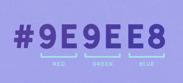
Designers often use hex codes to communicate with each other about specific colors. For example, if you’re working on a website design and want to use a specific color, you can ask your designer for the hex code of that color. The entire purpose of hex codes is to bring a good uniformity of colors amongst the users.
Some examples of color hex codes are:
– #000000 (black), #FFFFFF (white), #FF0000 (red)
– #0099CC (blue), #669900 (green), #FF9900 (orange)
What is the science of colors?
Websites are typically coded with what is called Hex color codes. In the digital world, colors can also be represented as RGB values. RGB stands for red, green, and blue. These values are usually given as a percentage of each color, from 0% to 100%. So, an RGB value of (255,0,0) would be pure red because it comprises all red and no green or blue.
When we mix colors, we create what is called a color wheel. The color wheel represents all the possible colors made by mixing different amounts of red, green, and blue light. The science of color is called chromatics. Chromatics is the study of colored objects and how we see them. It includes the study of light and its properties, human physiology and psychology, and the physics of color.
Color has three main properties: hue, saturation, and brightness. Hue is the name of a color (red, orange, yellow, green, blue, purple). Saturation is the amount of gray in color (how much white or black is mixed in). Finally, brightness is the amount of lightness or darkness in color.
The science of color is complex, but understanding the basics can help you create more effective websites and graphics. Websites that are easy to read and have a consistent color scheme are more likely to succeed than those that don’t. And knowing how colors interact with each other can help you create eye-catching designs.
Which color to use and when?
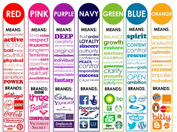
Different colors can have a big impact on our moods and emotions. Websites, for example, often use colors to create a certain feeling or atmosphere. Red might evoke excitement or energy, while blue might be used to create a feeling of calmness.
Some research has shown that different colors can affect our psychological state. For example, one study found that people exposed to the color red were more likely to report feelings of anger and aggression than those exposed to other colors.
So, if you’re looking to create a certain feeling on your website, it’s worth considering the psychological impact of different colors. Remember that everyone experiences color differently, so what works for one person might not work for another. Experiment and see what works best for you and your audience.
Statistically, the emotions linked with different colors are as follows:
Red:
Red is the color of passion and excitement. It is also the color of anger and danger. Red can make us feel energetic and alive, or it can make us feel frustrated and angry. Some people say that red is a powerful color because it is the color of blood and fire. Red can also be seen as the color of love because it is the color of roses and hearts.
Blue:
The color blue has long been associated with feelings of sadness and melancholy. In fact, the phrase “feeling blue” is often used to describe a person who is feeling down or depressed. However, the color blue can also evoke happiness, peace, and calm. In general, the color blue is seen as calming and serene, which is why it is often used in decorating schemes designed to create a relaxing atmosphere and generate confidence.
Green:
The color green is often associated with positive emotions such as happiness, hope, and excitement. Green also tends to evoke feelings of calm and relaxation. For many people, green is seen as a refreshing and rejuvenating color. In general, green is thought to represent growth, life, and fertility. It is often used to symbolize nature and the environment. Green is also associated with wealth, luck, and prosperity. Some people say that the color green has a calming effect and can help to reduce stress levels.
White:
Some people may feel that the color white evokes feelings of purity, innocence, and cleanliness. Others may feel that it is a pure or blank color. Still, others may find that it has calming or refreshing properties. Some cultures also associate the color white with death or mourning. In many cases, the emotions evoked by the color white will be influenced by personal experiences and cultural context.
Black:
The color black is often associated with feelings of sadness, anger, or fear. On the other hand, it can also be seen as a symbol of power, mystery, and sophistication. For some people, the color black represents death or danger. However, modern design has generously used black to make a bold statement. Black is also associated with elegance, and many luxury brands use that for their branding.
What are the 10 things you need to consider while choosing colors for a website?
Colors have the power to make your website stand out and instill a good brand recall on the user. It would be best if you considered the following aspects while choosing your website colors:
- Color Combination – Try to create a color scheme that is pleasing to the eye and easy on the viewer. Avoid using colors that clash or are too bright.
- Web-safe Colors – When selecting colors for your website, choose web-safe colors. These are colors that will display correctly on all browsers and devices.
- Type of Website – When choosing colors for your website, keep in mind how the site will be used. You’ll want to use colors that convey professionalism and trustworthiness if it is a business site. Brighter colors may be more appropriate if it is a site for a fun-loving person or business.
- Overall Look of Website – The color of your website should complement the site’s overall look. If the site is clean and minimalistic, you’ll want to use subdued colors and not too bright. Brighter colors may be a better fit if the site is more playful or youthful.
- Highlighting Important Elements – Use color to draw attention to essential elements on your website, such as call-to-action buttons or links.
- Not Use Too Much Color – Using too many colors on your website can be overwhelming and make it difficult for viewers to focus on the content. Stick to a limited color palette for a cleaner, more cohesive look.
- Consider Your Brand Identity – When choosing colors for your website, consider the colors associated with your brand. Using these colors will help reinforce your brand identity and make it more recognizable to viewers.
- Use Color Psychology – Color psychology studies how colors affect our moods and emotions. Specific colors can evoke certain feelings, so choose colors that create the desired emotion or feeling for your website.
- Test Color Scheme – Before finalizing your color scheme, test it out on different browsers and devices. This will ensure that the colors look consistent across all platforms.
- Get Feedback – Ask others for their opinion on your color scheme before launching your website. Getting feedback can help you fine-tune the color scheme and make sure it appeals to a broad audience.
10 best website examples of striking web-safe color combinations:
As a designer, you should not feel restricted about using only web-safe colors. There are a lot of good color combinations that you can come up with. Following are examples of major brands opting for web-safe colors for their website:
1. Visit Sweden
Color Combination: black, yellow, white
Web-safe Colors: 100% black, 100% yellow, 100% white

2. The National Geographic
Color Combination: green, yellow, brown, orange
Web-safe Colors: 66% green, 100% yellow, 100% brown, 100% orange

3. Apple Inc.
Color Combination: grey, white, black
Web-safe Colors: 33% grey, 100% white, 100% black

4. Coca Cola
Color Combination: red, white
Web-safe Colors: 100% red, 100% white

5. McDonald’s
Color Combination: yellow, red, white, black
Web-safe Colors: 100% yellow, 100% red, 100% white, 100% black

6. Pepsi
Color Combination: blue, red, white
Web-safe Colors: 100% blue, 100% red, 100% white

7. Tumblr
Color Combination: white, black, grey, blue
Web-safe Colors: 100% white, 100% black, 50% grey, 66% blue

8. WordPress
Color Combination: Blue, grey, white
Web-safe Colors: 100% blue, 50% grey, 100% white

9. ESPN
Color Combination: red, black, grey, white
Web-safe Colors: 100% red, 100% black, 50% grey, 100% white

10. Adobe
Color Combination: grey, white, black, green, yellow
Web-safe Colors: 33% grey, 100% white, 100% black, 66% green, 100% yellow

While all designers give due importance to selecting colors, one additional step that you can add is opting for web-safe colors. This will ensure that the website looks and operates as it was meant to be, displaying the right colors. In addition, it would help to consider the lasting color, design trends, and brand design style. Based on these inputs, you will be able to find the right web-safe color combination for your website.
