Line25 is reader supported. At no cost to you a commission from sponsors may be earned when a purchase is made via links on the site. Learn more
A touch screen is possibly one of the reasons mobile devices are so popular.
Touch screens remove the distance between a person and an interactive device and as a result, they feel intuitive and easy to use. Sliders can be easily incorporated into a mobile device because of that.
Sliders encourage users to explore content on a site simply by making a horizontal movement on the screen. However, they are a relatively underused option for mobile navigation.
Sliders present a great navigation option for sites and apps with only a few elements to explore. Sliders feel natural to users and provide a fun way to change settings or explore features. Sliders are easily recognizable to users, which makes them easy to use. This makes them a very practical option for designers to explore.
What are sliders good for
Sliders are easy for users to understand and explore. This makes them feel intuitive. Touchscreen devices have small screens and a slider makes a great option because it doesn’t take up a lot of space.
They are great because they also make a great deal of sense for a user interface design. Sliders help a user move backward and forwards, increase speed or volume and give a relative feel to a task (make the volume a little louder than it is now).
Some difficulties with using sliders
Looking at a design from the user’s perspective is important in order to ensure usability. Mobile users are often rushed or distracted while using a device. They may use it while running through a shopping center, eating or going for a walk.
When users make use of a slider, they are often doing so while distracted or in a rush. This often means pushing a slider too far in a single direction while attempting to remove their fingers away from a screen.
Sliders may also be very difficult to use for people who have motor difficulties. With a little too much pressure, it can be hard to get your slider to work in the way you would like it best.
Sliders can be equally difficult for older users with shaky hands. This makes it equally difficult to guarantee a precise result when using a slider. In these incidences, users may feel helpless when trying to navigate a site.
Consider your site audience. If you’re aiming at older viewers or people with health or motor control difficulties, a slider would not be the best choice.
Think about usability issues
Once you’ve considered your audience and you believe that using a slider may be appropriate, consider your design. Touchscreen users often use thumbs when working on their devices.
You want your design to be usable. As a result, it’s important to explore the area of the screen that would be taken up by the user’s finger or thumb. This will help you to place your slider on screen in a way that will make it easy to use or manipulate.
Designing for desktop where users will make use of a mouse to move a slider is different to a touchscreen device. With a touchscreen, you want to limit the potential for mistakes, pressing alternate links or covering up instructions while users place fingers or thumbs on the screen.
Any labels or values which explain the slider must appear beside or above both the user’s fingers or thumbs, and the slider button.
Use sliders to create a clear, visual impression
If you have a great deal of content which would be ‘too much information’ for your readers to explore or absorb, it often helps to use sliders to present a series of visual images for your user.
For example, if you would like to show a series of events which a user could follow in order to buy a product from an e-commerce site, a clear set of visual images which guide a user through the experience can be helpful and not demanding.
This saves the user time and makes a site easy to navigate. This process can be used in a range of different instances to assist a user to navigate a site or mobile application.
Slider types that you can use
There are different sliders which can be used when creating a website or application.
Single sliders
are best for working with a single value.
Double sliders
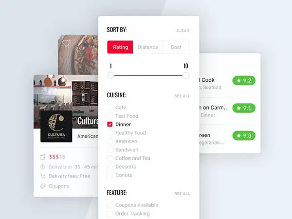
are great when using a range of values.
Continuous sliders
allow the user to select a space along the bar which is relatively higher or lower (maximum or minimum).
Discrete sliders
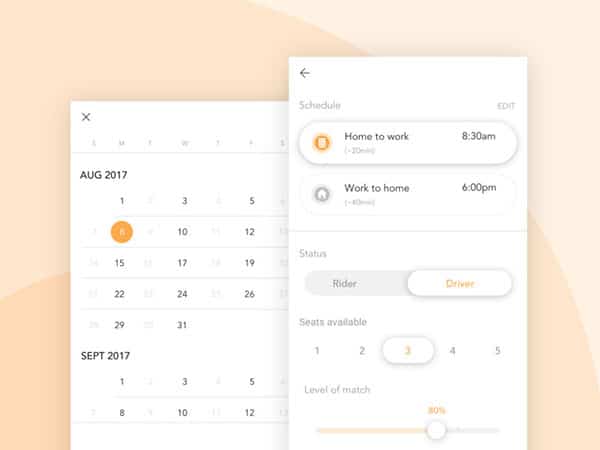
have set stops which the user can use to give a precise value to a situation.
Exact value or guess work?
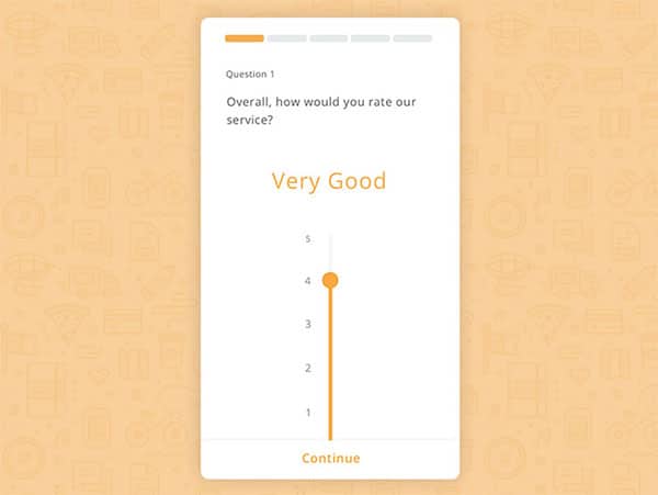
It can be difficult or complex for a user to use a slider in a precise manner. This is particularly true on touch devices. To be very specific with a tiny peg on a screen is difficult.
It is often easier to use sliders when a precise value is not important to users. If a user can use a slider to share an approximate value, this is often enough.
What to do when you need an exact value
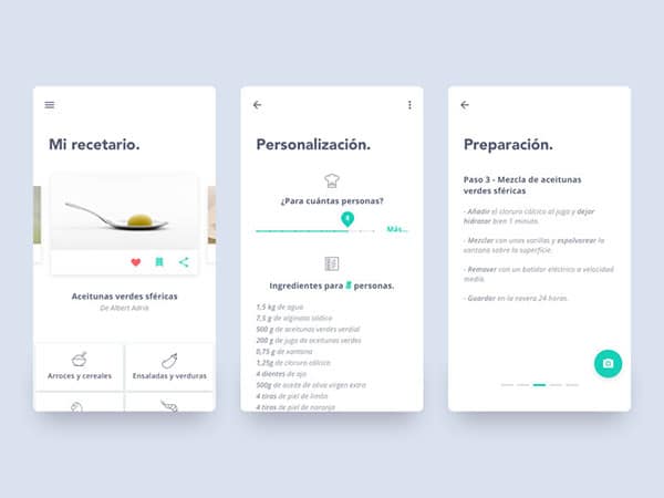
If your user is going to need a precise value when operating your slider, you can create a slider with an editable numerical value.
This means that your user will be able to touch the slider and then insert a number into a text box. This can become editable each and every time the thumb touches the slider.
However, if the User Interface requires an exact value in order for usability, it may be more helpful not to use sliders.
Show the range of values
Some sliders use numerical values so that a user can select options. An e-commerce app may offer a range of products which start at a $1 but range up to $999.
In this case, it is often helpful to show the exact range of numbers available on the site. This gives your user the ability to create a set range of items that they would be able to explore.
Creating a set range helps your user to avoid running up zero response. A smaller search result will often provide fewer items, while a larger search bar will offer up a larger range of items. However, your users won’t limit their choices unnecessarily. Neither will they grow frustrated with a range of options which they cannot afford.
Enable your user to explore your application even if they do not understand the slider and the ranges it makes available to a user.
Provide visual feedback
When you create your slider, add visual feedback to a user’s interactions. This is how your user will expect your application to work.
When your user uses a slider or inserts information into an edit box, provide an instant visual response.
You can use animations, rollovers or hover states in order to communicate with your user. These features will capture your user’s attention and create a communication. A dynamic website is always engaging.
When you create visual feedback, your users will feel acknowledged. This creates a feeling of confidence in their ability to navigate your site.
Ending thoughts
When you’re creating a web application, sliders often seem easy and intuitive. They are also a great aesthetic option. However, they aren’t always the best tool to use.
If you’re looking for relative values and you know your audience has good motor control, they can be a helpful option.
However, if you’re looking for exact values, it is helpful to provide the user with the option to type in this value.
As a designer, work towards creating a slider within which your user can select a range of values that can be explored on your site. This will help your user, who might struggle with creating a precise value while using the slider.
