Line25 is reader supported. At no cost to you a commission from sponsors may be earned when a purchase is made via links on the site. Learn more
Creating a special chocolate packaging design may not be as easy as it looks. Given the rising competition in the chocolate candy food sector, brands need to develop fascinating and captivating designs that stand out. In addition, the packaging needs to resonate with the brand, use its brand guidelines, and extend the brand niche. Unfortunately, there can be some frustration in finding good resources available that provide excellent quality ideas regarding chocolate packaging designs.
A brilliant chocolate treat cover should not only make consumers’ mouths water but also make them review the details of its wrapper or label. After all, chocolates are confections with a unique power of making your someone special feel special.
So, are you looking for inspiration to design delightful and delicious-looking chocolate packaging? Fret not; we have curated some fantastic-looking and downloadable chocolate packaging design vectors and images to power up your creative imagination.
Packaging designs for food products such as chocolate must have some important elements to convince the consumer that what you have to offer is better than the competition and will make them feel good, happy, and satisfied.
This is a common and effective goal in advertising food and confection-type products that we all see around us in our local grocery stores.
The proper use of colors, shapes, figures, and images can display multiple messages to the consumer that should be determined before going to print.
However, some designs are commonly used because they simply work. Our selection below can help narrow down the many choices of chocolate designs used in packaging, wrappers, labels, and covers. Many of these designs can be used for individual chocolate candy bars as well as small bite-size chocolate candy packages.
– Editors Note
The good part about this blog is that we have included both free downloadable chocolate packaging design images, or vectors, alongside Actual Real World Examples for your inspiration. These examples are showcasing how major chocolate brands are currently using highly creative packaging designs with their own chocolate candy bars.
At the same time, we are also providing stock images closely related to or resembling the real-world packaging examples used by existing brands. Let’s start with the selection below to narrow your design search down a bit.
Terminology: For this blog post, we will mostly refer to the word “packaging” which also includes the terms – wrappers, labels, and covers.
Good News!
The packaging design labels below are provided by Shutterstock & Adobe Stock. They are completely FREE to download with a trial subscription that includes 10 free images. Enjoy!
1. Bring in the Retro!
People love nostalgia. It is refreshing to see old covers, songs, colorful design patterns, and grainy photographs. Le Temps is a fictional company and the design attempts to bring retro vibes through colorful thick-lined illustrations that match the 60’s and 70’s dress code. Honestly, it looks quirky but gorgeous, precisely in taste with Gen Z likings.
Existing Brand Example: Le Temps (fictional brand)
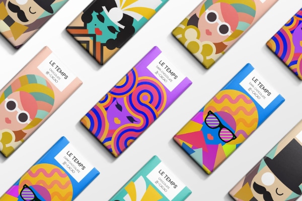
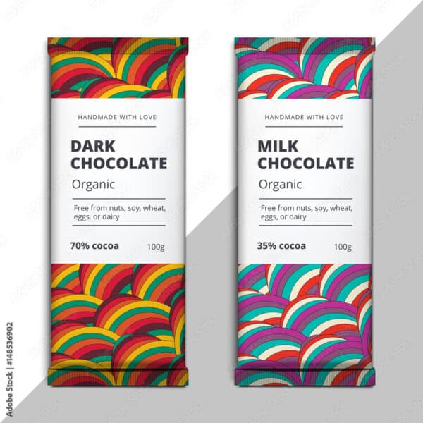
Designers can adapt and create a collection of retro vector elements such as disco balls, rock bands, roller skates, headphones, and boomboxes in packaging to create retro feels for boomers and cool collectibles. In addition, bold colors and vintage fonts such as Palm Canyon Drive, Noir, or Frontage Condensed will uplift the overall look of the cover. Finally, do not forget to use eco-friendly paper wrapping!
Available For Download: Adobe Stock Vector #148536902
www.stock.adobe.com – (both Vector and JPEG files included)
2. Play It With Patterns In Your Design
People who have watched ‘The Shinning’ will find Beau Cacao’s chocolate packaging design somewhat mesmerizing. Geometric maze pattern stamped in gold foil that runs on a coral color packaging brings out the brand’s elegance. It also reveals what holds inside the package, i.e., the geometrically sculpted pattern on the chocolate bar. Similar to the idea of designing a book cover that gives a visual context to what holds inside. Additionally, it looks premium and sophisticated.
Existing Brand Example: Beau Cacao
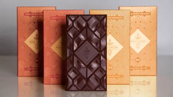
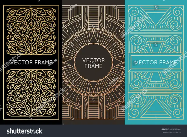
Designers can also experiment with this look. For example, if you are designing a cover for a handmade premium chocolate brand, try using golden foils and sophisticated colors like Beau Cacao. Fonts that go perfectly with such designs are Simplifica, Goudy Bookletter, and Oranienbaum. Also, keep the text content on the front minimal.
Available For Download: Shutterstock Vector #485233444
www.shutterstock.com – (EPS and JPG formats)
3. Minimalist Design For Your Chocolates
If your brand believes in minimalism, you can take Utopik chocolates’ inspiration. Designers have carefully designed Utopik’s design, hinting to be a handmade chocolate brand. How? By designing a cover that looks hand-folded and packed for their customers. What a clever way to tell your customers, ‘You are special.’
Moreover, other elements such as text, color, and pattern are kept minimal to make it look like an envelope. If you wish to design a package keeping minimalism as a central theme, you can add a little craft to it while keeping other elements to the minimum.
Existing Brand Example: Utopik Chocolate
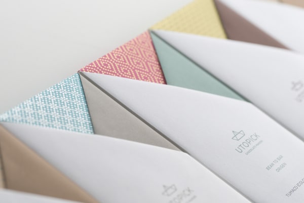
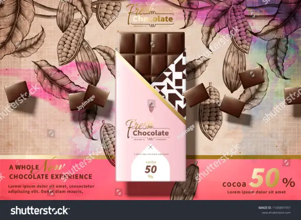
Minimalism is the talk of the town. As a result, most marketers brief their clients to keep the design minimalistic. Hence, you can check out the above image to get an idea about minimalistic design packages.
Available For Download: Shutterstock Vector #1145897597
www.shutterstock.com – (EPS and JPG formats)
4. Art Up A Corrugated Box
How to tell your customers that you sell fine handmade single-origin chocolate? Package it in what resembles a corrugated box!
Crude Raw’s chocolate packaging design is so simple, but like a makeover in Hollywood movies. Just remove spectacles, add some makeup, and Ta-Da! Designers chose a corrugated box to convey the natural element of the chocolate and enlarged art deco patterns in metallic foil. Besides, add a little description about the chocolate, and that’s it.
Existing Brand Example: Crude Raw Chocolate
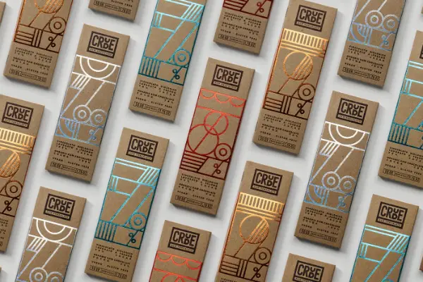
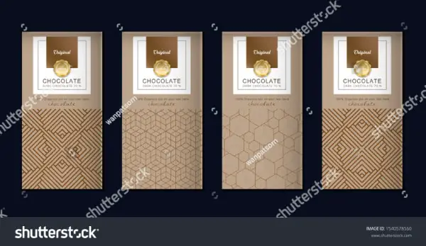
Designers can use the idea of corrugated boxes to translate the originality of your product to the customers. Additionally, using fancy yet sleek designs to add elegance will set your chocolate packaging design apart from the massive pack of chocolatiers.
Available For Download: Shutterstock Vector #1540578560
www.shutterstock.com – (EPS and JPG formats)
5. Tell A Tale With Your Cacao Package Design
Cacao 70 chocolates have a little tale to tell to its customers. Each flavor has a character attached to it. For example, it sells its sea salt flavor chocolate through ‘Sailor Jane’ and its dark chocolate in the name of ‘Lights Out.’ Designers use vectors to design the package so that it becomes visual storytelling. Moreover, it uses pastels colors for the package, similar to a storybook, to finish the look.
Existing Brand Example: Cacao 70
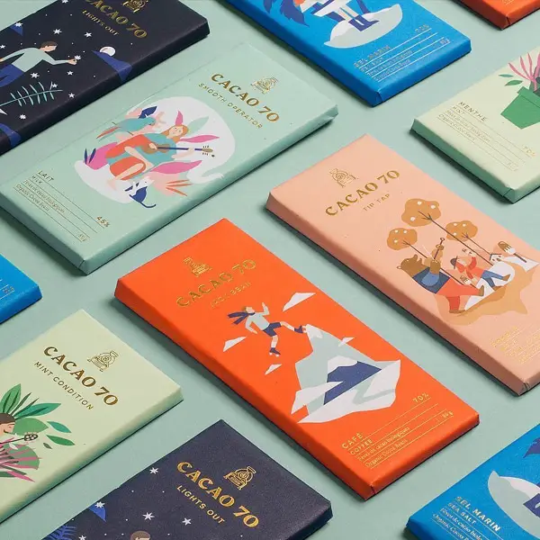
Designers can try out this idea, especially if your brand’s target audience is kids, as kids enjoy such storytelling. At the same time, illustrations can be very handy in telling the overall brand story. Such design ideas can also be used for seasonal chocolate packaging design if the brands are planning to come up with chocolate variations for Christmas and other seasons.
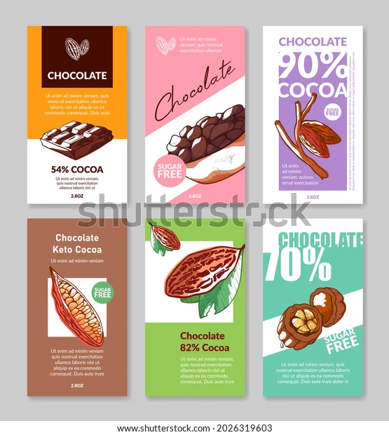
Available For Download: Shutterstock Vector #2026319603
www.shutterstock.com – (EPS and JPG formats)
6. Monochrome is the Mood
Creative people can turn almost everything into a piece of art. The limited-edition Jolly Good Nutcracker Chocolate pack was indeed a piece of art. Emedia Creative team, with the collective team effort, created its chocolate packaging design by playing a combination game. One began with head; another one drew hands, and so on. They turned the pencil drawing into a vector and printed it on a black cover with golden foil stamping. It looked extravagant.
Existing Brand Example: Jolly Good Nutcracker
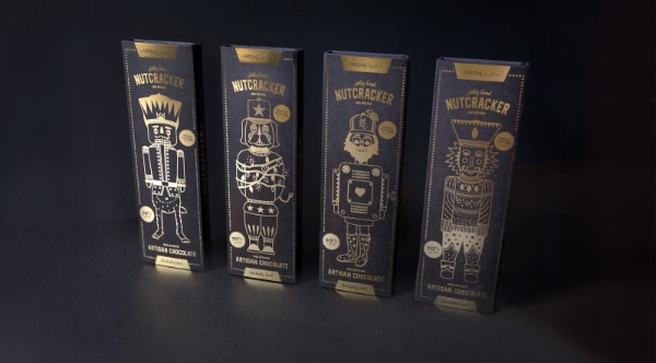
Tonyschocoloney’s had a similar monochromatic packaging of its chocolate at the famous contemporary artist CJ Henry ‘Blonde’ art exhibition. Hence, the monochrome-themed chocolate packaging design works well for chocolate covers—also, tall fonts on monochrome bring out its natural character and make a statement. Designers can experiment with Punch and Lato and see if it suits your design.
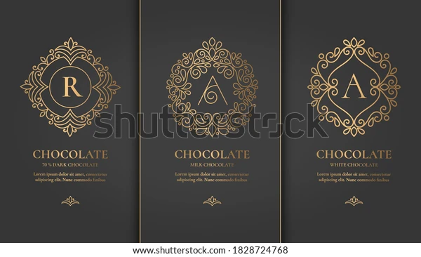
A monochrome theme makes everything elegant and classy. It also uniquely promises quality. However, using thin lines in text and vector are in trend, and designers can totally try it.
Available For Download: Shutterstock Vector #1828724768
www.shutterstock.com – (EPS and JPG formats)
7. Modern & Simple Design – Ritual Chocolates
When Ritual Chocolate decided to revive its brand and focus more on bean-to-bar artisan chocolate, it commissioned modern8 to develop a new brand identity and packaging. Modern8 created a chocolate packaging design with a border, sharp graphics, illustration, and text content. Everything with a thin, delicate line. Gradient colors pasted on the corrugated box looked tasteful and organic. Such design looks rich and raw, keeping simplicity but staying modern.
Existing Brand Example: Ritual Chocolate
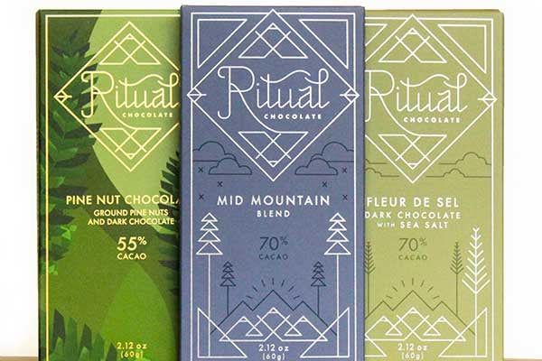
Designers can take inspiration and make single-line illustrations on packages. You can take up display fonts to make it look like a book cover. The key here is to use simple design shapes and also take inspiration from nature.
Available For Download: Adobe Stock Vector #375702152
www.stock.adobe.com – (for use with Adobe Illustrator)
8. Modern and Abstract Chocolate Packaging
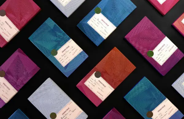
Often, food packagings become more popular than the product itself. So is the case for Gran Cruz Chocolate. Gran Cruz came up with an extraordinary packaging design to take immediate charge of the chocolate market or simply attract customers. Although at first glance, its package seems like a silver foil wrapper that comes under chocolate packages, after a careful observance, you will notice that it has Aztec symbols imprinted within those 3D- inspired designs. It seems like encryption, but it is not. Intriguing right? That’s how you win customers’ attention.
Gran Cruz has used pink, orange, silver, red, blue, and green colors on a metallic foil that looks futuristic. Additionally, a plain off-white sticker that carries the textual part and company’s stamp makes it more personal. Thus, Gran Cruz packaging has redefined modern abstract art and inspired many designers to get in the race of creating such futuristic designs.
Existing Brand Example: Gran Cruz Chocolate
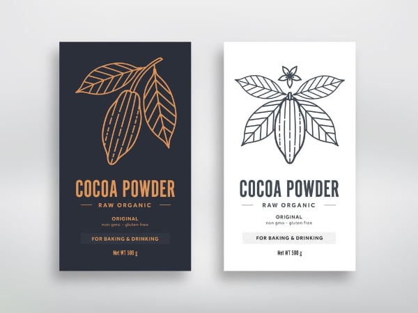
You can search for such abstract chocolate packaging design ideas for inspiration from Adobe stock. The above image is one such good example of an abstract packaging design that can easily be used for chocolates. Such designs stand out in the crowd and catch the immediate attention of consumers.
Available For Download: Adobe Stock Vector #219103593
www.stock.adobe.com – (both Vector and JPEG files included)
9. Swirling Chemistry Between Contrasting Elements
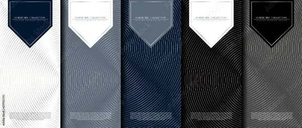
Pico’s chocolate range has embraced the Swiss heritage of chocolate making on its cover. Mountains on its packaging denote the Swiss alps, which is a smooth way to showcase your native culture and embrace the contemporary standards of designs. Such a contrast creates exciting chemistry between the traditional and modern.
It tells its customers that it is a Swiss chocolate brand that reminisces its golden heritage of chocolate making while on tryst with today’s quirky generation. Serif fonts all centrally aligned above the alps make the packaging look premium.
Existing Brand Example: Pico Chocolate
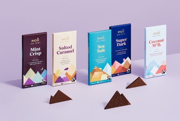
Designers can take inspiration from this very idea of bringing two contrasting elements about your brand and putting them together in one alignment to express harmony.
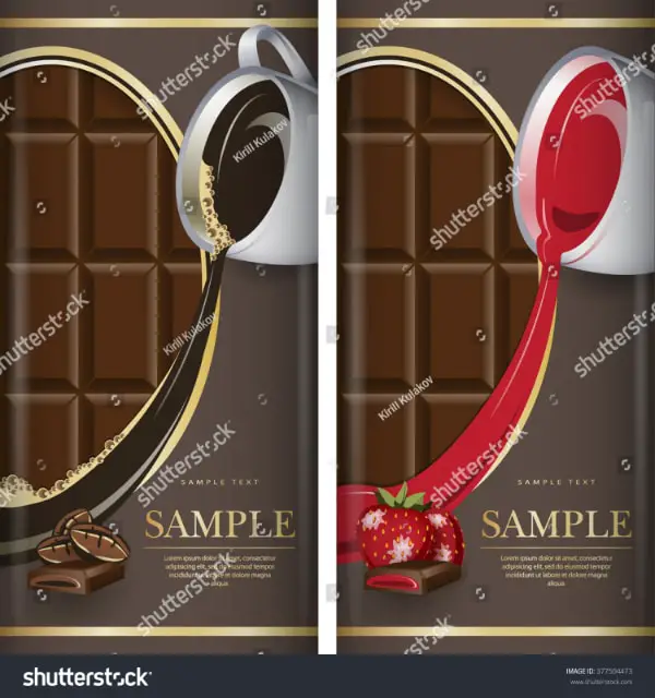
Available For Download: Shutterstock Vector #377504473
www.shutterstock.com – (EPS and JPG formats)
10. Dreamy Chocolate Packaging Design Cover
Mirzam chocolate packaging design takes you on a voyage that takes you to the country of origin of its cocoa seeds. Designers have tried to make its packaging dreamy, almost like a fantasy. A ship sailing on the water Reflections of the dark blue starry sky falls on the sea, making it similar; only white lines set both apart.
Existing Brand Example: Mirzam Chocolates
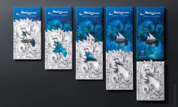
A ship sailing those white lines illustrates a dream floating on a pillow cover at night. Hence, the marketers have successfully sold a fantasy inside its dreamy chocolate packaging design.
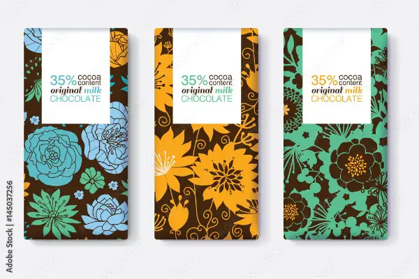
Available For Download: Adobe Stock #145037256
www.stock.adobe.com – (both Vector and JPEG files included)
11. Retro & Hand Drawn With Exotic Feel
Ach makes vegan chocolates with a combination of dry fruits and spices, which is evident through its chocolate packaging design. Designers created handmade drawings of its ingredients and painted them with bright tropical colors to express the strong flavor of each. Besides, it has a rectangular black patch in the middle that consists of all textual details within a golden boundary.
Black and golden, a deadly combination, stand out amid a tropical background that looks premium. Moreover, text inscribed in sans serif fonts in golden and the matching color from its design looks petite.
Existing Brand Example: Ach Vegan Chocolates
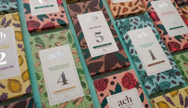
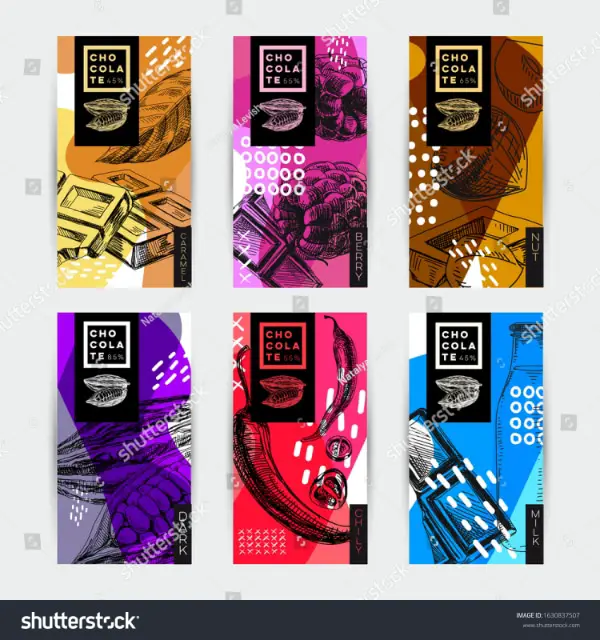
Such designs look grand and tangy on chocolate packages. Hence, the brand can make a different fanbase for its packaging with such exotic designs. Additionally, tall sans serif fonts in the upper case will go perfectly with the chocolate packaging design.
Available For Download: Shutterstock Vector #1630837507
www.shutterstock.com – (EPS and JPG formats)
12. Gift-Wrap It With Style
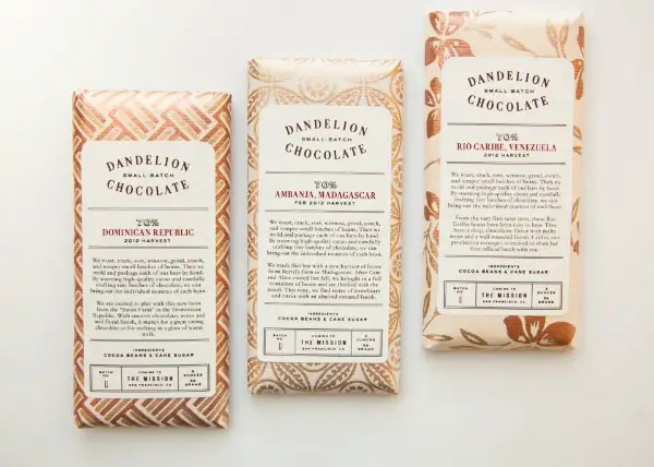
Dandelion Chocolate is a San Francisco-based bean-to-bar chocolate maker. Like its preparation is made of only two ingredients- cocoa and sugar, its packaging is made of only two colors, beige and golden. The company wanted to make its packaging similar to its standards- premium. Hence, the packaging has wallpaper-inspired designs that appear royal and elegant.
Existing Brand Example: Dandelion Chocolate
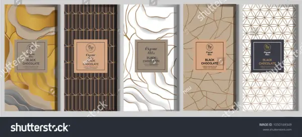
There are plenty of gift-wrapped-based chocolate package designs available on Shutterstock. Such designs work best for premium clients who expect a royal touch on their packaging. Designers can create such kaleidoscope-inspired designs on royal colors such as Persian blue, emerald green, and of course, off-white. Black Chancery and EB Garamond fonts will finish the overall royal look of your packaging.
Available For Download: Shutterstock Vector #1050169349
www.shutterstock.com – (EPS and JPG formats)
13. Good Use of Illustrations
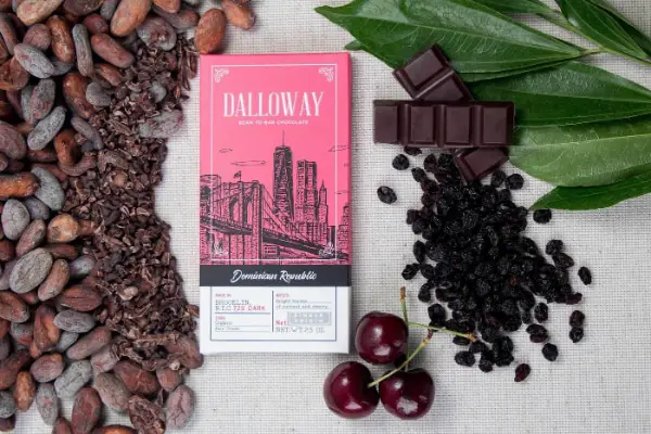
Dalloway chocolates make gluten-free, vegan, and low-sugar chocolates. Talking about its packaging takes three-fourths of the space on illustration and the rest on the description. It has its name engraved inside a classic window in the foreground. Moreover, tall fonts make the packaging looks vintage and clean.
Designers who are also pen artists can make an excellent illustration of the chocolate brand’s place or elements related to its origin. It will convey the brand’s ‘rooted to its roots’ sentiments and help create an emotional appeal amongst the audience. In addition, fonts that create nostalgia can appeal to its customer base.
Existing Brand Example: Dalloway Chocolate
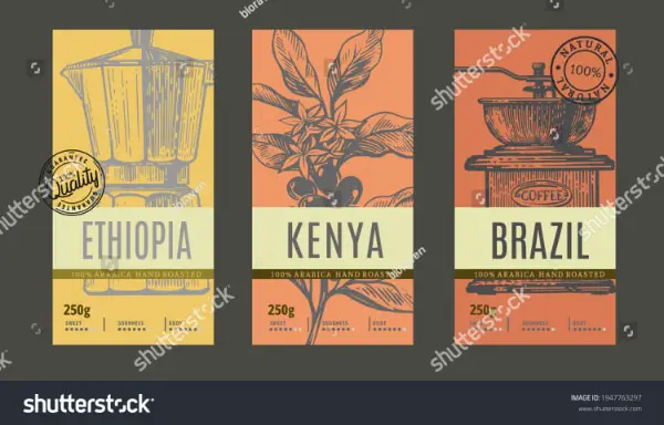
You can take advantage of this fact and draw objects those tick mark this criterion. Illustrations denoting the place of origin of your ingredients can be used and apply them to your packaging design, as in the above image from Shutterstock.
Available For Download: Shutterstock Vector #1947763297
www.shutterstock.com – (EPS and JPG formats)
14. Artsy Style Chocolate Packaging Design
Candela Chocolates come in a traditional packaging cover. Large illustrations flowing on a dark brown base flow look enchanting, just like Maroon 5’s ‘Songs about Mary Jane’ cover. Illustrations in fluorescent colors and wavy fonts floating on the cover create a distinct vibe.
Existing Brand Example: Candela Chocolates
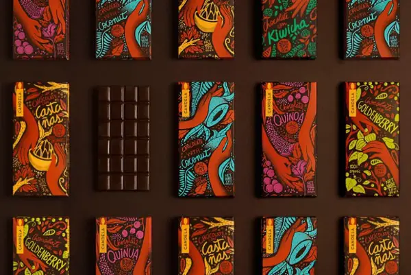
Designers who intend to create quirky chocolate covers can take inspiration from Candela chocolate’s traditional-looking covers and use a combination of quirky colors, fonts, and illustrations to design conventional yet unique packaging for their clients.
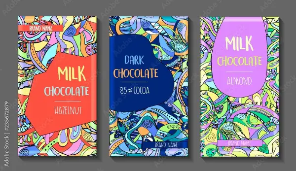
Available For Download: Adobe Stock Vector #235672879
www.stock.adobe.com – (both Vector and JPEG files included)
– Messages Within Food Packaging Designs
The food and beverage world creators have the challenging task of visually capturing our attention instantly – in seconds – with their food or consumable packaging designs.
However, for the company brand specifically needing a delicious-looking chocolate packaging design, there are some common design threads among the competition.
Your brand message and the type of flavor, taste, smell, and overall goodness of the product have to be displayed with visual excitement. Since we are specifically looking at chocolate, this sweet treat along with all other candy already has an advantage over other types of food products, sharing some common denominators we can see being used in current packaging, wrappers, and labels.
Color Messages In Your Chocolate Packaging Design
While it is common to make a bold design statement with colors and style, it’s important to note that colors explain much more, such as the type of food product and its available flavors.
For example, yellow announces lemon or citrus flavors, light green may be equal to mint flavors, purples and reds can reveal berry flavors are available, and so on.
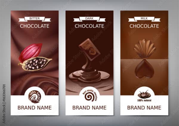
However, the common and obvious colors representing chocolates, in general, are various shades of brown. The available example below from Adobe Stock is a good asset displaying the different shades of brown representing the types of chocolates such as milk, dark and bitter flavors.
It’s worth mentioning that this chocolate packaging design stays almost exactly the same throughout, other than changes in the fonts, illustrations, and colors.
Note: This asset is available to use for your own design purposes.
Chocolate Packaging Design Colors – Example From Adobe Stock
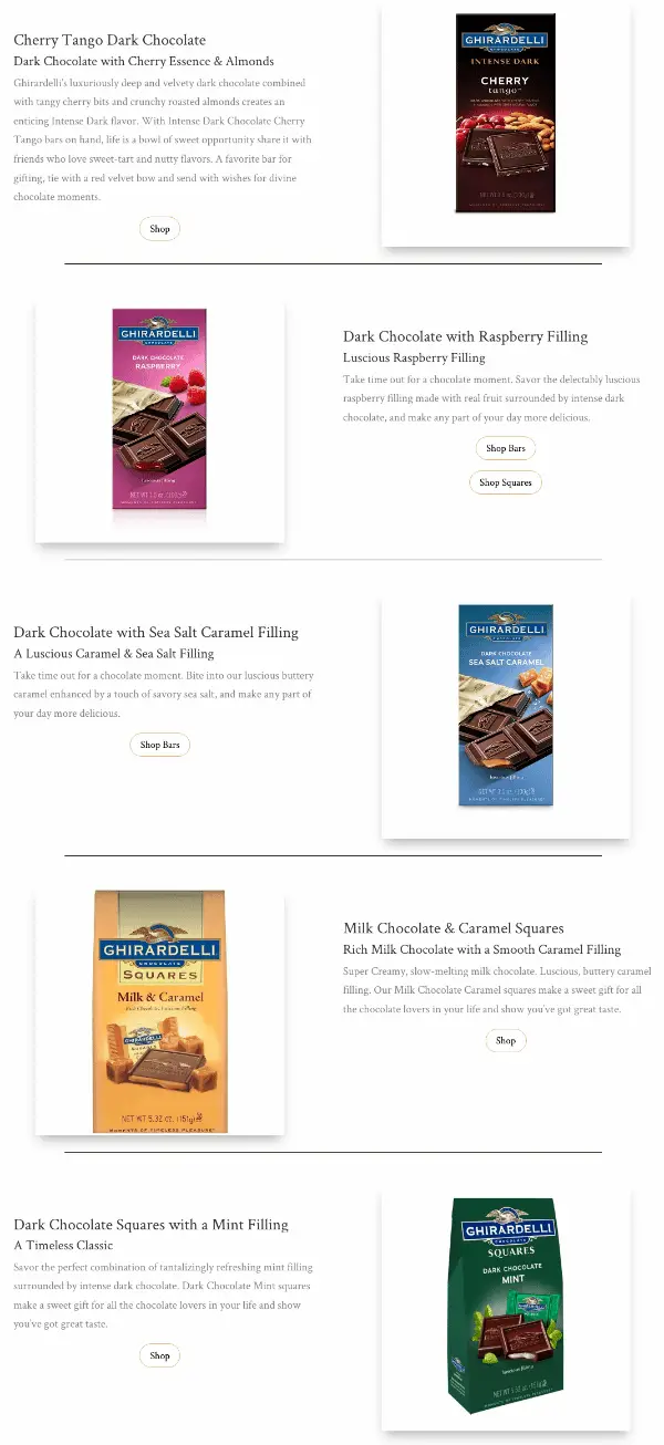
Here’s another really good example of how Ghiradelli chocolate flavors are identified according to the package colors.
The Cherry Tango Dark Chocolate has dark brown and red colors. The Dark Chocolate with Raspberry filling package shows pink and red colors. The Sea Salt Caramel has blue referencing the ocean. The caramel squares package color is golden to represent the creamy caramel flavor and the mint-filled dark chocolate squares packaging is an obvious green color.
Chocolate Packaging Design Colors – Example by Ghiradelli
Brand & Location Messages On Your Packaging Designs
The images, style, and design must be of the highest quality possible, which can be another way of visually telling the consumer how much value and care have been placed in the preparation of the delicious consumable with all its fine ingredients.
At the same time, the company brand may need to display its characteristics, company values, philosophy, and locations all within a small package, label, or wrapper.
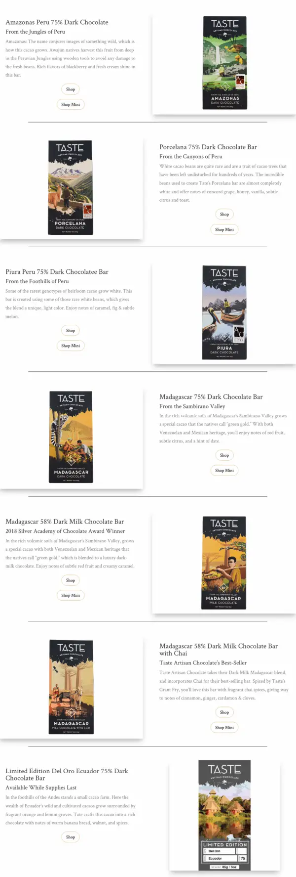
Sometimes the message is to give a sentimental feeling for something memorable or desired that will entice the consumer. Additionally, the image on your packaging can tell a story and reference the importance of something such as the location of where your cocoa is harvested like in the example below from the company Taste Artisan Chocolate.
Package Location Design Example by Taste Artisan Chocolate
Holiday Messages On Your Chocolate Packaging
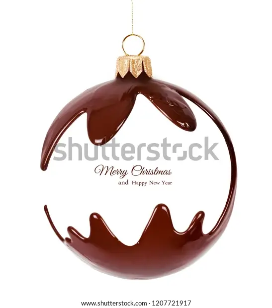
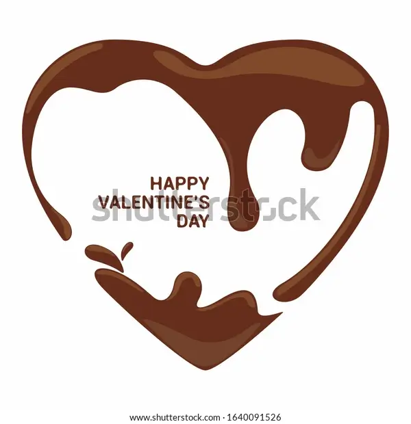
Maybe your sweet chocolate treat or candy bar design needs to capture the mood of a specific holiday like Easter, Christmas, or Valentine’s Day?
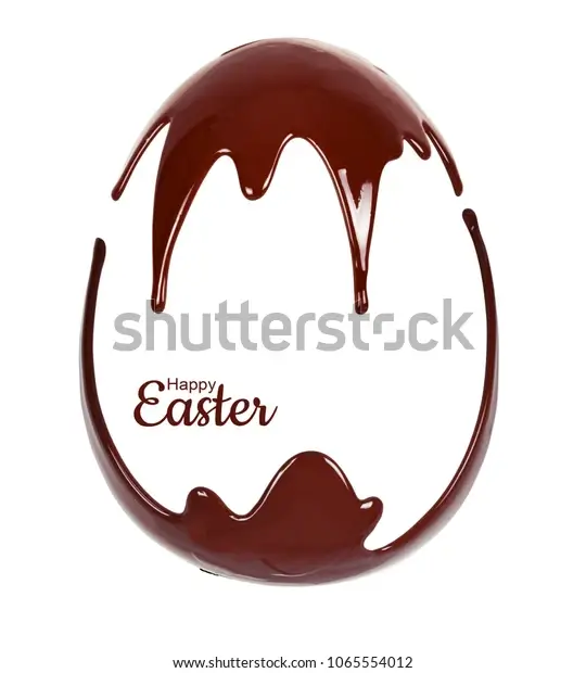
Well, take a look at these great examples of holiday chocolate packaging design concepts available for download at Shutterstock:
Easter Egg Melted Chocolate Candy Package Design
Christmas Melted Chocolate Ornament or Toy Design
Valentines Day Melted Chocolate Package Design
Overall, the colors, styles, and design within your chocolate packaging are invitations providing multiple types of messages including, one of the most important messages – trust.
Conclusion
Chocolate cover designs are a tricky subject. Designers must consider the impact of their packaging design on branding to encourage buying behavior and create a separate fan base for their brand. And, beyond everything, there’s an additional responsibility to create a design that feels special. Hence, it is most important to keep the human-touch present in your designs. We hope our list will inspire you to create beautiful chocolate packaging, wrapper, and label designs for your clients or your business. Again – Enjoy!
