Line25 is reader supported. At no cost to you a commission from sponsors may be earned when a purchase is made via links on the site. Learn more
Whether it’s a whisper or a shout, showing your name and brand identity on your 3 ring binders should make a lasting first impression. To help you make that stunning first impression we’re sharing some of the best binder design ideas we found from 18 examples.
Binder designs should attract attention, invite touch, and entice your audience to open it to see what you have to say. With so many materials and imprint options available, it should be a snap to pick and choose the right details to express your brand’s identity.
However, that’s not always the case. Having too many options can be challenging to make a final decision and so this post was created to help you narrow down your search.
Best 3 Ring Binder Designs Found In 18 Creative Examples
From classy to kitschy, this round-up of binder cover designs shows you how some of the best designers make the most of the medium. Check it out for a healthy dose of inspiration on how to wrap your brand story around a set of rings.
1. Add Pop (Culture) – Dynamic Paper Binder
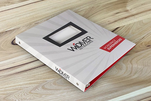
At a party, the people you notice are the ones having fun. The office superheroes at Widmer Interiors are clearly having a great time with their comic-book-kitschy aesthetic. With diagonal lines aplenty, this dynamic paper binder suggests that if you are in danger of a dull office, these folks stand ready to dash to your rescue. Kapow!
2. Be Bold – High Contrast Grecos Binder
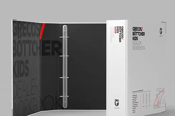
What’s black, white, and red all over? Anything that wants to get your attention. This high contrast binder design from Grecos/Bottcher uses the smallest touches of red against the white background to grab the eye. When slightly open, the black interior frames the white cover guiding your eye right to the company’s name. Also, it reminds people of penguins, which are almost universally adored.
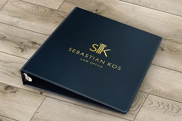
If you’re selling both experience and innovation, mixing classic and modern design elements makes the point. A Greek column is pure old school, but the sans serif font adds a modern touch. This navy binder with gold foil says if you’re looking for a law practice that is modern, established, classy, and upholds the pillars of justice, you’ve found it with Sebastian Kos.
4. Make an impression – Debossed Design
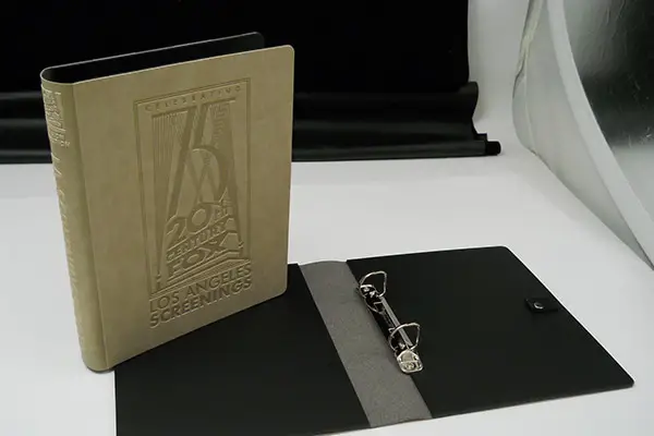
It is said that if you want to get someone’s attention, you should whisper. Certainly, when your name has been in lights for nearly a century, this subtly debossed design, which is the visual equivalent, is all it takes. Like a stage whisper, this dramatic cover from 20th Century Fox gets attention without raising its voice.
5. Keep it clean – Transparent 3 Ring Binder
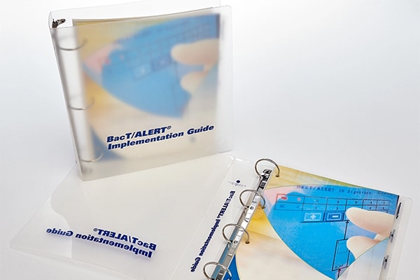
When it comes to protecting, poly performs. The plastic material is water-resistant and does not tear easily. In this design printed on transparent stock, it’s masquerading as one of those see-thru rain macs, enticing the reader with a hazy peek at the colorful Bac T/Alert Guide inside.
6. Inspire – Full-Color Binder
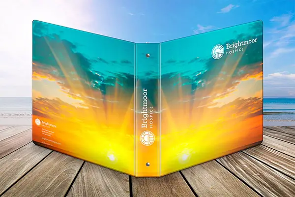
The poet Maya Angelou said, “People will forget what you said, people will forget what you did, but people will never forget how you made them feel.” On this vivid cover, the ephemeral flash of the sun across the sky at sunset speaks more to the brightness of life than its imminent dimming. With this brilliant full-color binder, Brightmoor Hospice promises reassuring warmth and light to those who are managing the challenge of end-of-life care.
7. Wrap it up – Elegant Three-Ring Binder
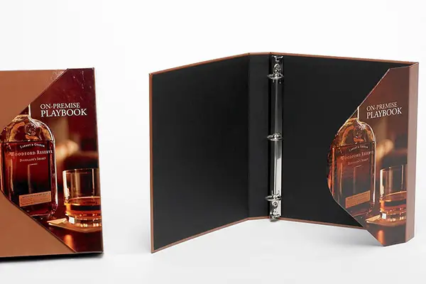
Just as a sophisticated serape creates the perfect finishing touch for an outfit, so too does a wraparound flap give your marketing binder a little panache. It keeps it from gaping open and gives the designer a highly visible spot to get fancy with the artwork. This elegant design for Woodford Reserve closes like the clutch purse you might see on a solid oak bar next to a crystal highball glass.
8. Go bright or go home – Red Turned Edge Binder
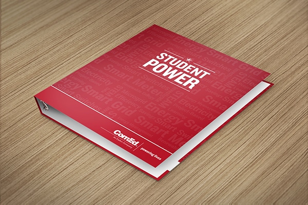
With binder designs, fading into the background is rarely the goal. If it were a sports car, this “arrest me” red turned edge binder would get pulled over as soon as it squealed out of the driveway. Though it may not start sirens wailing, ComEd’s bright red and high contrast white design will definitely get attention.
9. Think outside the vinyl – Aluminum Binder
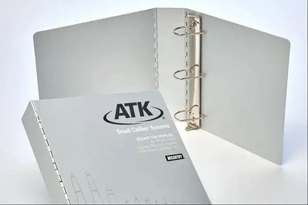
If the Terminator carried a binder, it would be sleek, futuristic, and resistant to post-apocalyptic warriors and plasma-spewing weapons. And, like this aluminum binder for ATK, it would protect his papers and give him a polished sci-fi look at trade shows. Depending on how many laser hits your budget can take, you might make a custom binder out of almost any material that expresses your brand.
10. Use your words – Cool Vinyl Design
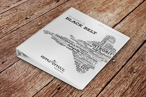
If a picture is worth a thousand words, what happens when you make a picture out of words? The math may be elusive, but the marketing impact is clear. Ripple Effect Martial Arts created a word cloud with a big kick, delivering little visual texture and a lot of storytelling. Their very cool vinyl binder, printed by Company Folders, Inc., shows what they’re all about at a glance.
11. Get points for fun – Menu Cover Design
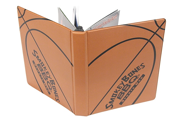
Just because it has a vinyl cover and rings, doesn’t mean your binder has to look like it belongs in an office. With a little imagination, you can get your binder off the bench and into the thick of the marketing game. Hot off the court, Smokey Bones BBQ Sports Bar shoots and scores with this menu cover design that looks like a basketball.
12. Keep it simple – Blue School Music Binder

Just as a single instrument can make beautiful music, a single color printed on a contrasting background can create a harmonious design. Here, the Music School designed their school’s binder to beat the band with just its name and a few well-composed bars of white ink.
13. Making room – Large Binder Cover
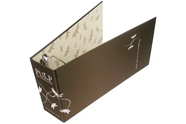
Big doesn’t need to be bulky-looking. No matter what size binder you need, your artwork can create a statement as brash or delicate as your brand. Pulp pulls a dainty nature motif together inside with dragonflies and reverses the values for contrast that makes this sizeable cover still look lovely and graceful.
14. Add a perfect picture – Custom Paper Binder
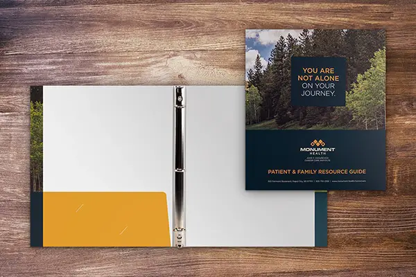
A tagline tells them who you are, but a photo can tell your whole story. Monument Health Care says you won’t be alone as you journey through the wilderness of medical treatment. But the bucolic image on their custom paper binder says so much more, suggesting that you’ll also travel through gently welcoming trees under blue skies.
15. Think Inside the box – Red Binder & Black Slip Case
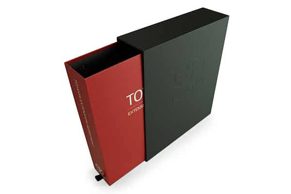
A slipcase tells ‘em they can expect leather, heated seats, and the latest in infotainment (or whatever the equivalent is in your industry). When this red Toyota binder pulls into its luxe black embossed garage, it exudes quality and confidence, reminding the recipient that they are dealing with a venerable global brand.
16. Give Them the Midas Touch – Gold Foil Binder
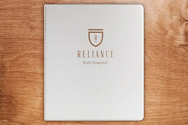
In print, nothing says “money” like gold. To be clear about what Reliance Wealth Management will do for you and your money, they’ve wrapped their initial in a gold shield, and placed it against the clean, white background of their vinyl binder cover. Reliance plus your money equals financial security and simplicity, it says.
17. Go Vintage – Vintage Paper Binder
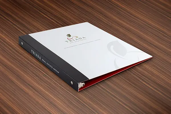
With the maker movement in full swing, a crafted look, even if it’s replicated on a printing press, expresses extra time and attention. In this realtor’s binder design, Triada Real Estate has borrowed from antique bookbinding arts, adding a touch of vintage design to create an air of exclusivity. Cleverly printed on a paper binder, the faux spine wrap, and watermark have a handmade feel that suggests you will get tailored personal service.
18. Dress to Impress – Foil Debossed Binders
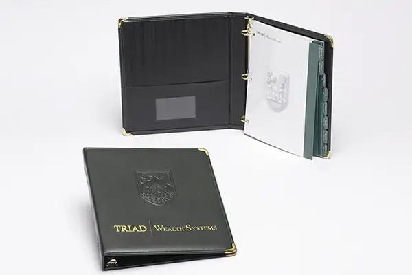
You can get all the cachet of leather and still keep your budget (and cows) happy with an imitation leather binder. Triad Wealth Systems has added a debossed crest and gold foil imprint to maximize a look so luxe it belongs in a castle. It’s organized with index tabs that repeat the crest artwork and the cover color and matches gold-toned rings and corners to the gold foil to pull together a look that says they have money and know what to do with yours.
Conclusion
Whether you’re creating matching brand collateral for your office or igniting a passion for your products at a sales meeting, binders give you a practical tool that can be designed to make marketing magic. These examples will help you use your imagination to turn your binder design ideas into the ultimate corporate expression.
