Line25 is reader supported. At no cost to you a commission from sponsors may be earned when a purchase is made via links on the site. Learn more
The new digital era of newspapers has begun to provide news articles to a wider range of users via websites, online e-news articles. People try to access enormous amounts of info on the internet daily, and this will impact the behavior of news websites. The main purpose of issuing news is to inform, educate, guide, and sometimes entertain.
News articles generally gather information regarding politics, business, economy, sports, and other interesting subjects that have led the news articles to become a major part of our world. The tricky part of designing a great news website is to adjust space for including all kinds of content.
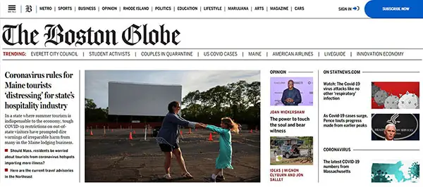
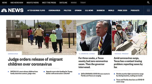
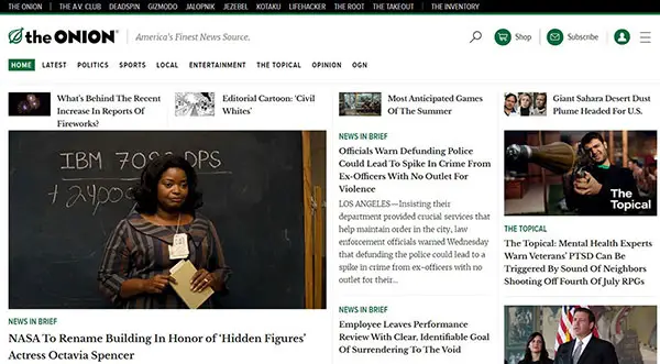
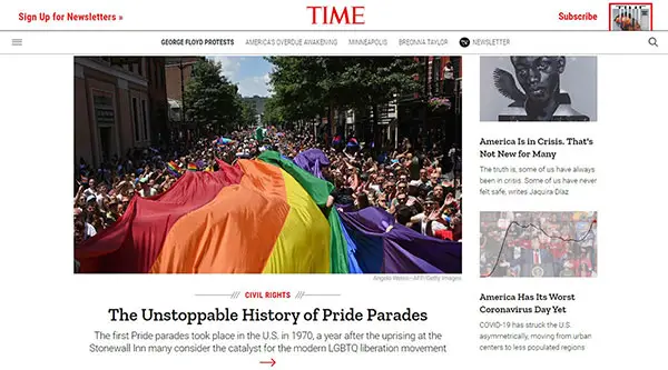
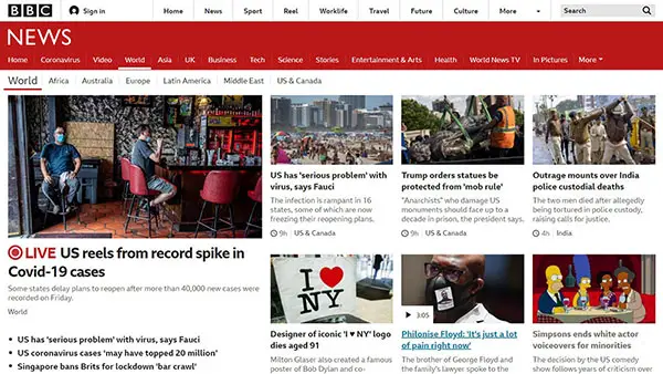
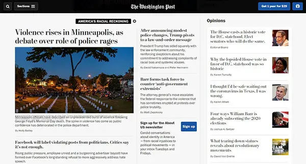
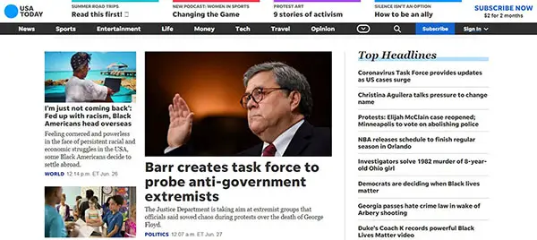
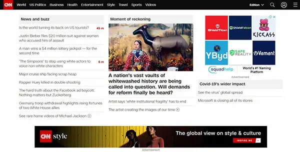
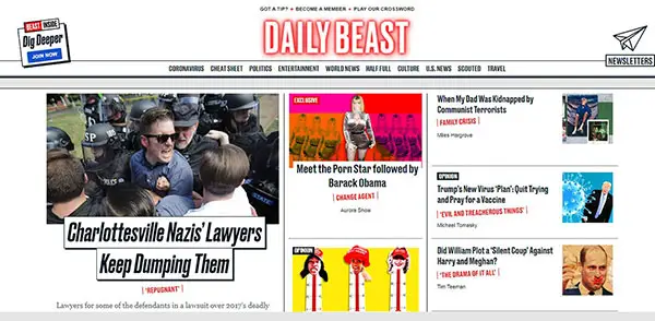
Large news websites aren’t famous for their quality of design or expertise. Irrespective of the news covered every newspaper company faces the difficulty of displaying enormous pieces of information on the homepage.
Tips and tricks for designing efficient huge news websites are mentioned as follows:
The use of a navigation system would help in paving a perfect roadmap to all kinds of information on the website. As long as there is a clear navigation, the visitors will remain on the site and have an enriching experience. The inclusion of a menu structure helps in guiding people to reach the information they need to access and also make them reach the point you want to present.
Color scheme
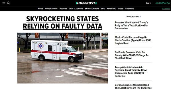
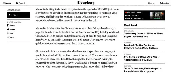
One of the most prominent features of news websites is readability. Many news websites have dark text on white backgrounds. As most of these news websites contain enormous amounts of content readability is vital.
The usage of contrasting colors helps in enhancing the readability and hence, it is considered that the ‘black & white’ color scheme is the best for a news website. So, always ensure that the color contrasting is always implemented in the website
Infinite scrolling and its efficiency
A lot of news websites have long scrolling pages for the visitors to absorb as much information as possible.
These layouts make sure that the users can keep scrolling to find the information they require, rather than being forced to click around until they meet their requirements.
Content hierarchy
Navigation is the key factor in designing a website for news as it is highly important to ensure that whether the users are successful in interpreting the information being presented. The important information on the site has to be presented in a readable format.
Make sure you pick the best font family that is versatile and you can use it in the many typographic styles that a news site needs. You’ll see that some old newspaper fonts that were used in print can be seen on the web as well. Still, that’s not a rule. What works in print doesn’t necessarily work on the web.
Breaking News
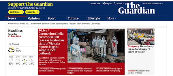
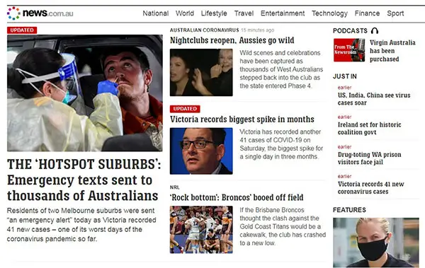
Breaking news is considered a vital feature in order to develop a successful news website. In order to ensure that the readers of your site interested in your website at all times, you need to display breaking news updates with a small text excerpt about popular subjects as the readers are known to frequently visit the sites where they can be informed about the latest updates.
Tabbed content sections
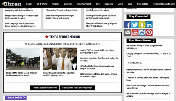
Almost all news websites use their sidebars as well as main content areas to present visitors with popular content, recently published articles, pages that received the most comments, etc. This process guarantees that users control the kind of content they access and also helps in saving the design space as the large amounts of content are made accessible in a certain section.
Responsive web design
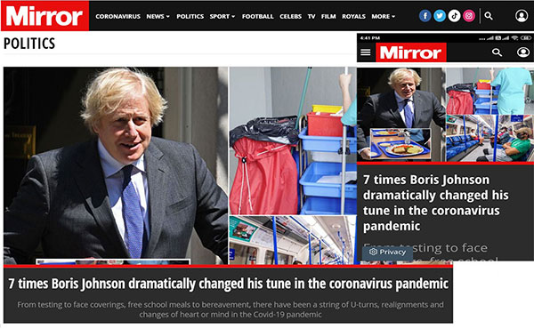
As it is known that most individuals prefer to access information through their mobile phones, the importance of having a responsive website has increased tremendously.
Social Media
The approach to integrate social media into your news website is known to boost the website’s SEO and also enhance the business image on the social media websites which would increase your followers count.
Style
Designing a news website with a good presentation requires creativity. Always ensure that you are creating a website with the use of stylish and latest designs keeping in mind how well your audience would appreciate it. If you want to have the same style as newspaper sites without an insane amount of effort, you can try making the news website you had in mind on WordPress and use a WordPress news plugin.
Grids
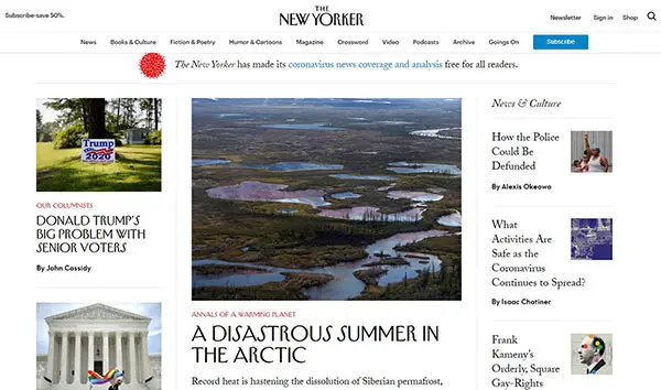
The grid is considered the best and popular way of creating a news website due to its efficiency in management and ability to organize bulk amounts of data. Also, the grid is known for its ability to provide a sharp look to the website. The New Yorker is an excellent example of the grid-based layout.
White space
One of the most overlooked elements that assist in developing a great website is white space. A major advantage of white space is that it increases content legibility which is crucial for a content-rich news website.
Primary & Secondary Content
In order to categorize the most important information and normal context, draw a separator between your content sections. For example, you can add on your homepage a header section for new articles which can be utilized as a highlights section with eye-catching images. This approach can help to emphasize the latest news and increase social shares.
Advertisement
One of the best ways to increase your profits on the website is to invest your resources in advertising. Also including the ad banners at particular positions is essential but don’t overdo it.
Also, banners have the best visibility in the center of the articles, but this is considered controversial as these ads can irritate your readers.
Social Media
These websites can not thrive without social media interaction. People spend most of their time in the era of online sharing and social networks. Hence, make use of social sites to display buttons for the networks that work best for you.
The comments section
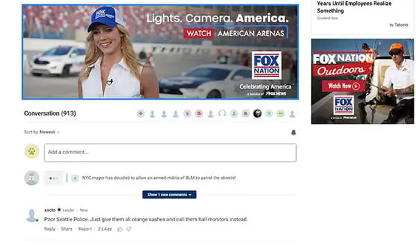
Reader comments are an important part of a news website. Digital newspapers are known to act more like social networks than websites. Readers find it essential to be able to let people know of their views such as liking or disliking certain situations and somehow let their voice be heard on particular issues. Hence, it is crucial to ensure this requirement of the users is satisfied.
Photos
Instead of presenting your visitors with a front-page full of text, allow them to explore your site using appealing graphics. It is essential to use high-quality and engaging photos for this approach to succeed.
Loading time
Most sites that run slow tend to annoy their users and make them bounce fast. One of the crucial parts of web designing is to ensure reliable hosting.
Always remember it is vital for a website to convey your brand. For your website beat the competitors to ensure that it is user-friendly, clean, and consists of readable content.
