Line25 is reader supported. At no cost to you a commission from sponsors may be earned when a purchase is made via links on the site. Learn more
Once considered a novelty, the hover effect has become an integral part of eCommerce website design. Designers having recognized the effectiveness of this special effect in capturing user attention, and engaging them to the point where conversions noticeably improve.
In addition to attracting user attention, hover effects can provide a variety of benefits by providing instant information or serving as navigation aids, with fewer clicks. Shop owners benefit by the way hover effects can be employed to steer users to calls to action, shopping carts, wish lists and the like. The end result— more sales.
Rather than making eCommerce websites more cluttered, a hover effect can achieve quite the opposite. It goes particularly well with sites having a minimalist design, since the added information hovering provides can also he presented in a minimalist format.
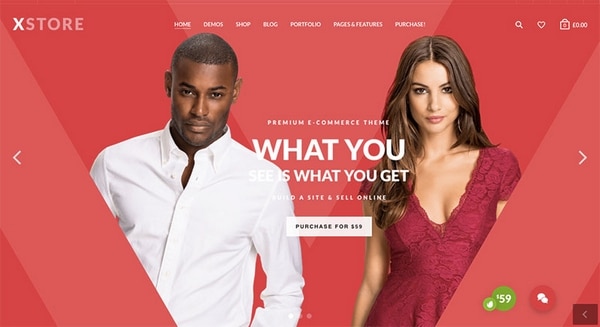
A cool homepage example.
As you are about to see, this relatively new theme has this special effect down to a fine art.
Hover Effects and eCommerce Go Together Hand-in-Glove
While there are many innovative ways the hover effect can be used, let’s look at several of its more common applications.
- A hover effect can present supplementary information: availability, color choices, price, etc.
- This special effect is an effective way to show a different view or perspective of a product, or highlight a key feature.
- Hovering over an image is often used for zooming, or to initiate movement or animation.
- Hovering can present the user with available options, each of which can lead to a specific action.
Each of these examples reduces the number of clicks required by a user.
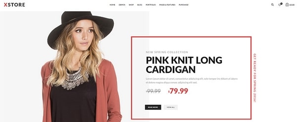
Hover effects play nicely with minimalist page formats.
Even though you will tend to stick with one or more of the above uses for your projects, there are no limits as to how you can put the hover effect into play. A general rule would be that, whatever the outcome, the action triggered should benefit the user, and by extension, the shop owner.
4 Examples of the Cool Use of Hover Effects on an eCommerce Category Page
An eCommerce category page is often used as a landing page. As such, it’s every bit as important to capture user interest as is the case with the home page. In the past, landing pages were treated as little more than product presentation pages. This remains true today for many websites, but a major trend in 2016 is to implement special effects that will drive up conversion rates. That is what the hover effect does, and what XStore will do for you as well.
These examples show how these attention-getting effects can be incorporated in strategic page locations.
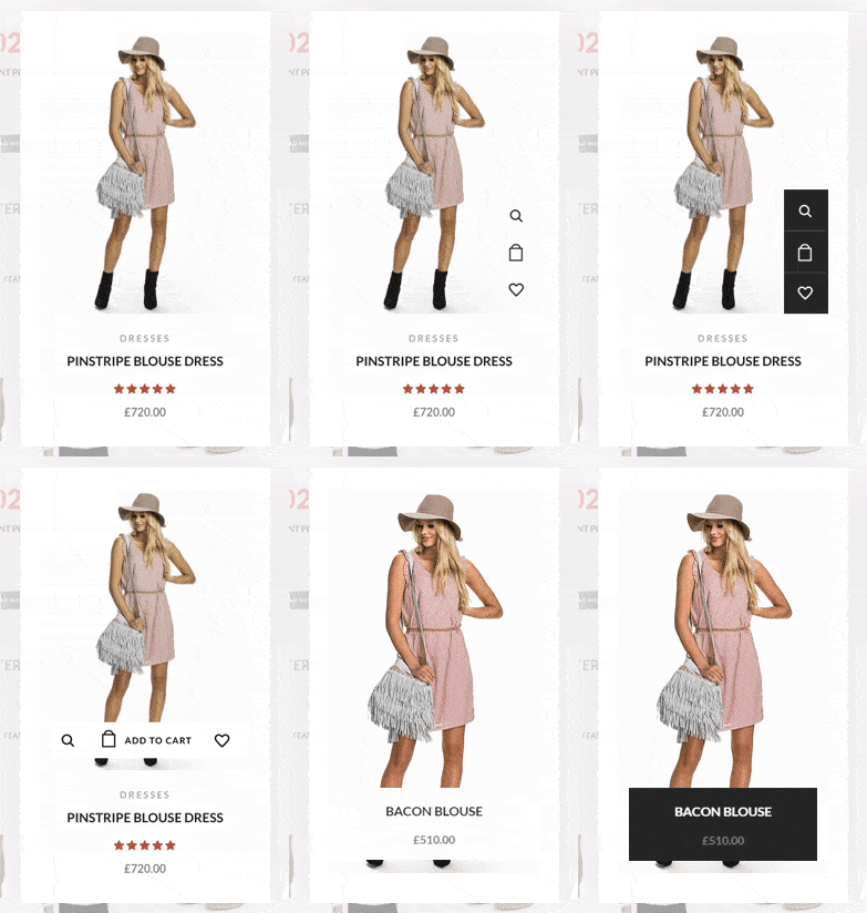
Hover effect applications available in XStore
- Hovering can display the price of a product; saving the user a click, and helping that user make a purchase decision.
- Hover effects are particularly suited for minimalist page designs. They keep a page clear and clean looking, and in true minimalist fashion, only necessary information is presented.
- A hover effect can be used to present an image in a darker shade. This powerful feature grounds the image. It provides a sense of visual equilibrium, and it is an effective attention-getter.
- A vertical photo effect can be generated that presents the product in an interesting perspective. Options can be given, or shopping cart status can be displayed.
These are the most common uses of this special effect, and they are easily implemented with XStore. As far as the number of different things you can do with a hover effect however, the sky’s the limit.
XStore – A New eCommerce WordPress Theme with Tons of Promise
What is it about XStore that holds so much promise? For one thing, it’s the 4 years of experience in building a better UX that its 8Theme creators brought to bear. These ThemeForest Power Elite authors account for more than 28,000 customers.
XStore has much more than hover effects and other cool effects to offer. It’s a theme that has been created specifically for the eCommerce website-building niche. XStore offers the perfect solution to a website builder’s needs, as you will discover by viewing the demos.
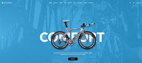
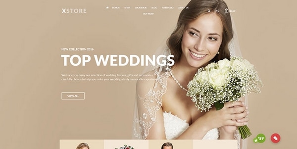
- The demos are fresh and modern looking, and ready to serve as starting points for building beautiful websites.
- The web designer is presented with a wide range of options. XStore’s powerful Admin Panel makes it a simple task to put these options into play.
- Web-building options include, but are not limited to, different shop styles, a great selection of product page types, and many column, grid, sidebar, and slider choices.
- An extremely important factor in eCommerce is page speed. Superior page speed is a given when XStore is the theme of choice.
There is much more of course, including lifetime updates and great support. It should also be mentioned that, with XStore, there’s never a need for coding.
