Line25 is reader supported. At no cost to you a commission from sponsors may be earned when a purchase is made via links on the site. Learn more
How does it sound to be the proud owner of a leading commercial website? What if we told you that it is easier than it sounds?
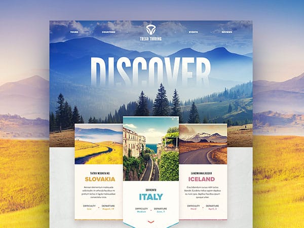
Today, when commerce is almost fully digitalized, businesses rely on successful website designs to lead sales their way.
The size of the business doesn’t matter – the rules of efficient web design are simple, and they apply to all clients regardless of their budget!
The importance of good appearance
Nobody expects you to come up with the most stunning design ever and have one of the best interactive websites out there, but you’re still required to meet a certain standard of quality and responsiveness.
If prospective users come across something that goes below their minimal expectations, they won’t take it seriously, and you will soon be targeted as a play-by-ear, unprofessional operator regardless of how well you’re doing.
With a smartly designed piece, on the other hand, you can look trustworthy despite a low market position and communicate a message of stability and professionalism.
Besides, good design is not painful to afford. For example, you can get cool bold fonts for free – it only takes to find a designer who understands you, and who has mastered his craft. Also, you can use a few simple effects, like the parallax scrolling effect, to give your website a better look.
Proper communication
Communication is the cornerstone of all amazing design projects, as, without it, your work may not meet your goals or the goals of your client. What we have in mind is open and constant communication, be that as you’re launching the project, or once you’ve finished it.
Clients will most of the time come to you with defined ideas, but if they’re not creative or experienced in web design, it may be difficult to turn their conceptions into practice.
Many collaborations hit the wrong foot at this point, which is why we recommend designers to use a creative brief. You can create one of your own and distribute it among clients to explain to them what you need.
To do this, you can organize a free survey with common questions and ask the clients to fill it and send it back, and you will have all the information you need.
Nothing but great loading times
The recommended loading time for a website is 8 seconds (or less) with a standard 56K modem (yeah, I know, it’s a silly standard). As revealed by two Forester and Gartner surveys, eCommerce websites let approximately $1.3 billion slide through the cracks because of slow loading times.
When a page takes ages to load, customers will have smarter things to do than waiting. And yes – your business will depend on it!
There are multiple tricks to improve the page loading speed. If you’re using WordPress, you can install several plugins, like W3 Total Cache, for example, and half of your job is done.
However, there are still more improvements that you can do. For example, you can move away from PNG and use SVG graphics for your logo, icons, or various design elements. There are a lot of tools online to help you with this, from PNG to SVG and from SVG to PNG, in case you need that too.
Website-wide changes with a simple trick
Let us introduce an interesting coding trick you can employ at the very beginning of your project – the wildcard CSS rule. What we have in mind here is utilizing an asterisk in the role of a selector, and that will help you make changes all across the page.
For instance, you can replace all fonts you’ve used with sans-serif only with the following code: *{font-family: Arial, Helvetica, sans-serif;}
This trick is amazing, and it is a good idea to keep it in mind all along the process. Normally, you should use it carefully, and only when absolutely necessary.
Effectively arranged information
The trick of every successful website is being able to arrange and address information to the right targeted audience.
For starters, it should introduce the mission work and service of the business to attract attention and share the shiny moments and accomplishments with prospective users.
The ideal location for the goals of your company/organization is the home page, where you should introduce smartly chosen call-to-action buttons for visitors to notice.
The rates model and handbook will keep the visitor informed on the latest fluctuations, while the managers can use them to make data-driven decisions.
Quality content
When thinking about what type of content to include, go for such your potential customers would like and need. To do so, you must know who you’re dealing with, so introduce yourself.
Communicate with your audience and people experienced in online sales, and learn which the basic things customers will look for are. Try to depict how they’re making their purchasing decisions, and give them the tools they expect.
The home page, to start with, is the place where you should provide clear information on who you are and what you have to offer, including the thing that makes you different from your competitors.
Ideally, it shouldn’t take more than a glance for the visitor to understand all of this, and to get the idea of which benefits you can provide.
Whatever you’re writing, make sure it is customer-oriented. Try to be a need caterer, a problem solver, a concern analyzer, and a reliable partner. Customers won’t care about your role in their company – all they will care about is whether you’re the provider they need!
All along, create reasons for clients to reach out to you, as for instance by providing them product information, or specific operating tips and tutorials.
Provide content for free or offer promotional prices, and makes sure all PDF files are converted to web pages so that they can download them right away.
Another amazing trick is to attach multimedia content, as everybody prefers to see what you can do instead of reading about it.
Make a plan
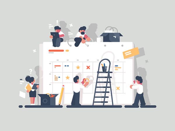
In web design, it is not enough to simply know where you’re heading. Instead, you should have a detailed plan of action you’ll share with your clients and a good understanding of what it takes to get where you’re headed. How will you produce content?
Where from will you get your images? When should your first wireframe be ready? How should you prepare it in the first place?
The less you know about these issues, the more chaotic your project will become, which is why you should devote enough attention to each part of the process, and remain ready for popup surprises that may delay your work.
As suggested, you should always address issues with a creative brief which not only supplies readers with important information but also puts your expectations on paper in a very professional way. As a matter of fact, you can make creative briefs an integral part of your project contracts.
A creative brief will only be useful when it contains the following elements:
- The objectives of the website/app
- The goals and challenges of the website/app
- The expected success rates of the website/apps
- Failure potential of the website/app
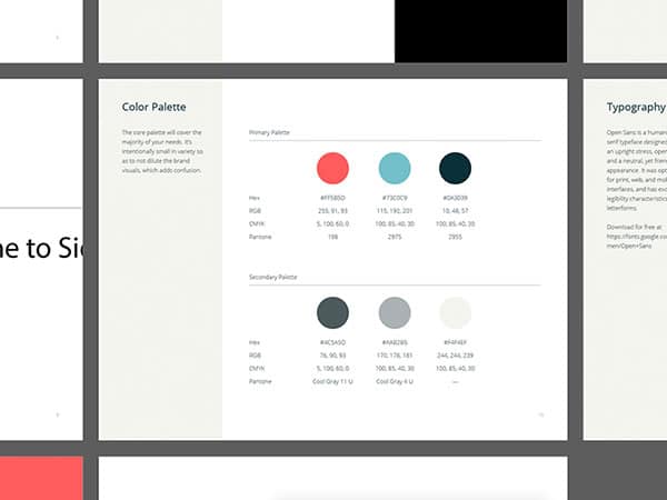
A smartly chosen color palette
Choose your website color scheme with extreme care. With a busy background, you’ll be making it more difficult for users to read and understand the text.
Keep the background theme consistent on each page and the content well-organized so that the color wouldn’t compromise it. Read a thing or two on color psychology, so that you’ll know the exact mood your website is about to invoke.
Brighter tones of red, yellow, and orange are perceived as cheerful and inspiring, while purple or blue can cause a calming and reliable feeling.
Exaggerating with dark colors such as black or brown may end up making the site depressive. Before you choose a palette, think of the effects your website is supposed to achieve.
Businesses are complex, especially those with large product/service lines and multiple options to offer. Those businesses will also target varying types of customers, serve several different industries, and promote content in various locations.
To be successful online, such businesses need to direct and channel customers to their purchases more effectively.
Translated to web design terms, this means to come up with smooth navigation patterns and to serve vital information in a way that will make users understand it instantly. If they’re lost, you’re lost too.
An interesting tip is to create a detailed catalog of your services and to invite users to download them. The download button should be placed in a very visible location, and ideally, appear on each page on the website.
You can even consider making a separate site for it so that users can find it without accessing your website first.
The secret of timeless web design
The more successful your website is, the more leads it will bring along, and the more it will expand your reach. Better yet, a good website is a classic website that can resist the test of time, and one you won’t have to update all the time.
Poorly designed and ineffective websites, on the other hand, will demand constant updates and redesigns, and you’ll end up spending much more than you originally expected.
In the ideal case, your great website will be operable for more than 5 years and updated easily and smoothly each time you wish to add information. Such websites are built with the use of the latest coding techniques, and signed by creative designers with a good understanding of what wide audiences expect.

