Line25 is reader supported. At no cost to you a commission from sponsors may be earned when a purchase is made via links on the site. Learn more
A feature comparison table is useful in decision making for customers. Comparison tables can add value to specific product features, explaining why the product is relevant to the customer and how it is better than others. Also, while putting the list of features together, you should include expert reviews, ratings, and customer reviews to provide complete information about the product.
However, designing a comparison table that provides a perfect comparison between products is not that easy. You will have to select appropriate features for meaningful comparison. Well designed comparison tables also enhance the visual impact of the website which is important for better conversion. Here are 7 tips for designing an ideal feature comparison table to help your customers make an informed decision.
1. Highlight important attributes:
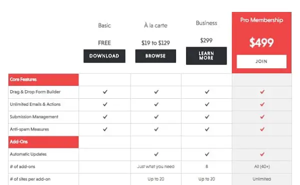
Ideally, you should only display comparable, meaningful attributes that the customer wants. However, merely mentioning some features will make the comparison incomplete. So you should determine and highlight points that users find interesting and have consistent, well-structured data about the products. While the first requirement is easy to crack, the second is a bit challenging. Having a well-structured data is remarkably difficult because of the content limitations rather than technical or design limitations. To solve this problem, you can use a specialized system that organizes, cleans up, and gathers data about products in the inventory and creates a list of consistent, well-structured, and complete attribute details.
2. Consider the content problem:
While comparing two electronics, the common problem arises when the critical attributes are missing in one of them. In such a case, a meaningful comparison is not possible, making it tough for the customer to make an informed decision. Because of this, most people tend to leave the website and search somewhere else. Now even if you display a table with blank sections, people will still leave the page thinking the site is broken and they will avoid any future sessions altogether. So rather than displaying incomplete information, you can create a table without that attribute and guide them to a relevant link or ask for their query and suggest them the best option instead.
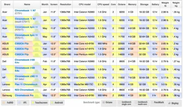
3. Group attributes:
If you follow all the above options and keep on adding all attributes, you might end up with 50 to 60 features in a list. Going through them and finding the important ones would require much work. So, to solve this problem, you can group attributes in sections and create collapsible sections. This way, you can save time and still display all the information. Additionally, you can use a filter or autocomplete search box to allow the customers to find only selected attributes for comparison. You can also add detailed information about some sophisticated qualities that will be displayed upon a click or tap. This way, an organized structure of displaying attributes would help visitors navigate to the points of interest and also see the difference within it.
4. Highlight according to the need:
Most of the websites highlight differences as it is the central purpose of comparison. However, adding a toggle between comparisons and giving the power to the user to select what they want to see is great for enhancing the usability of the table. Hence, the user can choose between seeing similarities, differences, or all the available attributes. Most of the users like to skim through all the attributes to see how time-consuming it is, only to return and select the option to show differences. This is the most used feature in comparison tables. When customers encounter such features, they tend to play around with it to get the most out of the information.
5. Maintain balance:
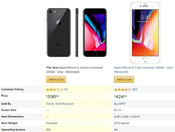
Comparing technical data is necessary for making an informed decision. However, for a not-so-savvy customer, such information is not particularly useful. It would be helpful to replace some technical attributes with practical ones. For example, Amazon does not display technical details as is. Instead, they translate attributes into a simple language that is comprehensible by average consumers. They present advantages and disadvantages for the compared items to separate qualities and highlight critical differences. Apart from this, it will be useful if you can also add a versus feature comparison to highlight how features compare with other products on a bar chart. So, detailed spec sheets alone are not enough to provide a meaningful comparison. You should add more details that customers find relevant.
6. Include sharable URLs:
A feature comparison table is most useful for users to make a purchase, especially if the product is expensive or requires time for decision making. In such cases, some people will take multiple screenshots for future references. However, most people use these screenshots to send it over to colleagues and friends for second opinion or understanding technical details. So, that screenshot will end up in WhatsApp groups, Facebook chats, and Instagram chats. Hence providing an option to save for comparison or share on different social media using a unique URL can enhance your website’s user experience.
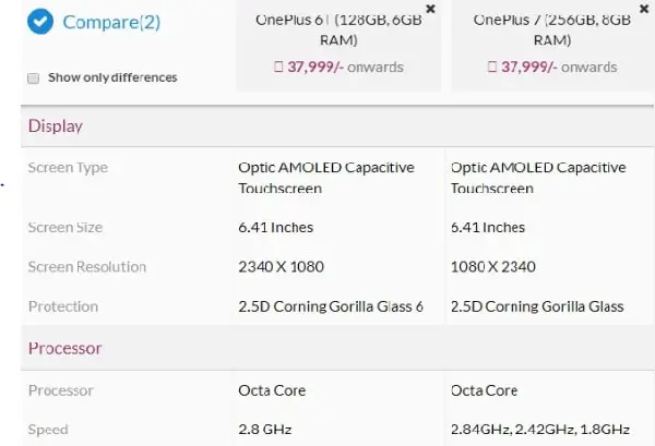
7. Color-code the differences or similarities:
Another much easier way to highlight differences or similarities is to use color-coding. You can use different colors or patterns on the table cells to indicate differences or similarities and define the meaning of the color at the bottom of the table. However, if you use too many colors, the table can end up looking messy. Also, the color you use can affect the presentation of the table. So try to use colors that do not hide the text instead emphasize on it. Furthermore, if your table contains a lot of numerical data, it is better to color code, both row, and column upon click or tap.
Additionally, you should add price, link to the product page, thumbnail, model number, and price comparison of different sites along with advantages and disadvantages to make the table more useful. Also, if you want to make your website more user-centric, you can include additional chat feature for customers who spend more time on the comparison table. However, before creating a comparison, you should first consider if you require it or not. Quite often, websites use a comparison table that seems irrelevant. Mostly cheap items don’t require a comparison table as users buy them frequently. On the other hand, expensive items need a feature comparison table as they aren’t purchased that frequently.