Line25 is reader supported. At no cost to you a commission from sponsors may be earned when a purchase is made via links on the site. Learn more
The world of website design and development is constantly evolving. There is a continuous rapid progression of front end technologies, especially in Javascript. It feels like each month there is a new JS library out; it can be difficult to keep track.
Technologies like React and Vue aside, there is a wide range of free and relatively easy to implement Javascript effects. Interactive JS effects and libraries that are widely available can, with a minimal amount of effort and coding knowledge, add a good level of interactivity to your site.
There is very much a trend in website design towards interactivity and animation. Using these free Javascript effects can help you animate and make your static site interactive, without necessarily having to go down a website redesign or re-development route.
Let’s take a look at 7 free JS examples you can use right now:
Particles.js
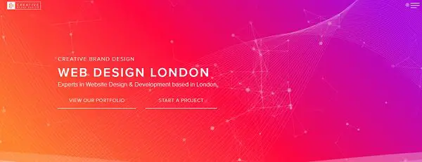
Probably one of the most versatile and widely known reactive JS effect libraries is Particles.js.
This effect uses multiple points and lines to create a network of linked particles in the background of a webpage. They move, swirl around and can often be clicked or dragged to produce new patterns.
The particles follow the viewer’s cursor, and clicking will cause a new wave to burst outwards and rebound across the header space.
The https://vincentgarreau.com/particles.js/ site offers a free configurator and CDN link, letting you get this effect in place on your site with ease.
This web design site is a good example of different particles on the header backgrounds, using a gradient and tasteful white particles to provide good contrast.
LottieFiles
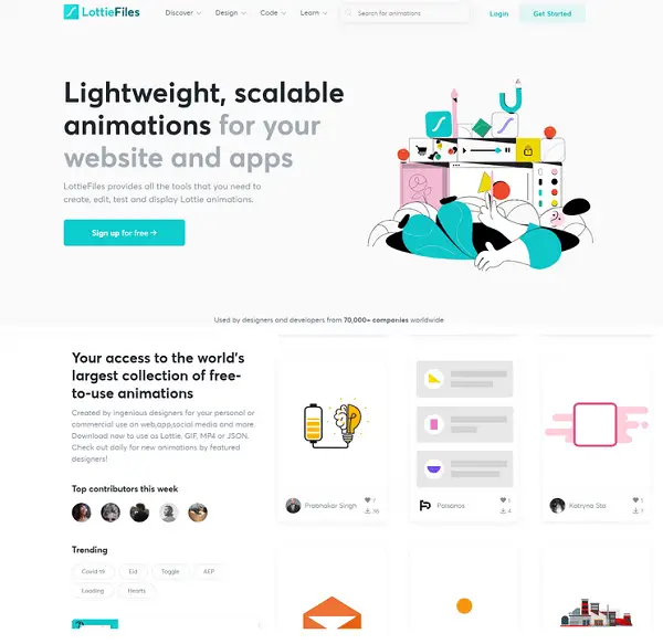
For Javascript power users, effect libraries are generally their first port of call when they need to add animated effects to a website. LottieFiles is a repository and marketplace for thousands of small, subtle animations that can make a site come to life. Their site is full of these animations and details, as a showcase of what they can do. Some site elements bounce, others wriggle, a few can even fly around the page if the cursor moves close to them. There are too many effects to list here, but it’s safe to say that LottieFiles is a great choice of library for burgeoning designers.
Bounce.js
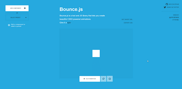
The main use of this effect is creating a “bounce” effect for a site component, occurring either when it’s clicked and dragged, or a cursor passes over it.
Again, this provides feedback for the end user and makes the site elements feel like they have a weight and momentum of their own. It’s this emphasis on physicality and internal logic that makes Bounce so useful, since applying it to multiple site components results in the same “weight” on each.
Often you’ll see users fiddling with the site as they think, so adding more stuff for them to play with is generally a good idea. A sense of playfulness is what makes good interactive features shine; it’s a natural human instinct to investigate and play, after all.
This Codepen is a good example of what can be achieved using the Bounce.JS library.
Mo.js
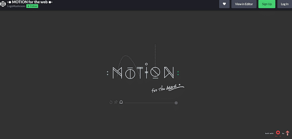
Mo.js is a great example of an open source, modular effects library, allowing users to pull certain effects and ignore others as their needs dictate. By building multiple effects on the same framework, these libraries solve a lot of compatibility issues before they even become a factor. And because many of them are open source, designers are able to modify the underlying code for their own purposes without worrying about copyright issues or ownership disputes. The image above, for their Motion effect, is a great example of the kinds of clean, simple animations mo.js can support.
There is a great Codepen article that details usage and examples.
Three.js
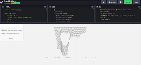
Three.js is a cross-browser 3d JavaScript library. It’s a bit more complex than others on this list, so we’ll focus on one easy to use example, Tearable Cloth. This is a much more exotic effect: a series of digital lines and squares adapted with simulated physics to act as tearable cloth materials, including gravity. It’s possible to alter the size, weight, density and pattern of the cloth using different parameters. The uses for this effect are almost limitless; a fabric ecommerce website could use it for all of their title covers, while a Halloween attraction could adapt it to simulate huge cobwebs without much effort. Its the creative out of the box applications of effects like this that lead to distinctive, interactive and pleasing web design. Novel effects like this are much more likely to be remembered by site visitors in the long run.
Interactive Particles
One of, if not the best effect from the Three.js library, a particle overlay that covers the text and moves away from the mouse cursor when it comes close enough. An awesomely responsive effect, designers can adjust the movement radius, text and particle colours and potentially even the font in use. Important to note, this effect is best used for titles and page headings in a large font size, as smaller body text may be illegible if covered with swirling particles. The upper layer reforms once the cursor moves far away, with a few straggler particles taking longer to coalesce. This little detail makes the movement seem much more natural and organic, and really elevates it to another level of quality.
Neon Hexagon Particles
A particularly striking effect, these particles follow a hexagonal grid and rapidly pulse between colours as they do so, creating an impression of vibrancy and light. There’s a definite cyberpunk vibe here, and websites adjacent to that aesthetic could make very good use of this effect. It probably isn’t suitable for a background due to contrast issues, but as a border or header it should work admirably.
Conclusion:
With these effects, you should be able to animate your website with relative ease. An interactive and animated site can help reduce your bounce rate and increase engagement up to 67%. It can help you retain and engage more customers than a static site. Interactivity is a pillar of good web design, and that’s unlikely to change anytime in the near future.
