Line25 is reader supported. At no cost to you a commission from sponsors may be earned when a purchase is made via links on the site. Learn more
Anaglyphs are those amazing 3D images that are created by offsetting two of the red, green and blue channels, and are viewed with those nerdy looking 3D glasses with different coloured lenses. I don’t know if this effect works for real, as I’ve unfortunately misplaced my 3D specs, but it’s a pretty cool text effect nevertheless! Let’s take a look at how a similar style can be created for sprucing up your web designs while taking into consideration semantics and avoiding the repetition of any markup.
What we’re creating is basically a cool transparency overlay effect that closely resembles anaglyph stereoscopic 3D images. To use the effect in our web designs we’ll, of course, build it with CSS, but the main consideration is to keep everything neat and true in our markup, without any repeated markup. Therefore, we don’t want to use anything like this:
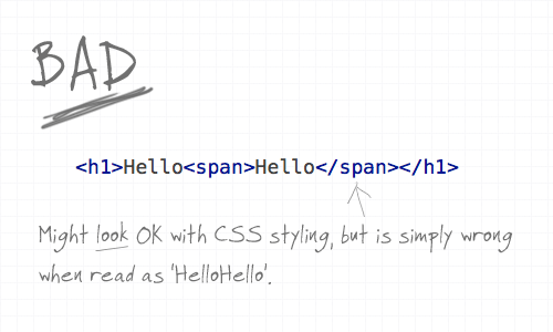
Using a span would be handy to provide us with something to target our CSS to and style up the two words to overlay on top of each other, but when reading aloud in the markup, and when viewed without CSS styling it’s simply wrong. With the effect being more presentational or aesthetic than it is part of the content, we need to ensure it’s semantically correct.
The :after class and content property
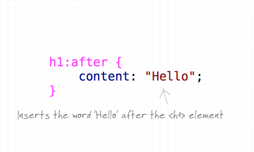
Here’s where the content property and the :after pseudo element comes into play. The :after pseudo element allows us to insert a snippet of content after the targeted header and adding our extra text in the CSS content property keeps our markup free of any wordage that shouldn’t be there, ensuring that it can’t be seen or read by screenreaders, RSS readers or search bots.
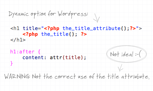
What’s more, we can also use the content property to not only manually write in some text, but also ask it to take the content from a specific attribute such as the title. This provides a dynamic solution that could be implemented in WordPress, but it’s not 100% ideal as it doesn’t stay true to the natural use of the title attribute. The title attribute should provide more information about the element, rather than regurgitate the same text.
Styling it up
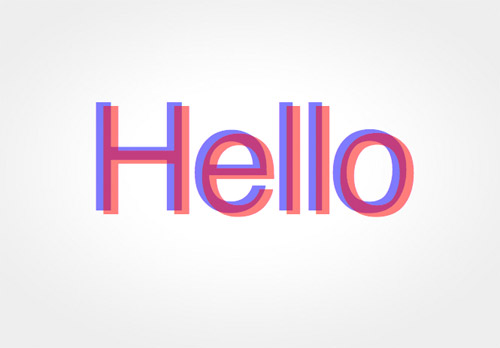
So far we’ve just got two of the same word placed side by side. Let’s add some extra CSS styling to overlay the two and bring in some colour.
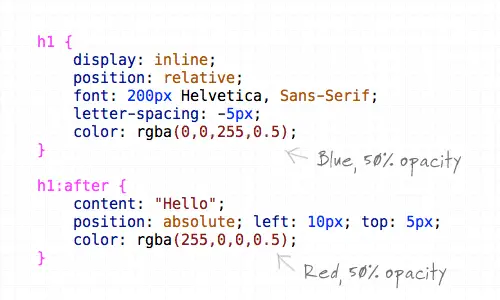
First up, the H1 element is converted to inline and positioned relatively to allow the absolute positioning of the generated text to work. Next up, the font styling is specified as 200px Helvetica with some letter-spacing tweaks to tighten up the example. The text is then coloured using RGBa, which allows the aplha transparency to be set so that when overlayed the underlying colour will show through. The generated text from the content property is also given some styling, specifically the text is positioned absolutely to sit slightly offset from the original at 10px and 5px on each axis, and is switched to red to contrast against the blue.
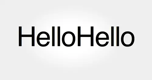
The final anaglyphic effect
<h1>Hello</h1>
h1 {
	display: inline;
	position: relative;
	font: 200px Helvetica, Sans-Serif;
	letter-spacing: -5px;
	color: rgba(0,0,255,0.5);
}

h1:after {
	content: "Hello";
	position: absolute; left: 10px; top: 5px;
	color: rgba(255,0,0,0.5);
}

don't mean to sound like the party poop but … don't any of you have business requirement needs to support IE6/7 in your dev work? I'd consider relying on styling such as this to define the look and feel of a site (as opposed to, say, by using images instead) as a UX #fail.
This is great, I like how you added all the CSS tips in as well, instead of taking the easy root out, to keep people right :)
this takes it a step further so you dont have to put hello in the title attribute and content
I didn’t realize you could get the content of an attribute with css!
h1, h1:after { content: attr(title); }
yes after spending ages figuring out how to do anaglaph im telling you it wont work for several reasons. first off the colours arent the most common anaglaph colours used, blue pink and black are more common.
also there is no reference to the 3d effect. its hard to see if it is popping off the page on plain white. try putting a textured background behind it
Nice idea but would you ever want to do that effect in a business sense?
Why not? It’s 2019
Hard coding content into css doesn’t seem right to me.. I think text-shadow would be the right way to do this, it would work no matter the content ;)
Man, I’m sorry but that sucks!!!!
there is no 3d effect at all…
I don’t have any glasses handy, but I think to get a 3d effect you need the horizontal offset to change along the text. If the letter spacing is different for the two colors you might get somewhere. Also get rid of the vertical offset, that makes no sense for stereoscopic vision.
Great info on 3D effects.It is an important feature for designing websites.
Custom web site design solutions for small businesses. Virginia website designers producing custom web sites, shopping cart sites & database driven sites, and everything else web related.
3D Modeling Virginia
Might have been a good idea to test with 3D glasses BEFORE you wrote a blog post about it!
Repeating content in CSS is if anything even worse than repeating it in the HTML. Now you have to update both HTML and CSS to change the content, which is less than ideal.
Here is a better approach, that also does away with the background image used for the gradient: https://users.skumleren.net/cers/examples/line25.html
I am trying with a pair of red/blue 3d glasses from an old box of cereal and I don’t notice any 3d effect :(
Agreed, it is wrong colors (i using the chrome). It’s ain’t work with my anaglyph glasses (red&cyan).
Great read, some good points mentioned there
Nice idea, but I’ve got one nit:
inserting text with CSS :after will not hide it from screen readers, since it will be part of the DOM.
Smart job…….It’s nice….Thank…..
But it do not work on IE6.
IE6 does not take ( h1:after ) attribute because, that is old brower.
thank you, it’s a great tutorial
Very clever idea Chris, but extra bonus points for those who thought of using text-shadow instead.
I like this topic and now i m looking for investment blog and i create very good one …..https://www.investresource.info
Thank you, it works. I use to combine color: rgba(153,204,255,0.5); and color: rgba(255,153,204,0.5); for my blog ;)
Nice technique Chris, thanks.
What I really like is …
The 2nd hello is created for presentational use… Separated to the CSS. That’s really awesome!
I’ve always known about the :after pseudo element but never actually used it!
I am changing my mind atm :)
effective use of the content property
Great work…but I have a query…
Is there any CSS property to make font smooth in IE?
waiting for your reply
Tutorial added to thewebtuts.com
Hello,
Very nice. but not good in IE. in IE its does not show any colour. only show black colour
only good in Mozzila browser
Great tutorial. Its good practice for web standards to create text effects like this using CSS and real text on websites instead of using images.
Nice tut buddy
This is the stuff of CSS Ninja’s!
Great tutorial Chris,
I think this is the second tutorial for the text effect using CSS. First one was Letterpress effect, Right?
Very interesting tip, I had not even thought about using content: in this way. Thanks Chris.
Wow this is a great tutorial! Thanks for sharing :)
Great tut. It works!
Chris – Love your work, but you should let folks know that the :before & :after pseudo elements aren’t supported in all browsers. Same w/ rgba colors.
With only a little bit of effort, the effect *could* be identical in IE8 at least. ;)
thank you for sharing. I like these simple tuts as the Letterpress one, more into good code than design.
That is really cool, at first it sent my eyes funny but after reading your tutorial I want to try it.
Wow, that really does look cool. I’ll have to use this is some of my designs at some time. Thank you, Chris.
This is awesome…will surely use it..
This is tight :-) Great technique
Just like Brad and Steffan said, text-shadow is much better. Simple CSS and easier to make template with CMS system.
CooOooOool Post i will use it my new personal project thanks Chris :)
*rawr*
Just love this cool Text Effect – thanks! :-)
Great effect. So simple and efficient.
Why use the :after pseudo-element at all? This seems like a job for text-shadow
h1{color:rgba(255,0,0,0.5);font:200px Helvetica, Sans-serif;letter-spacing:-5px;text-shadow:-8px -6px rgba(0,0,255,0.5);}
You know, that was kinda what I was thinking… But I guess either way will work just as well.
Very cool idea though and great use of CSS3, thanks Chris!
I firebugged the h3 heading above the last demo, and got just as good a result without having to enter content into the CSS (as the :after solution would have us do):
color: rgba(255, 0, 0, 0.5); font-size: 120px; text-shadow: -7px -5px 0pt rgba(0, 0, 255, 0.5);
Now _that’s_ using your head :)
Great effect. So simple and efficient.
Anaglyphic images should be vertically aligned, i.e., on the same horizontal line, just as human eyes are on the same horizontal line. Otherwise, you will have to tilt your head to see it right.
Interesting. Would work “h1:after:after{} as well or is there any alternative if I want more than one “after-text”?
This is a great tutorial. I had some clients asking me if something like this is possible on the web. Now I can tell them that it is. Thanks for the great post.
It’s things like this that make CSS3 pretty awesome. That’s one less thing to do in Photoshop!
Thanks for the tutorial Chris.
An alternative way to achieve a similar look, still using CSS3, would be to use text-shadow. Something like this would garner the same results:
h1 {
color:rgba(255, 0, 0, 0.5);
letter-spacing:-5px;
font: normal 200px “Helvetica, sans-serif”;
text-shadow:-10px -5px 0 rgba(0, 0, 255, 0.5);
}
So, just for grins… does anyone have 3D glasses laying around that they could test this out on and report back?
yeah, this does not work as 3D as this is not the technique used to create 3D images, but its a nice effect for plain viewing.
Nice. I tried something similar to this recently using multiple text-shadows. The advantage of that is that you can “set it and forget it” for something like a blog, rather than having to make a new :after for each piece of text you want to have the effect.
I’m dying to get a project where this would be appropriate. :)
https://hayloftdesign.com/3d-text.html
That’s brilliant!
I never tought of doing this like that. Thank your for this tutorial.
nice post ….
Good technique Chris. Nice tutorial.
NICE…..
Pretty neat! I will be using this in future projects! Thanks :)
yea, I am wondering how to make that “properly dynamic” when embedding it in some kind of web app…
great tutorial i will use that technique in my future project thanks Chris :-) Cheers
Awesome tutorial Chris. I never thought of doing this. I love how you create these cool text effects with just CSS3. Very creative and it definitely shows some forward thinking of practical uses for CSS3.
hey Chris,
I like the article, great us of rgba. I am not too sure about the h1 display:inline thing though… If we use this in “real life” the headings should remain block level elements :)
You could put the h1-tag in an additional div with display:block. Not the perfect solution, but you can overcome your problem.
Besides that: Great article, I simply love CSS3.