Line25 is reader supported. At no cost to you a commission from sponsors may be earned when a purchase is made via links on the site. Learn more
Dribbble is a fantastic place for designers to share their works in progress and is also a great place for designers to gain inspiration and pick out recurring trends across the design spectrum. This post rounds up a collection of snapshots of rich interface design elements from both website designs and app designs. Each one has been carefully crafted for its detail, use of textures, subtle lighting effects, and various tones & colours.
Searching on Universal Subtitles (web app interface UI UX)
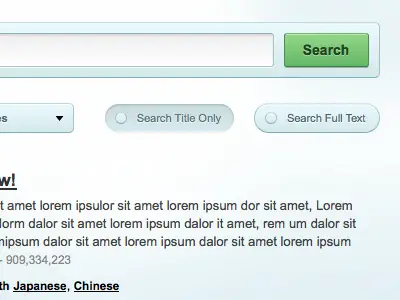
This web app interface uses a light blue palette and a green search button for its interface design.
Planner app
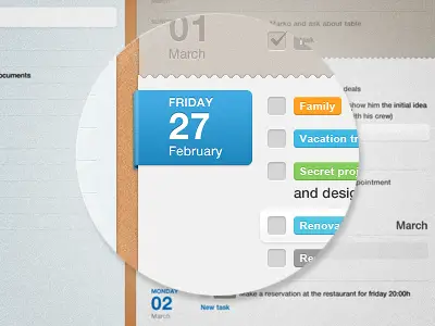
This planner app is only a small detail in a cool interface design. This is a good example of choosing the right textures, fonts and colours for your project.
New Flyosity Design: Contact Page
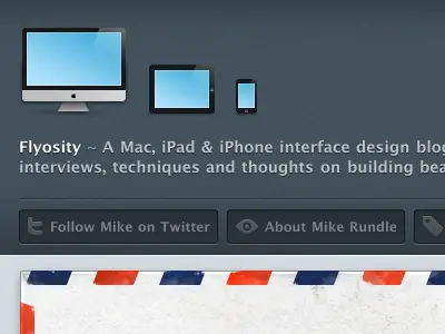
This is another example I find interesting through its neutral yet also friendly interface.
Web Stuff
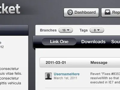
Sarah Mick chose a dark and light grey palette of colour for project’s interface design.
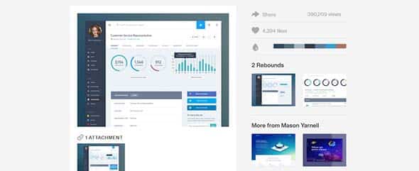
Dashboard Design
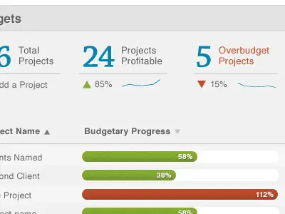
This is an example of a light grey dashboard design that also shows a great interest in choosing the right typography.
A Theme
This is a much more creative example thanks to the textures and colours it uses for its design.
Web Store Mock
This is a sneak peek at a web store project that uses grungy greys and bold green texture for its interface.
Web Interface
This light blue interface might be your next source of inspiration as it uses a classy and clean design.
Vintage
This example has a vintage theme for its interface design that uses light brown as its dominant colour.
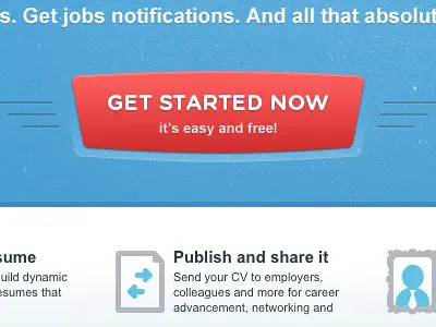
We Need Web Heroes Today
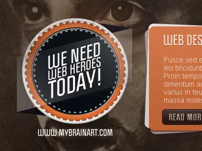
Check out this bold interface design that uses colours, textures, images and so much more for its web design layout.
Design Notes
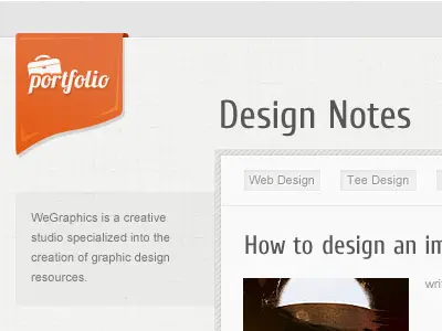
Design Notes has a sensitive touch thanks to the mathematics paper it uses as background texture.
Search
This innovative yellow search button might serve as a source of inspiration for your next project.
Blog Page Design for Marketing Website
If you’re in the mood for a bold coloured interface inspiration then you might want to check out this blog page design.
Photoshop Browser UI Action
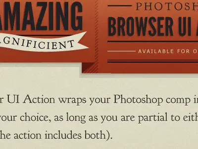
Who says red is no longer trendy? check out this cool Photoshop browser.
Ubiquity.
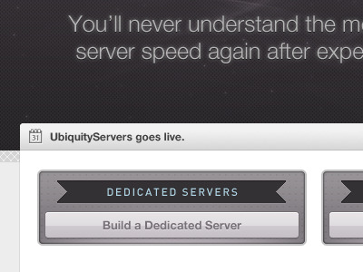
Or maybe you’re in the mood for design layout that uses darker colours, if so you should check out this sneak peek from Ubiquity.
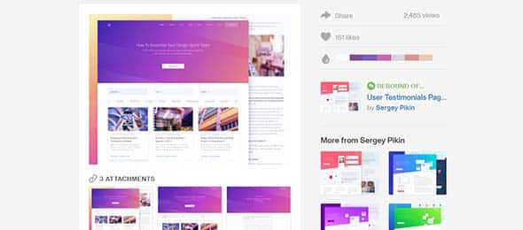
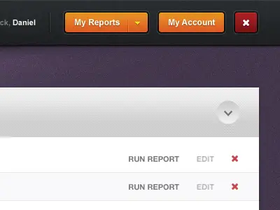
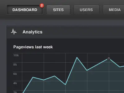
Dashboard Web App Product UI Design: Job Summary
If you like dark blue themes, this dashboard design might be a good source of inspiration for your project.
This is another good example of mixing the right textures and colours. The dark and grungy green blends well with the wood texture and the pale pink.
Slider Caption
This is yet another example that mixed the right textures for its interface design.
Website Design
This interface’s colours blend really well with the chosen texture that makes images stand out.
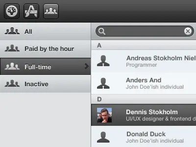
dashboard UI
This is another example of a dashboard UI this time with a much more girlier interface design thanks to the pink colours.
Freebie PSD: Flat UI Kit 2 (Blog)
This is a great set that also comes with a free PSD included. Feel free to try it out!
Ui Kit Rainy Season
If you’re up for a rainy season theme then you might want to have a look at this UI Kit.
Splash of red
Or maybe you’re in the mood for a splash of red in which case this design might be exactly what you’re looking for.
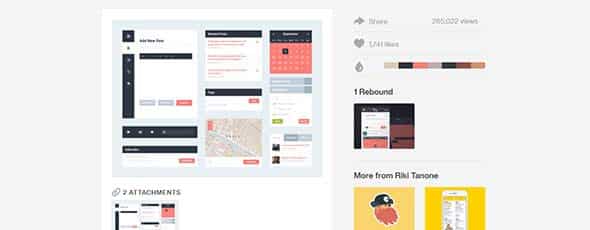
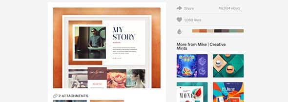
Zora Dash – Properties (WIPs)
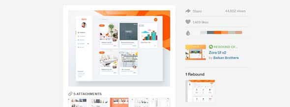
This example has a friendlier look and mixes bold orange colours with light grey tones.
Dellustrations New Look
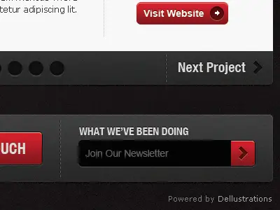
And if you like bold ideas you could also check out Dellustrations’ black and red interface design.
Sanithouse
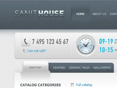
This is another inspiring example that uses grey tones and textures for its interface design.
eBay Redesign
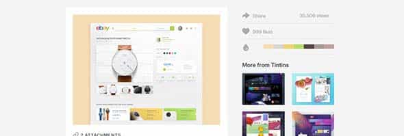
This eBay Redesign is another good example of choosing the right palette and style for interface design.
Resources

Have a look at the orange themed interface design and their choice of textures.
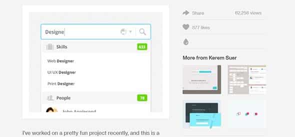
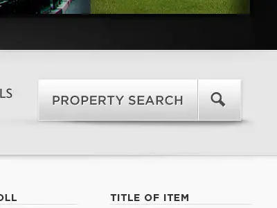
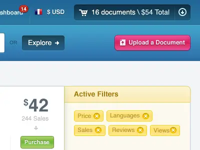
CRM Search & Widget
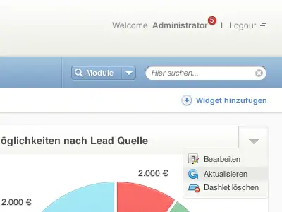
Check out Ivo Mynttinen’s search widget.
Joomla – Leopard Theme 3.
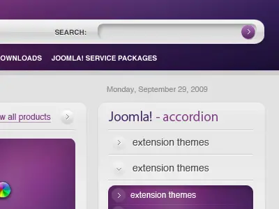
Joomla’s purple palette gives the interface a warm touch. You can also check the layout in full size.
Beta invite
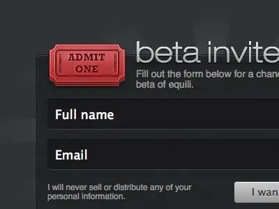
This is yet another cool example of a black and red theme that could serve well as inspiration
Toy store – home
Or how about this classy interface design that uses all the right textures.
Almost There
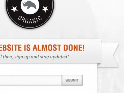
Almost there is combines a light grey palette with a letterpress effect in an interesting and innovative design.
Sanithouse Part II
This the second part of the Sanithouse project and has a neat interface design.
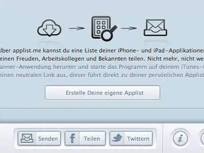
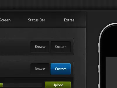
Buttons!
Buttons can give you lots of troubles and headaches so maybe this example might come in really handy the next time you’re looking for some inspiration.
Vrb
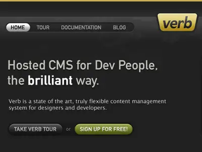
This is yet another example of an interface that uses black as its background. This kind of design can seem a little rough but in this case and with the right typography you can get an interesting result.
Dropdown Menu UI
This Dropdown Menu UI is only a small piece of a project for Love.ly. It uses a nice palette of colours and all the right textures.
Life on Prime UI
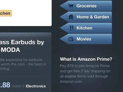
This is yet another example of an interface that uses dark tones of blue, this time, with white typography.
Aviathemes
This one has a much more dynamic touch thanks to its colours and typography.
D for Deploy
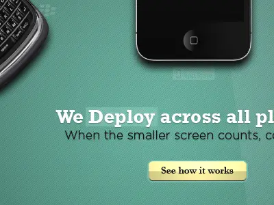
Check out this sneak peek for Deploy and see whether you like the mix of colours, textures, images and typography.
AC redesign – old
This is a much more creative example thanks to the textures and the doodles it uses for its interface design.
StudioTwentyEight v7
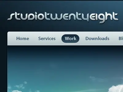
This project for StudioTwentyEight has a neat and clear design that uses blue tones and nice typography.
Search Animated
You might also want to check out this sneak peek for it may be a good source of inspiration in the future.
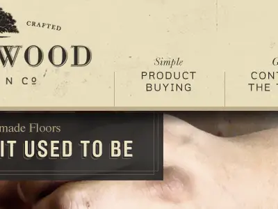
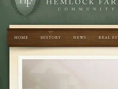
This is a much more detailed interface. It uses leader and wood textures which give a neat and classy look of the interface.
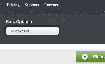
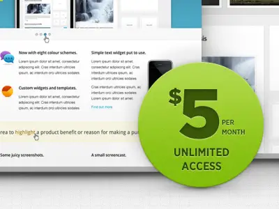
Plans & Pricing
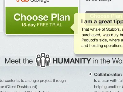
This one uses light blue textures which make content stand out and a green colour for the Plans and Pricing button.
Working on a new downloading UI for Miro
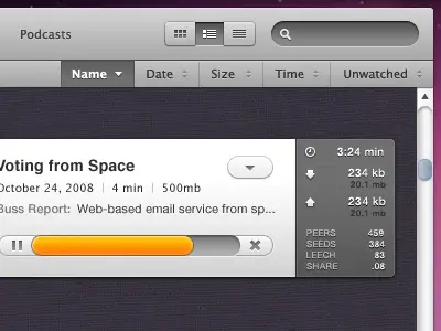
This is a sneak peek from
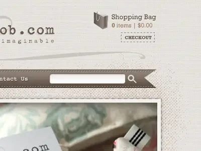
Checkout Interface
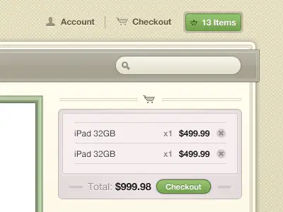
This is yet another good example of mixing the right textures and colours into a nice interface design.
Web Interface
This web interface uses a light blue grey palette with only a bit of red at its menu bar.
Game on…
Check out these details from Josh Hemsley’s project that also uses grey tones.
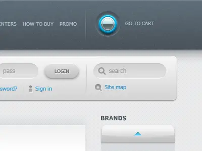
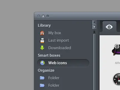
Admin Interface
This one mixes a purple palette with warm colours like orange and red but only in small quantities.
Webapp interface excerpt
This is yet another example that has a clean and neat design and uses grey tones.
Forum Interface
This forum interface design uses dark tones of grey and black with only a bit of blue.
Interface Design Elements
This a creative example of how you can mix colours textures and typography into a nice interface design.
Social interface
This is a much more playful example that uses bold colours like pink, green and purple.
Spot web app interface
This one uses a side bar menu and light colours for its interface design layout.
Dark CMS – Dashboard
This dark dashboard interface mixes all the right textures and colour tones into its design.
Soon.
This is yet another good example of choosing all the right textures for your next project.
Theme Builder V2
This black grungy texture that this project’s interface uses makes all the other colours stand out.
Iconbox
If you’re looking for some icon ideas or ways to uses them this project might be your next inspiration.
Candy Cane Loader
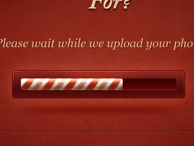
This is another example of a playful interface that has a candy cane as a loader.
iPad UI for cookbook
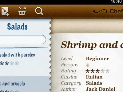
This interface also mixes the right texture and typography into a cool design.
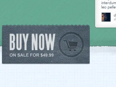
Big Green Button
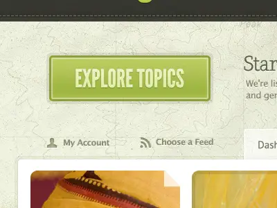
This big green button might just be your next source of inspiration for your project
Vintage Play Button
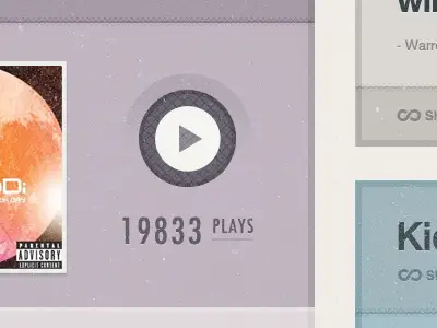
Or you could always have a look at this vintage purple play button. This is also a good example of mixing colours with textures into a good interface design.
Homepage Mashup
This is yet another bold interface design that mixes textures with striking colours and white typography.
A Big White Button
This neat and clear button might be just what was missing from your design layout.
Button
Or you could always get inspired by this bolder red button.
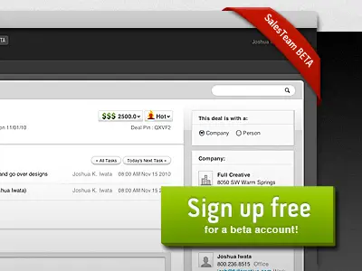
Sign In Button
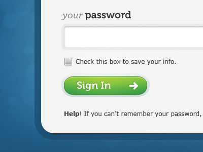
You might also want to check out this green sign in button and the way it blends in this interface design.
This is yet another cool example of mixing colours with textures into a neat interface design.
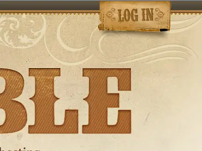
This textured thematic log in button could be your next source of inspiration.
MOJO Themes redesign
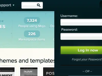
This is a cool theme redesign by Brian Hoff that uses a black background and makes all the other colours stand out.
Mkb SRP
Mkb SRP is a small insight on Jonatan Flores project which has a neat interface design.
[Redacted] Quality Service
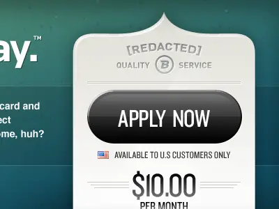
This interface design mixes textures with neat and clear designs making this example a good source of inspiration for futures projets.
Home Button
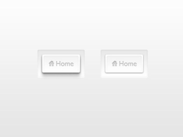
If you’re in the mood for something more elegant than this home button is just what you’ve been looking for.
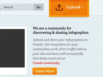
This orange upload button blends in really well with the light blue grungy texture in the background.
Download Button
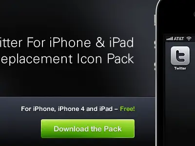
This is yet another example of a black background that makes typography and colours stand out.
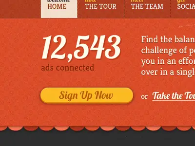
Chunky Button
This chunky sign-up button gives a much friendly look to a monochrome interface.
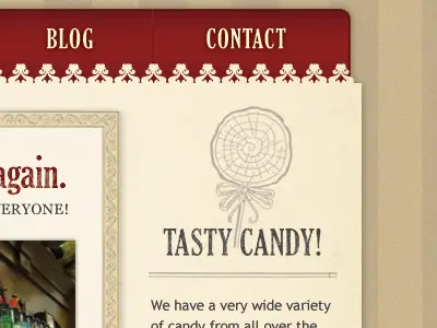
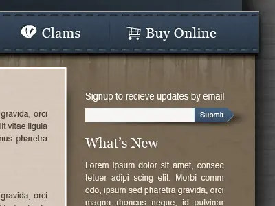
Wines Menu
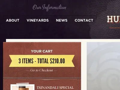
This example mixes textures and a vast range of colours for its interface design.
Trappe Door Menu
This themed vertical menu is another sneak peek from one of Matthew Smith’s projects.
bS
This example uses a blue palette and gives a friendly and familiar touch to the interface.
Short cut
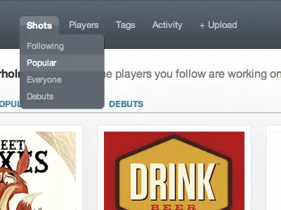
A shortcut example for a menu bar that uses grey tones in its interface design.
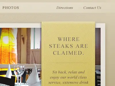
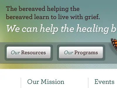
Coming together
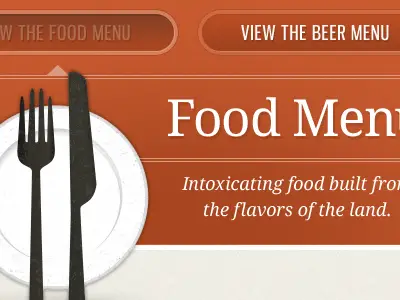
This is a sneak peek at an online food menu by Matthew Smith that uses warm colours and white typography.
Still working on it…
This is Danny’s sneak peek of a project he’s been working on. It uses smooth textures and huge typography.
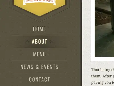
Theme Menu
This is yet another project that uses orange and other warm colours in its interface and the background texture is something you don’t see every day in website designs.
This expanded menu an insight from one of Mike Precious’ projects.
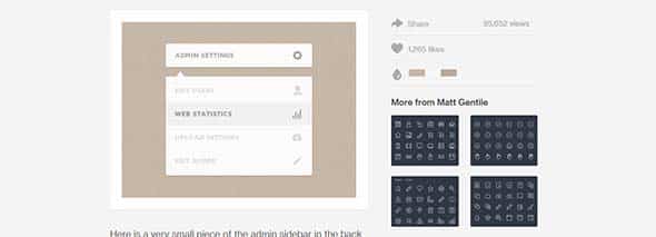
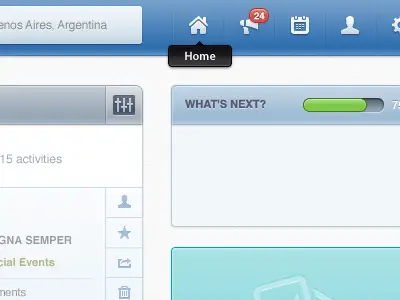
Management Control Panel
This management control panel has a good choice of colours and texture in its design.
Pricing Welcu: UPDATE
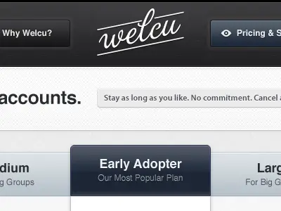
The Pricing Welcu example uses a blue-grey palette and has a more formal interface.
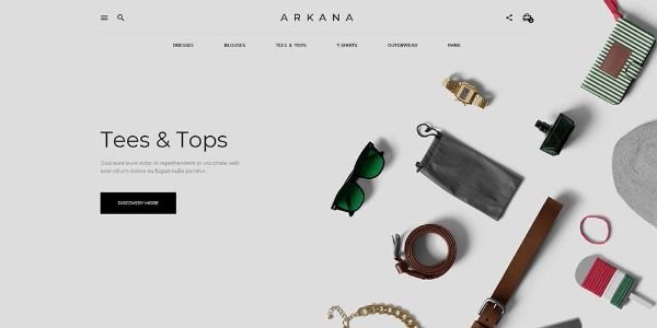
Web Design
This one uses warm colours and the right typography which give the interface an elegant touch.
Any Menu
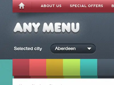
This a much more colourful example from ‘Any Menu’ that gives the interface a much friendly design.

Amazing work!!!!!!!!!!!!!
Cool and creative design specially for menu bar in Website Designing.
Thanks for sharing
inspiring collection you sharing.
Wow, really nice collection, thanks for sharing! :)
Great! Thank you for sharing!!
Very interesting Illustration and UI works! Thanks for sharing.
Perfect… This is a great source of inspiration, exactly what I need as I'm in the process of creating my own website.
Great collection. It's all in the details.
What a great collection of inspirational little details.
It is so true that the attention to detail can lift any design, especially web design.
The emergence and the relentless popularity of any type of Apple product, with its clean lines and sleek interface, which contain such attention to detail. This has seen the look rise dramatically in popularity and seen an abundance of its influence spread across the web.
This is no means to the detriment of the web, quite the opposite, it has enhanced the look of many websites and has stop the web being filled with numerous generic, poorly built, hideous sites and has added a level of sophistication.
This blog goes to show that with a little knowledge and several subtally placed gradients, textures, drop shadows and letterpress effects can elevate any websites design into a clean modern looking interface that would be welcome to grace the eyes of any Apple designer.
Great list! Thanks for sharing :)
Some very beautiful examples here, all inspired—in my mind at least—by Apple, and more specifically Mac OS X. Apple leads; others follow.
Spectra, it is important. This is especially valuable for the design. But, it is difficult for an unprepared person.
Thanks for the feature :) good selection.
Some simple and beautiful examples… Thank you!
awsome collection..
thanks for sharing…
Nice selection Chris. I really appreciate this post, and I would love to see some more as your "best websites of th week" posts.
Real nice collection.. thanks for compiling.
This page has gone into my "Inspiration" bookmarks.. :)
Great collection I must say… Great scrap book for inspiration and ideas.
Nice selection here Chris, thanks.
Muito boa seleção Chris, Thanks.
Great collection! Very useful as inspiration.
These are excellent. Pretty much what dribbble has to offer.
WOW! A great showcase of what can be done. Great inspiration, and makes me realize I've got a long way to go before my designs look that sexy!
Amazing how little design touches really make the elements look so great.
Thanks for another great post, Chris.
Brilliant Collection. Love the textures.
Thank you for sharing, Chris.
This is like 'the best of', very nice and great for inspiration! Thanks!
Thanks Chris for sharing it in minute detail. It is a great collection.
Nice round-up, Chris. Thanks!
The subtle use of texture in some of these designs are very good. Thank you, great inspiration.
Very stunning designs Chris! Good choices…thanks for the inspiration! :)
Awesome selection of UI masterpieces. Thank you Chris for the inspiration!
Chirs, where is the 'Like' button for this post ;)
*Chris*
One by one it are bbbeautiful pieces that you have selected Chris :-)
Detail and color selection are two important things in design.
Awesome..
they are all beautiful
Some beautiful design detail shown here! Adding a lot of detail is one of the most important elements in making a website stand out from the rest.
Thanks for sharing.
Truly awesome!