Line25 is reader supported. At no cost to you a commission from sponsors may be earned when a purchase is made via links on the site. Learn more
Table of contents:
show
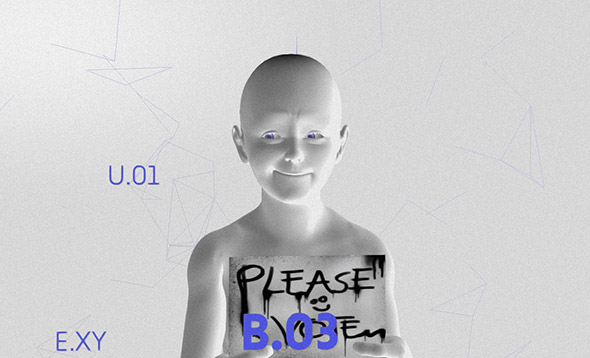
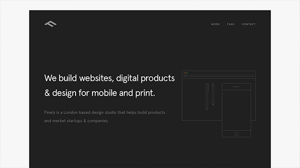
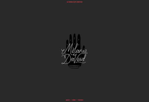
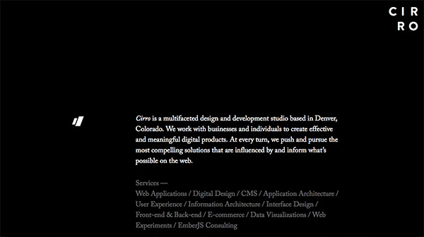
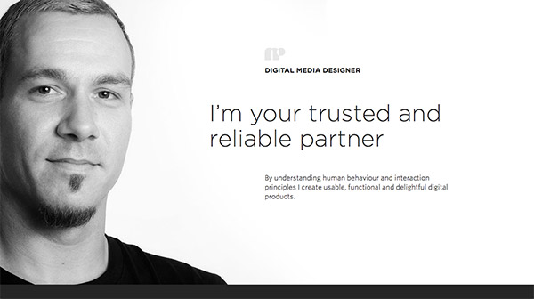
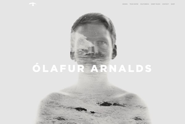
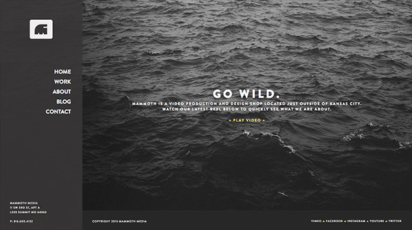
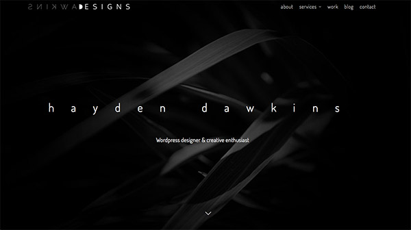
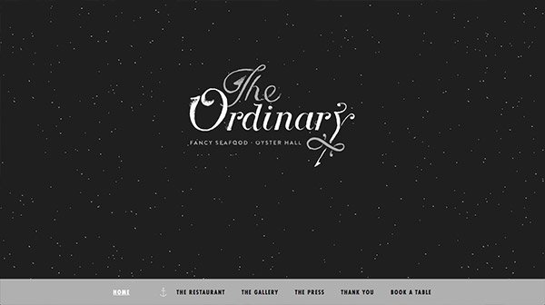
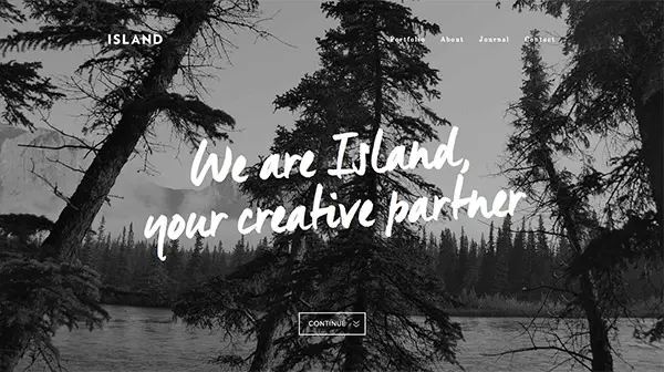
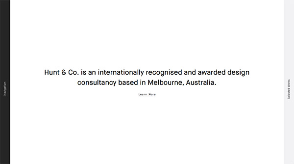
Designing a website using just black and white provides the highest contrast possible between text and background elements. Combined with black and white photography, this produces powerful designs that grab the attention of the viewer and draws them in with their seductive qualities. In today’s showcase I round up 20 beautiful examples of monochromatic website designs that master the use of black and white in their interfaces.
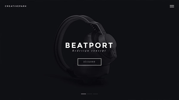
CREATIVEPARK
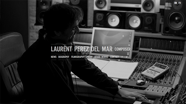
Laurent Perez Del Mar
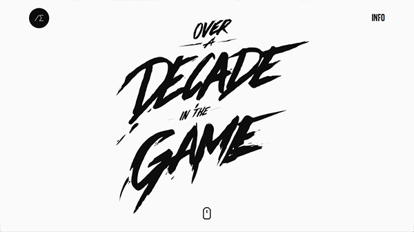
Alexander Engzell


I Loved the colors and concepts
Hatton seems to me very interesting
Thank
you
very nice site
wow great ! I love the black and white classy look
black and white design is beautiful and stylish, but is a little depressing
Very instructive black & white web design. Thanks for this wonderful colors and concepts ideas.
Hello
black and white contrast is nice but I think you can create contrast by other colors too , such as blue and red for example to make a website more cheerful.
Thanks
Thanks, I really like black and white design.
i love black and white design , really Wonderful Black & white web design
thanks for share this <3
I Loved the colors and concepts.thank you so much
I Loved the colors and concepts.thank you so much
Thank you so much for this great share<
Look at this awesome designs
Thank you for this selection ! You miss this one
tnx alot i love it great post
tnx alot i love this site :)
Loved the colors and concepts. This type of themes worth more than colorful themes because they look much attractive than colored ones.
Wonderful Black & white web design. I love all these design. Specially last one attract me much.
Thanks for sharing such a beautiful Black & White Web Designs.
Beautiful black and white web designs I liked the laurent Perez Del Mar and Island design
Thank you for this selection ! You miss this one https://raphaelmalka.com/home
Love black and white designs they are so clean great websites designs too lovely selection.
I really like the way you showcase a number of different websites and their designs on your blog regularly.
The designs of websites in this list are amazing!
i think the colorful PLAIN would be better
I’m loving this return to the ‘back to basics’ attitude towards design. For too long we’ve had too many colors, shapes and way too much noisy content. Black and white designs in the main look very contemporary and creative. Loving the Tobias van Schneider site…
Very beautiful, please visit our site
gowebsite.ir
Yes, This is great, it is useful..
Combined with black and white photography, this produces powerful designs that grab the attention of the viewer and draws them in with their seductive qualities.
So True boss.
Wao… Awesome web design.. Look fabolous.
Classic.
Black & White designs are simply amazing.
Thanks for sharing.
At risk of sounding like a total nob, I think that black and white has such elegance and modernism to it. I don’t know, I’m pretty minimalistic myself but I feel like you can do no wrong with plain ol’ B&W
Thanks for the roundup! What really captured my attention was the first two examples. I love that the composer website made use of a well-chosen grayscale background image to immediately tell you what the site is about. The Centralway “Numbrs” was a head-scratcher: it didn’t look like a banking app to me. They probably went to modern / minimalist with this one.
really powerful pack.
thank you dear author
Useful selection of great from this post!
Wow these are very impressive and eye-catching web designs and no doubt contrast of white and black always gives a very classy results.
wow this are very simple and beuaty
thanks a lot
While implementing in web design, I found unbelieveable result. Thanks for your information.
Really i doesn’t make color conflict, such design make nice looks of websites. very realistic and well experienced……
When did it become a rule that all creative agencies have to use the line “WE ARE ___________” as the banner on their websites? As soon as I see that line I always assume they aren’t really that creative after all.
Very inspiring and attractive list of websites.. Black and white colors make for each other because black and white color is attractive look to anything..
Thats indeed a very rare set of design inspiration.
While doing a redesign for my portfolio(https://www.terminalalterego.com) I too had something of these sort in mind. The power of black and white and the contrast it creates for the content.
I love these examples, what a great way to inspire people to do more black and white designs. I really love these!