Line25 is reader supported. At no cost to you a commission from sponsors may be earned when a purchase is made via links on the site. Learn more
How often do we go to an unknown place and have this fear of getting lost? All we look for is for signs to help us navigate the surroundings. We’re looking for something that helps us get around the unknown territory. Some information that would help us reach the destination or at least will keep us informed about where we are. Well, that is precisely what breadcrumbs do for websites; in simpler words, they are the signs for websites. For websites that have a large number of pages, for instance, e-commerce sites, breadcrumbs help users to navigate and improve their website experience. A breadcrumb helps reduce the efforts for the visitor to reach a higher-level page.
1. What is a Breadcrumb?
The term Breadcrumb is from the fairy tale Hansel and Gretel in which two children used breadcrumbs for forming a trail back to their home. Breadcrumbs in the digital world offer your site users to trace back to the original landing point. So, in layman language, A “breadcrumb” is secondary navigation that helps your users to get through your website/ application quickly.
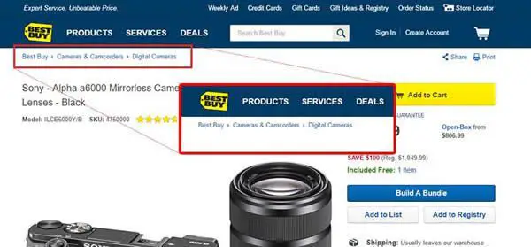
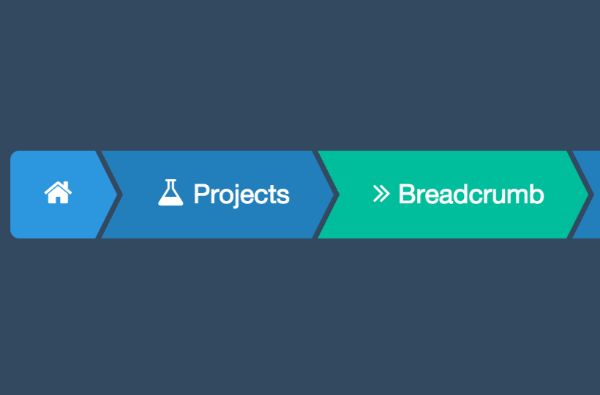
Breadcrumbs are horizontally arranged text links that are usually separated by (>) the higher than symbol. It guides you about the hierarchy of the page.
Of course, Breadcrumbs are great, but not for all sites. It should be avoided from single level websites. Sites that have a tonne of content need breadcrumbs. You can usually find breadcrumbs of e-commerce sites or in web applications that have ample of steps. You can simply pen down a diagram of the website’s architecture and analyze it further to determine if it requires a breadcrumb trail or not.
As vital as this feature is, it is to keep in mind that it is an extra feature and should be treated as primary navigation menus. Of course, the major aspects are the primary focus when it comes to designing the primary navigation. Still, small things such as breadcrumb trail are as well equally crucial for your visitors to have a seamless experience.
Well, we are about to dive into the design aspects of a breadcrumb, but before that, let’s take a glance on why should it be used.
2. Why Should I Use Breadcrumbs?
Breadcrumbs turn out to be an effective visual aid as it indicates the user of its location in the website hierarchy. Hence, this makes it very easy for users to understand where they are and where else/ further they can navigate.
Apart from the users perspective breadcrumbs are also very useful for SEO since it’s easy to navigate through your website, your bounce rate drops drastically.
Also, you want to minimize your users’ number of actions and provide them with a seamless experience. A study revealed that users who were guided by breadcrumbs completed site tasks much faster than the ones who didn’t.
3. Types of Breadcrumbs:
Just before we dive into design aspects of the Breadcrumbs, here are a few types of Breadcrumbs you should know.
1. Path:
Just as the name suggests, Path-based breadcrumbs display the path taken by the user to reach the current page. This type of Breadcrumb provides similar functionality as the forward and backward button and hence it is least used.
2. Location:
Location-based breadcrumbs indicate where the current page stand in the hierarchy of the website.
3. Attribute:
Attribute-based breadcrumbs guide the user according to the attributes or categories of the website. Such a type of Breadcrumb is more often used in e-commerce websites.
Since breadcrumbs hardly take up any space and harm your users, there is no harm in trying it out, right? Convinced to put up Breadcrumbs in your design? Here are a few most basic things to keep in mind while designing a breadcrumb!
4. The basics of Breadcrumbs design:
The essential thing to consider is that Breadcrumb is not primary navigation; it is a secondary feature just to support the users’ navigation. Your home page doesn’t need a Breadcrumb. The users’ journey starts at the homepage and hence it requires it.
2. Link it Right:
Do not make the page the users’ are on/ current page a link. Since your users’ are already on that page, they don’t require a link for the same. Instead, it may confuse the user if it leads to a different page or is the same one.
3. Not too eye-catchy:
We have been repeating ourselves that Breadcrumbs are not a primary element. Hence, they shouldn’t be designed in a way that they grab any attention. In simple words, they shouldn’t be the centre of your design. A too eye-catchy design might distract visitors from the primary navigation.
4. Style it right:
Your styling and sizing for this element should be such that it simply gels in with the rest of the page. It should be the first thing your user notices while visiting your website. Along with keeping your design not too obtrusive, don’t design in a way that it’s hard to find it.
5. Placement is the key:
Place it right. Your main navigation should be on the top of the page, and since Breadcrumbs are secondary navigation, it should be below your main navigation yet above the page content.
6. Arrange the trail:
Start it right. Since the home page is the starting point, that is where your trail should start.
Providing a link to homepage acts to link and anchor and makes it easy for the user.
The end goal should be to gel in the links in a natural way. It should just fit in seamlessly. Google is one of the best examples of it since Google products have ample content.
7. Keep it familiar:
Since you’ll have breadcrumbs on each page of your website ensure that they are placed in the same way and occupy a similar space everywhere.
8. All about symbols:
Traditionally breadcrumbs usually are put up with a few text symbols like the forward-slash or the right arrow bracket (>). These work because they’ve been used for decades and users are familiar with them. But, don’t be scared to experiment. You can anytime customize your bread crumbs and come up with a new design.
The “greater than” symbol (>) is the frequently used symbol for separating links. The higher than symbol helps to denote the hierarchy. For instance, Parent category > Child category.
Symbols such as arrows pointing to the right (→), right angle quotation marks (») and slashes (/) are as well used as separators. Their symbols make it easy for the user to understand the hierarchy used are arrows. The choice depends on the aesthetical values of the site as well as the type of Breadcrumb used. It is suggested to use arrowheads and not slashes as separators.
9. Avoid them on mobile sites:
Say no to Breadcrumbs on a Mobile Site. If you feel that your mobile site requires breadcrumbs to navigate users, then the first thing on your checklist should be to examine and analyze your design again. Breadcrumbs should not even be on the agenda when it comes to mobile site.
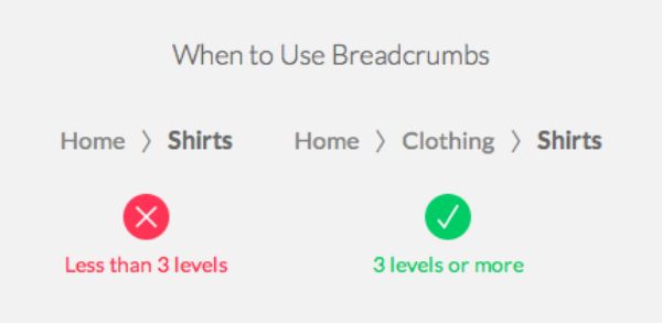
10. Show the necessary path:
Always show the whole path. When working on it, makes sure that you show the whole path to avoid any sort of confusion. Keep your users informed about where they are on your website.
Highlight the last item. As the text would be prominent, it would be easier for your user to know where they currently are in the website hierarchy.
It is a sensible idea to use the full-page title in breadcrumbs. It helps the users understand where exactly each hyperlink leads to. Changing the title would furthermore lead more confusions.
11. Use Ellipses:
If a long time or anything else hinders you. You can consider cutting off the title using an ellipse that is (…). Ellipsis is punctuation marking consisting of three dots use can use while you want to cut off some content from quoted text.
It is important to have your page URL and breadcrumb architecture hand in hand. If not users might get inconsistent messages from both, the URL and Breadcrumb and might get confused.
12. Consider Readability:
When it comes to content, readability is an essential factor. Try not to ignore it. Christian Holst stated that if a text too long, the users’ eye would have a difficult time focusing on it. The length makes it difficult to judge where the line starts and ends. Also, huge blocks of text can make it difficult to continue reading the correct line. So, is the case with short lines too. Extremely shorts lines tend to stress out the user. They might end up skipping to the next line before finishing the current one, missing on potentially important content. May be starting with ⅓ rd of the page would be a good idea.
Just as we suggested above that having your text on 1/3 rd of the page is a good idea, this should be applied even if the breadcrumbs are collapsed or expanded.
Collapse your breadcrumbs when you think the items are getting overload. Just ensure that you are providing the user with an option to go through the whole path. Clickable ellipses might be an excellent way to practice it.
Also, you’d want to put ellipses closer to the first items. The final/current item usually hold more value to the user. Hence, you’d want to make them visible.
Well, still don’t go overboard and make ellipses the actual first item. It is important to keep the first item readable, considering users would want to know the origin of their page.
Ensure that when the user refreshes/ re-navigates to the page, breadcrumbs are collapsed again. While there might be a manual way to collapse the breadcrumbs but it gets too tedious, rather ensure they are collapsed every time the page is loaded.
Since ellipses play such a huge role in breadcrumbs, why miss it on the name. You should also leverage ellipses in the name too, considering the name is too long. For instance, if the name of the page is “ Black shoes for women”, an appropriate ellipsis would be “Black shoes…..em.”
The hover over a feature here can be a time saving here. Your visitors wouldn’t want to click on every individual ellipse. Hence, don’t miss out on the hover over feature when you replace the text with ellipses. It makes it easier for the user to know the page title without clicking on the ellipsis.
We hope we covered all the basics to get you started on your breadcrumb design. This is how easy it is to hook your visitors on your site a bit longer and make their time more productive. Assuming the humongous amount of content you’d have on your website this simple feature if put right can lead to a lot enjoyable. This one line in the design is one of the many features that enhance user experience and usability. It is the utmost essential design aspects that you need to take care of to get the most out of this one-liner functionality!